Home / Bold and Raw / Newspaper Editorial
Newspaper Editorial CSS Template, Free with Live Demo
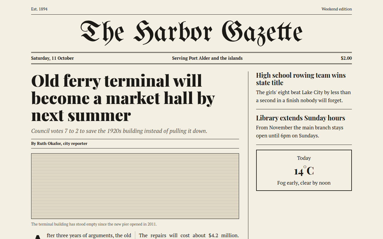
Free newspaper style website template with a masthead, serif headlines, drop cap and multi column text in pure CSS. Live demo and HTML download. The example is The Harbor Gazette, a local news site.
What is newspaper editorial?
Newspaper editorial style brings the front page of a printed paper to the web. A blackletter masthead, a double rule under the date, big serif headlines and text flowing in narrow columns.
CSS columns do the heavy lifting. One property splits the story into two columns with a thin rule between them, and ::first-letter makes the classic drop cap.
Good for
- Local news and community papers
- Blogs and magazines
- Newsletters and long reads
- Law firms and traditional brands
What you get in this template
- Blackletter masthead font
- Double rule date bar
- Two column story with column rule
- Drop cap on the first paragraph
- Sidebar with short stories and weather box
The key CSS
This is the part that makes the newspaper editorial look work. Copy it into your own project.
.cols {
  columns: 2;
  column-gap: 26px;
  column-rule: 1px solid #b9b2a2;
  text-align: justify; hyphens: auto;
}
.cols p:first-child::first-letter {
  float: left; font-size: 4rem; line-height: .8;
  font-family: "Playfair Display", serif; font-weight: 900;
}
.date { border-block: 3px double #1b1a17; }
How to use it
- Click Download HTML file above.
- Open the file in any code editor, like VS Code.
- Change the text, colors and links to match your project. Colors are at the top of the style tag.
- Upload it to any host, such as GitHub Pages, Netlify or your own server. It is one file with no build step.
Questions people ask
How do you make newspaper columns in CSS?
Use the columns property, for example columns: 2 with column-gap and column-rule. The text flows from one column into the next on its own.
How do I add a drop cap?
Style p:first-child::first-letter with float: left, a large font size and a tight line height.
Is justified text a good idea on the web?
It looks like print but can leave gaps. Adding hyphens: auto helps. On phones this template switches to one column so the text reads well.
More Bold and Raw designs
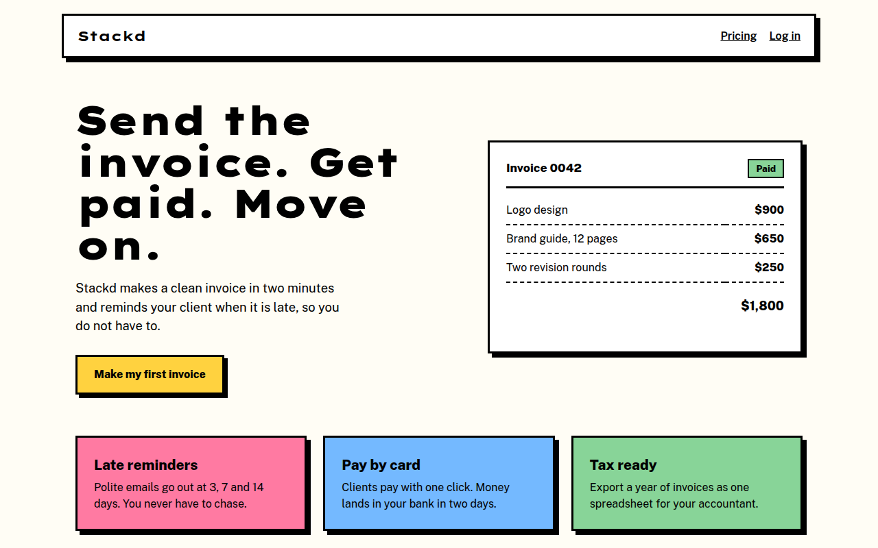
011. Neo Brutalism
Stackd, an invoicing tool for freelancers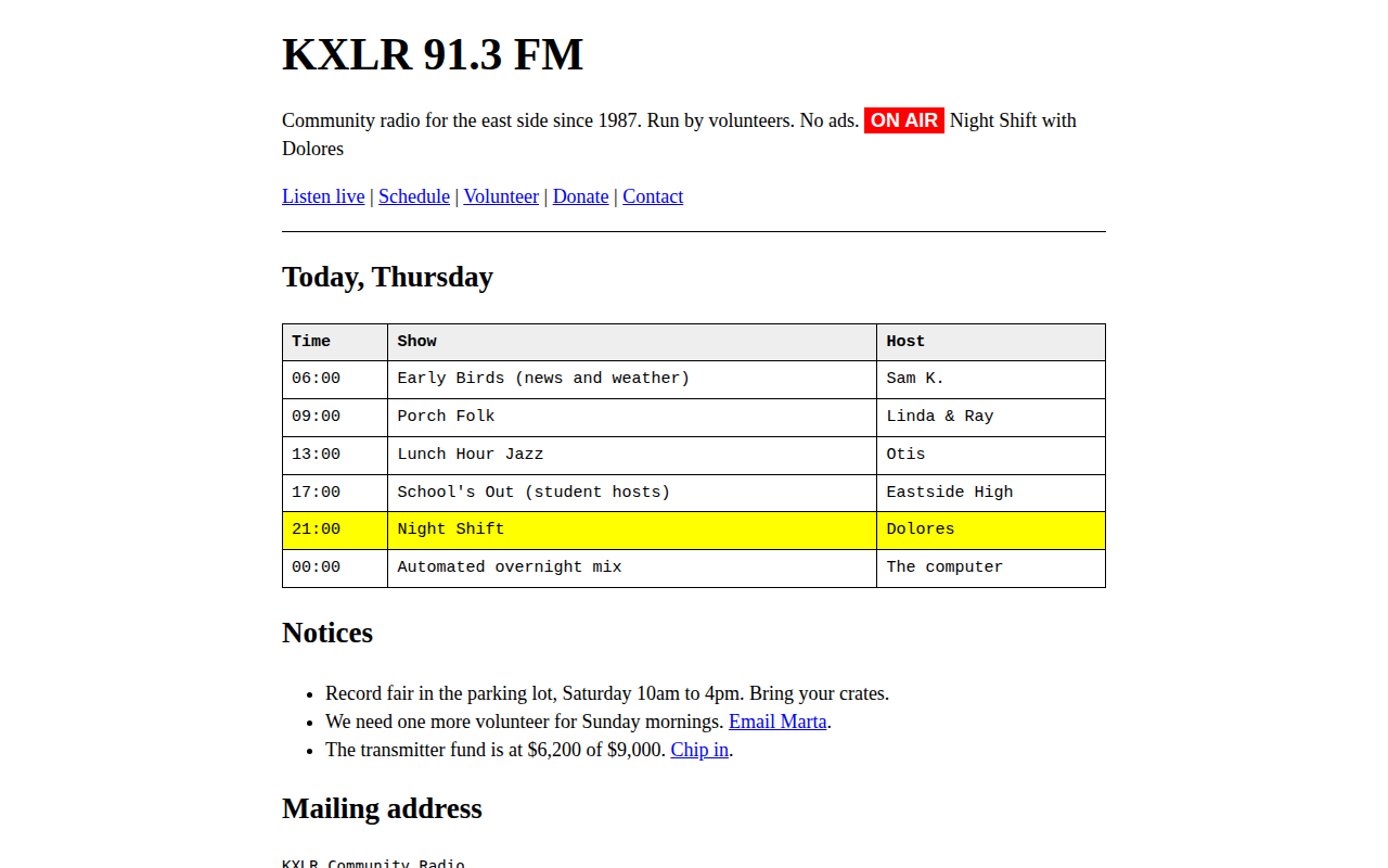
012. Raw Brutalist
KXLR, a community radio station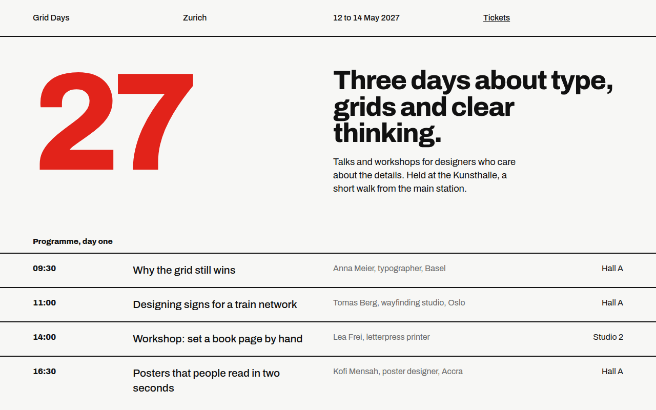
013. Swiss Grid
Grid Days, a design conference in Zurich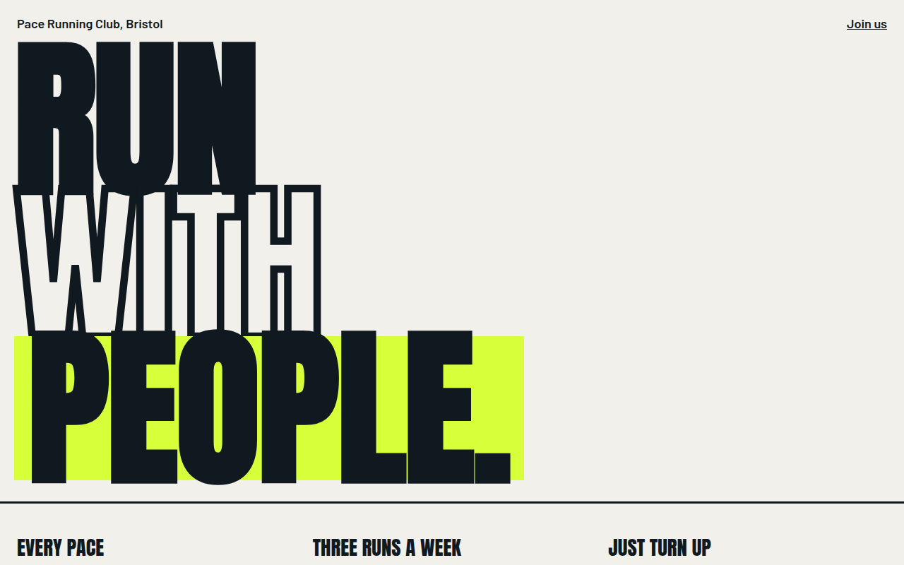
014. Bold Type Hero
Pace, a running club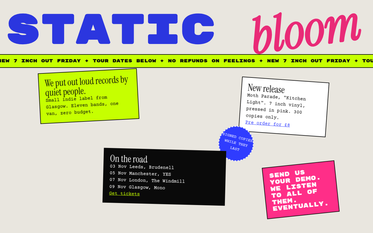
015. Anti Design
Static Bloom, an indie record label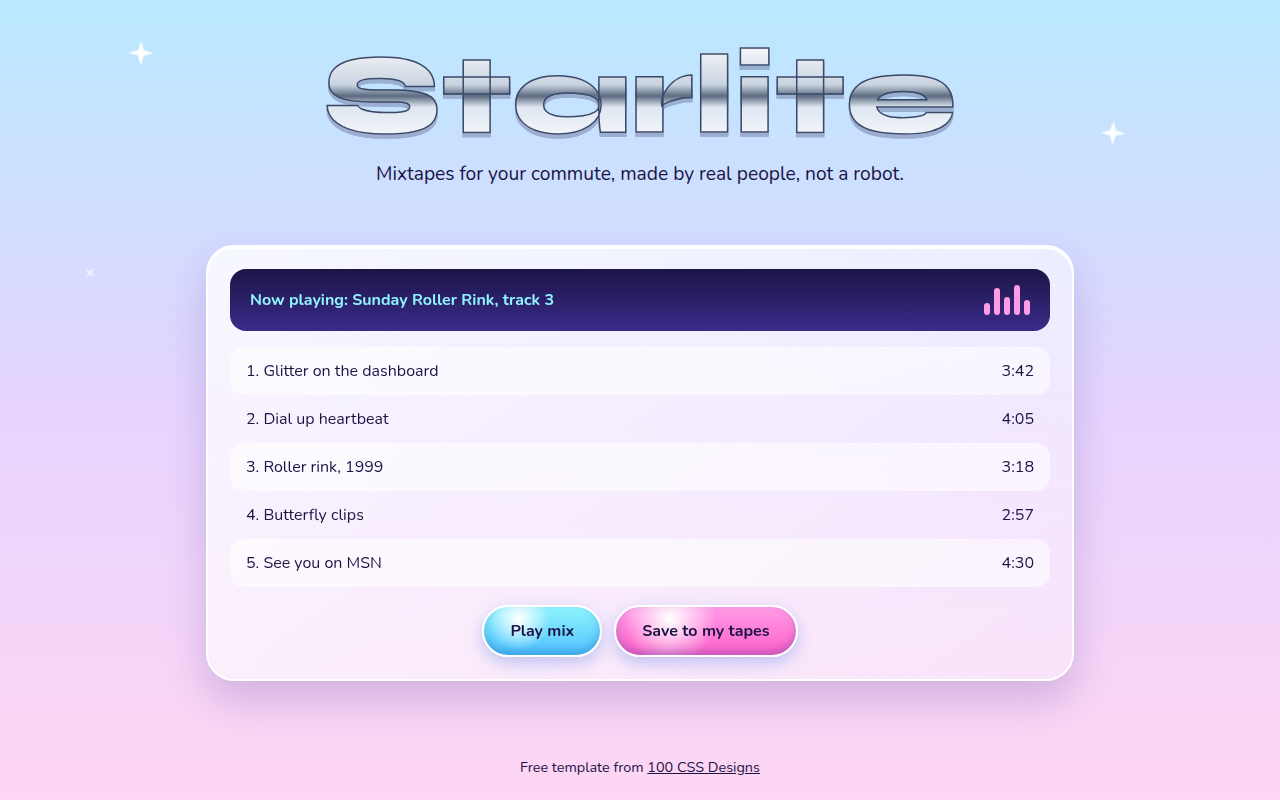
016. Y2K Revival
Starlite, a mixtape playlist site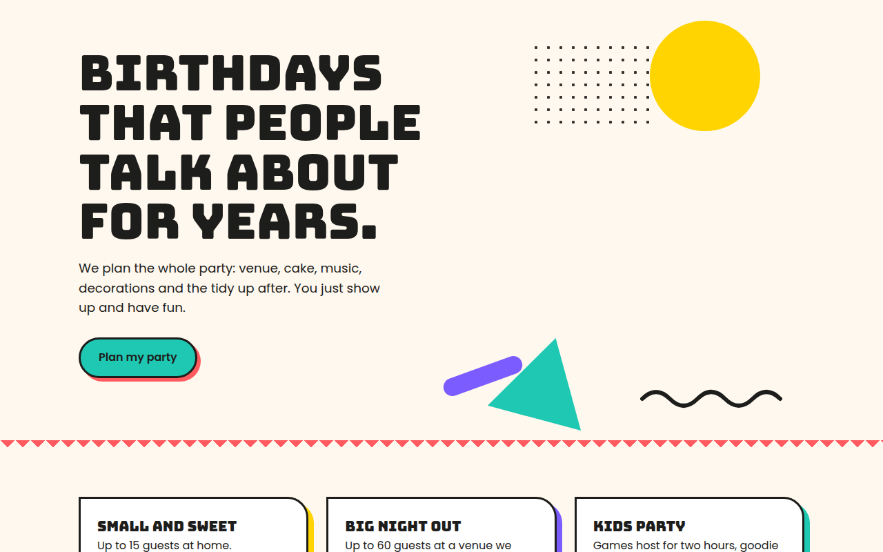
017. Memphis
Confetti Co., a party planner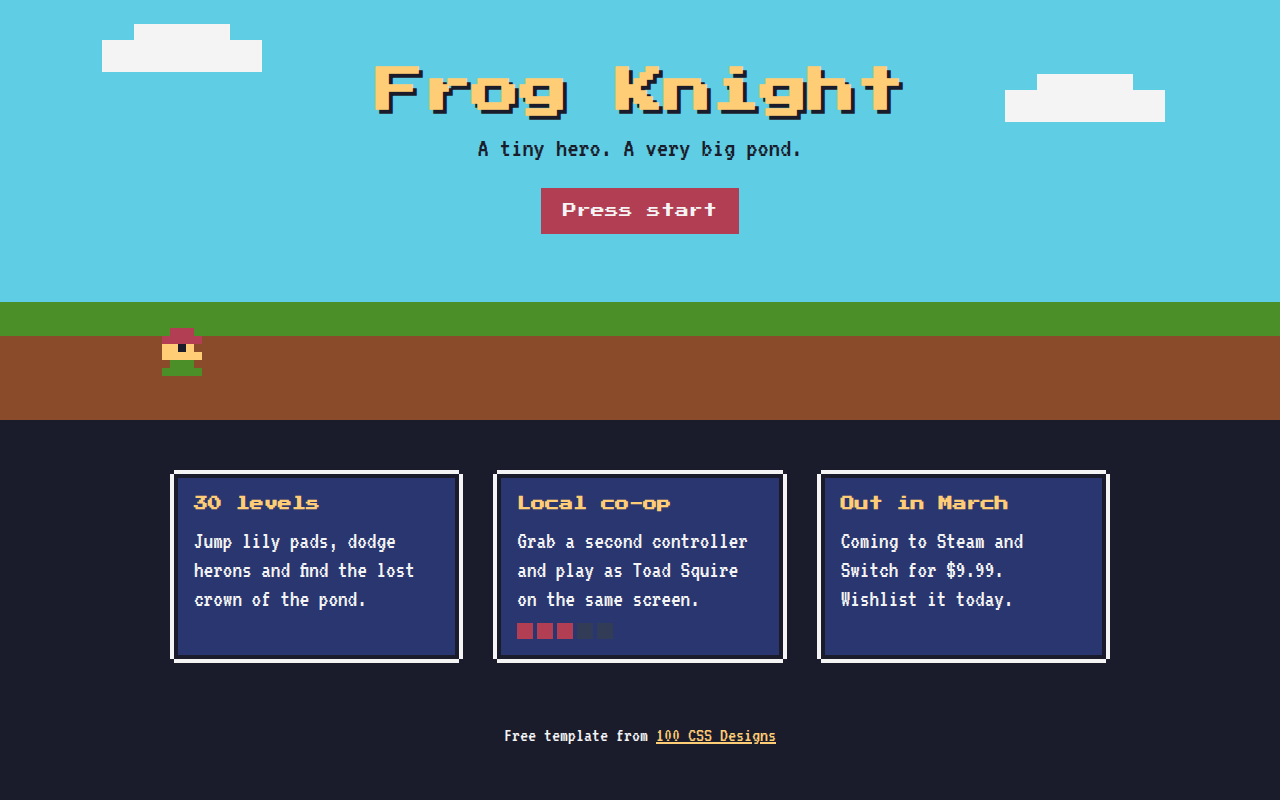
018. Retro Pixel
Frog Knight, an indie game launch page