Was This Helpful Bar
A short question at the end of an answer with Yes and No buttons. It turns into a thank you once someone answers.
One HTML file with the CSS and JavaScript inside. No library needed. MIT license.
How to use it
- Click Copy the code, or download the file.
- Paste the CSS into your stylesheet, the HTML where you want the component, and the script before the closing body tag.
- Change
--accentat the top of the CSS to your brand color, then connect the events to your AI service.
What you get
- Works in light and dark mode automatically
- Keyboard friendly, with labels for screen readers
- Fits phones, tablets and desktops
- Respects the reduced motion setting
- No framework, so it works with any stack
The code
<!DOCTYPE html>
<!--
  Was This Helpful Bar: a free AI UI component
  From 100 Free AI UI Components by MM Rahman Bappi, MIT license
  https://mmrahmanbappi.github.io/100-free-ai-ui-components/

  How to use: copy the CSS, HTML and JavaScript below into your page.
  Colors are CSS variables at the top. Change --accent to match your brand.
  Light and dark themes follow the visitor's system setting, or set
  data-theme="dark" or data-theme="light" on the html element.
-->
<html lang="en">
<head>
<meta charset="UTF-8">
<meta name="viewport" content="width=device-width, initial-scale=1">
<title>Was This Helpful Bar | Free AI UI Component</title>
<meta name="description" content="A short question at the end of an answer with Yes and No buttons. It turns into a thank you once someone answers.">
<meta name="robots" content="noindex, follow">
<style>
:root{
  --accent:#5b5bd6; --accent-ink:#fff; --accent-soft:#ececfc;
  --bg:#f7f7f8; --surface:#fff; --surface-2:#f1f1f4; --ink:#17171c; --text:#3a3a44; --muted:#6c6c78;
  --line:#e3e3e8; --good:#15803d; --warn:#b45309; --bad:#c62828;
  --radius:14px; --shadow:0 1px 2px rgba(20,20,30,.06),0 8px 24px -12px rgba(20,20,30,.18);
  --font:system-ui,-apple-system,"Segoe UI",Roboto,Ubuntu,sans-serif; --mono:ui-monospace,"Cascadia Code",Menlo,Consolas,monospace;
}
@media (prefers-color-scheme:dark){:root:not([data-theme=light]){
  --accent:#8b8bff; --accent-ink:#0f0f16; --accent-soft:#25254a;
  --bg:#0f0f13; --surface:#18181f; --surface-2:#212129; --ink:#f3f3f6; --text:#d4d4dc; --muted:#9a9aa8;
  --line:#2c2c36; --good:#4ade80; --warn:#fbbf24; --bad:#f87171; --shadow:0 1px 2px rgba(0,0,0,.4),0 10px 30px -12px rgba(0,0,0,.6);
}}
:root[data-theme=dark]{
  --accent:#8b8bff; --accent-ink:#0f0f16; --accent-soft:#25254a;
  --bg:#0f0f13; --surface:#18181f; --surface-2:#212129; --ink:#f3f3f6; --text:#d4d4dc; --muted:#9a9aa8;
  --line:#2c2c36; --good:#4ade80; --warn:#fbbf24; --bad:#f87171; --shadow:0 1px 2px rgba(0,0,0,.4),0 10px 30px -12px rgba(0,0,0,.6);
}
*{box-sizing:border-box}
html,body{margin:0}
body{min-height:100vh;display:grid;grid-template-columns:minmax(0,1fr);place-items:center;padding:24px;background:var(--bg);color:var(--text);font:15px/1.5 var(--font);-webkit-font-smoothing:antialiased}
button,input,textarea,select{font:inherit;color:inherit}
:focus-visible{outline:2px solid var(--accent);outline-offset:2px}
[hidden]{display:none!important}
.sr{position:absolute;width:1px;height:1px;overflow:hidden;clip:rect(0 0 0 0);white-space:nowrap}
@media (prefers-reduced-motion:reduce){*,*::before,*::after{animation-duration:.01ms!important;animation-iteration-count:1!important;transition:none!important}}
/* ---- component ---- */
.wrap{width:min(100%,640px);display:flex;flex-direction:column;gap:14px}
.ai{display:flex;gap:12px;align-items:flex-start}
.av{width:32px;height:32px;border-radius:50%;background:var(--accent);color:var(--accent-ink);display:grid;place-items:center;flex:none}
.col{display:flex;flex-direction:column;gap:8px;min-width:0;flex:1}
.bubble{background:var(--surface);border:1px solid var(--line);border-radius:4px 16px 16px 16px;padding:11px 15px;box-shadow:var(--shadow);color:var(--text);overflow-wrap:anywhere}
.card{background:var(--surface);border:1px solid var(--line);border-radius:var(--radius);box-shadow:var(--shadow);padding:16px 18px}
.card h2{font-size:15px;margin:0 0 4px;color:var(--ink)}.card p{margin:0 0 12px;color:var(--muted);font-size:14px}
.ib{display:inline-flex;align-items:center;justify-content:center;gap:6px;border:0;background:none;color:var(--muted);height:32px;min-width:32px;padding:0 8px;border-radius:8px;cursor:pointer;font-size:13px}
.ib:hover{background:var(--surface-2);color:var(--ink)}
.ib[aria-pressed=true]{color:var(--accent);background:var(--accent-soft)}
.btn{display:inline-flex;align-items:center;gap:6px;border:1px solid var(--line);background:var(--surface);color:var(--ink);border-radius:9px;padding:7px 14px;font-size:14px;cursor:pointer}
.btn:hover{border-color:var(--accent)}.btn.pri{background:var(--accent);border-color:var(--accent);color:var(--accent-ink);font-weight:600}
.btn:disabled{opacity:.45;cursor:not-allowed}
.thanks{font-size:13.5px;color:var(--good);display:flex;align-items:center;gap:6px;animation:in .25s ease}
@keyframes in{from{opacity:0;transform:translateY(3px)}}.hb{display:flex;align-items:center;gap:10px;flex-wrap:wrap;background:var(--surface-2);border:1px solid var(--line);border-radius:12px;padding:8px 10px 8px 14px;font-size:14px}
.hb span{color:var(--text);margin-right:auto}
.hb .btn{padding:5px 14px}
</style>
</head>
<body>
<div class="wrap"><div class="ai"><div class="av" aria-hidden="true"><svg viewBox="0 0 24 24" width="16" height="16" fill="currentColor" aria-hidden="true"><path d="M12 2l1.8 6.2L20 10l-6.2 1.8L12 18l-1.8-6.2L4 10l6.2-1.8z"/></svg></div><div class="col"><div class="bubble">To remove a red wine stain, blot it right away, then cover it with salt or baking soda for 10 minutes. Rinse with cold water, not hot, and wash as usual.</div>
  <div class="hb" id="hb" aria-live="polite"><span>Was this answer helpful?</span><button class="btn" type="button" data-v="yes">Yes</button><button class="btn" type="button" data-v="no">No</button></div>
</div></div></div>
<script>
// Demo helper: add ?theme=dark or ?theme=light to the address to preview a theme.
(function(){var t=new URLSearchParams(location.search).get('theme');if(t)document.documentElement.dataset.theme=t;})();
var hb=document.getElementById('hb');
hb.addEventListener('click',function(e){var b=e.target.closest('button');if(!b)return;
  hb.innerHTML='<span class="thanks">'+(b.dataset.v==='yes'?'Great, thanks for telling us.':'Sorry about that. Thanks for telling us.')+'</span>';});
</script>
</body>
</html>
More answer feedback components
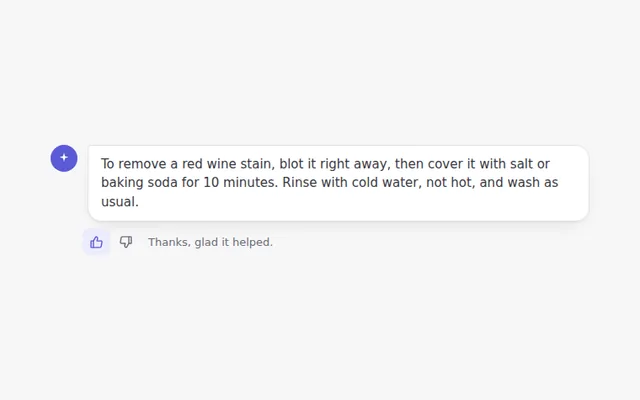
Thumbs Up and Down
Two small buttons under an answer. Pick one to rate it, pick it again to undo, and see a short thank you.
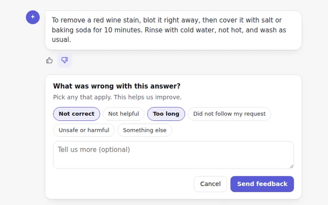
Thumbs Down with Reasons
When someone marks an answer as bad, a small panel asks why, with quick reason buttons and an optional comment.
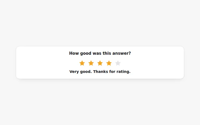
Star Rating
Rate an answer from one to five stars with the mouse or keyboard. Each level shows a word, like Good or Excellent.
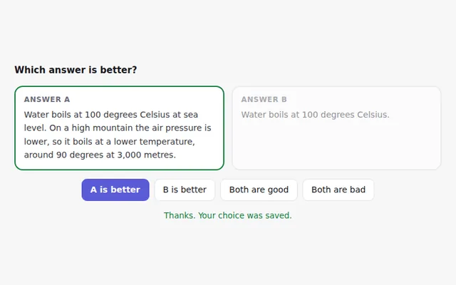
Compare Two Answers
Two answers side by side so people can pick the better one, or say both are good or both are bad. Useful for testing models.
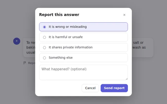
Report a Problem Dialog
A report button opens a dialog to flag an answer, with categories and details. It traps focus and closes with Escape.
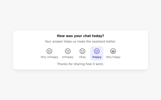
Satisfaction Scale
Five faces from very unhappy to very happy. A quick way to ask how a chat went, drawn in SVG so it looks the same everywhere.