Home / Comparison Charts / Grouped Bar Chart
Grouped Bar Chart in HTML, CSS and JavaScript
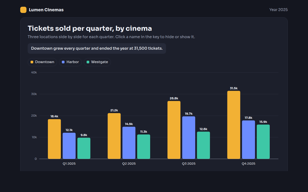
A grouped bar chart, also called a clustered bar chart, puts two or more bars next to each other for every category. This free template draws one with plain SVG and vanilla JavaScript, no chart library. The example shows cinema ticket sales for three locations per quarter.
What is a grouped bar chart?
A grouped bar chart, also called a clustered bar chart, puts two or more bars next to each other for every category. Each color stands for one series, so you can compare series inside a group and see how groups change.
Use it when you have two ways to split your data, like quarter and location. The reader can compare Downtown with Harbor inside one quarter, or follow one color across the year.
At a glance
- Best for
- Comparing 2 to 4 series across a few groups
- Data you need
- A table with groups as rows and series as columns
- Skip it when
- More than 4 series. The groups get too crowded.
- Made with
- HTML, CSS and vanilla JavaScript. No library.
When to use a grouped bar chart
- Sales for several stores per quarter
- This year compared with last year by month
- Survey results split by age group
- Test scores by class and subject
When to pick another chart
- Stacked Bar Chart: the total of each group matters more than each part
- Dumbbell Chart: you only have two series, like before and after
What you get in this template
- Bars grouped with a simple inner band layout
- Click any name in the key to hide or show that series
- The axis rescales when series are hidden
- Short value labels like 18.4k above each bar
- Dark theme with colors that stay readable
- Tooltips, keyboard focus and a data table
How the code works
Here is a short version of the idea behind this grouped bar chart. The full file adds the axis, labels, tooltips, sorting and resizing on top of it.
const groups = ['Q1', 'Q2', 'Q3', 'Q4'];
const series = [
  { name: 'Downtown', color: '#f2b134', values: [18400, 21200, 26800, 31500] },
  { name: 'Harbor', color: '#6c8cff', values: [12100, 14900, 19700, 17800] }
];
const groupWidth = 600 / groups.length;
const barWidth = groupWidth * 0.8 / series.length;
const max = Math.max(...series.flatMap(s => s.values));

groups.forEach((g, gi) => {
  series.forEach((s, si) => {
    const x = gi * groupWidth + groupWidth * 0.1 + si * barWidth;
    const barHeight = s.values[gi] / max * 260;
    drawRect(x, 280 - barHeight, barWidth - 4, barHeight, s.color);
  });
});
The example uses four tiny helpers that create SVG shapes. Put them above the code and it runs as is.
const svg = document.querySelector('svg');
function make(tag, attrs) {
  const n = document.createElementNS('http://www.w3.org/2000/svg', tag);
  for (const k in attrs) n.setAttribute(k, attrs[k]);
  svg.appendChild(n);
  return n;
}
function drawRect(x, y, width, height, fill) { return make('rect', { x, y, width, height, fill }); }
function drawCircle(cx, cy, r, fill) { return make('circle', { cx, cy, r, fill }); }
function drawLine(x1, y1, x2, y2, stroke, width, dash) {
  return make('line', { x1, y1, x2, y2, stroke, 'stroke-width': width || 1, 'stroke-dasharray': dash || 'none' });
}
function drawText(x, y, str, anchor) {
  const t = make('text', { x, y, 'text-anchor': anchor || 'start' });
  t.textContent = str;
  return t;
}
How to add it to your website
- Download the file. Click Download HTML file above. You get one file called grouped-bar-chart.html with everything inside.
- Change the data. Open the file in any code editor and find the DATA list near the bottom. Replace the names and numbers with your own.
- Change the colors and text. Colors are at the top of the style tag. The title, subtitle and main point are plain HTML near the top of the body.
- Put it online. Upload the file to any host, such as GitHub Pages, Netlify or your own server, or paste it into your site. There is no build step.
Questions people ask
What is the difference between a grouped and a stacked bar chart?
A grouped bar chart puts bars side by side, so each value is easy to compare. A stacked bar chart piles them on top of each other, so the total is easy to see but the middle parts are harder to compare.
How many series should a grouped bar chart have?
Two to four works best. With five or more colors in every group, readers lose track. Split the chart into small charts instead.
Is a clustered bar chart the same as a grouped bar chart?
Yes. Clustered bar chart, grouped bar chart and side by side bar chart all mean the same thing.
Can I hide a series in this chart?
Yes. Click a name in the key above the chart. The bars for that series disappear and the axis adjusts to the ones left.
More comparison charts
001. Bar Chart
Example: weekly bread sales at a bakery
003. Stacked Bar Chart
Example: website visits by source for an outdoor shop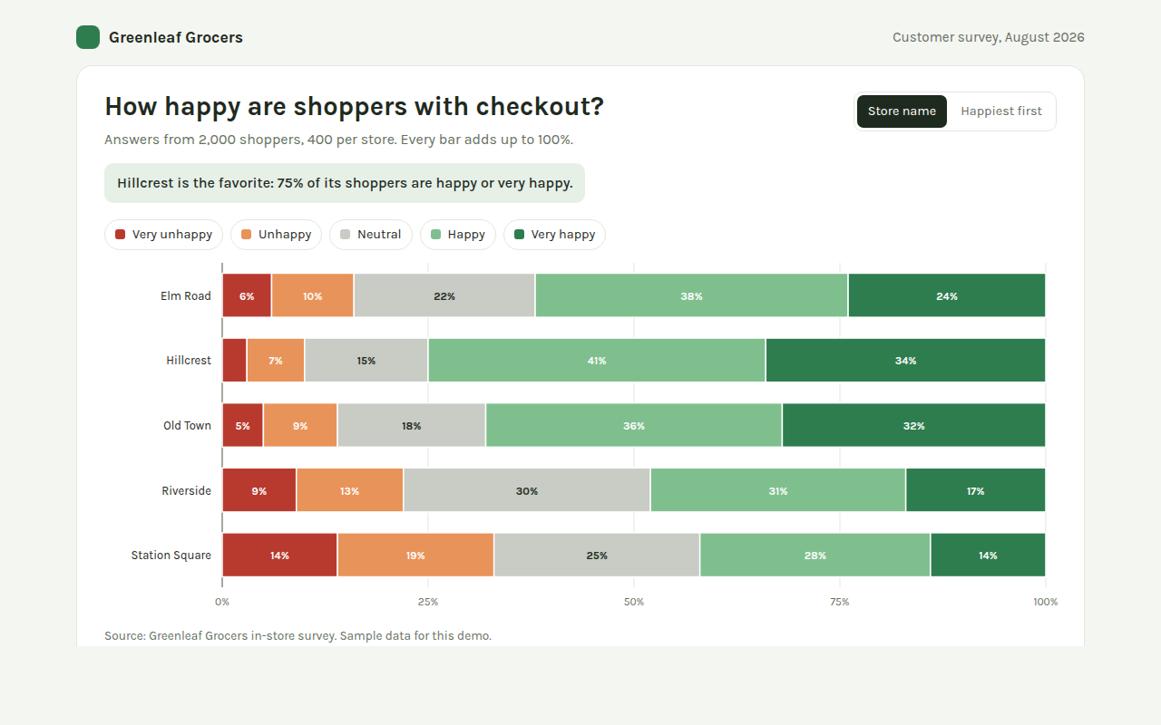
004. 100% Stacked Bar Chart
Example: customer survey results for five grocery stores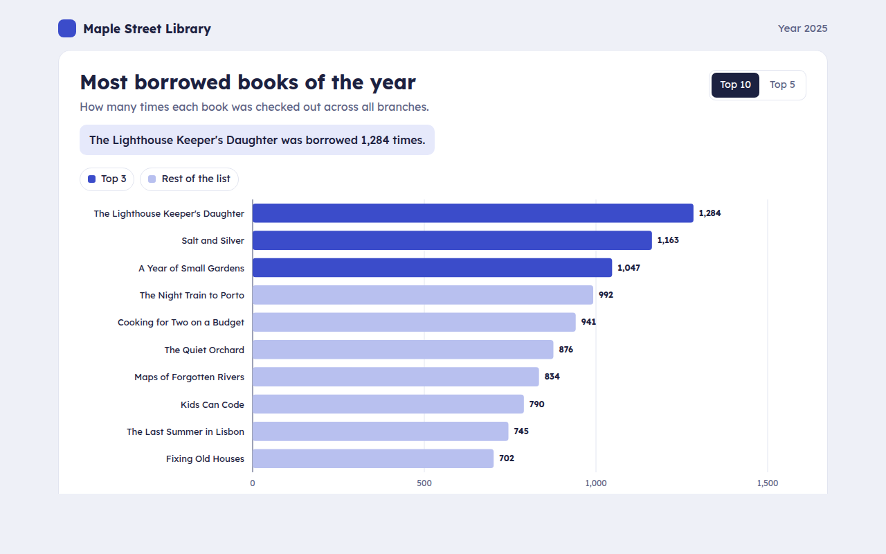
005. Horizontal Bar Chart
Example: the most borrowed library books of the year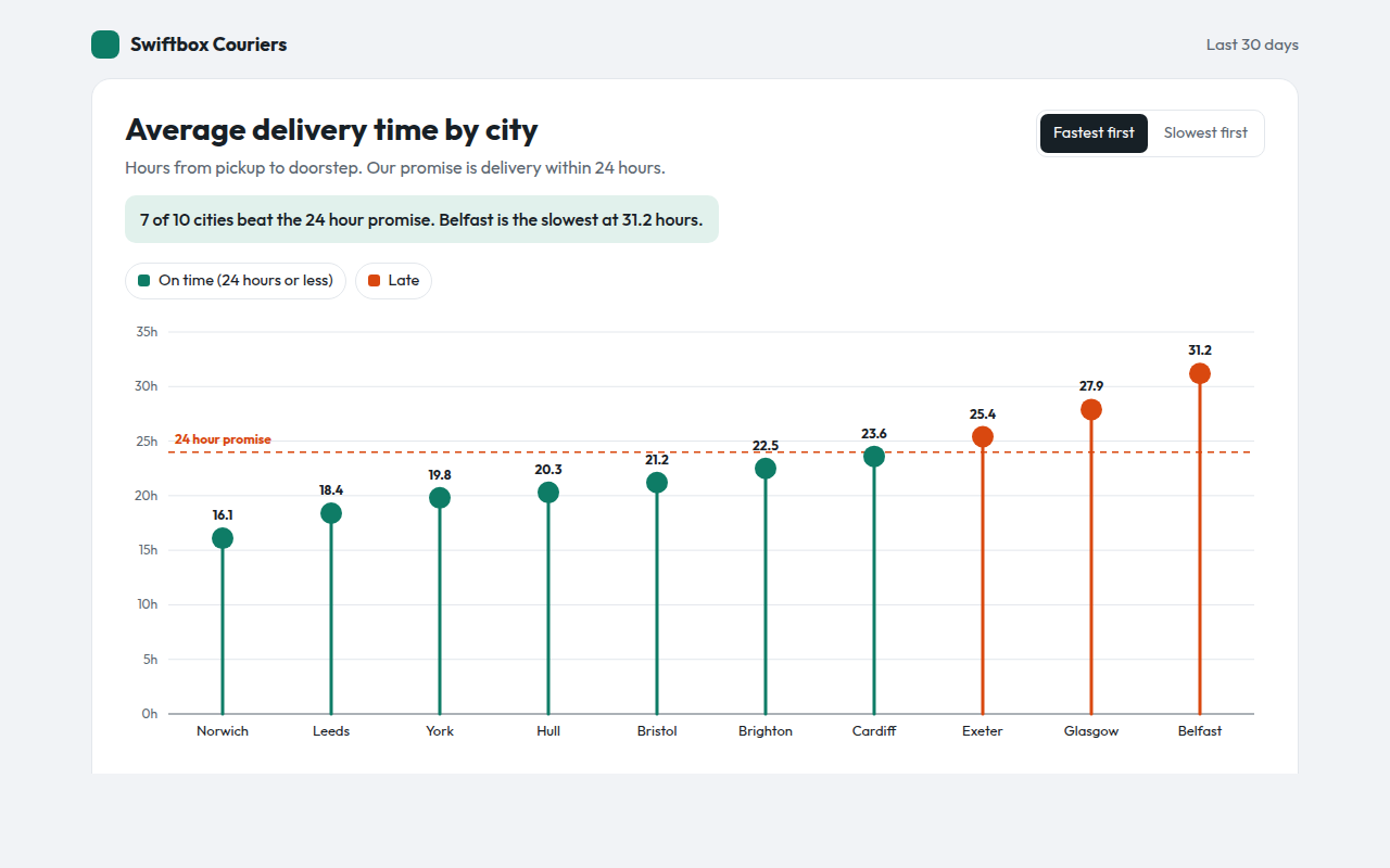
006. Lollipop Chart
Example: average delivery time by city with a 24 hour target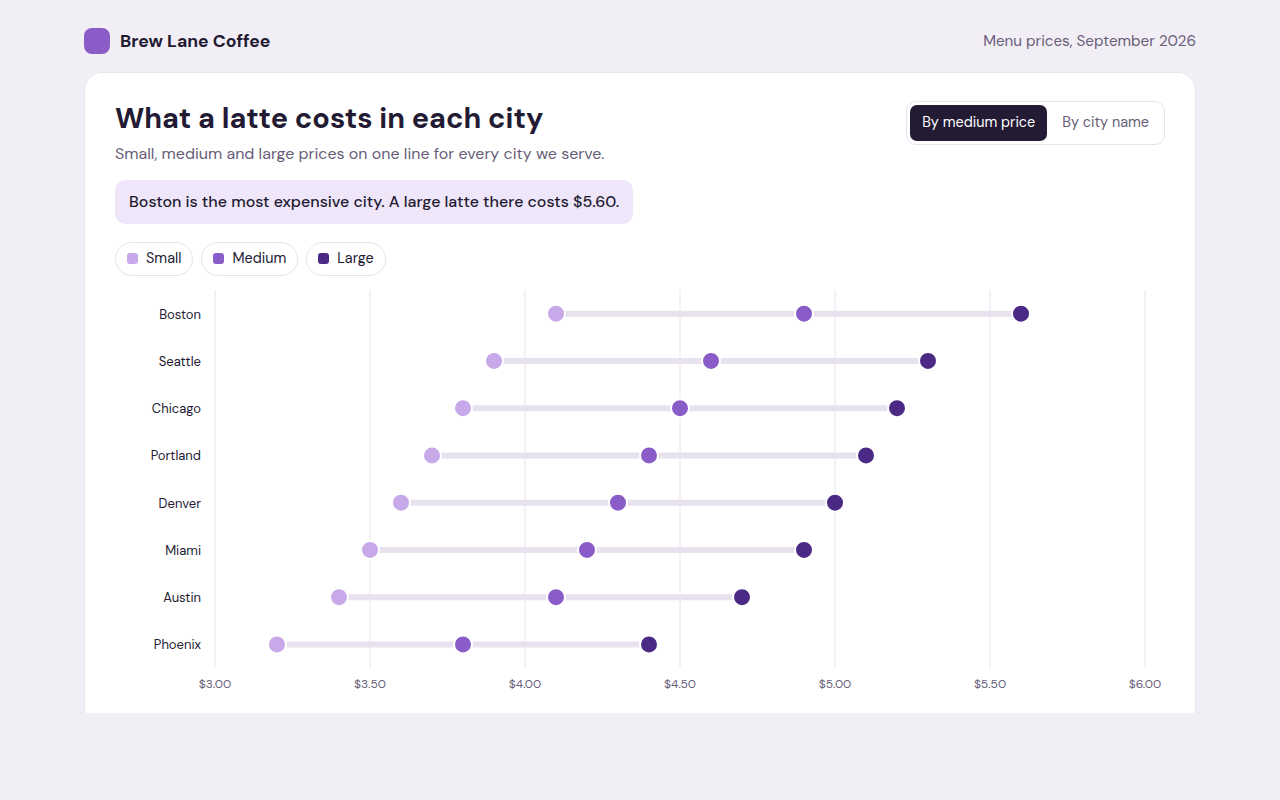
007. Dot Plot
Example: small, medium and large latte prices in eight cities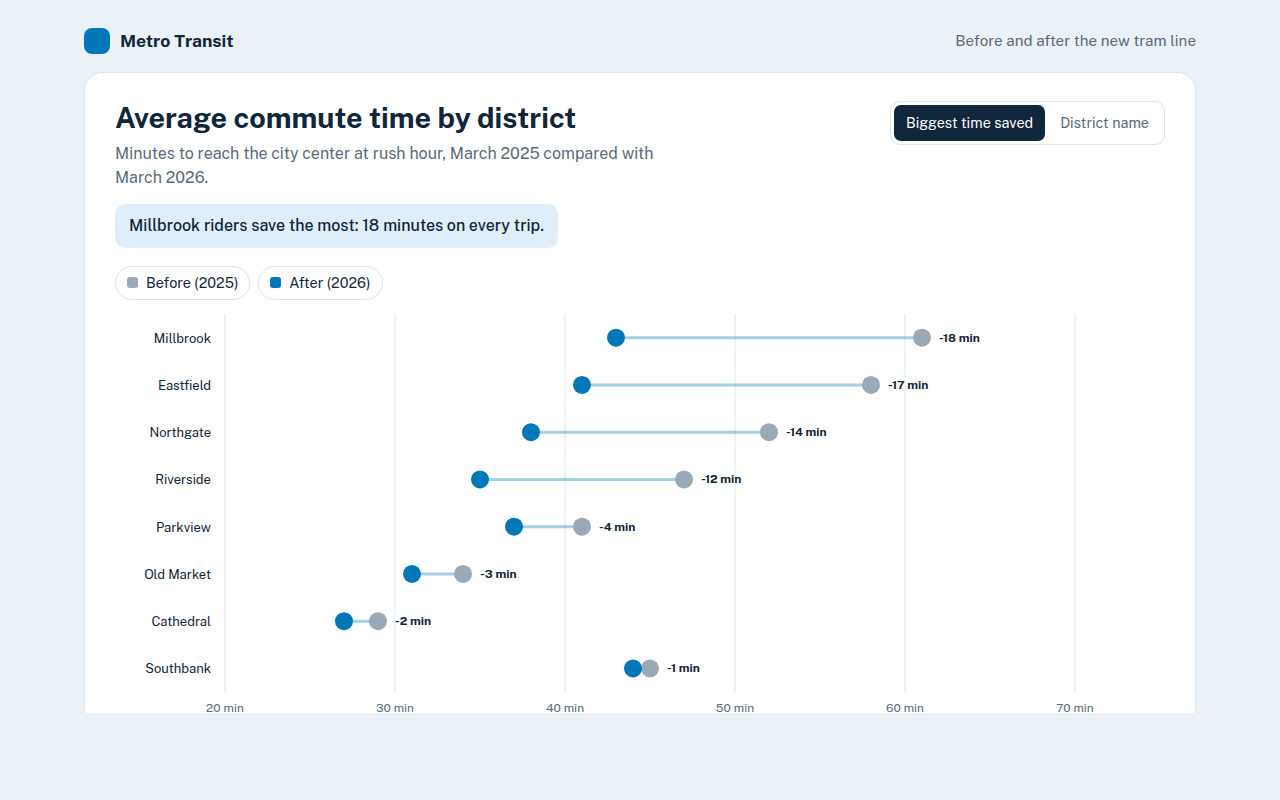
008. Dumbbell Chart
Example: commute times before and after a new tram line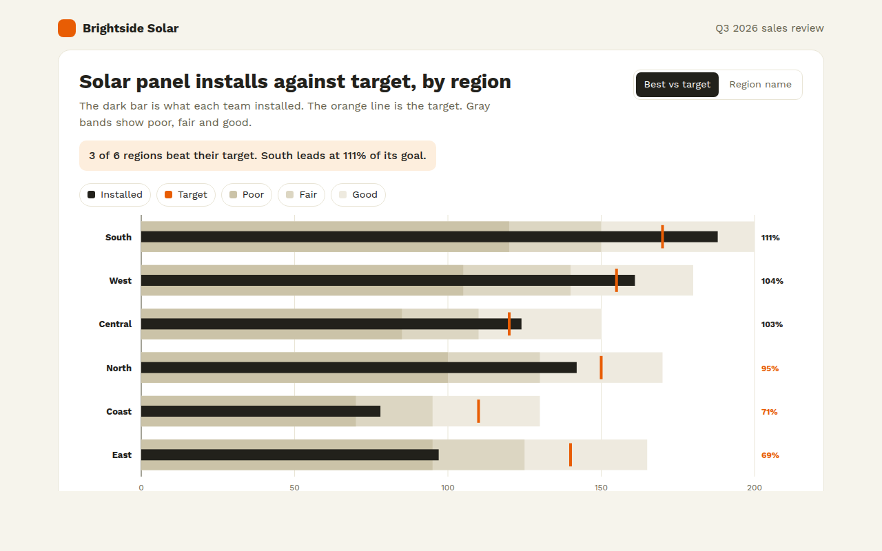
009. Bullet Chart
Example: solar panel installs against target for six regions