Home / Typography / Kinetic Type
Kinetic Type CSS Template, Free with Live Demo
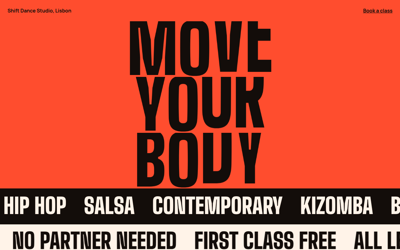
Free kinetic typography website template for a dance studio. Letters that stretch and bounce one after another, plus sliding text rows. Live demo. The example is Shift, a dance studio.
What is kinetic type?
Kinetic typography means text that moves. Letters stretch, squash and bounce, and whole lines slide across the screen. It turns the words themselves into the main visual, which suits brands about movement, music and energy.
Each letter is its own span with a small delay set by a CSS variable, so the bounce travels along the word like a wave. The sliding rows are a doubled line of text moved with translateX, so they loop without a gap.
Good for
- Dance, fitness and sports brands
- Music and event sites
- Agency and portfolio intros
- Launch pages that need energy
What you get in this template
- Letters that stretch and bounce in a wave
- Delay per letter set with one CSS variable
- Two text rows sliding in opposite directions
- Screen readers read each word once
- All motion stops for reduced motion
The key CSS
This is the part that makes the kinetic type look work. Copy it into your own project.
.word span {
  display: inline-block;
  transform-origin: bottom;
  animation: hop 2.4s cubic-bezier(.6, 0, .3, 1) infinite;
  animation-delay: calc(var(--i) * .08s);
}
@keyframes hop {
  0%, 60%, 100% { transform: scaleY(1); }
  20% { transform: scaleY(1.35) translateY(-4%); }
  35% { transform: scaleY(.8); }
}
How to use it
- Click Download HTML file above.
- Open the file in any code editor, like VS Code.
- Change the text, colors and links to match your project. Colors are at the top of the style tag.
- Upload it to any host, such as GitHub Pages, Netlify or your own server. It is one file with no build step.
Questions people ask
What is kinetic typography?
It is text that moves or changes shape as part of the design, like letters bouncing, stretching or sliding across the page.
How do you animate each letter separately?
Wrap every letter in a span with a number, like style="--i:2", and use animation-delay: calc(var(--i) * .08s) so each one starts a little later.
Is animated text bad for accessibility?
It can be. This template gives each word an aria-label so it is read once, hides the letter spans from screen readers, and stops all motion for reduced motion users.
More Typography designs
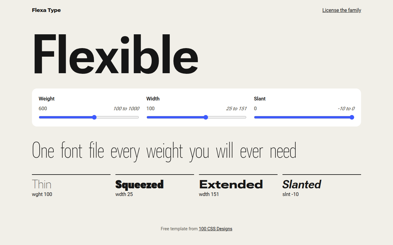
052. Variable Fonts
Flexa, a type foundry specimen page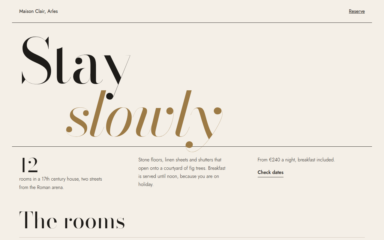
053. Oversized Serif
Maison Clair, a boutique hotel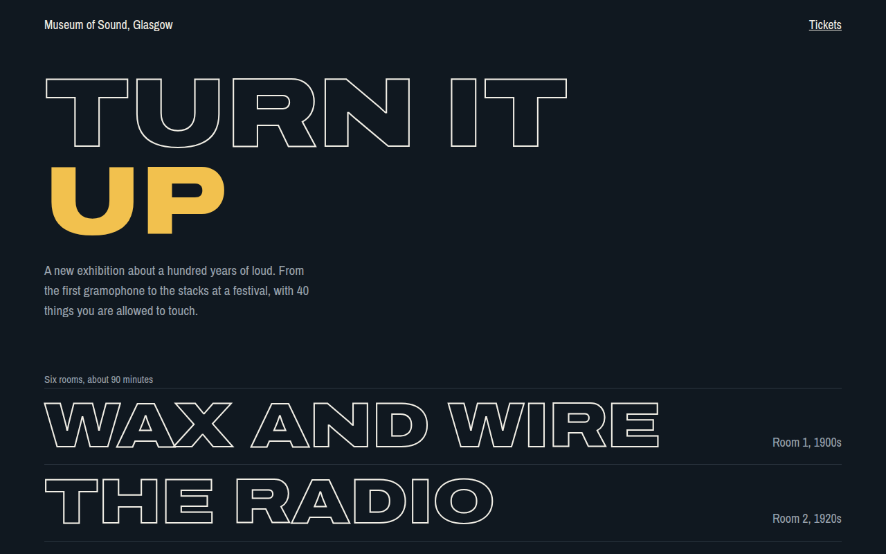
054. Outline Text
Museum of Sound, an exhibition site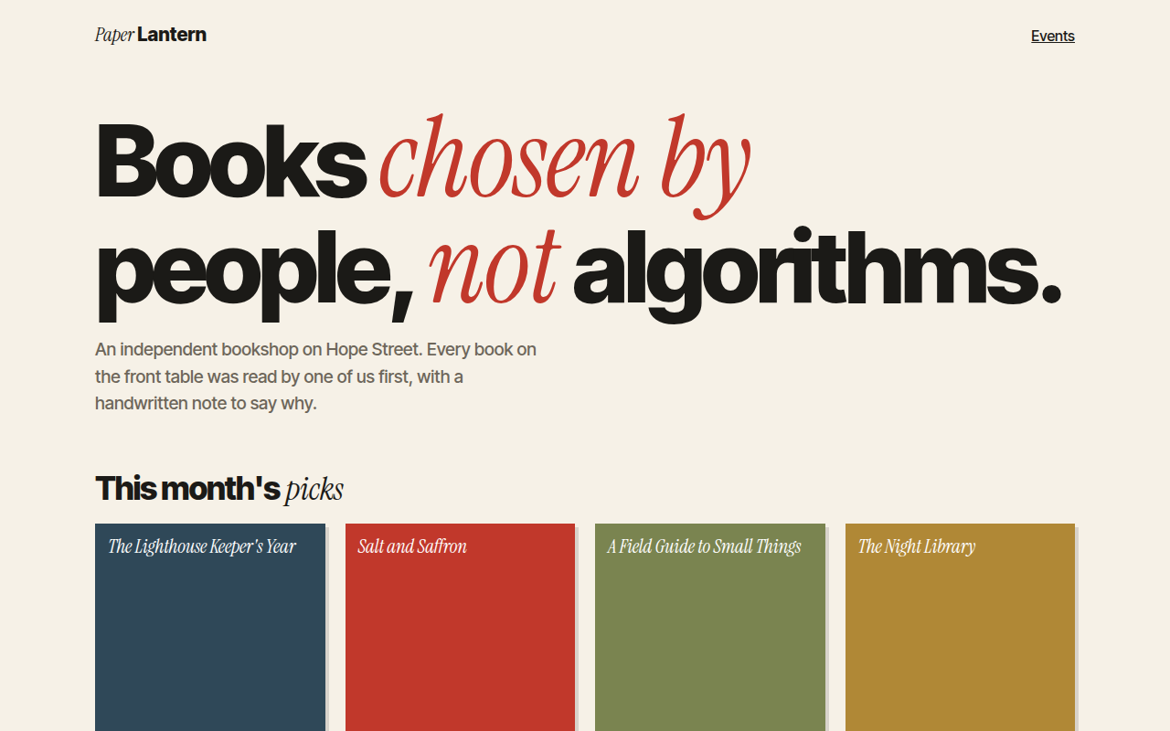
055. Mixed Font Pairing
Paper Lantern, an independent bookshop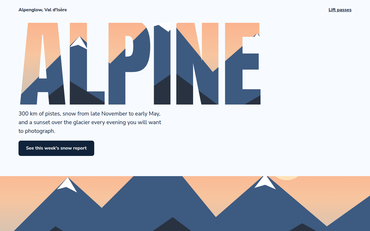
056. Image in Text
Alpenglow, a ski resort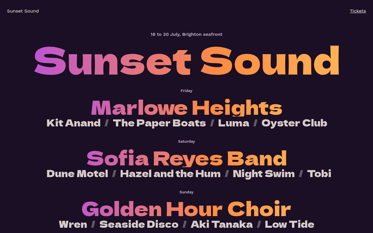
057. Gradient Text
Sunset Sound, a festival lineup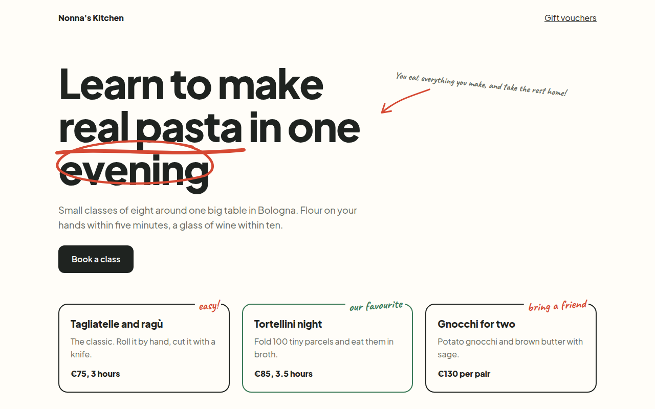
058. Handwritten Accents
Nonna's Kitchen, a cooking school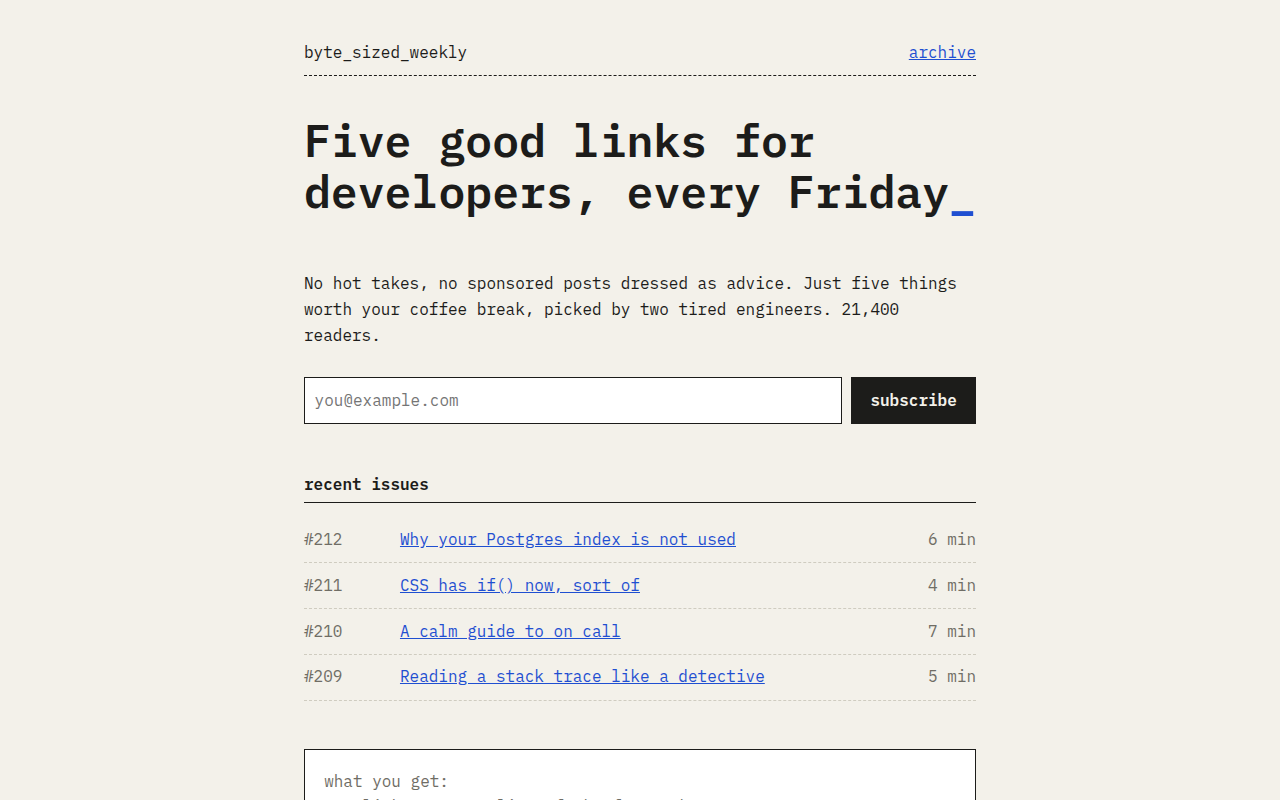
059. Monospace
Byte Sized Weekly, a developer newsletter