Home / Typography / Mixed Font Pairing
Mixed Font Pairing CSS Template, Free with Live Demo
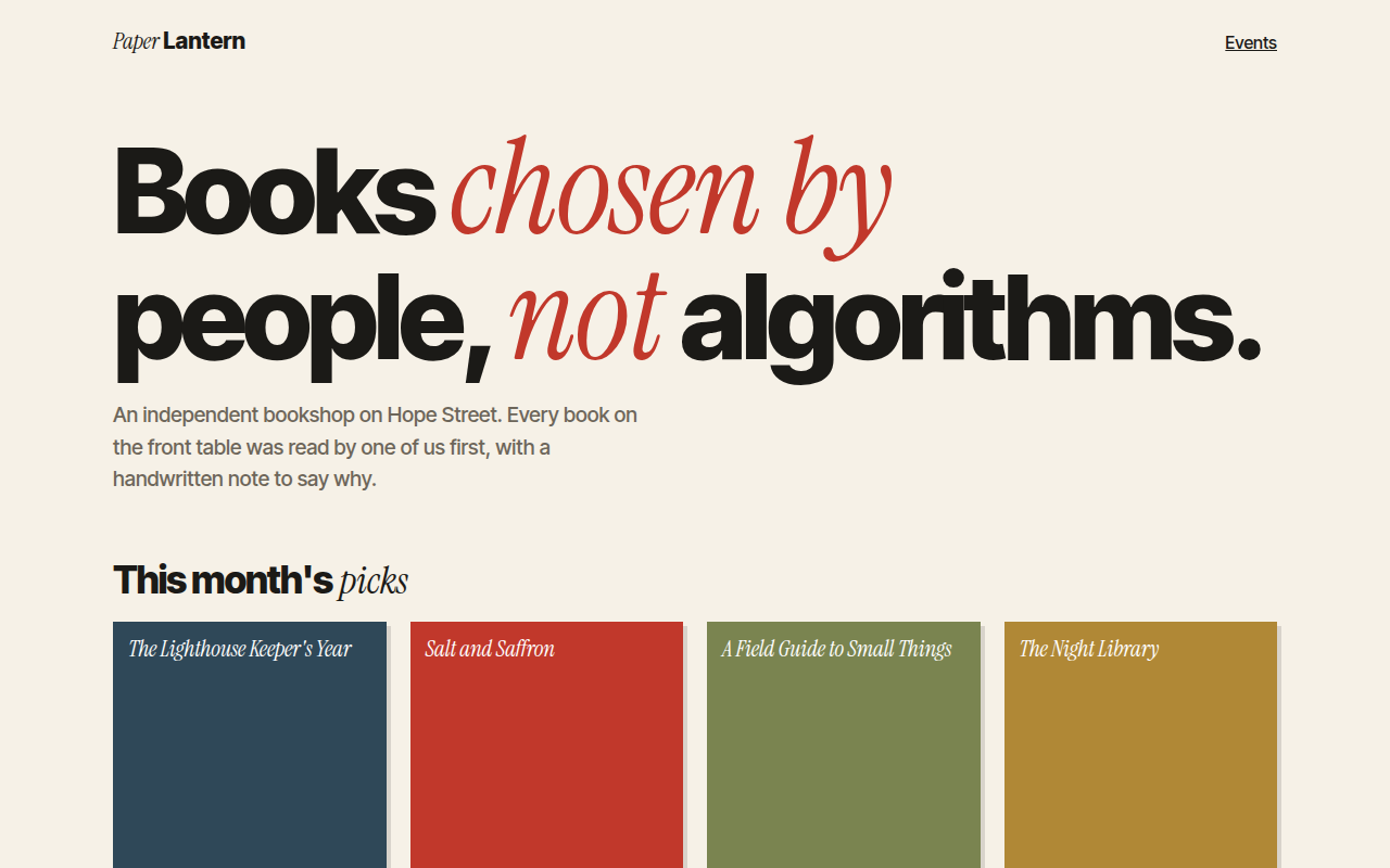
Free font pairing website template for a bookshop. Italic serif and bold grotesk mixed inside the same headline for an editorial feel. Live demo. The example is Paper Lantern, an independent bookshop.
What is mixed font pairing?
Mixed font pairing puts two very different fonts in the same line: a bold, tight sans serif and a soft italic serif. The switch between them adds rhythm and emphasis, like a voice changing tone mid sentence.
It is simple to build. Two classes, one for each font, used on spans inside the headline. The trick is to make the serif a touch larger so both fonts look the same size.
Good for
- Bookshops and publishers
- Editorial blogs and magazines
- Creative agencies
- Coffee shops and lifestyle brands
What you get in this template
- Inter Tight and Instrument Serif mixed in headlines
- Italic serif words in red for emphasis
- Book cover cards made with CSS
- Staff pick notes in italic serif
- Same pairing used in the logo
The key CSS
This is the part that makes the mixed font pairing look work. Copy it into your own project.
.s { font-family: "Instrument Serif", serif; font-style: italic; font-weight: 400; }
.g { font-weight: 800; letter-spacing: -.04em; }

h1 {
  font-family: "Inter Tight", sans-serif;
  font-weight: 800; letter-spacing: -.045em;
}
h1 .s { font-size: 1.12em; color: #c1382b; }
How to use it
- Click Download HTML file above.
- Open the file in any code editor, like VS Code.
- Change the text, colors and links to match your project. Colors are at the top of the style tag.
- Upload it to any host, such as GitHub Pages, Netlify or your own server. It is one file with no build step.
Questions people ask
What is a good font pairing for websites?
A reliable rule is one serif and one sans serif with clear differences. Instrument Serif with Inter Tight, or Playfair Display with Source Sans, both work well.
Why make the serif slightly bigger?
Serif italics usually look smaller than a bold sans at the same size. Scaling them to about 1.1em evens them out.
How many fonts should a site use?
Two is plenty for most sites. More than three starts to look messy.
More Typography designs
051. Kinetic Type
Shift, a dance studio
052. Variable Fonts
Flexa, a type foundry specimen page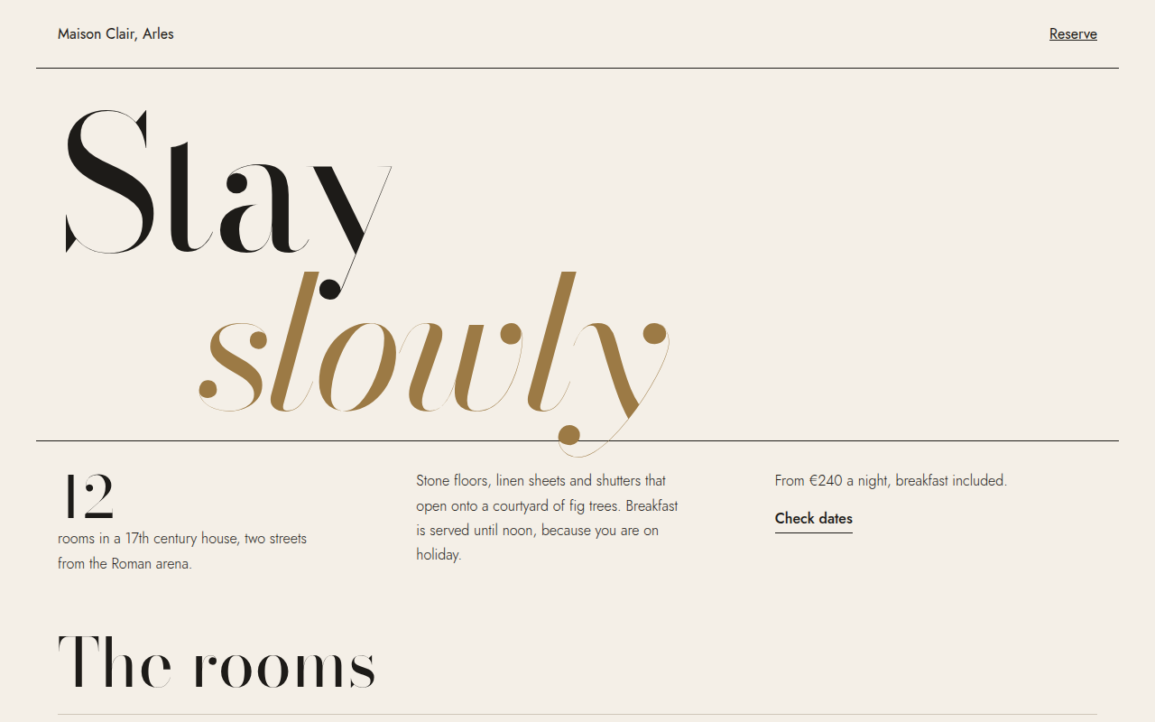
053. Oversized Serif
Maison Clair, a boutique hotel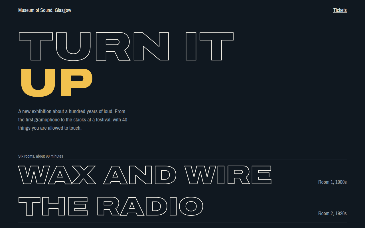
054. Outline Text
Museum of Sound, an exhibition site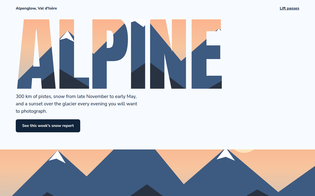
056. Image in Text
Alpenglow, a ski resort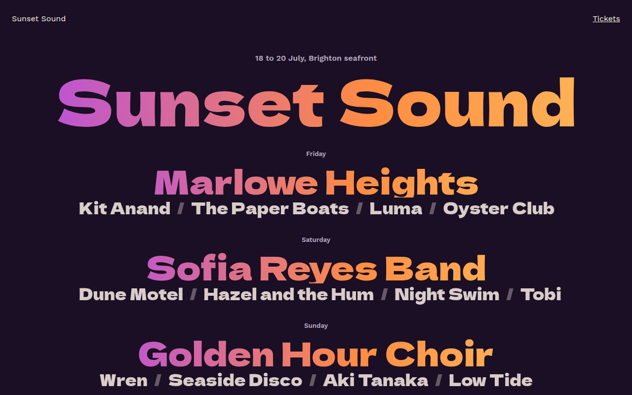
057. Gradient Text
Sunset Sound, a festival lineup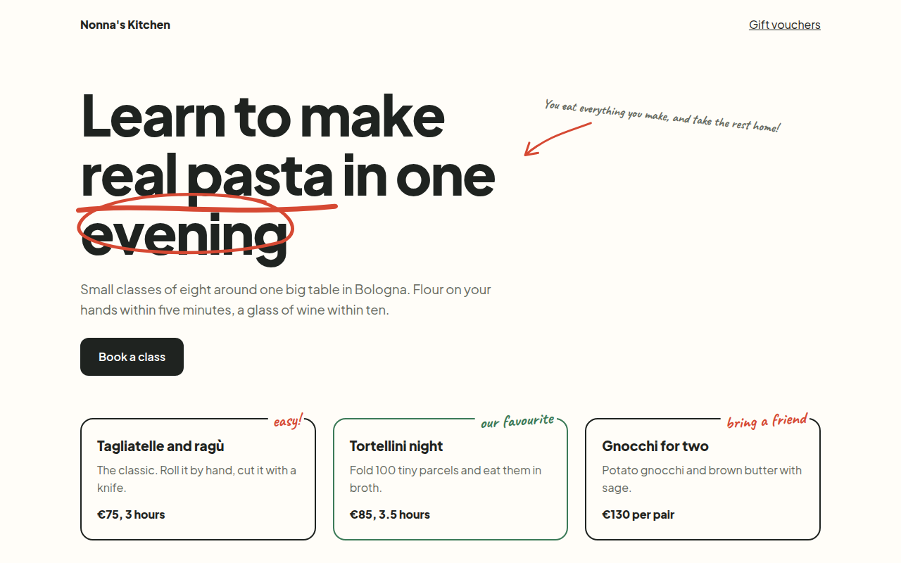
058. Handwritten Accents
Nonna's Kitchen, a cooking school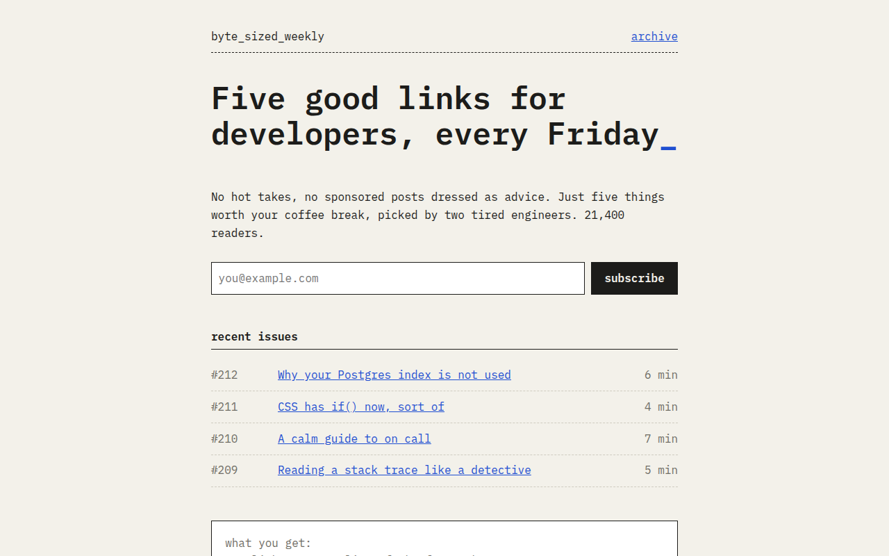
059. Monospace
Byte Sized Weekly, a developer newsletter