Prompt Tips Card
Tips for writing better prompts, each with a weak and a stronger example side by side. Flip through them with the arrows.
One HTML file with the CSS and JavaScript inside. No library needed. MIT license.
How to use it
- Click Copy the code, or download the file.
- Paste the CSS into your stylesheet, the HTML where you want the component, and the script before the closing body tag.
- Change
--accentat the top of the CSS to your brand color, then connect the events to your AI service.
What you get
- Works in light and dark mode automatically
- Keyboard friendly, with labels for screen readers
- Fits phones, tablets and desktops
- Respects the reduced motion setting
- No framework, so it works with any stack
The code
<!DOCTYPE html>
<!--
Prompt Tips Card: a free AI UI component
From 100 Free AI UI Components by MM Rahman Bappi, MIT license
https://mmrahmanbappi.github.io/100-free-ai-ui-components/
How to use: copy the CSS, HTML and JavaScript below into your page.
Colors are CSS variables at the top. Change --accent to match your brand.
Light and dark themes follow the visitor's system setting, or set
data-theme="dark" or data-theme="light" on the html element.
-->
<html lang="en">
<head>
<meta charset="UTF-8">
<meta name="viewport" content="width=device-width, initial-scale=1">
<title>Prompt Tips Card | Free AI UI Component</title>
<meta name="description" content="Tips for writing better prompts, each with a weak and a stronger example side by side. Flip through them with the arrows.">
<meta name="robots" content="noindex, follow">
<style>
:root{
--accent:#5b5bd6; --accent-ink:#fff; --accent-soft:#ececfc;
--bg:#f7f7f8; --surface:#fff; --surface-2:#f1f1f4; --ink:#17171c; --text:#3a3a44; --muted:#6c6c78;
--line:#e3e3e8; --good:#15803d; --warn:#b45309; --bad:#c62828;
--radius:14px; --shadow:0 1px 2px rgba(20,20,30,.06),0 8px 24px -12px rgba(20,20,30,.18);
--font:system-ui,-apple-system,"Segoe UI",Roboto,Ubuntu,sans-serif; --mono:ui-monospace,"Cascadia Code",Menlo,Consolas,monospace;
}
@media (prefers-color-scheme:dark){:root:not([data-theme=light]){
--accent:#8b8bff; --accent-ink:#0f0f16; --accent-soft:#25254a;
--bg:#0f0f13; --surface:#18181f; --surface-2:#212129; --ink:#f3f3f6; --text:#d4d4dc; --muted:#9a9aa8;
--line:#2c2c36; --good:#4ade80; --warn:#fbbf24; --bad:#f87171; --shadow:0 1px 2px rgba(0,0,0,.4),0 10px 30px -12px rgba(0,0,0,.6);
}}
:root[data-theme=dark]{
--accent:#8b8bff; --accent-ink:#0f0f16; --accent-soft:#25254a;
--bg:#0f0f13; --surface:#18181f; --surface-2:#212129; --ink:#f3f3f6; --text:#d4d4dc; --muted:#9a9aa8;
--line:#2c2c36; --good:#4ade80; --warn:#fbbf24; --bad:#f87171; --shadow:0 1px 2px rgba(0,0,0,.4),0 10px 30px -12px rgba(0,0,0,.6);
}
*{box-sizing:border-box}
html,body{margin:0}
body{min-height:100vh;display:grid;grid-template-columns:minmax(0,1fr);place-items:center;padding:24px;background:var(--bg);color:var(--text);font:15px/1.5 var(--font);-webkit-font-smoothing:antialiased}
button,input,textarea,select{font:inherit;color:inherit}
:focus-visible{outline:2px solid var(--accent);outline-offset:2px}
[hidden]{display:none!important}
.sr{position:absolute;width:1px;height:1px;overflow:hidden;clip:rect(0 0 0 0);white-space:nowrap}
@media (prefers-reduced-motion:reduce){*,*::before,*::after{animation-duration:.01ms!important;animation-iteration-count:1!important;transition:none!important}}
/* ---- component ---- */
a{color:var(--ink);font-weight:600}
.wrap{width:min(100%,600px);display:flex;flex-direction:column;gap:14px}
.card{background:var(--surface);border:1px solid var(--line);border-radius:var(--radius);box-shadow:var(--shadow);padding:18px 20px}
.card h2{font-size:15.5px;margin:0 0 4px;color:var(--ink)}
.muted{color:var(--muted);font-size:13px}
.btn{display:inline-flex;align-items:center;justify-content:center;gap:6px;border:1px solid var(--line);background:var(--surface);color:var(--ink);border-radius:10px;padding:8px 14px;font-size:14px;font-weight:600;cursor:pointer}
.btn:hover{border-color:var(--accent)}.btn.pri{background:var(--accent);border-color:var(--accent);color:var(--accent-ink)}.btn:disabled{opacity:.45;cursor:not-allowed}
.ib{width:30px;height:30px;display:grid;place-items:center;border:0;background:none;color:var(--muted);border-radius:8px;cursor:pointer}.ib:hover{background:var(--surface-2);color:var(--ink)}
kbd{font:600 12px var(--mono);background:var(--surface-2);border:1px solid var(--line);border-bottom-width:2px;border-radius:6px;padding:1px 7px;color:var(--ink)}
dialog{border:0;border-radius:18px;padding:0;background:var(--surface);color:var(--text);box-shadow:0 30px 80px -20px rgba(0,0,0,.5);width:min(92vw,460px)}
dialog::backdrop{background:rgba(10,10,20,.45)}
.top{display:flex;justify-content:space-between;align-items:center;gap:10px}
.nav{display:flex;align-items:center;gap:4px;font-size:13px;color:var(--muted);font-variant-numeric:tabular-nums}
.tip h3{margin:14px 0 10px;font-size:17px;color:var(--ink)}
.pair{display:grid;grid-template-columns:1fr 1fr;gap:10px}
.ex{border-radius:12px;padding:10px 12px;font-size:14px;line-height:1.5;border:1px solid var(--line)}
.ex small{display:block;font-size:11.5px;font-weight:700;text-transform:uppercase;letter-spacing:.05em;margin-bottom:4px}
.ex.weak{background:var(--surface-2)}.ex.weak small{color:var(--muted)}
.ex.good{background:color-mix(in srgb,var(--good) 8%,var(--surface));border-color:color-mix(in srgb,var(--good) 35%,var(--line))}.ex.good small{color:var(--good)}
.use{margin-top:12px}
@media(max-width:520px){.pair{grid-template-columns:1fr}}
</style>
</head>
<body>
<div class="wrap"><div class="card">
<div class="top"><h2>Write better prompts</h2><div class="nav"><button class="ib" id="pv" type="button" aria-label="Previous tip">‹</button><span id="pos" aria-live="polite">1 / 4</span><button class="ib" id="nx" type="button" aria-label="Next tip">›</button></div></div>
<div class="tip" id="tip"></div>
<button class="btn use" id="use" type="button">Try the stronger prompt</button>
<p class="muted" id="st" role="status" aria-live="polite" style="margin:8px 0 0"></p>
</div></div>
<script>
// Demo helper: add ?theme=dark or ?theme=light to the address to preview a theme.
(function(){var t=new URLSearchParams(location.search).get('theme');if(t)document.documentElement.dataset.theme=t;})();
var T=[['Say who it is for','Explain photosynthesis.','Explain photosynthesis to a 10 year old in 3 short sentences.'],
['Give the format you want','Compare these two phones.','Compare these two phones in a table with price, battery and camera.'],
['Share the context','Write an email to my landlord.','Write a polite email to my landlord asking to fix the kitchen heater this week.'],
['Ask for one step at a time','Plan my wedding.','List the first 5 things to decide when planning a small wedding for 40 people.']];
var i=0,tip=document.getElementById('tip'),pos=document.getElementById('pos');
function show(){var t=T[i];tip.innerHTML='<h3></h3><div class="pair"><div class="ex weak"><small>Weak</small><span></span></div><div class="ex good"><small>Stronger</small><span></span></div></div>';
tip.querySelector('h3').textContent=t[0];var s=tip.querySelectorAll('.ex span');s[0].textContent=t[1];s[1].textContent=t[2];pos.textContent=(i+1)+' / '+T.length;}
document.getElementById('pv').addEventListener('click',function(){i=(i-1+T.length)%T.length;show();});
document.getElementById('nx').addEventListener('click',function(){i=(i+1)%T.length;show();});
document.getElementById('use').addEventListener('click',function(){document.getElementById('st').textContent='Added to the prompt box: "'+T[i][2]+'"';});
show();
</script>
</body>
</html>
More trust and onboarding components
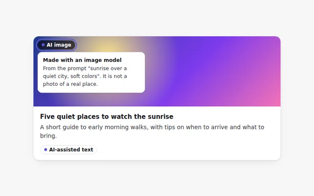
AI-Generated Label
A clear label that marks text or images made by AI. Hover or focus it to see how it was made and what to check.
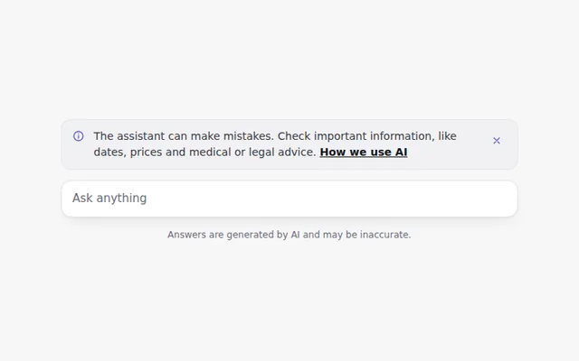
AI Disclaimer Banner
A short, honest notice that the assistant can make mistakes, with a link to learn more. It can be closed and remembers that choice.
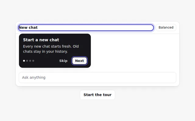
Onboarding Tour
A step by step tour that points at parts of the app with short tips. People can go back, skip, or use the arrow keys.
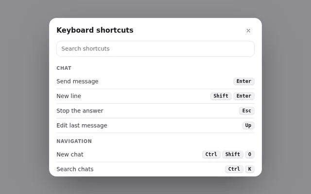
Keyboard Shortcuts Panel
A panel of keyboard shortcuts that opens with the question mark key, with a search box and keys grouped by task.
AI Error States
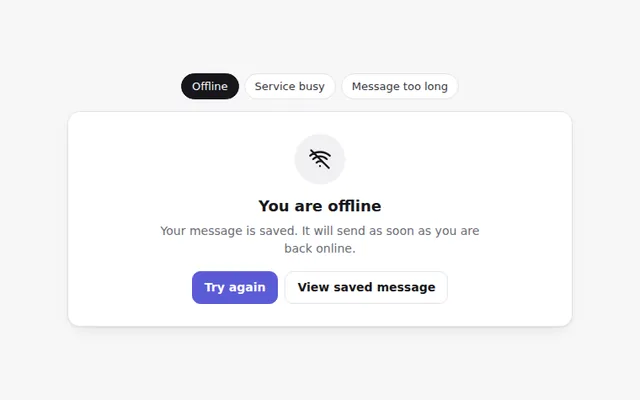
Friendly error screens for common AI problems: no internet, the service is busy, and a message that is too long. Each says what to do next.
Sensitive Content Notice
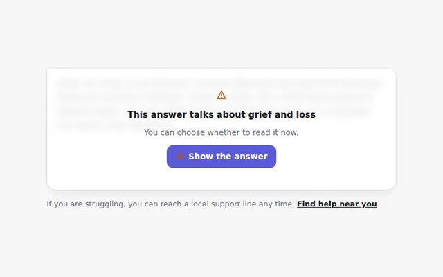
Hides an answer about a sensitive topic behind a calm notice, with a clear choice to show it and a link to real help.