Home / Business Ready Pages / Analytics Dashboard
Analytics Dashboard CSS Template, Free with Live Demo
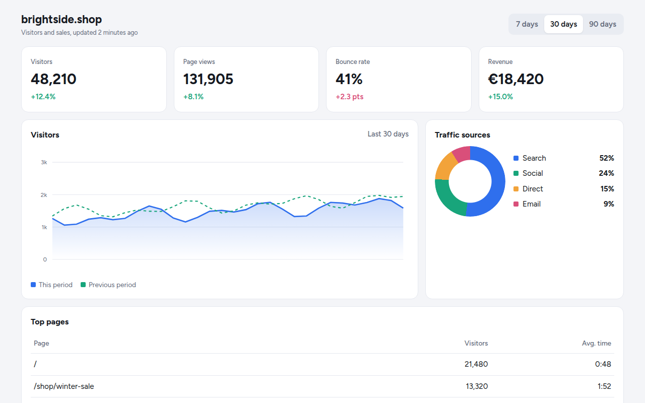
Free analytics dashboard template. KPI cards, an SVG line chart with a date range switch, a donut chart and a top pages table with bars. Live demo. The example is Tally, a web analytics tool.
What is analytics dashboard?
An analytics dashboard turns numbers into a quick picture. Four headline numbers, a chart of the trend compared with last period, where visitors came from and which pages they read.
Charts are made without a library. The line chart is an SVG path built from the data, with a soft gradient under it. The donut is a conic gradient with a hole cut by a mask. Switching the date range redraws everything.
Good for
- Analytics and reporting tools
- Shop and SaaS admin panels
- Client reports
- Internal KPI screens
What you get in this template
- Four KPI cards with change versus last period
- SVG line chart with previous period for comparison
- Date range switch for 7, 30 and 90 days
- Donut chart made with conic-gradient
- Top pages table with inline bars
The key CSS
This is the part that makes the analytics dashboard look work. Copy it into your own project.
.ring {
  width: 140px; height: 140px; border-radius: 50%;
  background: conic-gradient(#2f6fed 0 52%, #18a57b 52% 76%, #f2a33a 76% 91%, #d94f7a 91%);
  mask: radial-gradient(circle, transparent 42px, #000 43px);
}
.lineA { fill: none; stroke: #2f6fed; stroke-width: 2.5; }
.bar::before { width: var(--p); background: #eef3fe; }
How to use it
- Click Download HTML file above.
- Open the file in any code editor, like VS Code.
- Change the text, colors and links to match your project. Colors are at the top of the style tag.
- Upload it to any host, such as GitHub Pages, Netlify or your own server. It is one file with no build step.
Questions people ask
How do you draw a line chart without a library?
Turn each data point into x and y positions and join them into an SVG path with M and L commands. Close the path along the bottom for the filled area.
How do you make a donut chart in CSS?
Use conic-gradient with a slice for each value, then cut out the middle with a radial-gradient mask.
How do I use my own data?
Replace the sample series in the script with your numbers or with data from your API.
More Business Ready Pages designs
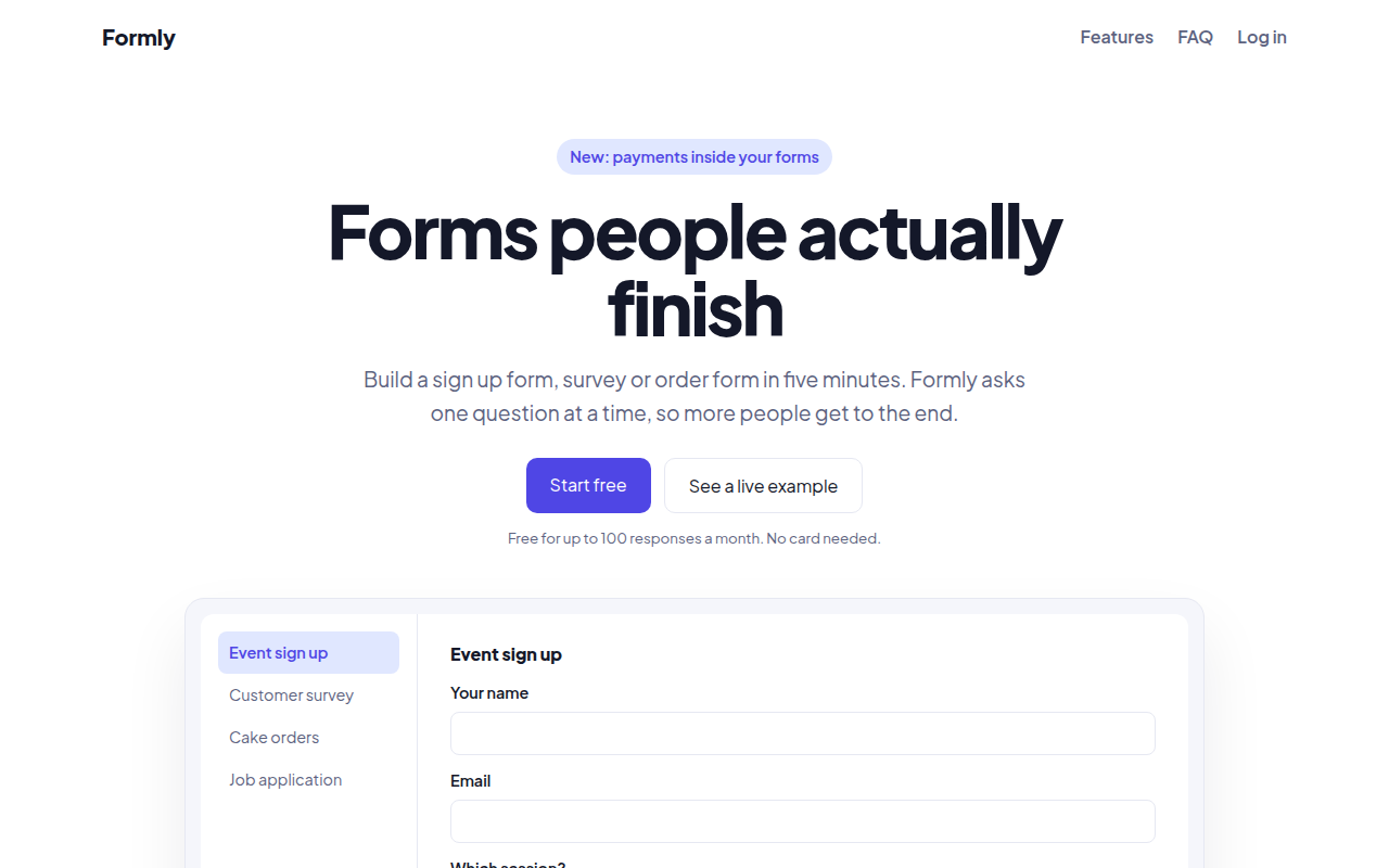
091. SaaS Landing Page
Formly, a form builder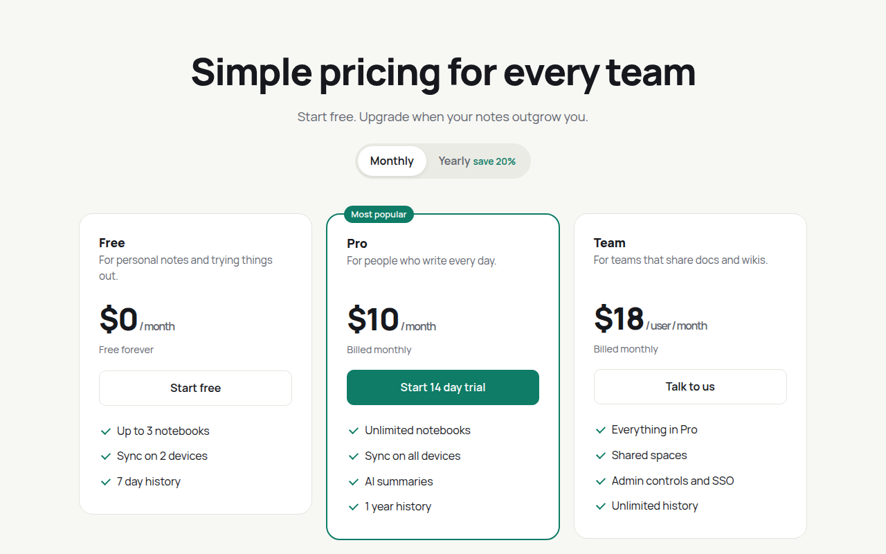
092. Pricing Table
Notecraft, a notes app
093. Minimal Portfolio
Ana Ribeiro, a product designer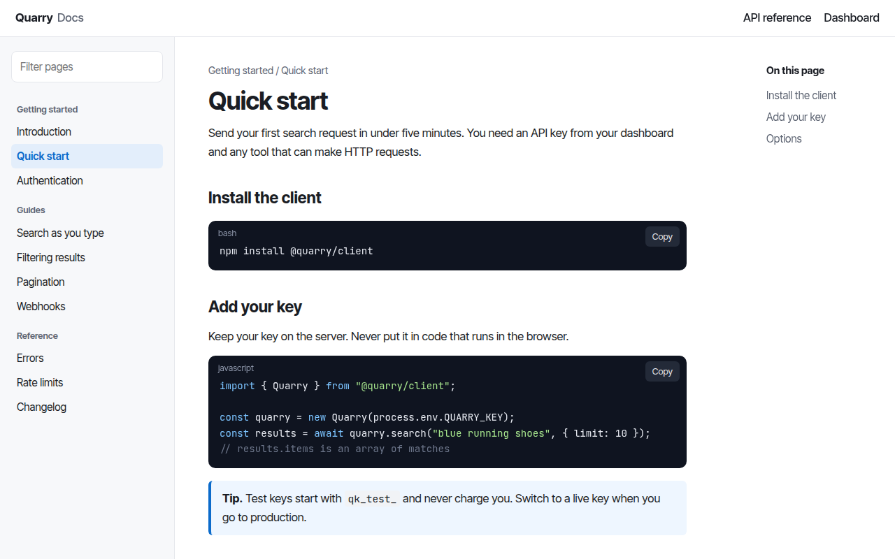
094. Docs Site
Quarry, an API documentation site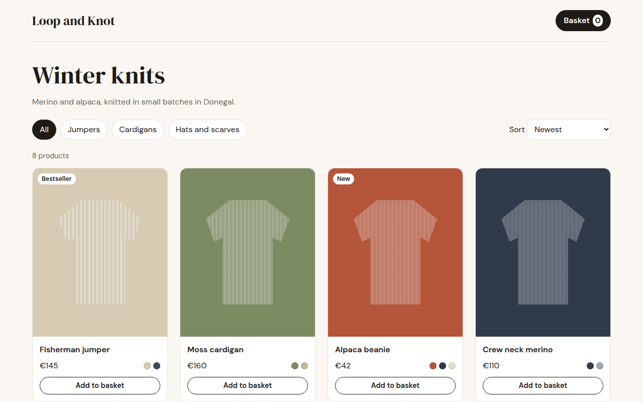
095. Shop Product Grid
Loop and Knot, a knitwear shop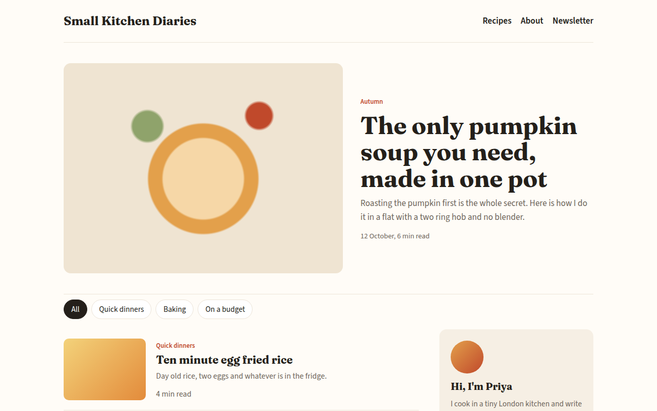
097. Blog
Small Kitchen Diaries, a food blog
098. Link in Bio
Juno Hale, a musician
099. Waitlist Page
Brightwell, a sleep app before launch