What's New Dialog
A short dialog that introduces new features, with a few slides, Beta labels and a way to send feedback. It shows once per version.
One HTML file with the CSS and JavaScript inside. No library needed. MIT license.
How to use it
- Click Copy the code, or download the file.
- Paste the CSS into your stylesheet, the HTML where you want the component, and the script before the closing body tag.
- Change
--accentat the top of the CSS to your brand color, then connect the events to your AI service.
What you get
- Works in light and dark mode automatically
- Keyboard friendly, with labels for screen readers
- Fits phones, tablets and desktops
- Respects the reduced motion setting
- No framework, so it works with any stack
The code
<!DOCTYPE html>
<!--
What's New Dialog: a free AI UI component
From 100 Free AI UI Components by MM Rahman Bappi, MIT license
https://mmrahmanbappi.github.io/100-free-ai-ui-components/
How to use: copy the CSS, HTML and JavaScript below into your page.
Colors are CSS variables at the top. Change --accent to match your brand.
Light and dark themes follow the visitor's system setting, or set
data-theme="dark" or data-theme="light" on the html element.
-->
<html lang="en">
<head>
<meta charset="UTF-8">
<meta name="viewport" content="width=device-width, initial-scale=1">
<title>What's New Dialog | Free AI UI Component</title>
<meta name="description" content="A short dialog that introduces new features, with a few slides, Beta labels and a way to send feedback. It shows once per version.">
<meta name="robots" content="noindex, follow">
<style>
:root{
--accent:#5b5bd6; --accent-ink:#fff; --accent-soft:#ececfc;
--bg:#f7f7f8; --surface:#fff; --surface-2:#f1f1f4; --ink:#17171c; --text:#3a3a44; --muted:#6c6c78;
--line:#e3e3e8; --good:#15803d; --warn:#b45309; --bad:#c62828;
--radius:14px; --shadow:0 1px 2px rgba(20,20,30,.06),0 8px 24px -12px rgba(20,20,30,.18);
--font:system-ui,-apple-system,"Segoe UI",Roboto,Ubuntu,sans-serif; --mono:ui-monospace,"Cascadia Code",Menlo,Consolas,monospace;
}
@media (prefers-color-scheme:dark){:root:not([data-theme=light]){
--accent:#8b8bff; --accent-ink:#0f0f16; --accent-soft:#25254a;
--bg:#0f0f13; --surface:#18181f; --surface-2:#212129; --ink:#f3f3f6; --text:#d4d4dc; --muted:#9a9aa8;
--line:#2c2c36; --good:#4ade80; --warn:#fbbf24; --bad:#f87171; --shadow:0 1px 2px rgba(0,0,0,.4),0 10px 30px -12px rgba(0,0,0,.6);
}}
:root[data-theme=dark]{
--accent:#8b8bff; --accent-ink:#0f0f16; --accent-soft:#25254a;
--bg:#0f0f13; --surface:#18181f; --surface-2:#212129; --ink:#f3f3f6; --text:#d4d4dc; --muted:#9a9aa8;
--line:#2c2c36; --good:#4ade80; --warn:#fbbf24; --bad:#f87171; --shadow:0 1px 2px rgba(0,0,0,.4),0 10px 30px -12px rgba(0,0,0,.6);
}
*{box-sizing:border-box}
html,body{margin:0}
body{min-height:100vh;display:grid;grid-template-columns:minmax(0,1fr);place-items:center;padding:24px;background:var(--bg);color:var(--text);font:15px/1.5 var(--font);-webkit-font-smoothing:antialiased}
button,input,textarea,select{font:inherit;color:inherit}
:focus-visible{outline:2px solid var(--accent);outline-offset:2px}
[hidden]{display:none!important}
.sr{position:absolute;width:1px;height:1px;overflow:hidden;clip:rect(0 0 0 0);white-space:nowrap}
@media (prefers-reduced-motion:reduce){*,*::before,*::after{animation-duration:.01ms!important;animation-iteration-count:1!important;transition:none!important}}
/* ---- component ---- */
a{color:var(--ink);font-weight:600}
.wrap{width:min(100%,600px);display:flex;flex-direction:column;gap:14px}
.card{background:var(--surface);border:1px solid var(--line);border-radius:var(--radius);box-shadow:var(--shadow);padding:18px 20px}
.card h2{font-size:15.5px;margin:0 0 4px;color:var(--ink)}
.muted{color:var(--muted);font-size:13px}
.btn{display:inline-flex;align-items:center;justify-content:center;gap:6px;border:1px solid var(--line);background:var(--surface);color:var(--ink);border-radius:10px;padding:8px 14px;font-size:14px;font-weight:600;cursor:pointer}
.btn:hover{border-color:var(--accent)}.btn.pri{background:var(--accent);border-color:var(--accent);color:var(--accent-ink)}.btn:disabled{opacity:.45;cursor:not-allowed}
.ib{width:30px;height:30px;display:grid;place-items:center;border:0;background:none;color:var(--muted);border-radius:8px;cursor:pointer}.ib:hover{background:var(--surface-2);color:var(--ink)}
kbd{font:600 12px var(--mono);background:var(--surface-2);border:1px solid var(--line);border-bottom-width:2px;border-radius:6px;padding:1px 7px;color:var(--ink)}
dialog{border:0;border-radius:18px;padding:0;background:var(--surface);color:var(--text);box-shadow:0 30px 80px -20px rgba(0,0,0,.5);width:min(92vw,460px)}
dialog::backdrop{background:rgba(10,10,20,.45)}
.slide{padding:22px 22px 8px}
.pic{height:140px;border-radius:14px;margin-bottom:16px;display:grid;place-items:center;color:#fff;font-weight:800;font-size:22px}
.slide h2{margin:0 0 6px;font-size:18px;color:var(--ink);display:flex;align-items:center;gap:8px}
.beta{font-size:11px;font-weight:700;letter-spacing:.05em;text-transform:uppercase;border:1px solid var(--accent);color:var(--accent);border-radius:999px;padding:1px 8px}
.slide p{margin:0;font-size:14px}
.ft{display:flex;align-items:center;gap:8px;padding:14px 22px 18px}
.dots{display:flex;gap:6px;flex:1}.dots i{width:8px;height:8px;border-radius:50%;background:var(--line)}.dots i.on{background:var(--accent)}
.fb{font-size:13px;color:var(--muted);padding:0 22px 16px;margin:0}.fb a{color:var(--ink);font-weight:600}
</style>
</head>
<body>
<button class="btn" id="open" type="button">See what is new</button>
<dialog id="dlg" aria-labelledby="wh"><div id="slide" class="slide" aria-live="polite"></div>
<div class="ft"><span class="dots" id="dots" aria-hidden="true"></span><button class="btn" id="bk" type="button">Back</button><button class="btn pri" id="nx" type="button">Next</button></div>
<p class="fb">Have thoughts on these features? <a href="#">Send feedback</a></p></dialog>
<script>
// Demo helper: add ?theme=dark or ?theme=light to the address to preview a theme.
(function(){var t=new URLSearchParams(location.search).get('theme');if(t)document.documentElement.dataset.theme=t;})();
var V='2.4',S=[['Voice chats','Talk to the assistant hands free, with live captions.',false,'#4f46e5'],['Projects','Keep chats, files and notes for one goal in a single place.',true,'#0f766e'],['Longer files','Upload documents up to 300 pages and ask questions about them.',false,'#b45309']];
var dlg=document.getElementById('dlg'),slide=document.getElementById('slide'),dots=document.getElementById('dots'),bk=document.getElementById('bk'),nx=document.getElementById('nx'),i=0;
function show(k){i=k;var s=S[k];slide.innerHTML='<div class="pic" aria-hidden="true"></div><h2 id="wh"></h2><p class="muted"></p>';slide.querySelector('.pic').style.background=s[3];slide.querySelector('.pic').textContent=s[0];
var h=slide.querySelector('h2');h.textContent=s[0];if(s[2])h.insertAdjacentHTML('beforeend','<span class="beta">Beta</span>');slide.querySelector('p').textContent=s[1];
dots.innerHTML=S.map(function(_,j){return '<i class="'+(j===k?'on':'')+'"></i>';}).join('');bk.disabled=k===0;nx.textContent=k===S.length-1?'Got it':'Next';}
function open(){show(0);dlg.showModal();nx.focus();}
// Show once per version: remember the version you last showed, for example in localStorage.
document.getElementById('open').addEventListener('click',open);
bk.addEventListener('click',function(){if(i>0)show(i-1);});nx.addEventListener('click',function(){if(i<S.length-1)show(i+1);else dlg.close();});
dlg.addEventListener('keydown',function(e){if(e.key==='ArrowRight'&&i<S.length-1)show(i+1);if(e.key==='ArrowLeft'&&i>0)show(i-1);});
dlg.addEventListener('close',function(){document.getElementById('open').focus();});
</script>
</body>
</html>
More trust and onboarding components
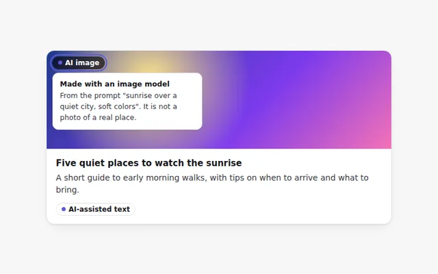
AI-Generated Label
A clear label that marks text or images made by AI. Hover or focus it to see how it was made and what to check.
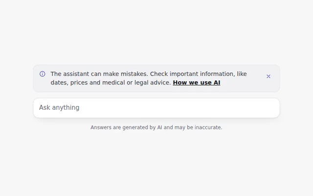
AI Disclaimer Banner
A short, honest notice that the assistant can make mistakes, with a link to learn more. It can be closed and remembers that choice.
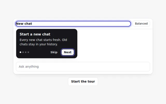
Onboarding Tour
A step by step tour that points at parts of the app with short tips. People can go back, skip, or use the arrow keys.
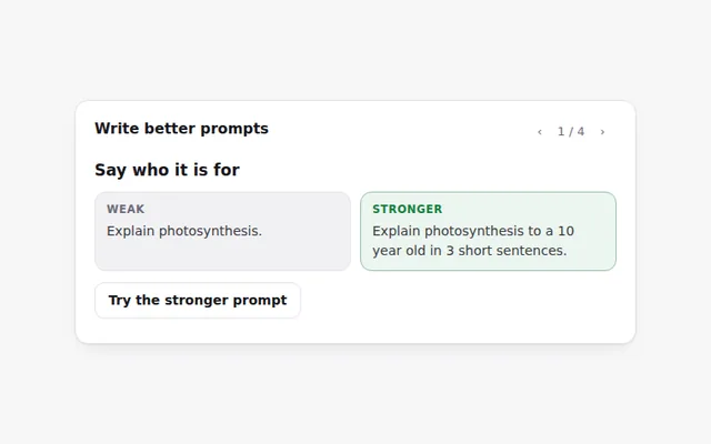
Prompt Tips Card
Tips for writing better prompts, each with a weak and a stronger example side by side. Flip through them with the arrows.
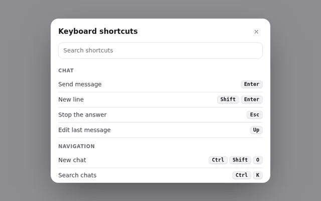
Keyboard Shortcuts Panel
A panel of keyboard shortcuts that opens with the question mark key, with a search box and keys grouped by task.
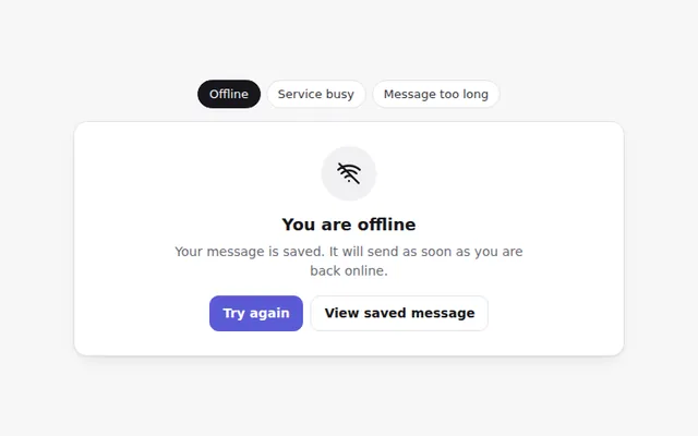
AI Error States
Friendly error screens for common AI problems: no internet, the service is busy, and a message that is too long. Each says what to do next.