Credits Remaining Card
Shows how many credits are left this month, when they reset, and a button to buy more. The bar changes color as credits run low.
One HTML file with the CSS and JavaScript inside. No library needed. MIT license.
How to use it
- Click Copy the code, or download the file.
- Paste the CSS into your stylesheet, the HTML where you want the component, and the script before the closing body tag.
- Change
--accentat the top of the CSS to your brand color, then connect the events to your AI service.
What you get
- Works in light and dark mode automatically
- Keyboard friendly, with labels for screen readers
- Fits phones, tablets and desktops
- Respects the reduced motion setting
- No framework, so it works with any stack
The code
<!DOCTYPE html>
<!--
  Credits Remaining Card: a free AI UI component
  From 100 Free AI UI Components by MM Rahman Bappi, MIT license
  https://mmrahmanbappi.github.io/100-free-ai-ui-components/

  How to use: copy the CSS, HTML and JavaScript below into your page.
  Colors are CSS variables at the top. Change --accent to match your brand.
  Light and dark themes follow the visitor's system setting, or set
  data-theme="dark" or data-theme="light" on the html element.
-->
<html lang="en">
<head>
<meta charset="UTF-8">
<meta name="viewport" content="width=device-width, initial-scale=1">
<title>Credits Remaining Card | Free AI UI Component</title>
<meta name="description" content="Shows how many credits are left this month, when they reset, and a button to buy more. The bar changes color as credits run low.">
<meta name="robots" content="noindex, follow">
<style>
:root{
  --accent:#5b5bd6; --accent-ink:#fff; --accent-soft:#ececfc;
  --bg:#f7f7f8; --surface:#fff; --surface-2:#f1f1f4; --ink:#17171c; --text:#3a3a44; --muted:#6c6c78;
  --line:#e3e3e8; --good:#15803d; --warn:#b45309; --bad:#c62828;
  --radius:14px; --shadow:0 1px 2px rgba(20,20,30,.06),0 8px 24px -12px rgba(20,20,30,.18);
  --font:system-ui,-apple-system,"Segoe UI",Roboto,Ubuntu,sans-serif; --mono:ui-monospace,"Cascadia Code",Menlo,Consolas,monospace;
}
@media (prefers-color-scheme:dark){:root:not([data-theme=light]){
  --accent:#8b8bff; --accent-ink:#0f0f16; --accent-soft:#25254a;
  --bg:#0f0f13; --surface:#18181f; --surface-2:#212129; --ink:#f3f3f6; --text:#d4d4dc; --muted:#9a9aa8;
  --line:#2c2c36; --good:#4ade80; --warn:#fbbf24; --bad:#f87171; --shadow:0 1px 2px rgba(0,0,0,.4),0 10px 30px -12px rgba(0,0,0,.6);
}}
:root[data-theme=dark]{
  --accent:#8b8bff; --accent-ink:#0f0f16; --accent-soft:#25254a;
  --bg:#0f0f13; --surface:#18181f; --surface-2:#212129; --ink:#f3f3f6; --text:#d4d4dc; --muted:#9a9aa8;
  --line:#2c2c36; --good:#4ade80; --warn:#fbbf24; --bad:#f87171; --shadow:0 1px 2px rgba(0,0,0,.4),0 10px 30px -12px rgba(0,0,0,.6);
}
*{box-sizing:border-box}
html,body{margin:0}
body{min-height:100vh;display:grid;grid-template-columns:minmax(0,1fr);place-items:center;padding:24px;background:var(--bg);color:var(--text);font:15px/1.5 var(--font);-webkit-font-smoothing:antialiased}
button,input,textarea,select{font:inherit;color:inherit}
:focus-visible{outline:2px solid var(--accent);outline-offset:2px}
[hidden]{display:none!important}
.sr{position:absolute;width:1px;height:1px;overflow:hidden;clip:rect(0 0 0 0);white-space:nowrap}
@media (prefers-reduced-motion:reduce){*,*::before,*::after{animation-duration:.01ms!important;animation-iteration-count:1!important;transition:none!important}}
/* ---- component ---- */
.wrap{width:min(100%,560px);display:flex;flex-direction:column;gap:14px}
.card{background:var(--surface);border:1px solid var(--line);border-radius:var(--radius);box-shadow:var(--shadow);padding:18px 20px}
.card h2{font-size:15px;margin:0 0 4px;color:var(--ink)}
.muted{color:var(--muted);font-size:13px}
.num{font-variant-numeric:tabular-nums}
.btn{display:inline-flex;align-items:center;justify-content:center;gap:6px;border:1px solid var(--line);background:var(--surface);color:var(--ink);border-radius:10px;padding:8px 14px;font-size:14px;font-weight:600;cursor:pointer;text-decoration:none}
.btn:hover{border-color:var(--accent)}.btn.pri{background:var(--accent);border-color:var(--accent);color:var(--accent-ink)}
.bar{height:8px;border-radius:99px;background:var(--surface-2);overflow:hidden}
.bar i{display:block;height:100%;border-radius:99px;background:var(--accent);transition:width .3s,background .3s}
.ok{--lvl:var(--accent)}.warn{--lvl:var(--warn)}.full{--lvl:var(--bad)}
.tg{width:38px;height:22px;border-radius:99px;background:var(--line);position:relative;flex:none;border:0;cursor:pointer;padding:0}
.tg::after{content:"";position:absolute;top:3px;left:3px;width:16px;height:16px;border-radius:50%;background:#fff;transition:left .15s}
.tg[aria-checked=true]{background:var(--accent)}.tg[aria-checked=true]::after{left:19px}
.big{font-size:34px;font-weight:800;color:var(--ink);letter-spacing:-.02em;line-height:1.1;margin:8px 0 2px}
.big span{font-size:15px;font-weight:600;color:var(--muted);letter-spacing:0}
.card .bar{margin:14px 0 8px}.card .bar i{background:var(--lvl)}
.row{display:flex;justify-content:space-between;align-items:center;gap:10px;flex-wrap:wrap;margin-top:14px}
</style>
</head>
<body>
<div class="wrap"><div class="card ok" id="c">
  <h2>Credits</h2>
  <p class="big num" id="left">0 <span>left</span></p>
  <p class="muted num" id="of"></p>
  <div class="bar" role="progressbar" aria-label="Credits used" aria-valuemin="0" aria-valuemax="100" id="pb"><i id="bi"></i></div>
  <div class="row"><span class="muted">Resets on October 1</span><div style="display:flex;gap:8px"><button class="btn" type="button" id="use">Use 150</button><button class="btn pri" type="button" id="buy">Buy more</button></div></div>
</div></div>
<script>
// Demo helper: add ?theme=dark or ?theme=light to the address to preview a theme.
(function(){var t=new URLSearchParams(location.search).get('theme');if(t)document.documentElement.dataset.theme=t;})();
function fmt(n){return n>=1e6?(n/1e6).toFixed(n>=1e7?0:1)+'M':n>=1e3?(n/1e3).toFixed(n>=1e4?0:1)+'k':String(n)}
function level(p){return p>=1?'full':p>=.8?'warn':'ok'}
var TOTAL=2000,left=640,c=document.getElementById('c'),lf=document.getElementById('left'),of=document.getElementById('of'),bi=document.getElementById('bi'),pb=document.getElementById('pb');
function render(){var used=TOTAL-left,p=used/TOTAL;lf.innerHTML=left.toLocaleString()+' <span>left</span>';of.textContent=used.toLocaleString()+' of '+TOTAL.toLocaleString()+' credits used this month';
  bi.style.width=(p*100)+'%';pb.setAttribute('aria-valuenow',Math.round(p*100));c.className='card '+level(p);}
document.getElementById('use').addEventListener('click',function(){left=Math.max(0,left-150);render();});
document.getElementById('buy').addEventListener('click',function(){TOTAL+=1000;left+=1000;render();});
render();
</script>
</body>
</html>
More tokens and usage components
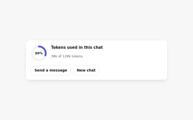
Token Ring Meter
A small ring that fills as a chat uses up its token budget. It turns orange near the limit and red when full, with an exact count on hover.
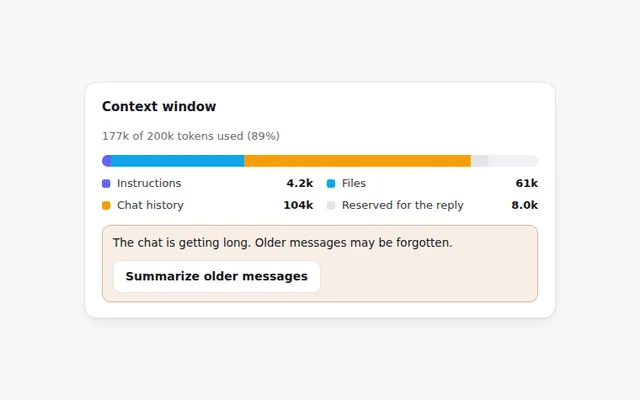
Context Window Bar
A bar that shows what fills the AI's memory for this chat: instructions, files, chat history and room left for the reply.
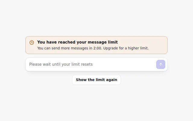
Rate Limit Banner
A clear banner when someone hits their message limit, with a live countdown to when they can send again and the prompt box turned off.
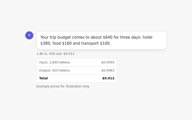
Cost per Message
A small line under each answer showing tokens in and out and what the message cost. Click it to see the full breakdown.
Daily Usage Chart
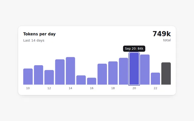
A small bar chart of tokens used each day for two weeks. Hover or use the Tab key to read each day's exact number.
Upgrade Plan Banner
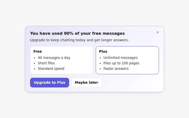
A friendly banner that appears when someone is close to their free limit, comparing free and paid limits. It can be closed.