Upgrade Plan Banner
A friendly banner that appears when someone is close to their free limit, comparing free and paid limits. It can be closed.
One HTML file with the CSS and JavaScript inside. No library needed. MIT license.
How to use it
- Click Copy the code, or download the file.
- Paste the CSS into your stylesheet, the HTML where you want the component, and the script before the closing body tag.
- Change
--accentat the top of the CSS to your brand color, then connect the events to your AI service.
What you get
- Works in light and dark mode automatically
- Keyboard friendly, with labels for screen readers
- Fits phones, tablets and desktops
- Respects the reduced motion setting
- No framework, so it works with any stack
The code
<!DOCTYPE html>
<!--
  Upgrade Plan Banner: a free AI UI component
  From 100 Free AI UI Components by MM Rahman Bappi, MIT license
  https://mmrahmanbappi.github.io/100-free-ai-ui-components/

  How to use: copy the CSS, HTML and JavaScript below into your page.
  Colors are CSS variables at the top. Change --accent to match your brand.
  Light and dark themes follow the visitor's system setting, or set
  data-theme="dark" or data-theme="light" on the html element.
-->
<html lang="en">
<head>
<meta charset="UTF-8">
<meta name="viewport" content="width=device-width, initial-scale=1">
<title>Upgrade Plan Banner | Free AI UI Component</title>
<meta name="description" content="A friendly banner that appears when someone is close to their free limit, comparing free and paid limits. It can be closed.">
<meta name="robots" content="noindex, follow">
<style>
:root{
  --accent:#5b5bd6; --accent-ink:#fff; --accent-soft:#ececfc;
  --bg:#f7f7f8; --surface:#fff; --surface-2:#f1f1f4; --ink:#17171c; --text:#3a3a44; --muted:#6c6c78;
  --line:#e3e3e8; --good:#15803d; --warn:#b45309; --bad:#c62828;
  --radius:14px; --shadow:0 1px 2px rgba(20,20,30,.06),0 8px 24px -12px rgba(20,20,30,.18);
  --font:system-ui,-apple-system,"Segoe UI",Roboto,Ubuntu,sans-serif; --mono:ui-monospace,"Cascadia Code",Menlo,Consolas,monospace;
}
@media (prefers-color-scheme:dark){:root:not([data-theme=light]){
  --accent:#8b8bff; --accent-ink:#0f0f16; --accent-soft:#25254a;
  --bg:#0f0f13; --surface:#18181f; --surface-2:#212129; --ink:#f3f3f6; --text:#d4d4dc; --muted:#9a9aa8;
  --line:#2c2c36; --good:#4ade80; --warn:#fbbf24; --bad:#f87171; --shadow:0 1px 2px rgba(0,0,0,.4),0 10px 30px -12px rgba(0,0,0,.6);
}}
:root[data-theme=dark]{
  --accent:#8b8bff; --accent-ink:#0f0f16; --accent-soft:#25254a;
  --bg:#0f0f13; --surface:#18181f; --surface-2:#212129; --ink:#f3f3f6; --text:#d4d4dc; --muted:#9a9aa8;
  --line:#2c2c36; --good:#4ade80; --warn:#fbbf24; --bad:#f87171; --shadow:0 1px 2px rgba(0,0,0,.4),0 10px 30px -12px rgba(0,0,0,.6);
}
*{box-sizing:border-box}
html,body{margin:0}
body{min-height:100vh;display:grid;grid-template-columns:minmax(0,1fr);place-items:center;padding:24px;background:var(--bg);color:var(--text);font:15px/1.5 var(--font);-webkit-font-smoothing:antialiased}
button,input,textarea,select{font:inherit;color:inherit}
:focus-visible{outline:2px solid var(--accent);outline-offset:2px}
[hidden]{display:none!important}
.sr{position:absolute;width:1px;height:1px;overflow:hidden;clip:rect(0 0 0 0);white-space:nowrap}
@media (prefers-reduced-motion:reduce){*,*::before,*::after{animation-duration:.01ms!important;animation-iteration-count:1!important;transition:none!important}}
/* ---- component ---- */
.wrap{width:min(100%,560px);display:flex;flex-direction:column;gap:14px}
.card{background:var(--surface);border:1px solid var(--line);border-radius:var(--radius);box-shadow:var(--shadow);padding:18px 20px}
.card h2{font-size:15px;margin:0 0 4px;color:var(--ink)}
.muted{color:var(--muted);font-size:13px}
.num{font-variant-numeric:tabular-nums}
.btn{display:inline-flex;align-items:center;justify-content:center;gap:6px;border:1px solid var(--line);background:var(--surface);color:var(--ink);border-radius:10px;padding:8px 14px;font-size:14px;font-weight:600;cursor:pointer;text-decoration:none}
.btn:hover{border-color:var(--accent)}.btn.pri{background:var(--accent);border-color:var(--accent);color:var(--accent-ink)}
.bar{height:8px;border-radius:99px;background:var(--surface-2);overflow:hidden}
.bar i{display:block;height:100%;border-radius:99px;background:var(--accent);transition:width .3s,background .3s}
.ok{--lvl:var(--accent)}.warn{--lvl:var(--warn)}.full{--lvl:var(--bad)}
.tg{width:38px;height:22px;border-radius:99px;background:var(--line);position:relative;flex:none;border:0;cursor:pointer;padding:0}
.tg::after{content:"";position:absolute;top:3px;left:3px;width:16px;height:16px;border-radius:50%;background:#fff;transition:left .15s}
.tg[aria-checked=true]{background:var(--accent)}.tg[aria-checked=true]::after{left:19px}
.up{position:relative;border-radius:var(--radius);padding:18px 20px;background:linear-gradient(135deg,color-mix(in srgb,var(--accent) 16%,var(--surface)),var(--surface));border:1px solid color-mix(in srgb,var(--accent) 35%,var(--line));box-shadow:var(--shadow)}
.up h2{font-size:16px;margin:0 0 4px;color:var(--ink);padding-right:30px}
.up p{margin:0 0 14px;font-size:14px}
.cmp{display:grid;grid-template-columns:1fr 1fr;gap:10px;margin-bottom:14px}
.pl{background:var(--surface);border:1px solid var(--line);border-radius:12px;padding:10px 12px;font-size:13.5px}
.pl b{display:block;color:var(--ink);font-size:14px;margin-bottom:4px}.pl.pro{border-color:var(--accent)}
.pl ul{margin:0;padding-left:18px}.pl li{margin:2px 0}
.x{position:absolute;top:10px;right:10px;width:30px;height:30px;border:0;background:none;color:var(--muted);border-radius:8px;cursor:pointer;display:grid;place-items:center}
.x:hover{background:var(--surface-2);color:var(--ink)}
.acts{display:flex;gap:8px;flex-wrap:wrap}
@media(max-width:460px){.cmp{grid-template-columns:1fr}}
</style>
</head>
<body>
<div class="wrap">
  <section class="up" id="up" aria-labelledby="uh">
    <button class="x" id="x" type="button" aria-label="Close"><svg viewBox="0 0 24 24" width="14" height="14" fill="none" stroke="currentColor" stroke-width="2.2" stroke-linecap="round" aria-hidden="true"><path d="M6 6l12 12M18 6L6 18"/></svg></button>
    <h2 id="uh">You have used 90% of your free messages</h2>
    <p>Upgrade to keep chatting today and get longer answers.</p>
    <div class="cmp"><div class="pl"><b>Free</b><ul><li>40 messages a day</li><li>Short files</li><li>Standard speed</li></ul></div>
      <div class="pl pro"><b>Plus</b><ul><li>Unlimited messages</li><li>Files up to 100 pages</li><li>Faster answers</li></ul></div></div>
    <div class="acts"><a class="btn pri" href="#">Upgrade to Plus</a><button class="btn" type="button" id="later">Maybe later</button></div>
  </section>
  <button class="btn" type="button" id="show" style="align-self:center" hidden>Show the banner again</button>
</div>
<script>
// Demo helper: add ?theme=dark or ?theme=light to the address to preview a theme.
(function(){var t=new URLSearchParams(location.search).get('theme');if(t)document.documentElement.dataset.theme=t;})();
var up=document.getElementById('up'),show=document.getElementById('show');
function hideBanner(){up.hidden=true;show.hidden=false;show.focus();}
document.getElementById('x').addEventListener('click',hideBanner);document.getElementById('later').addEventListener('click',hideBanner);
show.addEventListener('click',function(){up.hidden=false;show.hidden=true;document.getElementById('x').focus();});
</script>
</body>
</html>
More tokens and usage components
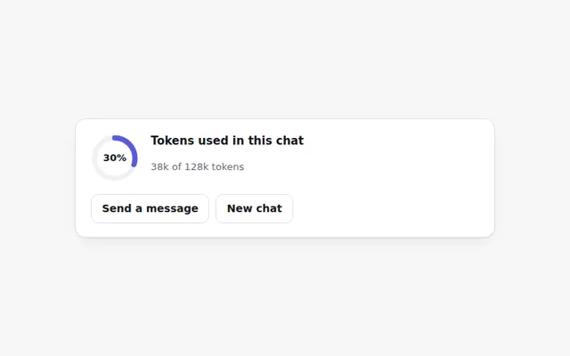
Token Ring Meter
A small ring that fills as a chat uses up its token budget. It turns orange near the limit and red when full, with an exact count on hover.
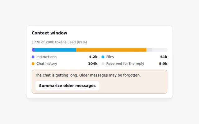
Context Window Bar
A bar that shows what fills the AI's memory for this chat: instructions, files, chat history and room left for the reply.
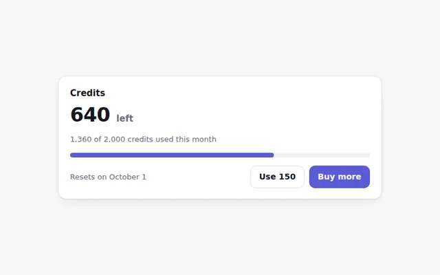
Credits Remaining Card
Shows how many credits are left this month, when they reset, and a button to buy more. The bar changes color as credits run low.
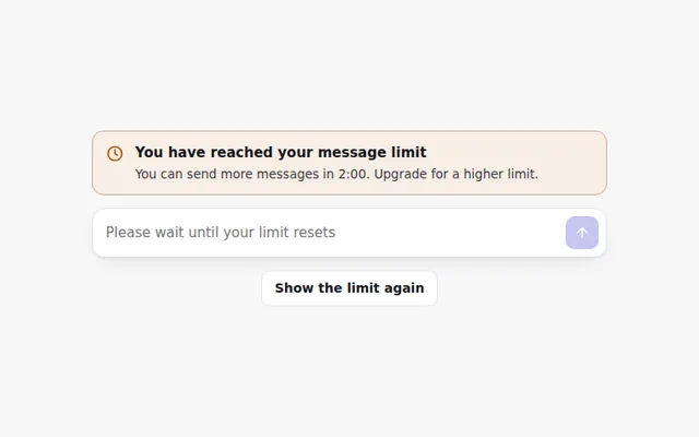
Rate Limit Banner
A clear banner when someone hits their message limit, with a live countdown to when they can send again and the prompt box turned off.
Cost per Message
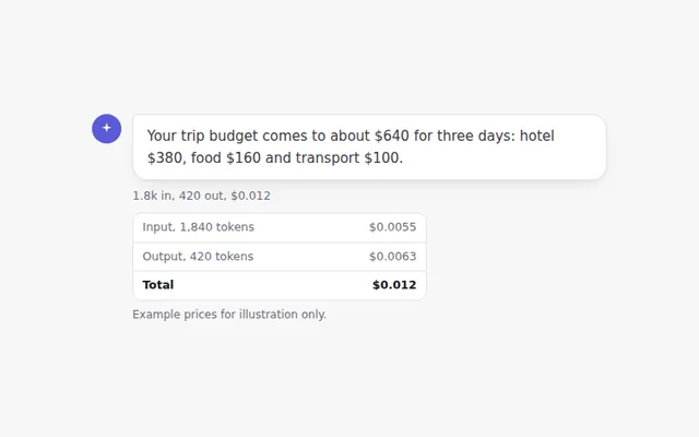
A small line under each answer showing tokens in and out and what the message cost. Click it to see the full breakdown.
Daily Usage Chart
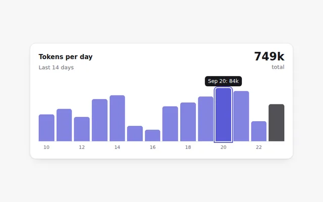
A small bar chart of tokens used each day for two weeks. Hover or use the Tab key to read each day's exact number.