Home / Part to Whole / Waffle Chart
Waffle Chart in HTML, CSS and JavaScript
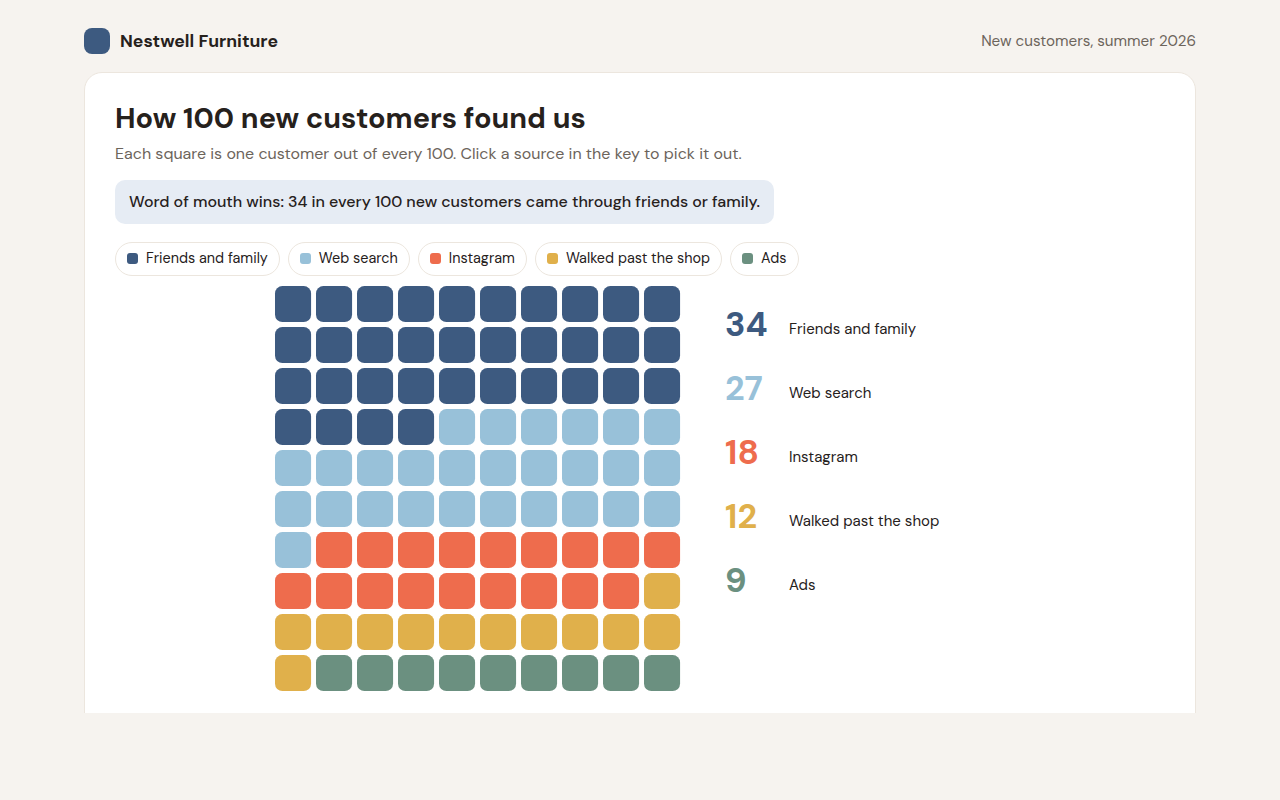
A waffle chart is a grid of 100 squares where each square stands for 1%. This free template draws one with plain SVG and vanilla JavaScript, no chart library. The example shows how 100 new customers found a furniture shop.
What is a waffle chart?
A waffle chart is a grid of 100 squares where each square stands for 1%. The squares are colored by group, so 34 blue squares means 34 out of every 100.
People find it easier to picture 34 out of 100 people than a 34% slice of a pie. That makes waffle charts a friendly choice for reports and websites aimed at a general audience.
At a glance
- Best for
- Percentages that people should be able to picture
- Data you need
- Whole number shares that add up to 100
- Skip it when
- Many small groups or decimals.
- Made with
- HTML, CSS and vanilla JavaScript. No library.
When to use a waffle chart
- How customers found you
- Survey results for a general audience
- Share of people in each group
- Charity and public health reports
When to pick another chart
- Pie Chart: you want the quickest chart for two or three shares
- 100% Stacked Bar Chart: you want to compare shares across several groups
What you get in this template
- 100 squares in a 10 by 10 grid, filled in reading order
- A list with the big numbers next to the grid
- Click a source in the key to pick it out and fade the rest
- The squares fill in one by one on load
- Hover any square to see its group
- Stacks on phones with the list under the grid
How the code works
Here is a short version of the idea behind this waffle chart. The full file adds the axis, labels, tooltips, sorting and resizing on top of it.
const groups = [['Friends and family', 34, '#3d5a80'], ['Web search', 27, '#98c1d9'], ['Instagram', 18, '#ee6c4d'], ['Walked past', 12, '#e0b04b'], ['Ads', 9, '#6b9080']];
const size = 28, gap = 4;
let i = 0;

groups.forEach(([name, count, color]) => {
  for (let n = 0; n < count; n++, i++) {
    const col = i % 10, row = Math.floor(i / 10);
    drawRect(col * size, row * size, size - gap, size - gap, color);
  }
});
The example uses four tiny helpers that create SVG shapes. Put them above the code and it runs as is.
const svg = document.querySelector('svg');
function make(tag, attrs) {
  const n = document.createElementNS('http://www.w3.org/2000/svg', tag);
  for (const k in attrs) n.setAttribute(k, attrs[k]);
  svg.appendChild(n);
  return n;
}
function drawRect(x, y, width, height, fill) { return make('rect', { x, y, width, height, fill }); }
function drawCircle(cx, cy, r, fill) { return make('circle', { cx, cy, r, fill }); }
function drawLine(x1, y1, x2, y2, stroke, width, dash) {
  return make('line', { x1, y1, x2, y2, stroke, 'stroke-width': width || 1, 'stroke-dasharray': dash || 'none' });
}
function drawText(x, y, str, anchor) {
  const t = make('text', { x, y, 'text-anchor': anchor || 'start' });
  t.textContent = str;
  return t;
}
How to add it to your website
- Download the file. Click Download HTML file above. You get one file called waffle-chart.html with everything inside.
- Change the data. Open the file in any code editor and find the DATA list near the bottom. Replace the names and numbers with your own.
- Change the colors and text. Colors are at the top of the style tag. The title, subtitle and main point are plain HTML near the top of the body.
- Put it online. Upload the file to any host, such as GitHub Pages, Netlify or your own server, or paste it into your site. There is no build step.
Questions people ask
What is a waffle chart?
A waffle chart is a 10 by 10 grid of squares where each square is 1%. Colored squares show how many out of every 100 belong to each group.
Why use a waffle chart instead of a pie chart?
Counting squares is easier than judging angles. Saying 34 out of 100 also feels more real to most readers than a 34% slice.
What if my percentages have decimals?
Round them to whole numbers and make sure they still add up to 100. If the decimals matter, use a bar chart instead.
Is a waffle chart the same as a square pie chart?
Yes. Square pie chart and waffle chart are two names for the same idea.
More part to whole
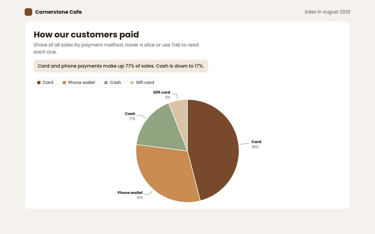
021. Pie Chart
Example: how customers paid at a cafe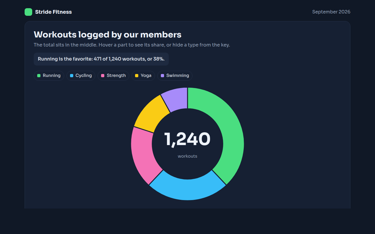
022. Donut Chart
Example: workouts logged by members of a fitness app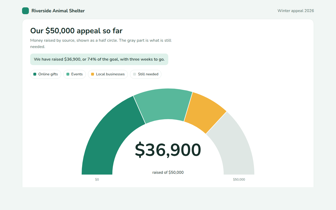
023. Semi Donut Chart
Example: a fundraising appeal and the money still needed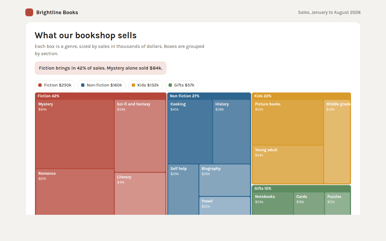
024. Treemap
Example: bookshop sales by section and genre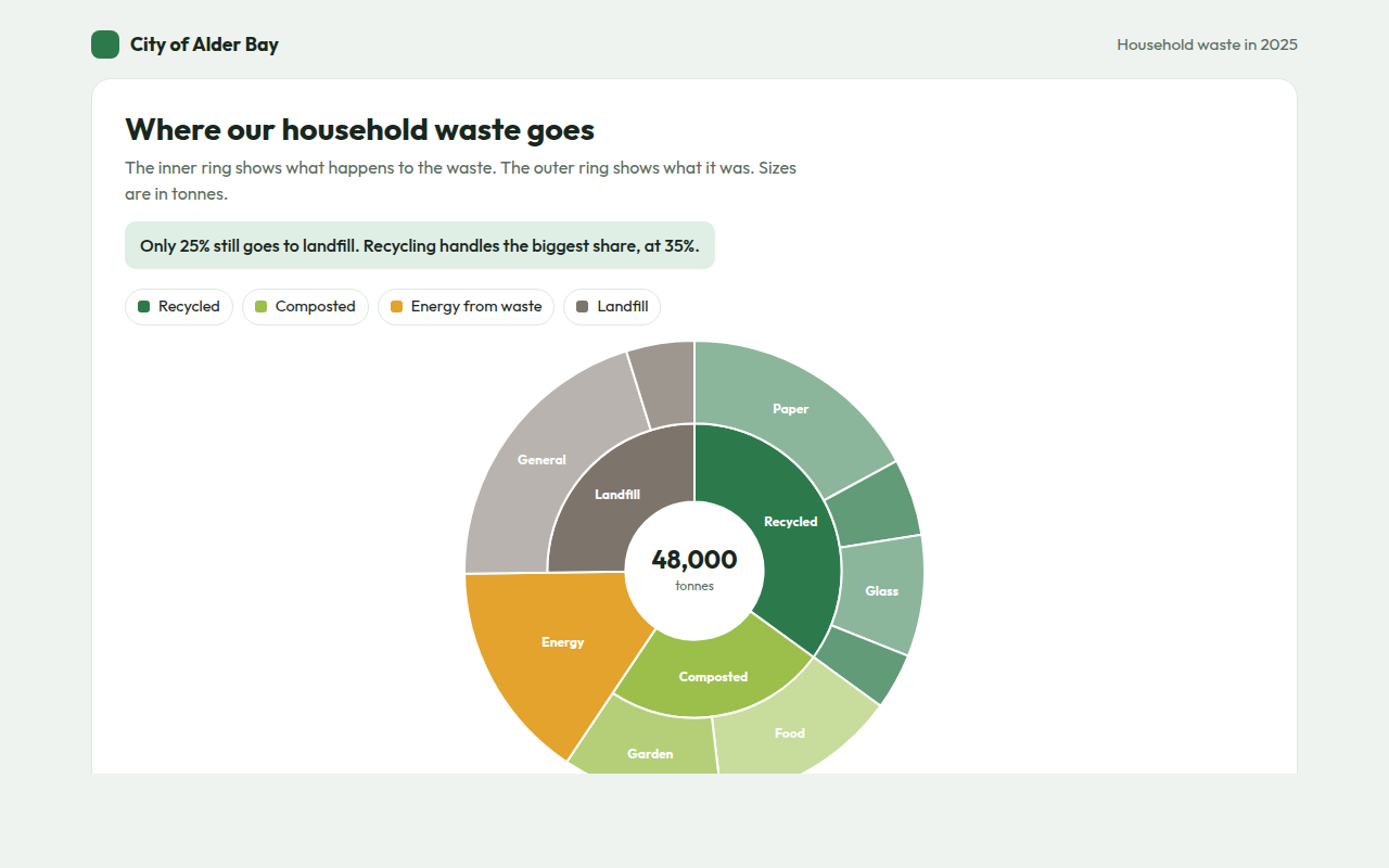
025. Sunburst Chart
Example: where a city sends its household waste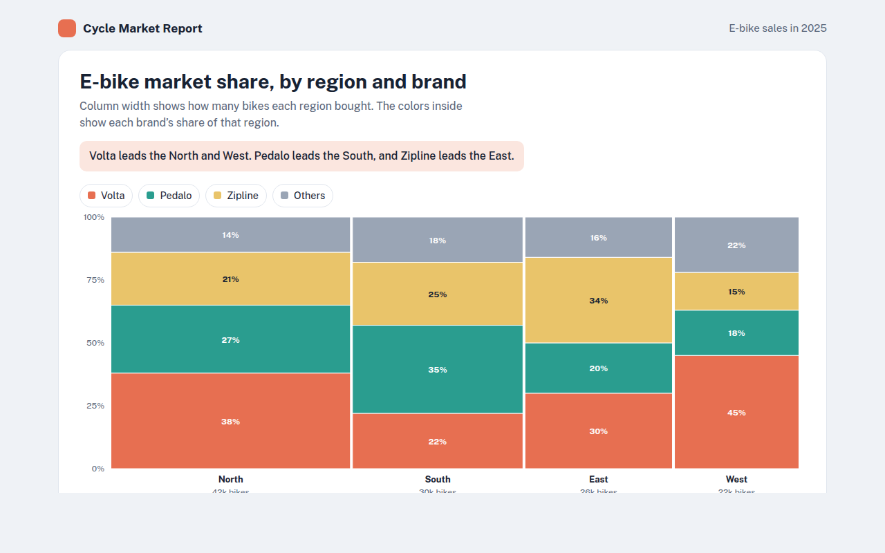
027. Marimekko Chart
Example: e-bike market share by region and brand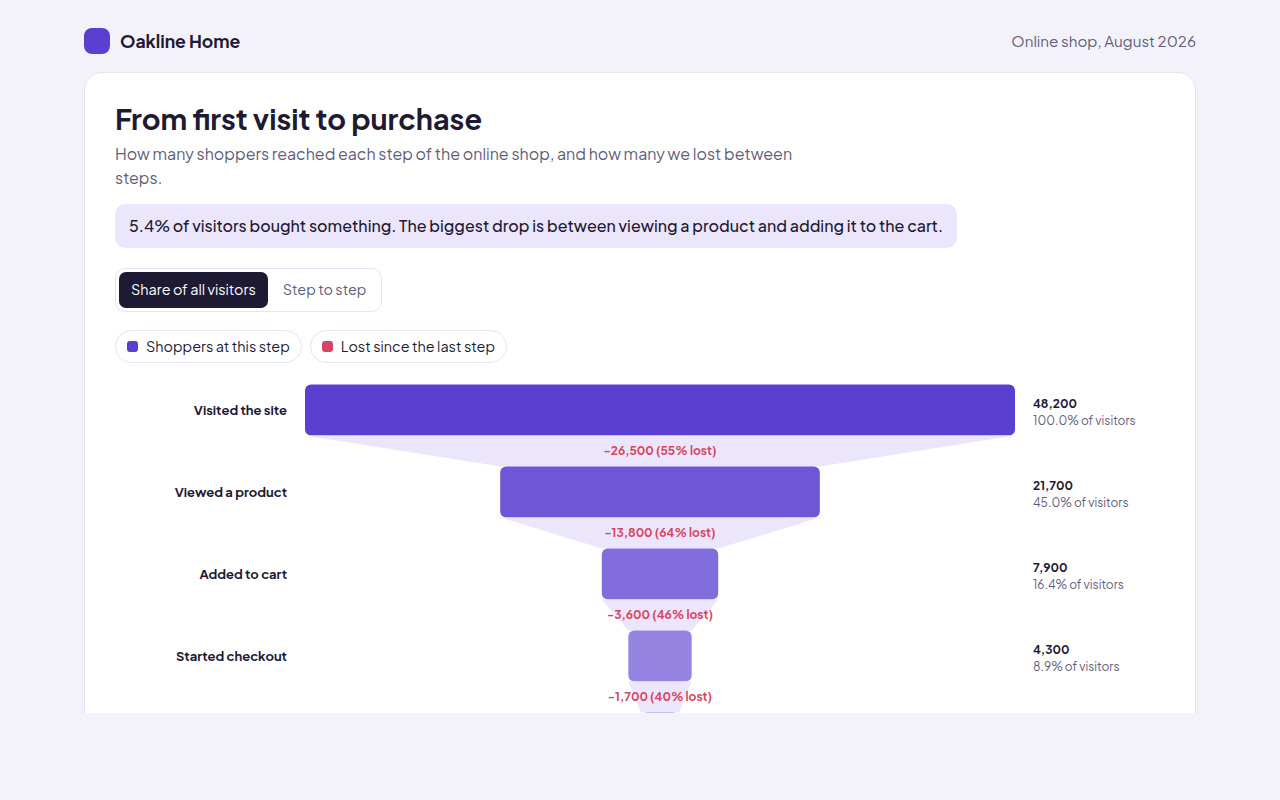
028. Funnel Chart
Example: shoppers moving from first visit to purchase in an online shop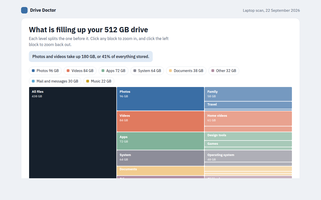
029. Icicle Chart
Example: what is filling up a laptop drive