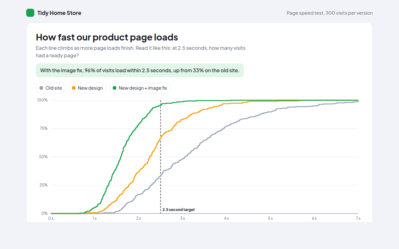
Home / Distribution
Distribution in HTML and JavaScript
An average only tells part of the story. These charts show how numbers are spread out: where most values sit, how wide the range is, and which ones are unusual. Use a histogram for one set of numbers, a box or violin plot to compare groups, and a beeswarm or strip plot when you want every single value on show. All ten are single HTML files with no library.
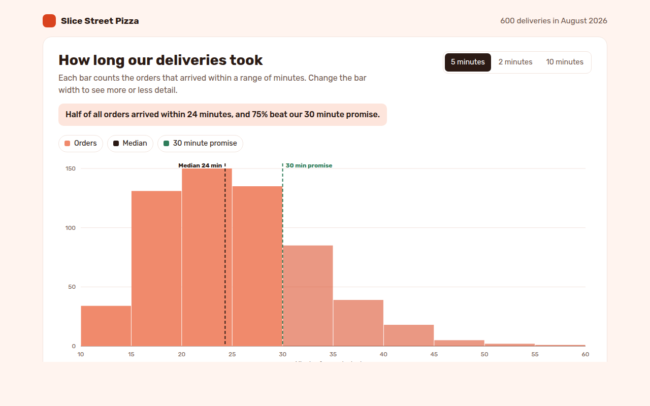
031. Histogram
Example: delivery times for 600 pizza orders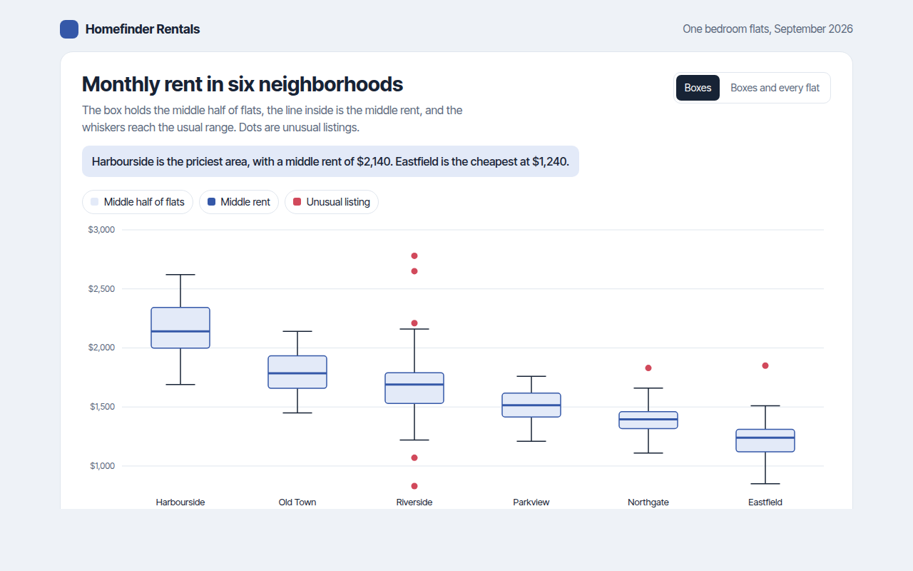
032. Box Plot
Example: monthly rent for flats in six neighborhoods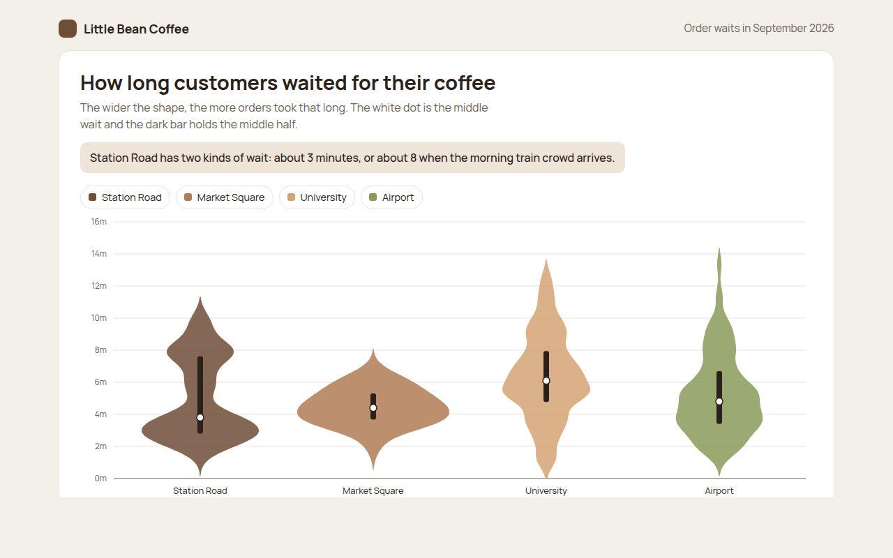
033. Violin Plot
Example: coffee order waits at four cafes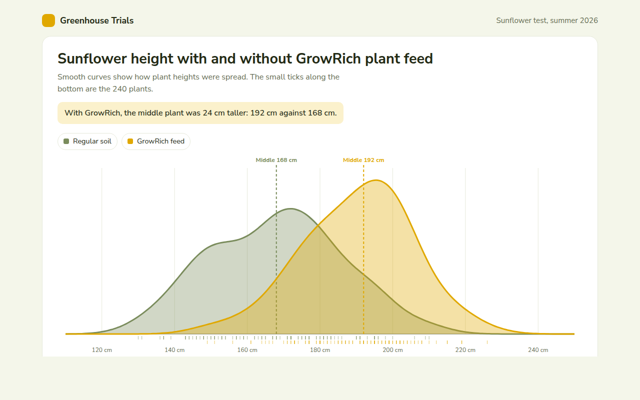
034. Density Plot
Example: sunflower heights with and without plant feed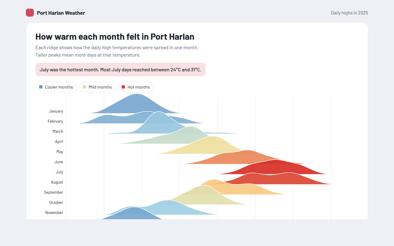
035. Ridgeline Plot
Example: daily high temperatures for each month of the year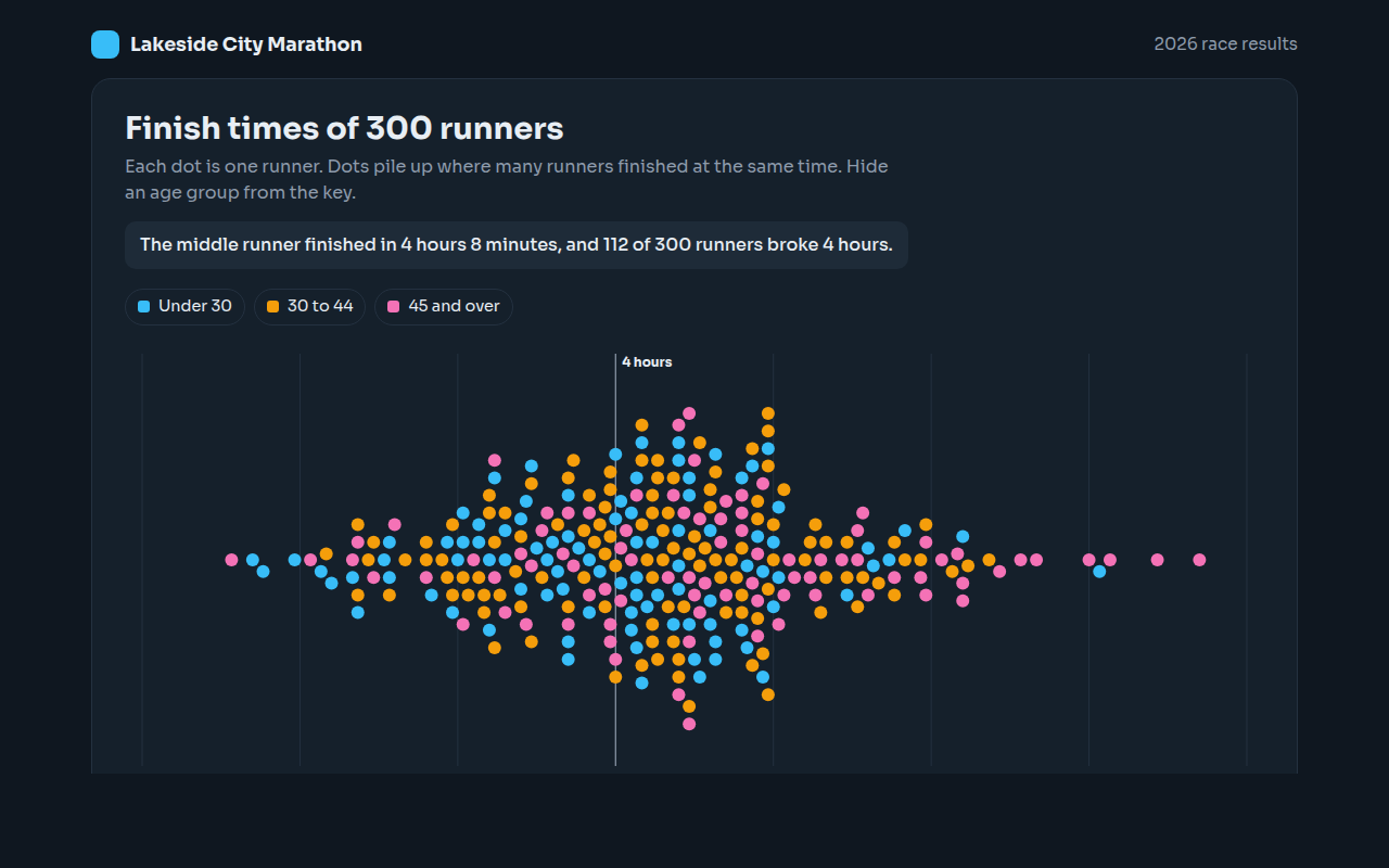
036. Beeswarm Plot
Example: finish times for 300 marathon runners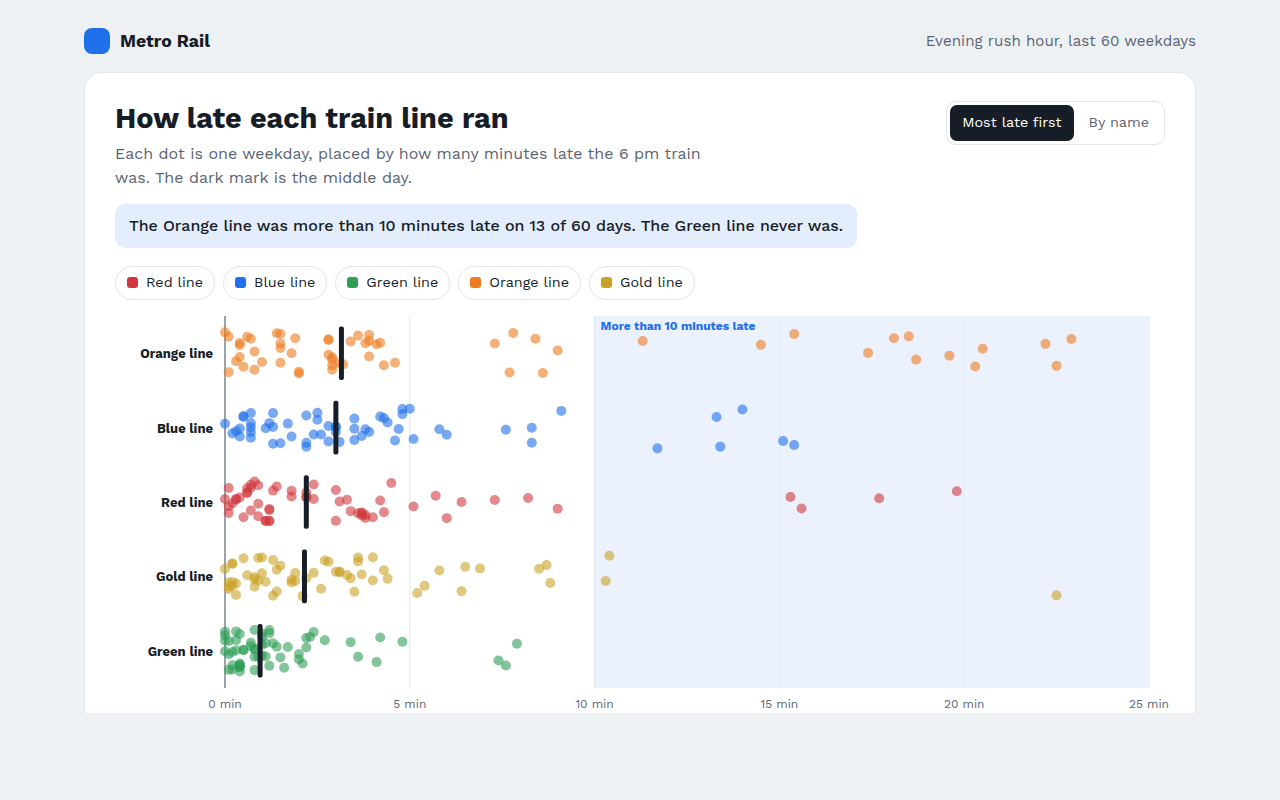
037. Strip Plot
Example: train delays on five lines over 60 weekdays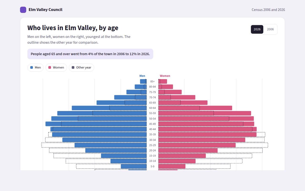
038. Population Pyramid
Example: the age of a town in 2006 and 2026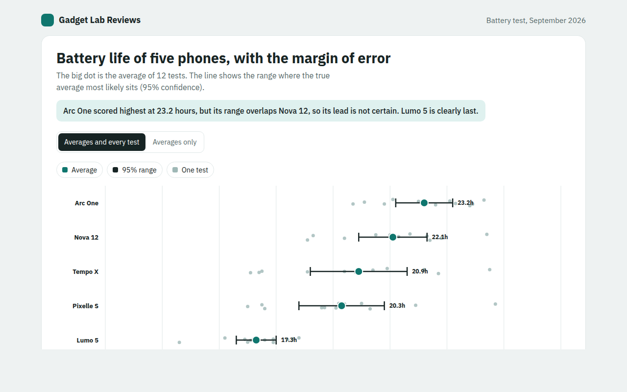
039. Error Bar Chart
Example: battery life test results for five phones