Home / Distribution / Population Pyramid
Population Pyramid in HTML, CSS and JavaScript
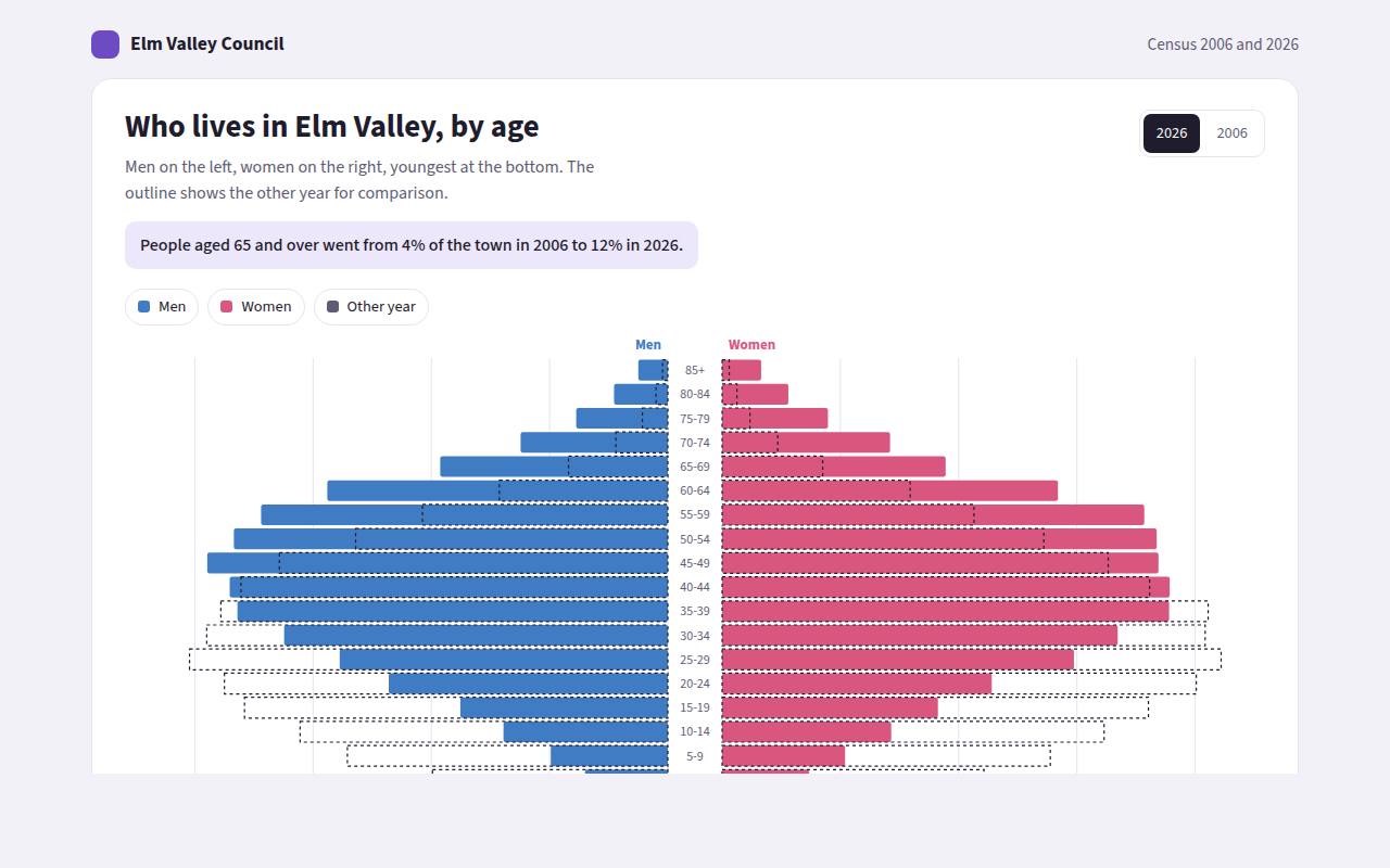
A population pyramid shows how many people there are in each age group, with men on one side and women on the other. This free template draws one with plain SVG and vanilla JavaScript, no chart library. The example shows the age of a town in 2006 and 2026.
What is a population pyramid?
A population pyramid shows how many people there are in each age group, with men on one side and women on the other. The youngest are at the bottom and the oldest at the top.
Its shape tells a story. A wide base means many children, a straight column means a steady population, and a wide top means an ageing town. Comparing two years shows how a place has changed.
At a glance
- Best for
- The age and sex make up of a population
- Data you need
- A count of men and women for each age group
- Skip it when
- Data with no age groups.
- Made with
- HTML, CSS and vanilla JavaScript. No library.
When to use a population pyramid
- Towns, cities and countries
- Staff of a company by age
- Members of a club or customers of a shop
- Planning schools, housing or health services
When to pick another chart
- Diverging Bar Chart: you have one value per item that can be positive or negative
- Histogram: you only have ages, not men and women
What you get in this template
- Men and women on opposite sides of a center line
- A switch between 2006 and 2026
- A dashed outline of the other year for a direct comparison
- Age groups written in the middle
- Bars grow outward from the center on load
- Tooltips with both years, and a full data table
How the code works
Here is a short version of the idea behind this population pyramid. The full file adds the axis, labels, tooltips, sorting and resizing on top of it.
const ages = ['0-19', '20-39', '40-59', '60-79', '80+'];
const men = [640, 820, 700, 420, 90], women = [610, 800, 720, 480, 150];
const mid = 300, scale = 0.3, rowH = 40;

ages.slice().reverse().forEach((age, i) => {
  const k = ages.length - 1 - i, y = 20 + i * rowH;
  drawRect(mid - 30 - men[k] * scale, y, men[k] * scale, rowH - 6, '#3f7cc4');
  drawRect(mid + 30, y, women[k] * scale, rowH - 6, '#d9577f');
  drawText(mid, y + 22, age, 'middle');
});
The example uses four tiny helpers that create SVG shapes. Put them above the code and it runs as is.
const svg = document.querySelector('svg');
function make(tag, attrs) {
  const n = document.createElementNS('http://www.w3.org/2000/svg', tag);
  for (const k in attrs) n.setAttribute(k, attrs[k]);
  svg.appendChild(n);
  return n;
}
function drawRect(x, y, width, height, fill) { return make('rect', { x, y, width, height, fill }); }
function drawCircle(cx, cy, r, fill) { return make('circle', { cx, cy, r, fill }); }
function drawLine(x1, y1, x2, y2, stroke, width, dash) {
  return make('line', { x1, y1, x2, y2, stroke, 'stroke-width': width || 1, 'stroke-dasharray': dash || 'none' });
}
function drawText(x, y, str, anchor) {
  const t = make('text', { x, y, 'text-anchor': anchor || 'start' });
  t.textContent = str;
  return t;
}
How to add it to your website
- Download the file. Click Download HTML file above. You get one file called population-pyramid.html with everything inside.
- Change the data. Open the file in any code editor and find the DATA list near the bottom. Replace the names and numbers with your own.
- Change the colors and text. Colors are at the top of the style tag. The title, subtitle and main point are plain HTML near the top of the body.
- Put it online. Upload the file to any host, such as GitHub Pages, Netlify or your own server, or paste it into your site. There is no build step.
Questions people ask
What is a population pyramid?
It is a pair of horizontal bar charts back to back, showing how many men and women there are in each age group, with the youngest at the bottom.
How do you read a population pyramid?
Look at the shape. A wide bottom means a young population, a wide top means an old one. Compare the two sides to see where there are more men or more women.
Should I use counts or percentages?
Use counts for one place and one year. Use percentages when comparing places or years with very different totals, so the shapes compare fairly.
Why does the pyramid often get wider at the top for women?
Women tend to live longer, so in older age groups there are usually more women than men. You can see this in the top rows of the example.
More distribution
031. Histogram
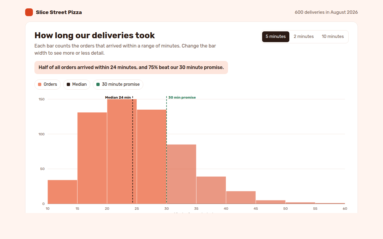
Example: delivery times for 600 pizza orders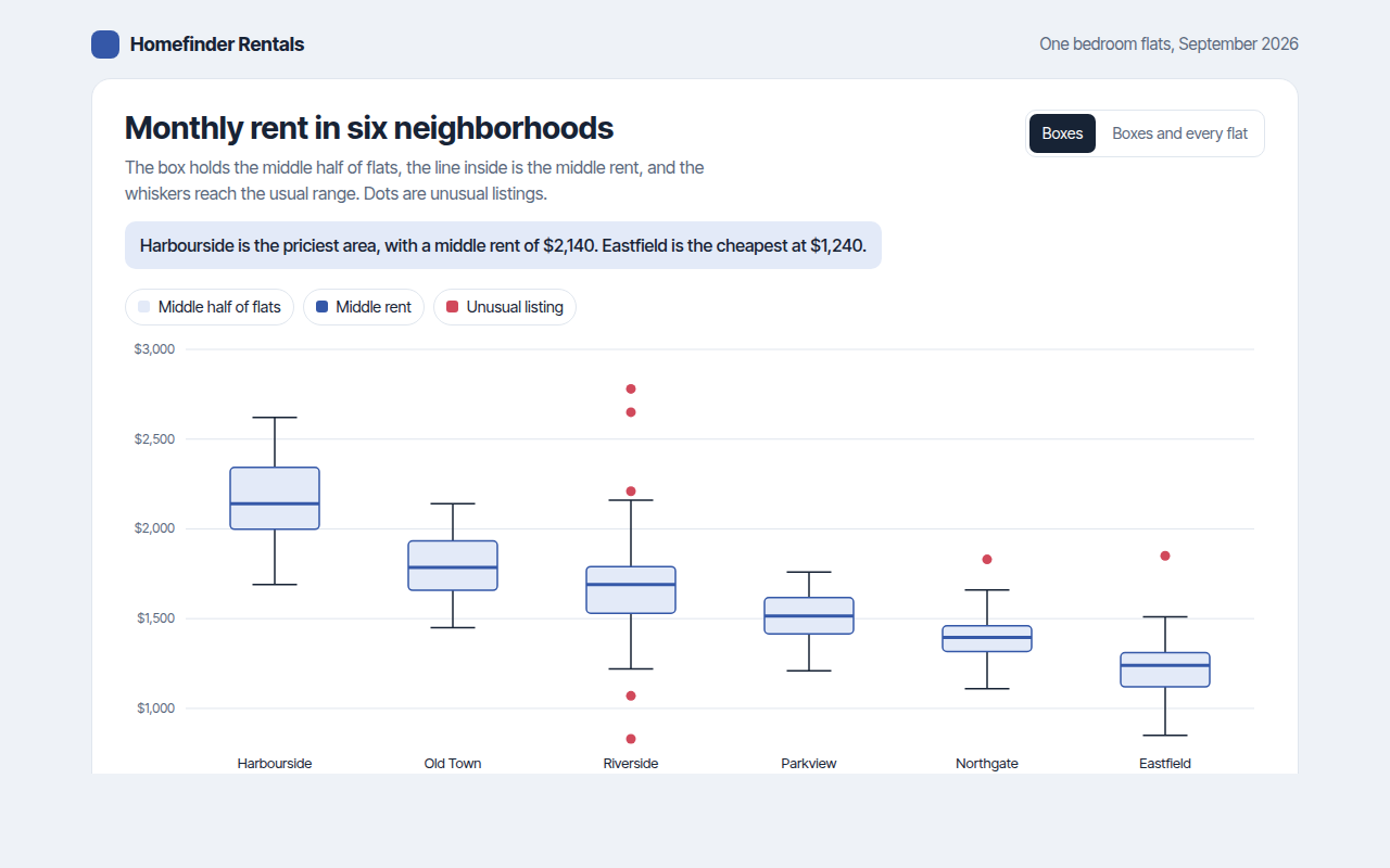
032. Box Plot
Example: monthly rent for flats in six neighborhoods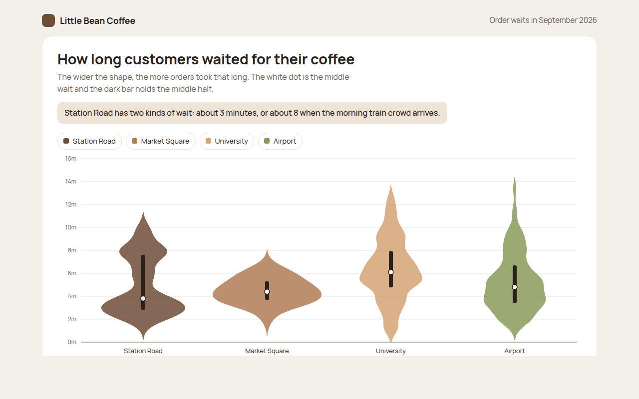
033. Violin Plot
Example: coffee order waits at four cafes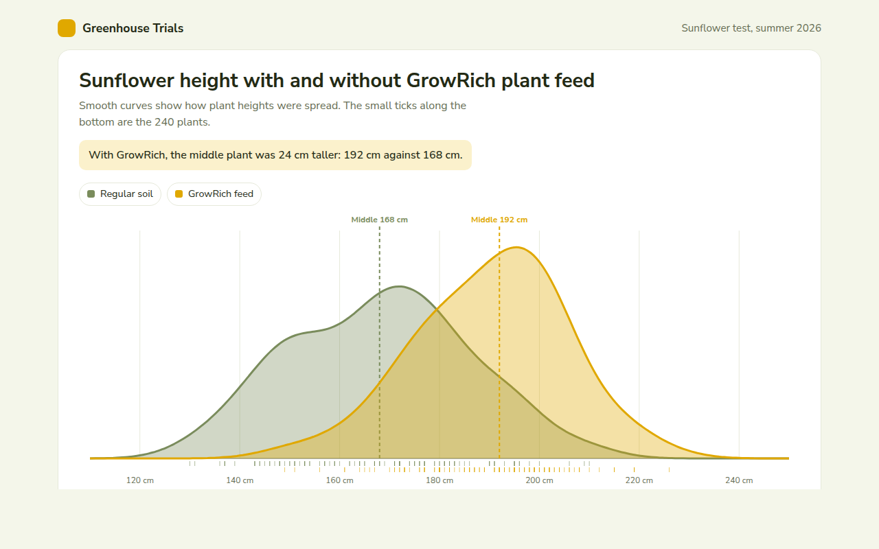
034. Density Plot
Example: sunflower heights with and without plant feed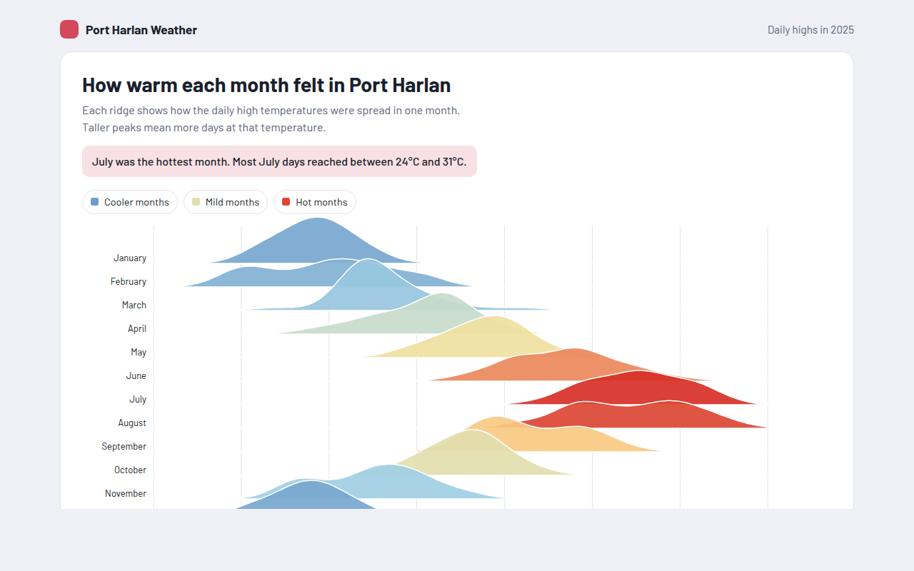
035. Ridgeline Plot
Example: daily high temperatures for each month of the year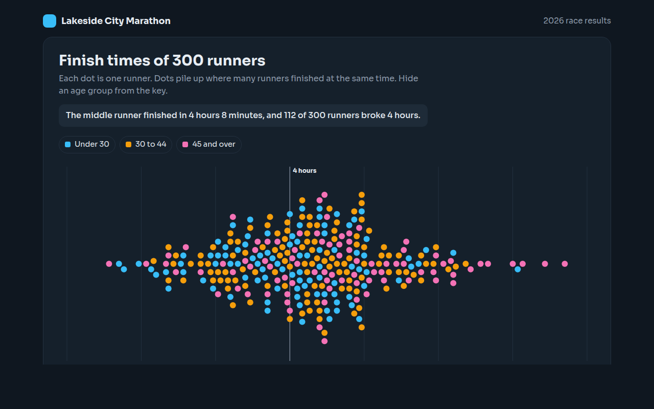
036. Beeswarm Plot
Example: finish times for 300 marathon runners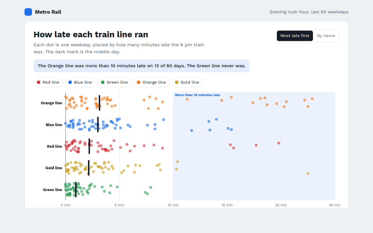
037. Strip Plot
Example: train delays on five lines over 60 weekdays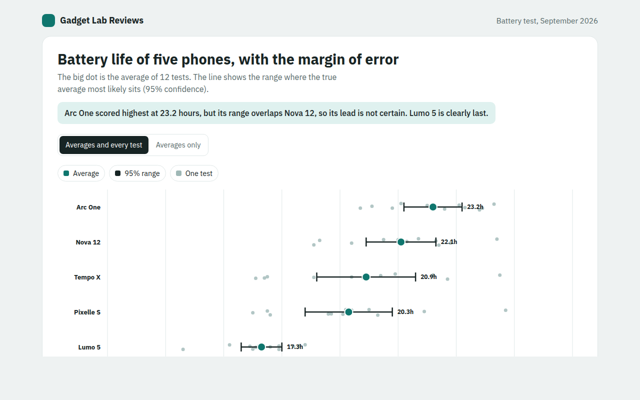
039. Error Bar Chart
Example: battery life test results for five phones