Home / Distribution / Box Plot
Box Plot in HTML, CSS and JavaScript
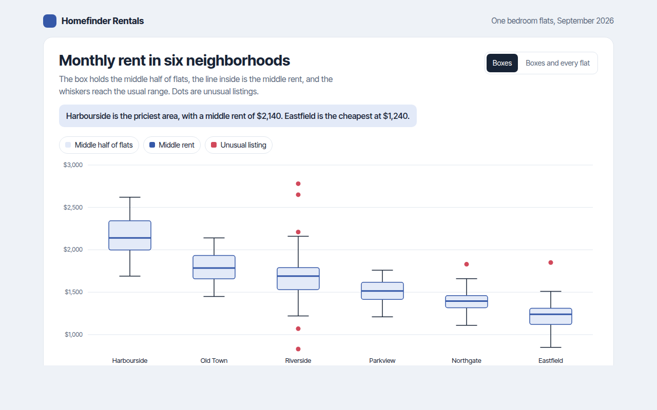
A box plot, also called a box and whisker plot, sums up a set of numbers in five values. This free template draws one with plain SVG and vanilla JavaScript, no chart library. The example shows monthly rent for flats in six neighborhoods.
What is a box plot?
A box plot, also called a box and whisker plot, sums up a set of numbers in five values. The box holds the middle half of the data, the line inside is the median, and the whiskers reach out to the usual lowest and highest values.
Anything far outside the whiskers is drawn as a dot, so unusual values stand out right away. Box plots are compact, which makes them ideal for comparing many groups side by side.
At a glance
- Best for
- Comparing the spread of several groups
- Data you need
- A list of numbers for each group
- Skip it when
- Groups with two peaks. A violin plot shows them.
- Made with
- HTML, CSS and vanilla JavaScript. No library.
When to use a box plot
- Rent, prices or salaries by area
- Test scores by class or school
- Delivery times by region
- Lab or quality results by batch
When to pick another chart
- Violin Plot: you want to see the full shape, including two peaks
- Strip Plot: you have few values and want to show every one
- Histogram: you only have one group
What you get in this template
- Quartiles and medians worked out in plain JavaScript
- Whiskers that follow the standard 1.5 times the box height rule
- Unusual listings drawn as red dots with their own tooltips
- A switch to show every flat as a faint dot on top of the boxes
- Groups sorted from most to least expensive
- Keyboard support and a table of all five numbers
How the code works
Here is a short version of the idea behind this box plot. The full file adds the axis, labels, tooltips, sorting and resizing on top of it.
const rents = [1850, 1920, 1990, 2050, 2100, 2140, 2200, 2280, 2340, 2410, 2780];
const s = rents.slice().sort((a, b) => a - b);
const q = p => { const i = (s.length - 1) * p, lo = Math.floor(i); return s[lo] + (s[Math.ceil(i)] - s[lo]) * (i - lo); };
const q1 = q(0.25), median = q(0.5), q3 = q(0.75), iqr = q3 - q1;
const low = s.find(v => v >= q1 - 1.5 * iqr), high = s.filter(v => v <= q3 + 1.5 * iqr).pop();
const y = v => 280 - (v - 1600) / 1400 * 260;

drawLine(100, y(low), 100, y(high), '#172335', 1.5);             // whiskers
drawRect(70, y(q3), 60, y(q1) - y(q3), '#e3eaf8');              // box
drawLine(70, y(median), 130, y(median), '#3558a8', 3);           // median
s.filter(v => v > high || v < low).forEach(v => drawCircle(100, y(v), 4, '#d1495b'));
The example uses four tiny helpers that create SVG shapes. Put them above the code and it runs as is.
const svg = document.querySelector('svg');
function make(tag, attrs) {
  const n = document.createElementNS('http://www.w3.org/2000/svg', tag);
  for (const k in attrs) n.setAttribute(k, attrs[k]);
  svg.appendChild(n);
  return n;
}
function drawRect(x, y, width, height, fill) { return make('rect', { x, y, width, height, fill }); }
function drawCircle(cx, cy, r, fill) { return make('circle', { cx, cy, r, fill }); }
function drawLine(x1, y1, x2, y2, stroke, width, dash) {
  return make('line', { x1, y1, x2, y2, stroke, 'stroke-width': width || 1, 'stroke-dasharray': dash || 'none' });
}
function drawText(x, y, str, anchor) {
  const t = make('text', { x, y, 'text-anchor': anchor || 'start' });
  t.textContent = str;
  return t;
}
How to add it to your website
- Download the file. Click Download HTML file above. You get one file called box-plot.html with everything inside.
- Change the data. Open the file in any code editor and find the DATA list near the bottom. Replace the names and numbers with your own.
- Change the colors and text. Colors are at the top of the style tag. The title, subtitle and main point are plain HTML near the top of the body.
- Put it online. Upload the file to any host, such as GitHub Pages, Netlify or your own server, or paste it into your site. There is no build step.
Questions people ask
How do you read a box plot?
The line in the box is the median. The box holds the middle 50% of values, from the lower quarter to the upper quarter. The whiskers show the usual range, and dots beyond them are unusual values.
What counts as an outlier in a box plot?
The usual rule is any value more than 1.5 times the box height above the box or below it. This template uses that rule.
When should I use a box plot instead of a histogram?
Use a box plot when you want to compare several groups at once. Use a histogram when you want to see the full shape of one group.
What are the limits of a box plot?
It hides the shape inside the box. Two groups can have the same box but very different patterns, like two peaks. Show the points or use a violin plot when shape matters.
More distribution
031. Histogram
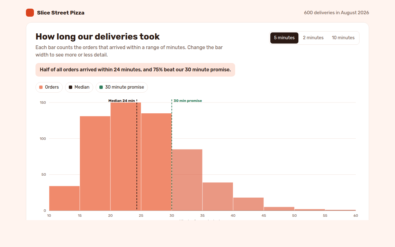
Example: delivery times for 600 pizza orders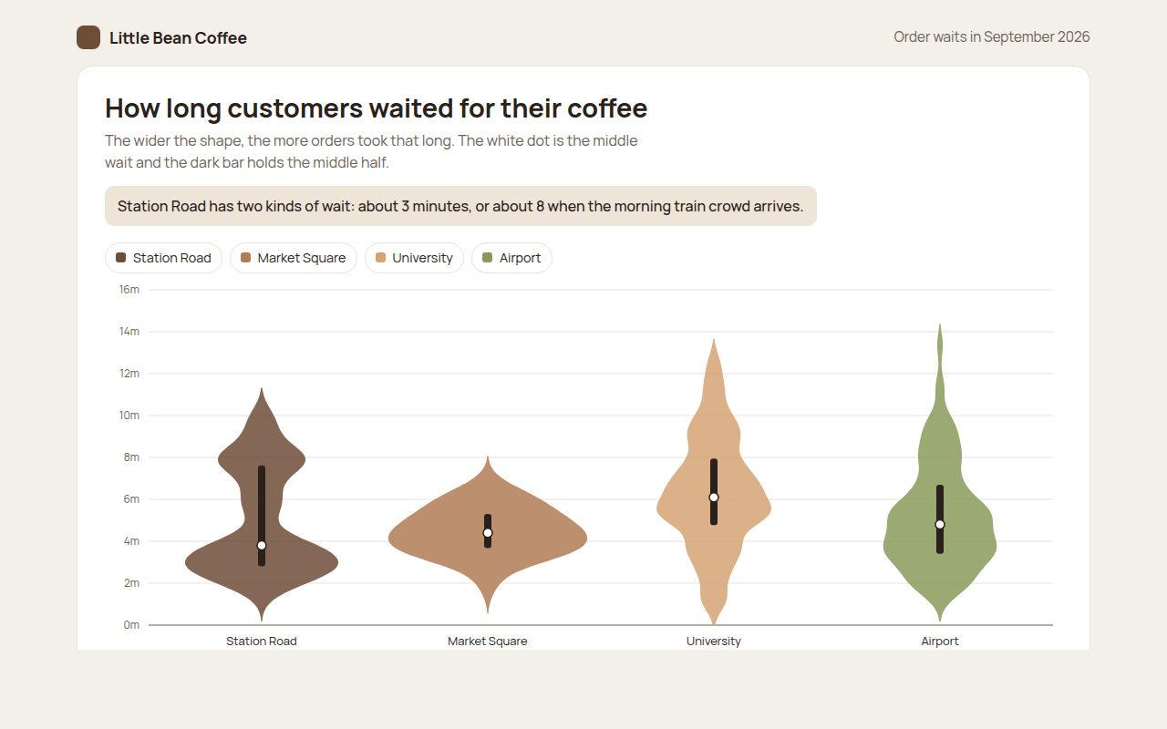
033. Violin Plot
Example: coffee order waits at four cafes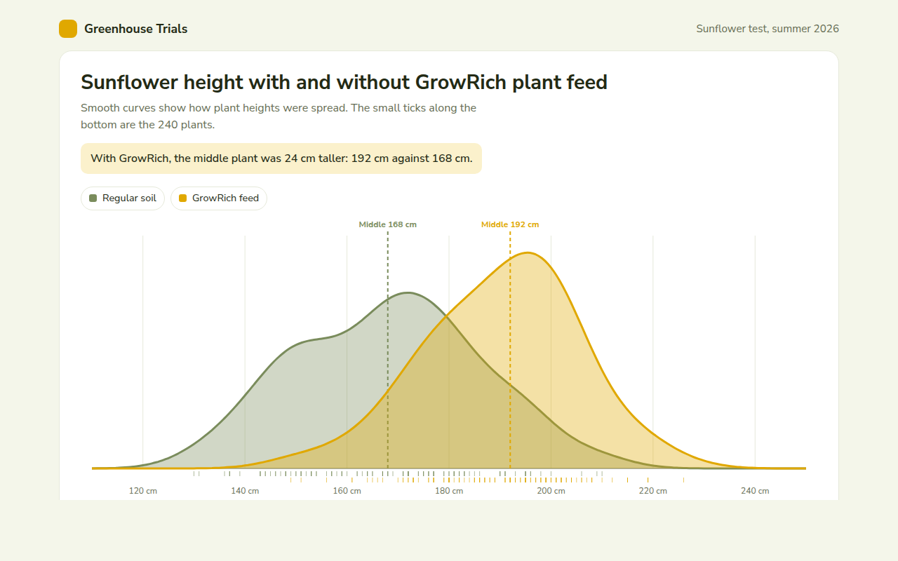
034. Density Plot
Example: sunflower heights with and without plant feed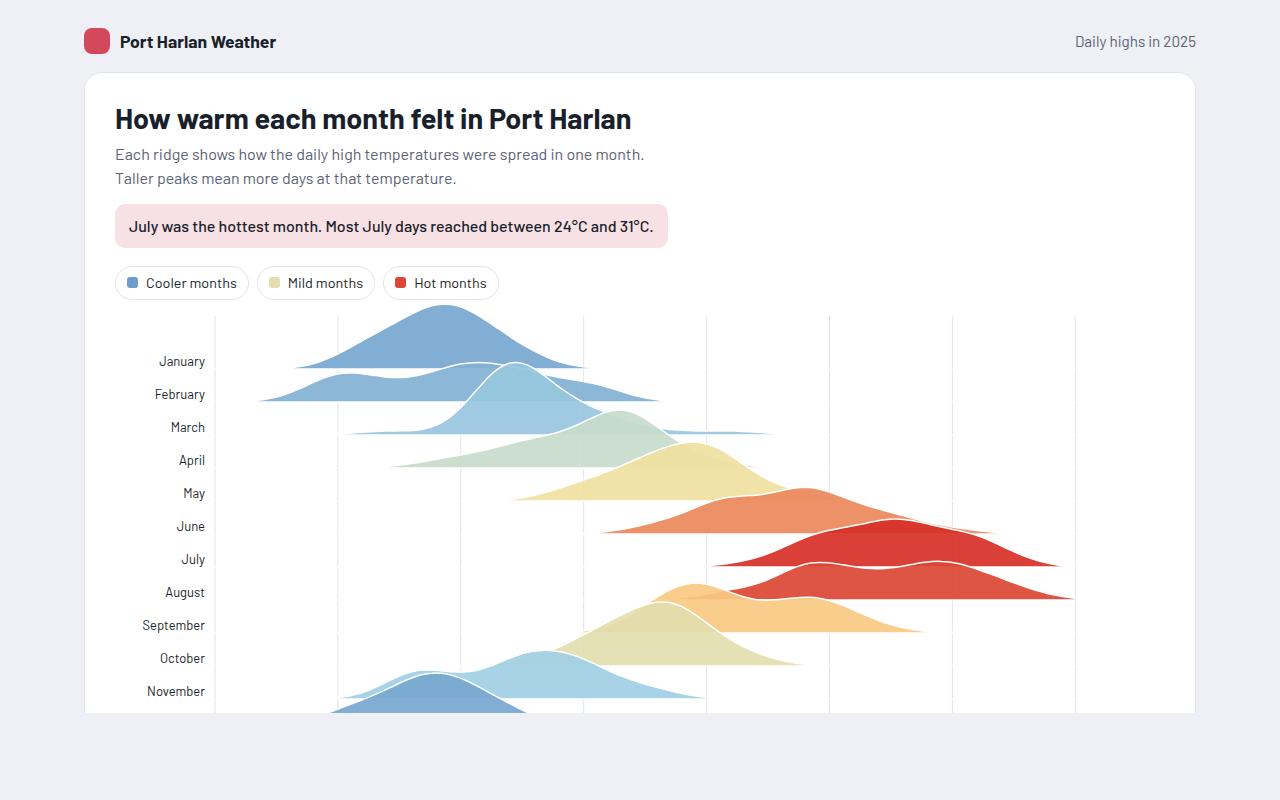
035. Ridgeline Plot
Example: daily high temperatures for each month of the year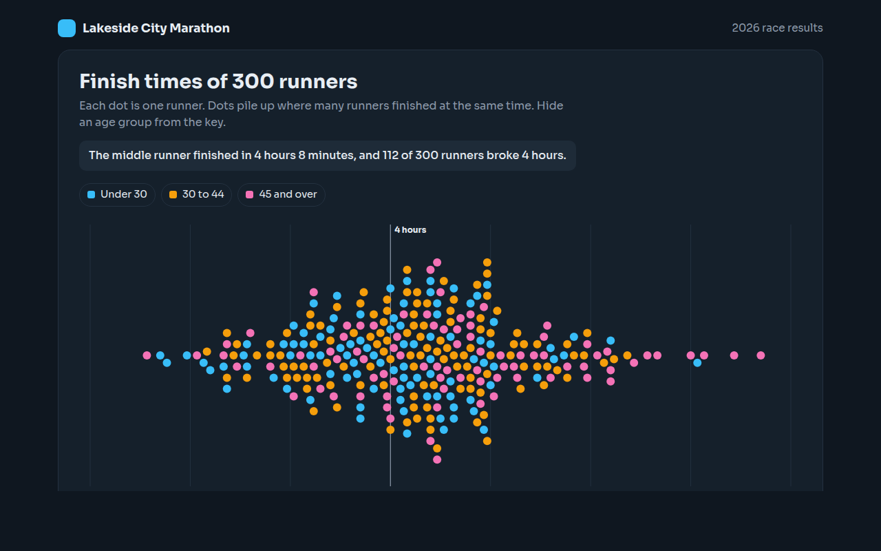
036. Beeswarm Plot
Example: finish times for 300 marathon runners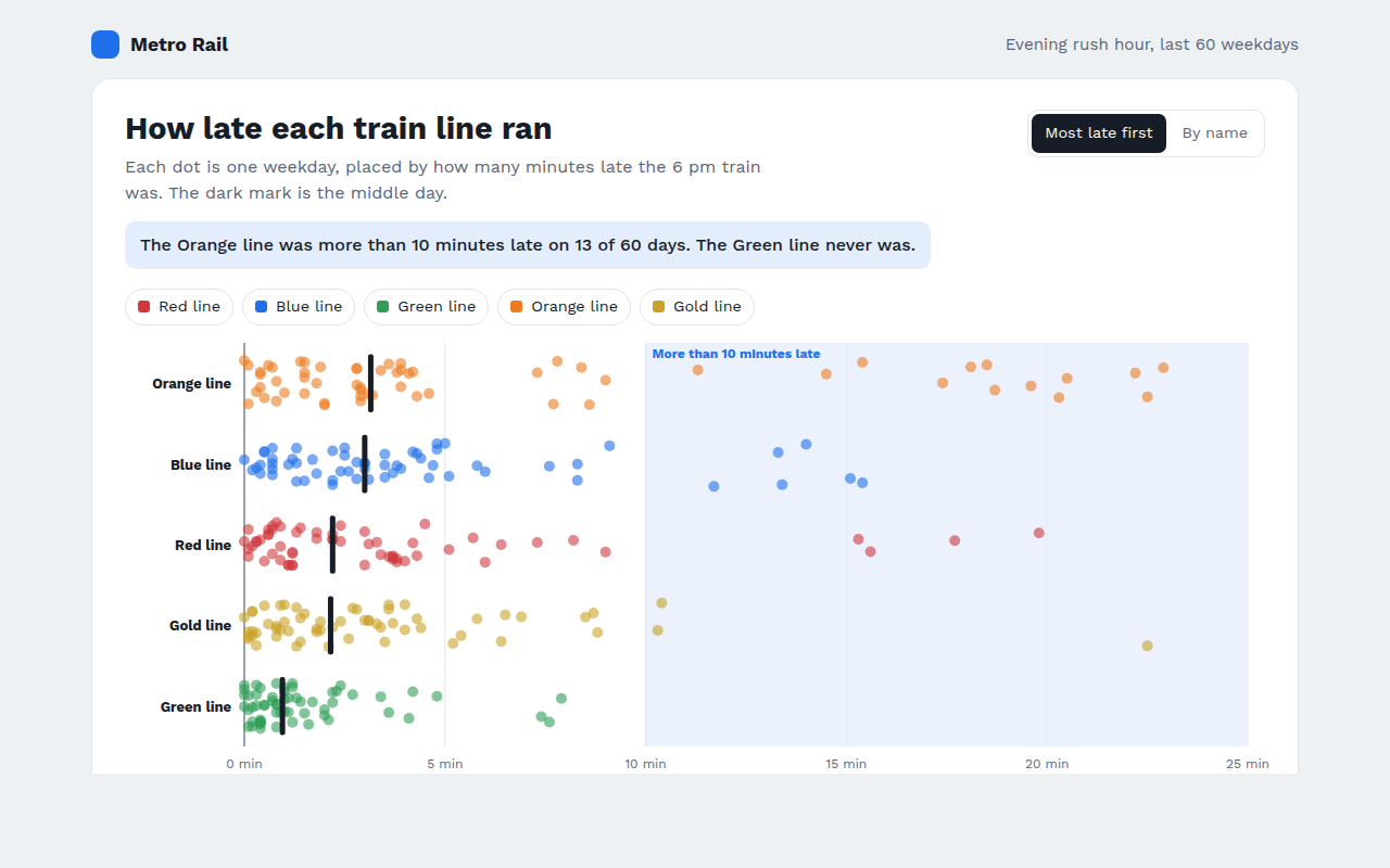
037. Strip Plot
Example: train delays on five lines over 60 weekdays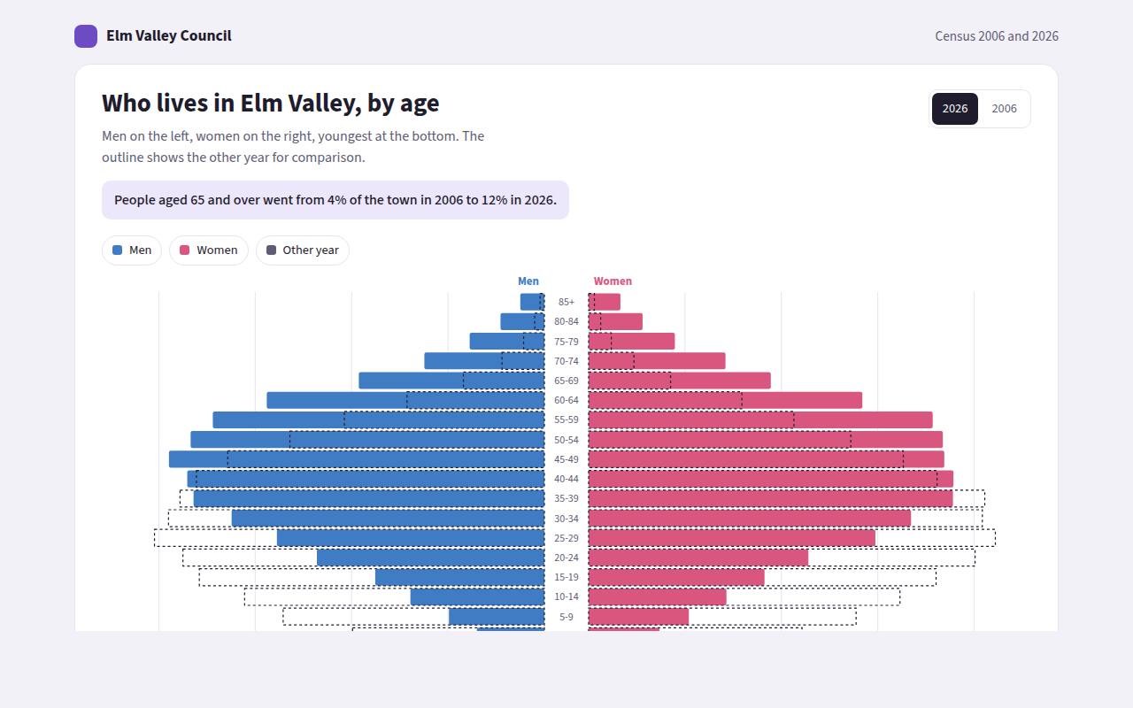
038. Population Pyramid
Example: the age of a town in 2006 and 2026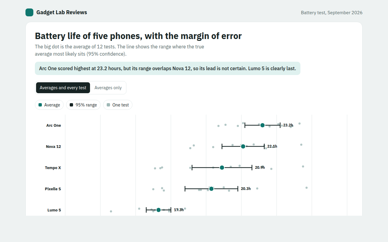
039. Error Bar Chart
Example: battery life test results for five phones