Home / Soft and Tactile UI / Glassmorphism
Glassmorphism CSS Template, Free with Live Demo
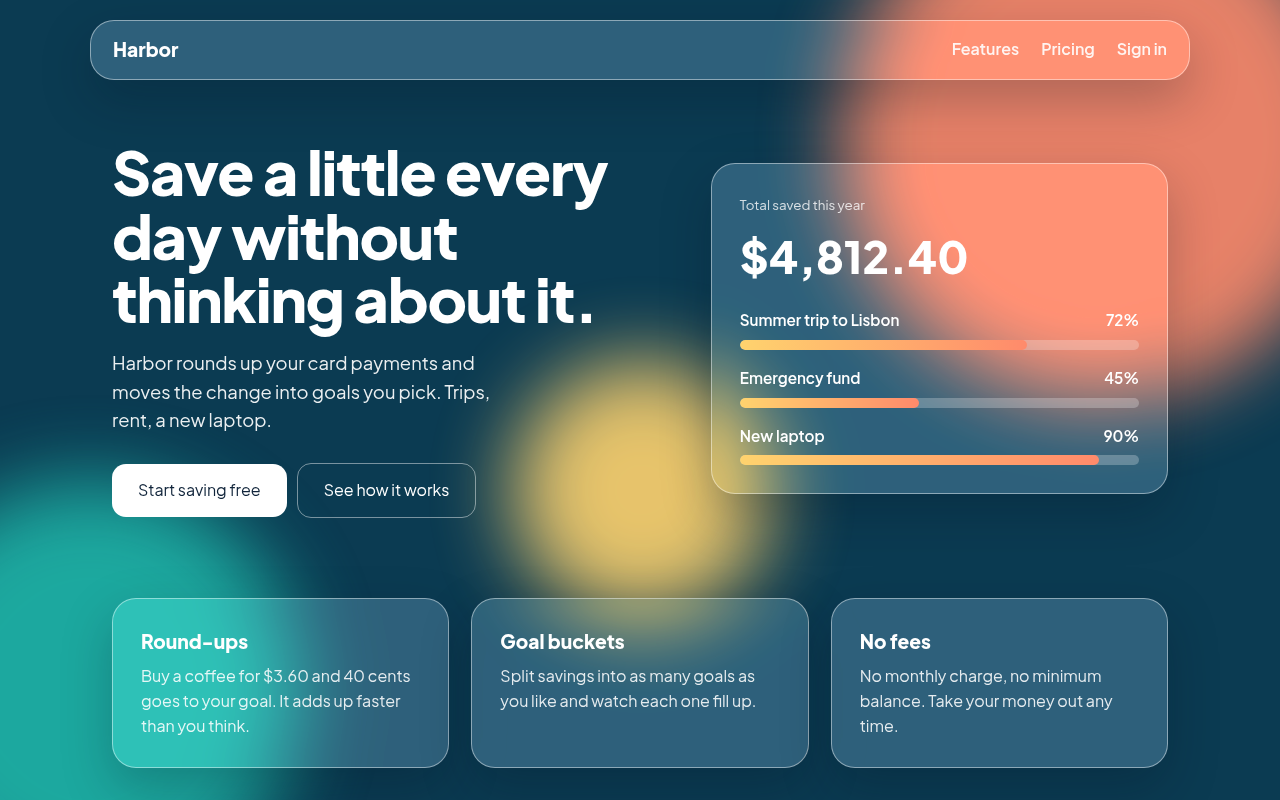
Free glassmorphism HTML and CSS template with frosted glass cards and blurred panels. See the live demo, copy the CSS, or download the single HTML file. The example is Harbor, a savings app landing page.
What is glassmorphism?
Glassmorphism is a design style where panels look like frosted glass. You can see the colors behind them, but blurred, as if you were looking through a bathroom window. A thin white border and a soft shadow make each panel feel like it floats above the page.
The whole effect comes from one CSS property called backdrop-filter. It blurs whatever sits behind an element. Put a few bright color shapes in the background, place a semi transparent card on top, and you have glassmorphism.
Good for
- Finance and banking app landing pages
- Dashboards with a few key numbers
- Login and sign up screens
- Music, weather and lifestyle apps
What you get in this template
- Frosted navigation bar and cards made with backdrop-filter
- Three blurred color shapes in the background, no images needed
- Savings goal progress bars with a warm gradient
- Responsive layout that stacks on phones
- Clear focus outlines for keyboard users
The key CSS
This is the part that makes the glassmorphism look work. Copy it into your own project.
.glass {
  background: rgba(255, 255, 255, 0.18);
  border: 1px solid rgba(255, 255, 255, 0.45);
  border-radius: 24px;
  backdrop-filter: blur(18px) saturate(140%);
  -webkit-backdrop-filter: blur(18px) saturate(140%);
  box-shadow: 0 20px 50px rgba(3, 20, 35, 0.25);
}
How to use it
- Click Download HTML file above.
- Open the file in any code editor, like VS Code.
- Change the text, colors and links to match your project. Colors are at the top of the style tag.
- Upload it to any host, such as GitHub Pages, Netlify or your own server. It is one file with no build step.
Questions people ask
How do you make glassmorphism in CSS?
Give an element a semi transparent background, such as rgba(255, 255, 255, 0.18), then add backdrop-filter: blur(18px). Add a thin light border and a soft shadow. The effect only shows when there is something colorful behind the element.
Does backdrop-filter work in all browsers?
Yes. Chrome, Edge, Firefox and Safari all support it today. Safari still likes the -webkit- prefix, so this template includes both versions.
Is glassmorphism bad for readability?
It can be if the text sits on a busy background. Keep the blur strong, use white or very dark text, and check contrast. This template uses a dark, calm background so text stays easy to read.
More Soft and Tactile UI designs
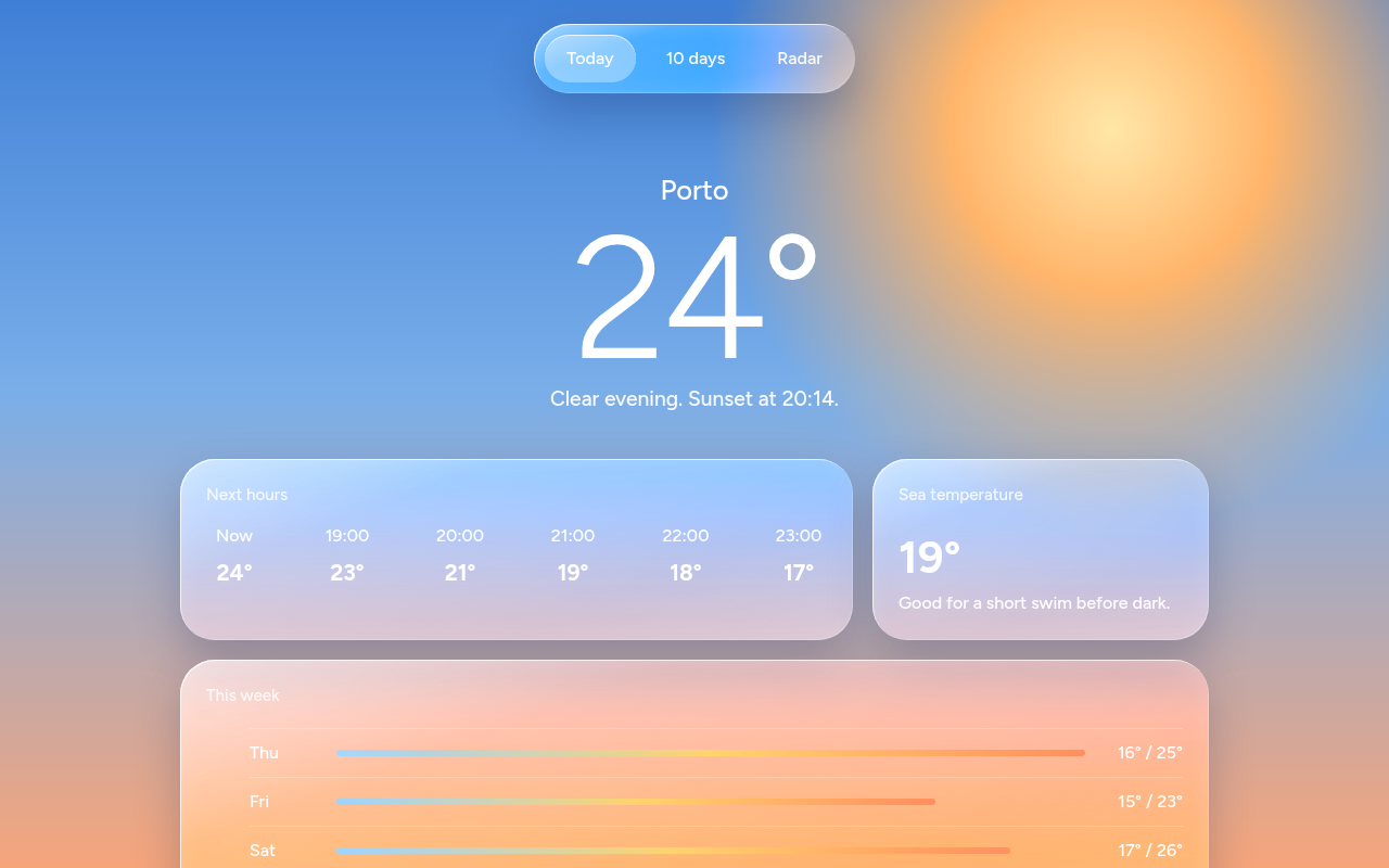
002. Liquid Glass
Tidewell, a weather app screen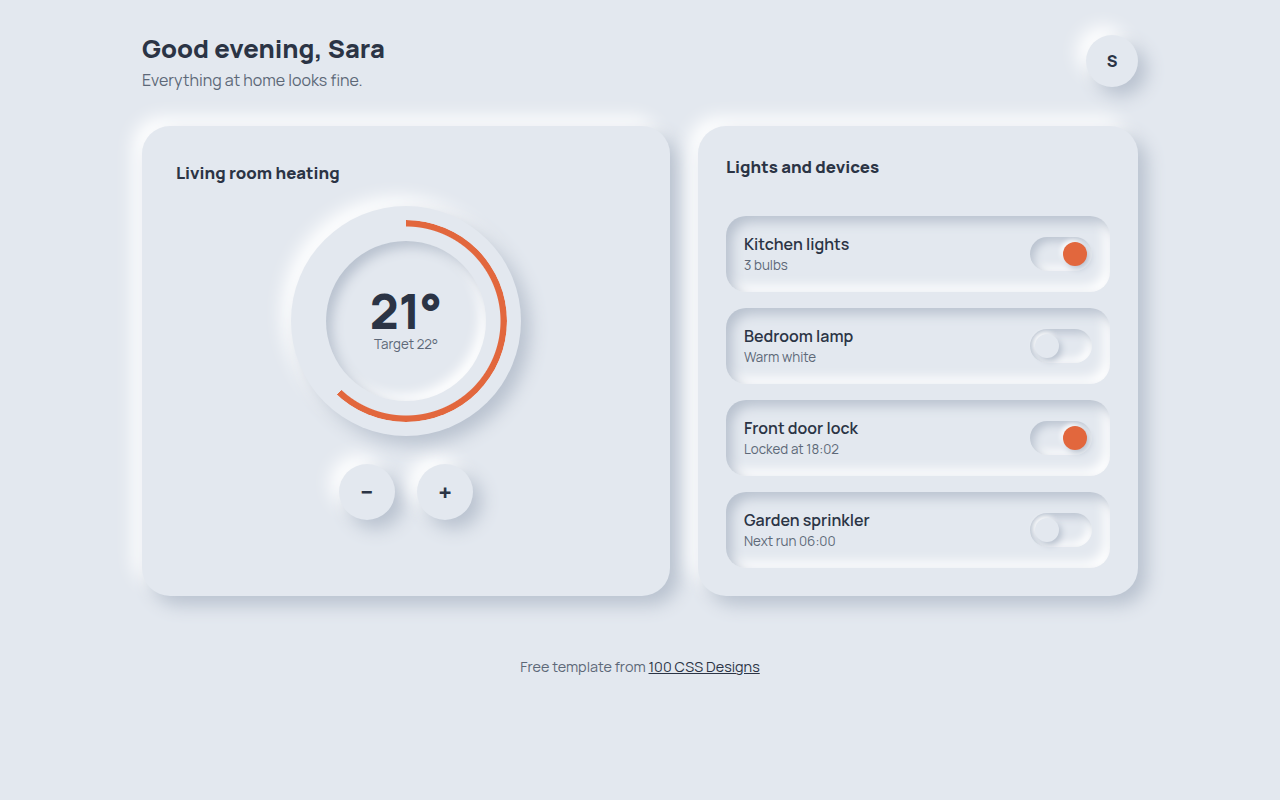
003. Neumorphism
Hearth, a smart home control panel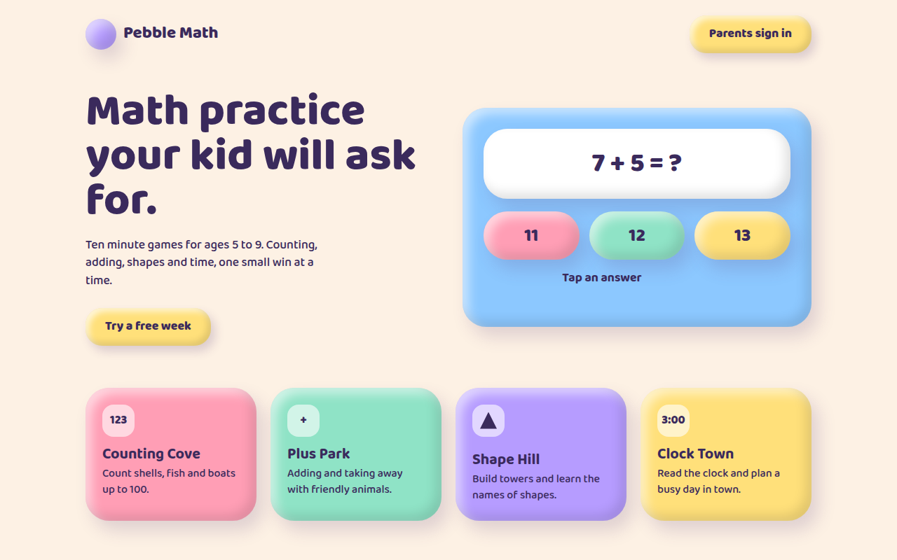
004. Claymorphism
Pebble Math, a kids learning app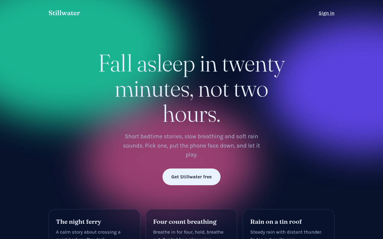
005. Frosted Aurora
Stillwater, a sleep and calm app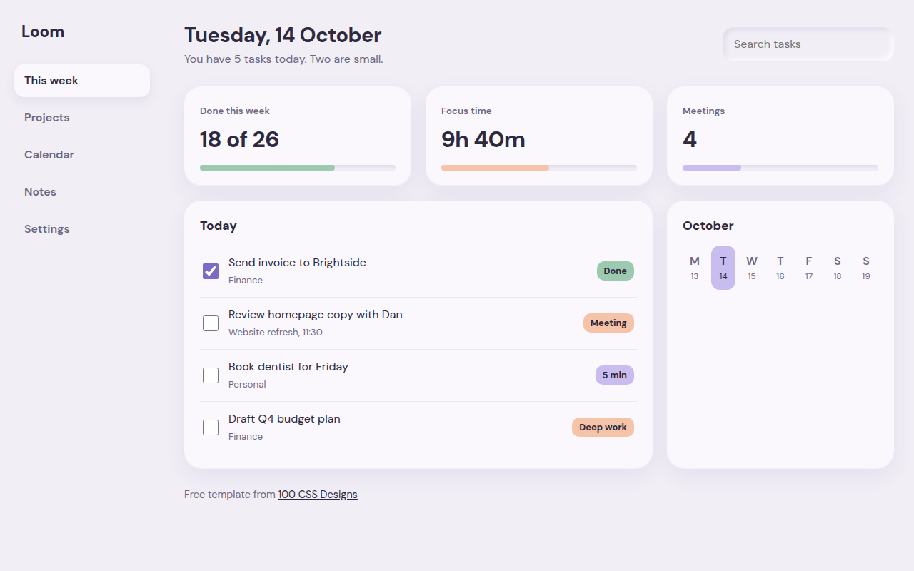
006. Soft UI
Loom, a weekly planner dashboard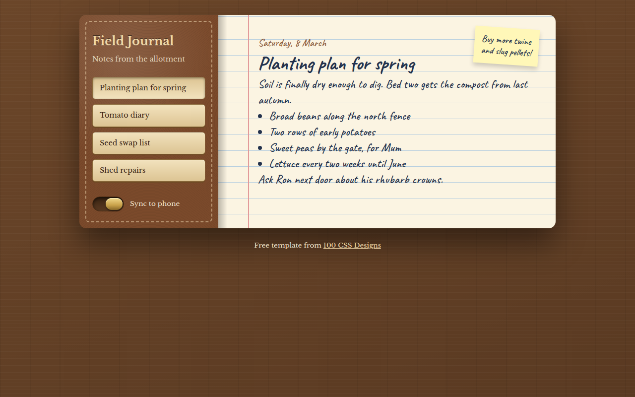
007. Skeuomorphism
Field Journal, a notes app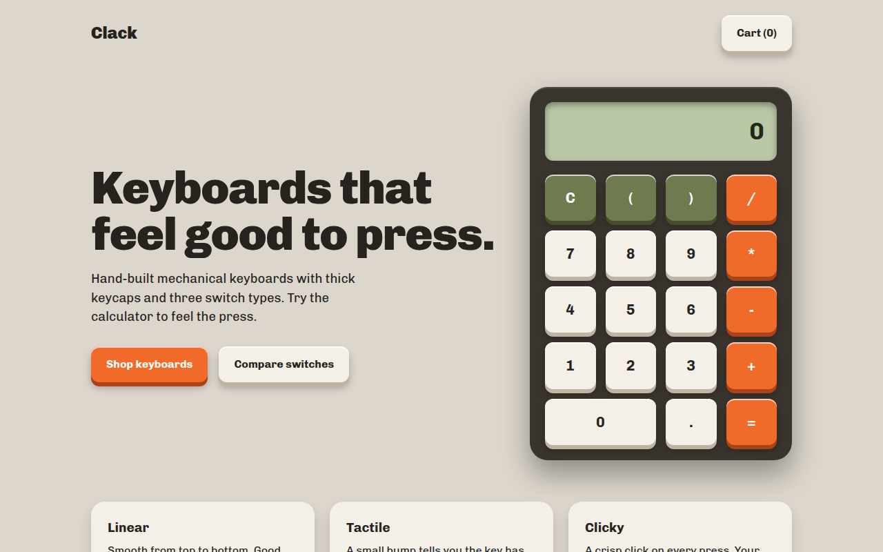
008. Tactile Buttons
Clack, a keyboard shop with a working calculator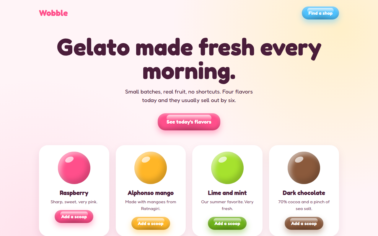
009. Jelly UI
Wobble, a gelato shop