Home / Soft and Tactile UI / Neumorphism
Neumorphism CSS Template, Free with Live Demo
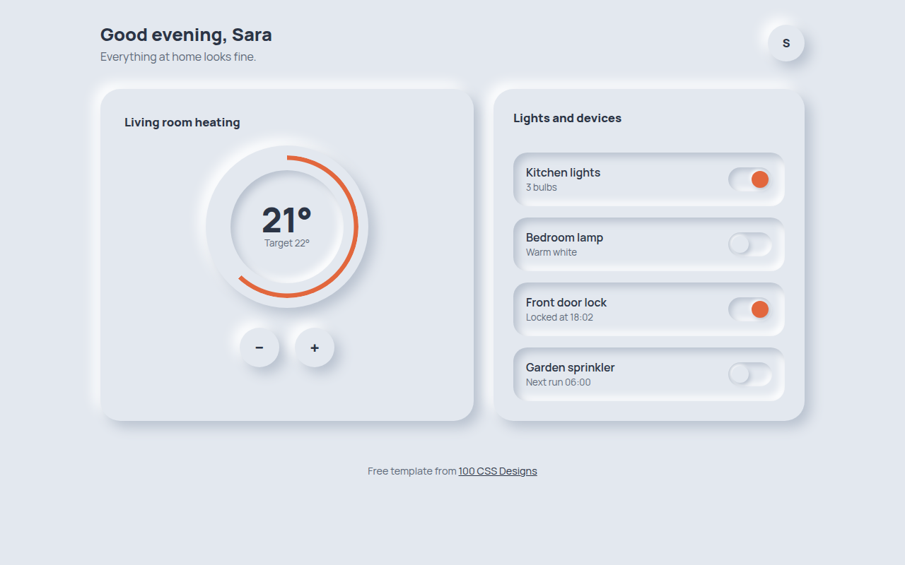
Free neumorphism UI template for a smart home panel. Soft extruded dials, switches and cards in pure CSS, with improved contrast. Live demo and download. The example is Hearth, a smart home control panel.
What is neumorphism?
Neumorphism makes buttons and cards look like they are pushed out of, or pressed into, the same material as the background. There are no borders. Everything is shaped by two shadows: a dark one on the bottom right and a light one on the top left.
The original 2020 version had a real problem. Buttons were so low contrast that people could not see them. This template fixes that with darker text, a colored accent for active states, and inset wells that make switches easy to spot.
Good for
- Smart home and device control apps
- Music players and audio tools
- Calculators and simple utilities
- Settings screens with toggles and sliders
What you get in this template
- Thermostat dial with a colored progress ring
- Working plus and minus buttons that press in
- Four accessible toggle switches using role switch
- Raised and inset surfaces from one color
- Orange accent so active states are easy to see
The key CSS
This is the part that makes the neumorphism look work. Copy it into your own project.
:root { --bg: #e3e8ef; --dark: #b9c2cf; --light: #ffffff; }

.raised {
  background: var(--bg);
  border-radius: 28px;
  box-shadow: 9px 9px 18px var(--dark), -9px -9px 18px var(--light);
}

.pressed {
  box-shadow: inset 6px 6px 12px var(--dark), inset -6px -6px 12px var(--light);
}
How to use it
- Click Download HTML file above.
- Open the file in any code editor, like VS Code.
- Change the text, colors and links to match your project. Colors are at the top of the style tag.
- Upload it to any host, such as GitHub Pages, Netlify or your own server. It is one file with no build step.
Questions people ask
How do you make a neumorphic button in CSS?
Use the same background color as the page, then add two box shadows: one darker shadow toward the bottom right and one lighter shadow toward the top left. For the pressed state, switch both shadows to inset.
Is neumorphism still popular?
It came back in a more careful form. Designers now mix it with a strong accent color and higher contrast text, which fixes the readability issues of the first wave.
Is neumorphism accessible?
It can be, if you do not rely on shadows alone. Use clear text labels, a visible focus outline and a color change for on and off states, like this template does.
More Soft and Tactile UI designs
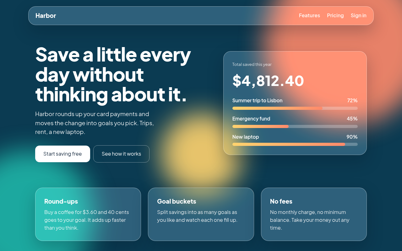
001. Glassmorphism
Harbor, a savings app landing page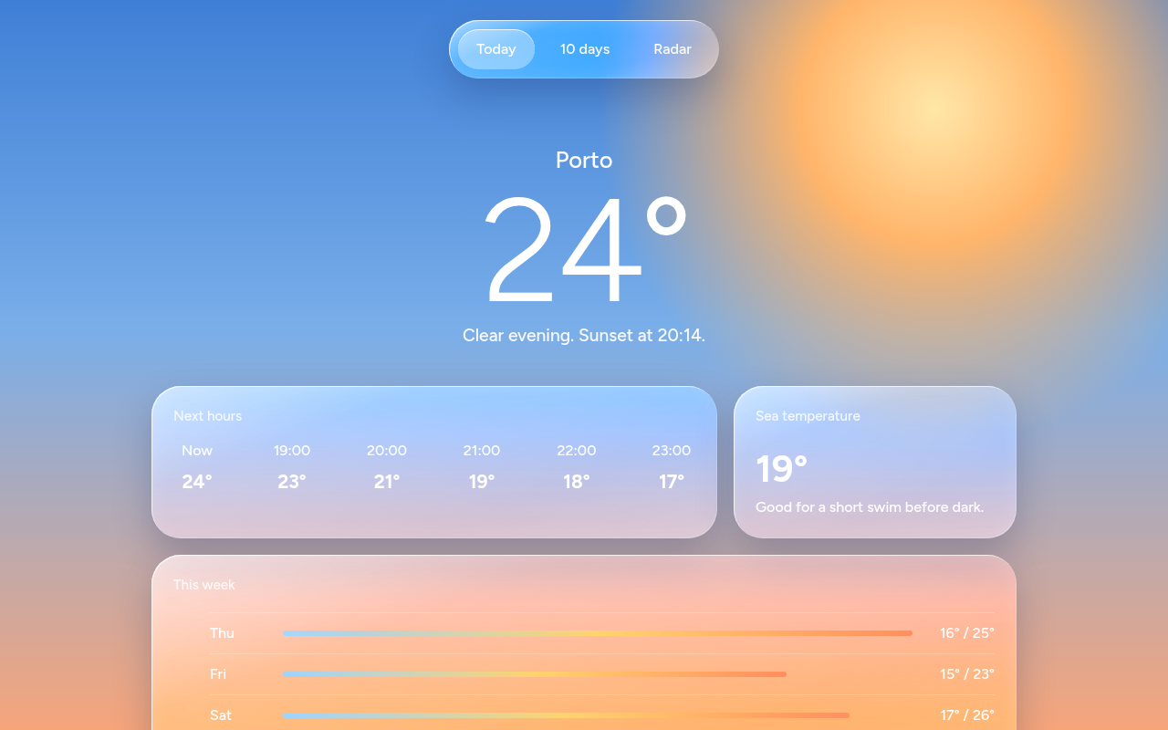
002. Liquid Glass
Tidewell, a weather app screen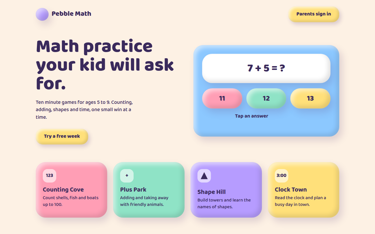
004. Claymorphism
Pebble Math, a kids learning app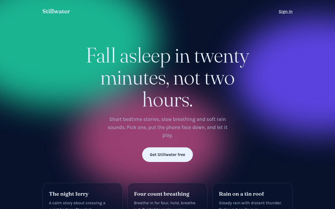
005. Frosted Aurora
Stillwater, a sleep and calm app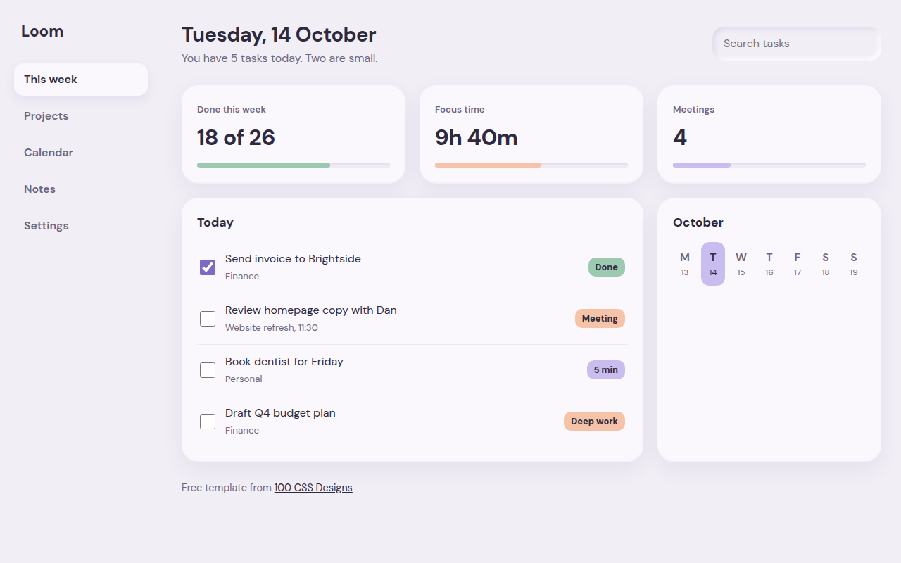
006. Soft UI
Loom, a weekly planner dashboard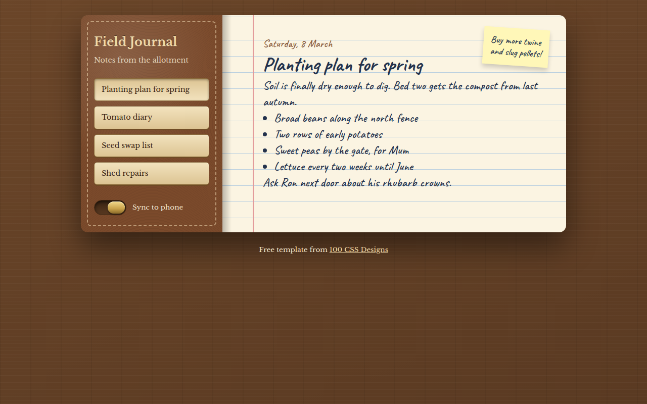
007. Skeuomorphism
Field Journal, a notes app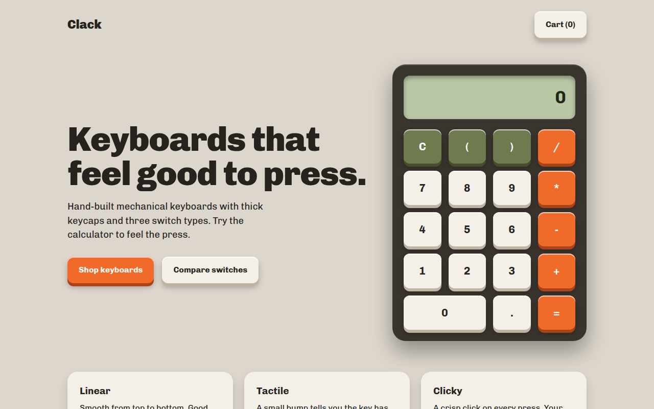
008. Tactile Buttons
Clack, a keyboard shop with a working calculator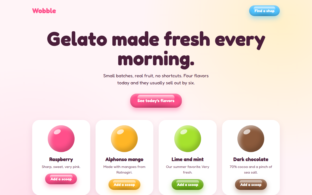
009. Jelly UI
Wobble, a gelato shop