Home / Color and Light / Neon Cyberpunk
Neon Cyberpunk CSS Template, Free with Live Demo
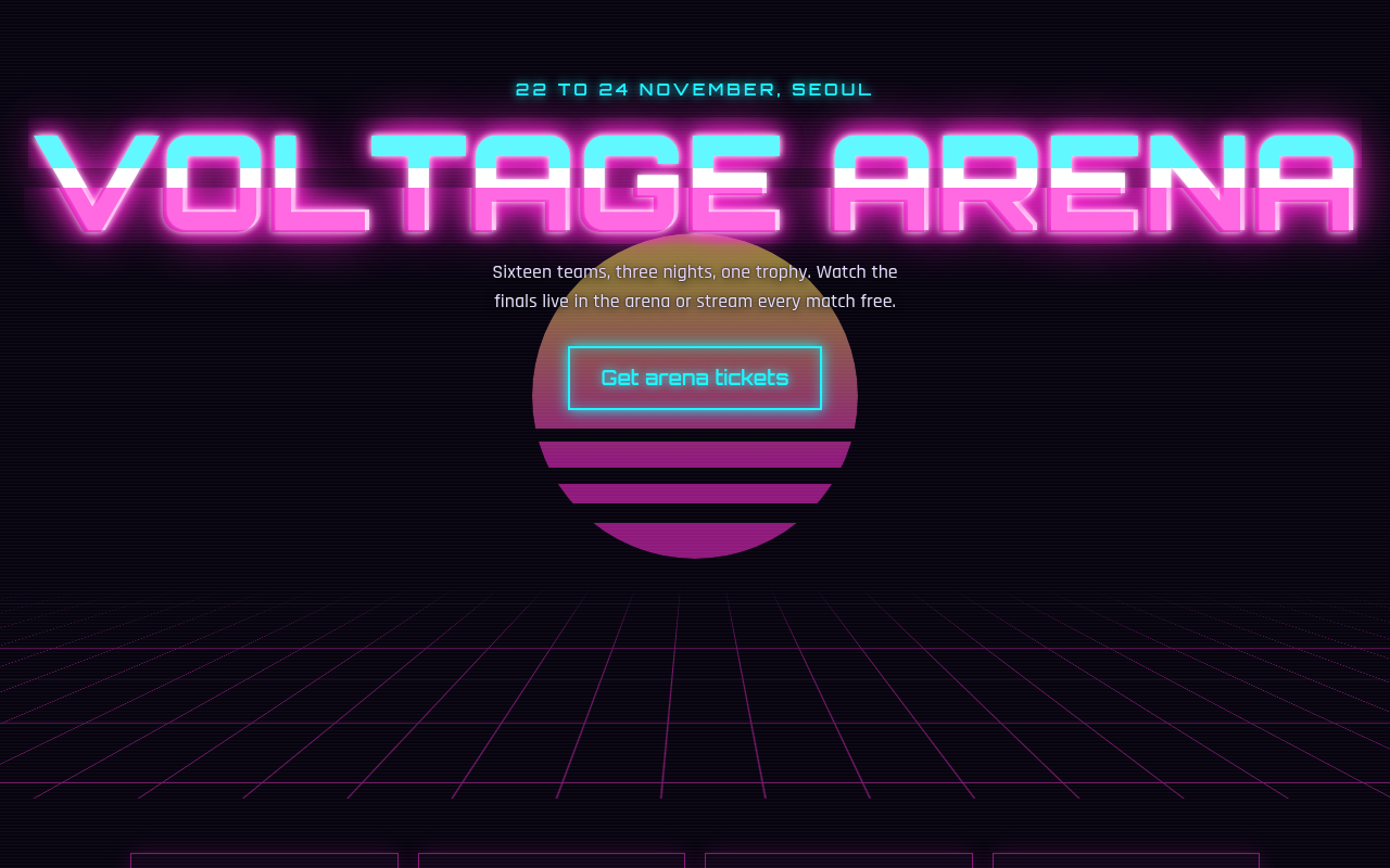
Free neon cyberpunk website template for an esports event. Glowing pink and cyan text, a synthwave sun, grid floor and a glitch headline. Live demo. The example is Voltage Arena, an esports tournament.
What is neon cyberpunk?
Neon cyberpunk is the look of glowing signs on a dark night street. Hot pink and electric cyan light up a black background, with scan lines, a retro sun and a grid floor that runs to the horizon.
The glow is layered text-shadow. The grid floor is two line gradients tilted back in 3D. The glitch copies the headline twice in pink and cyan, clips each copy and nudges it now and then.
Good for
- Esports and gaming events
- Night clubs and music nights
- Tech and hackathon sites
- Game launch pages
What you get in this template
- Neon glow text made with layered shadows
- Synthwave sun with sliced stripes
- Perspective grid floor in pure CSS
- Glitch headline that stops for reduced motion
- Scan line overlay across the page
The key CSS
This is the part that makes the neon cyberpunk look work. Copy it into your own project.
h1 { color: #fff; text-shadow: 0 0 6px #fff, 0 0 20px #ff2bd6, 0 0 50px #ff2bd6; }
.floor {
  background-image:
    linear-gradient(#ff2bd6 1px, transparent 1px),
    linear-gradient(90deg, #ff2bd6 1px, transparent 1px);
  background-size: 60px 60px;
  transform: perspective(400px) rotateX(62deg);
}
h1::before { content: attr(data-t); color: #1ef6ff; clip-path: inset(0 0 60% 0); }
How to use it
- Click Download HTML file above.
- Open the file in any code editor, like VS Code.
- Change the text, colors and links to match your project. Colors are at the top of the style tag.
- Upload it to any host, such as GitHub Pages, Netlify or your own server. It is one file with no build step.
Questions people ask
How do you make neon text in CSS?
Use white or light text with several text shadows in your neon color at growing blur sizes, for example 0 0 6px #fff, 0 0 20px pink, 0 0 50px pink.
How is the grid floor made?
Two repeating line gradients form a grid, and transform: perspective(400px) rotateX(62deg) tilts it back so it looks like a floor.
Is the glitch effect accessible?
The copies are decoration made with CSS pseudo elements, so screen readers read the headline once. The glitch stops when reduced motion is on.
More Color and Light designs

041. Aurora Gradient
Solace, a skincare brand
042. Duotone
Harbor Film Festival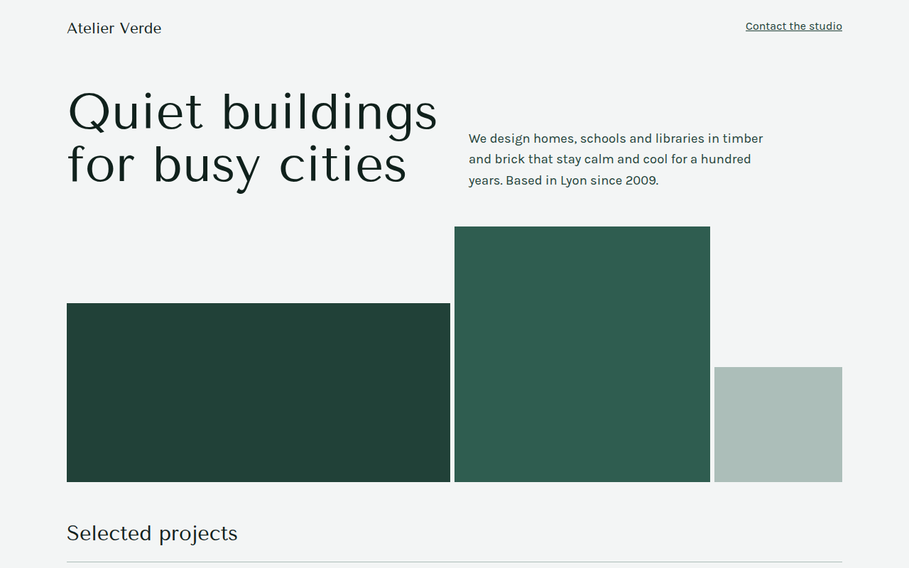
043. Monochrome
Atelier Verde, an architecture studio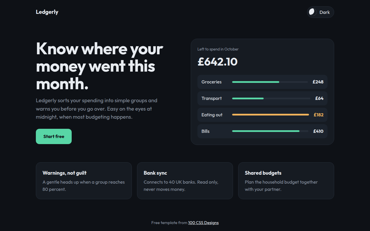
044. Dark Mode First
Ledgerly, a budget app
046. Earthy Natural
Rootstock Farm, an organic veg box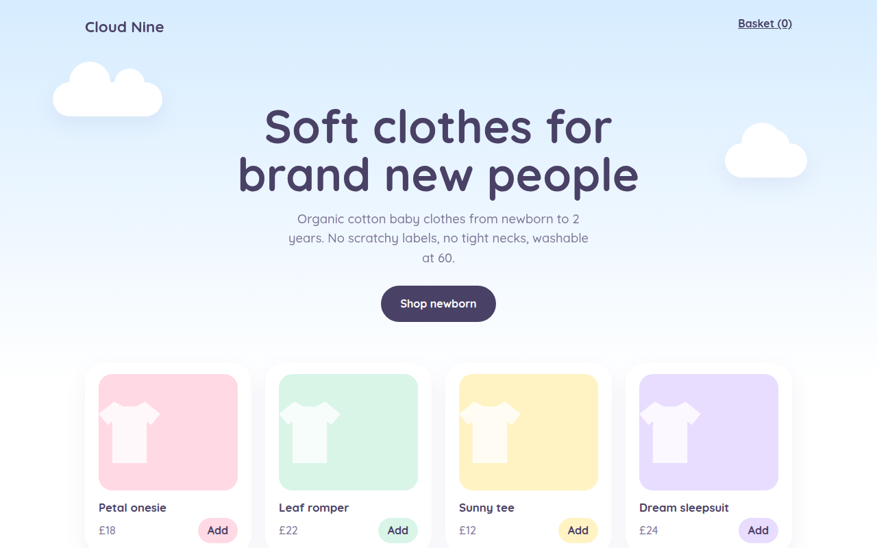
047. Pastel Dream
Cloud Nine, a baby clothing shop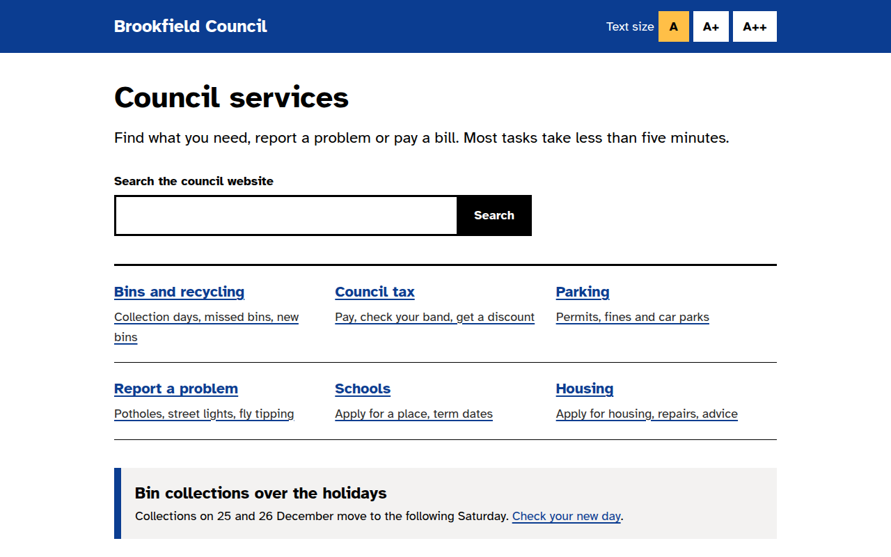
048. High Contrast Accessible
Brookfield Council, a local government site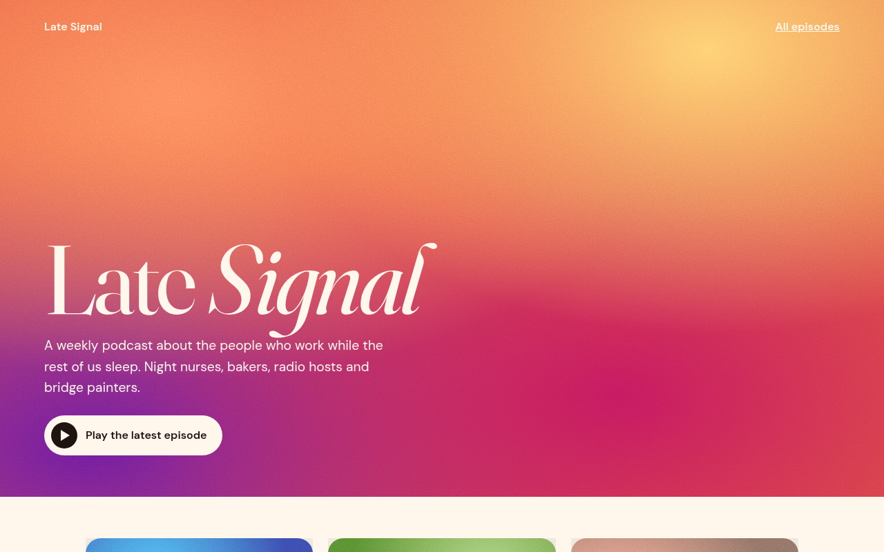
049. Grainy Gradient
Late Signal, a podcast