Home / Color and Light / High Contrast Accessible
High Contrast Accessible CSS Template, Free with Live Demo
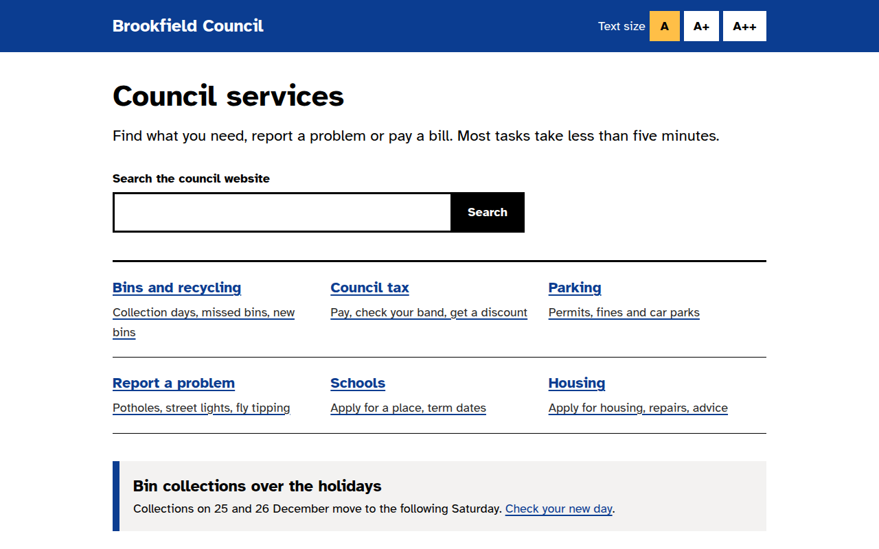
Free high contrast accessible website template for a local council. WCAG AAA colors, big focus rings, skip link and text size buttons. Live demo. The example is Brookfield Council, a local government site.
What is high contrast accessible?
A high contrast accessible design puts everyone first: people with low vision, older users, people on bright screens outside, and keyboard users. Black on white, blue underlined links, large text and focus rings you cannot miss.
It follows the same ideas as the UK government design system. There is a skip link, every button is at least 44 pixels tall, and the text size buttons change one variable that scales the whole page.
Good for
- Government and council websites
- Health services and clinics
- Schools and universities
- Charities and public services
What you get in this template
- Black and white text with contrast above 15 to 1
- Yellow and black focus ring on every control
- Skip to main content link
- Three text size buttons that scale the page
- Atkinson Hyperlegible, a font made for low vision readers
The key CSS
This is the part that makes the high contrast accessible look work. Copy it into your own project.
:root { font-size: var(--fs, 18px); }
:focus-visible {
  outline: 4px solid #000;
  box-shadow: 0 0 0 8px #ffbf47;
}
.skip { position: absolute; left: -9999px; }
.skip:focus { left: 12px; top: 12px; }
a { color: #0b3d91; text-decoration-thickness: 2px; text-underline-offset: 3px; }
How to use it
- Click Download HTML file above.
- Open the file in any code editor, like VS Code.
- Change the text, colors and links to match your project. Colors are at the top of the style tag.
- Upload it to any host, such as GitHub Pages, Netlify or your own server. It is one file with no build step.
Questions people ask
What contrast ratio does WCAG need?
WCAG AA needs 4.5 to 1 for normal text and AAA needs 7 to 1. The main text in this template is black on white, which is 21 to 1.
What is a skip link?
It is a hidden link at the top that appears when you press Tab. It lets keyboard users jump past the menu straight to the content.
Which font is best for accessibility?
Atkinson Hyperlegible was designed by the Braille Institute for readers with low vision. It is free on Google Fonts.
More Color and Light designs
041. Aurora Gradient
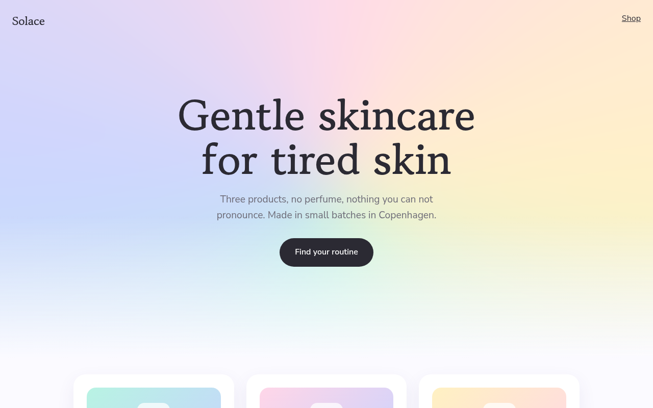
Solace, a skincare brand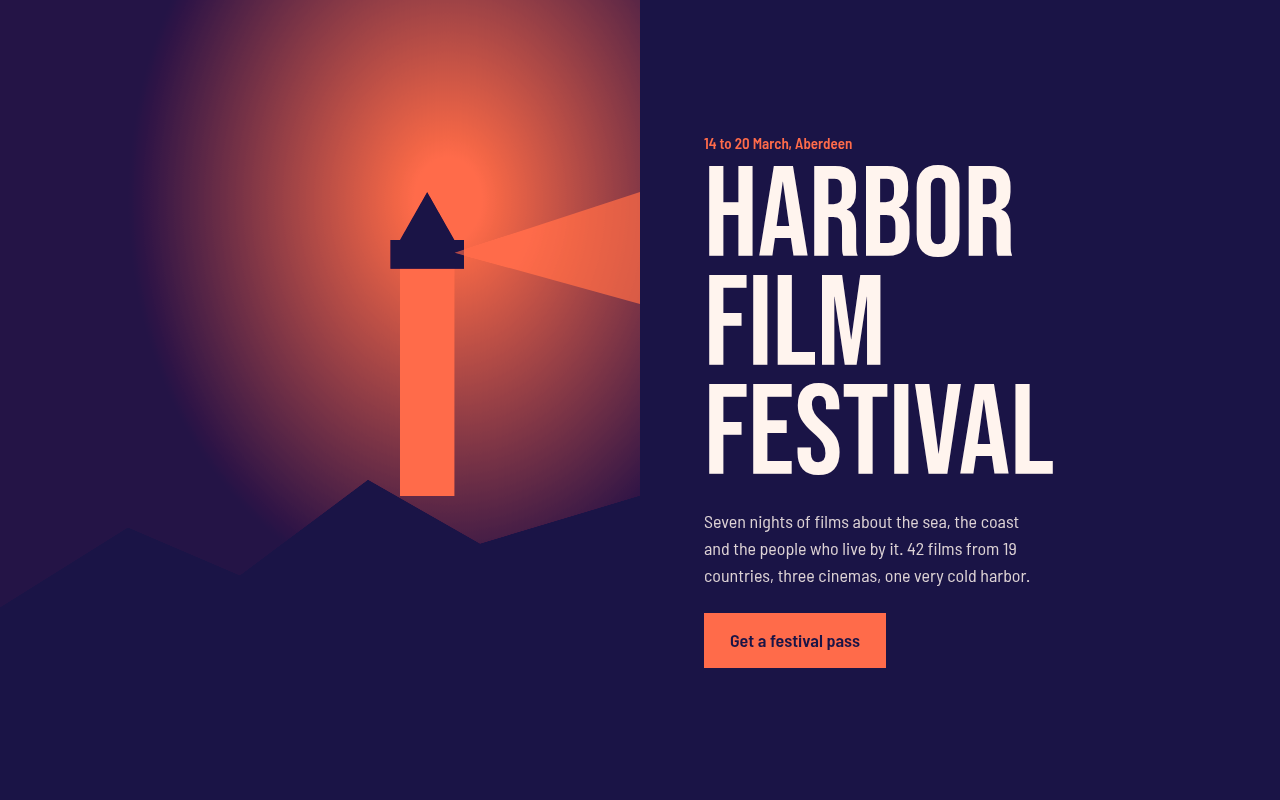
042. Duotone
Harbor Film Festival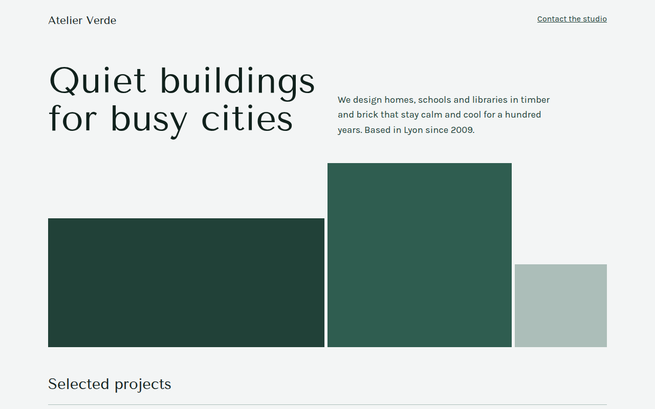
043. Monochrome
Atelier Verde, an architecture studio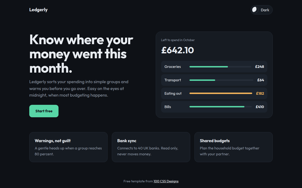
044. Dark Mode First
Ledgerly, a budget app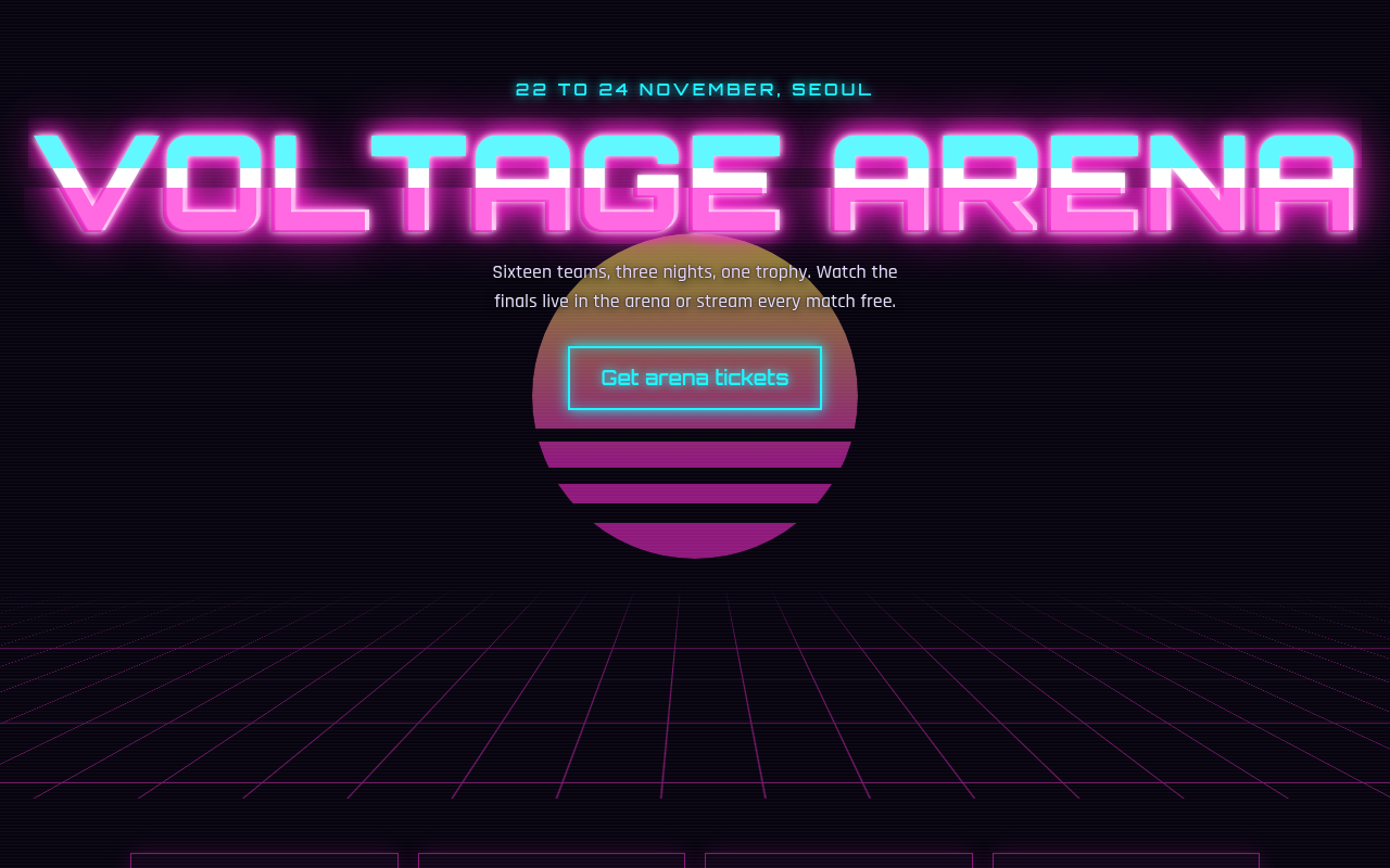
045. Neon Cyberpunk
Voltage Arena, an esports tournament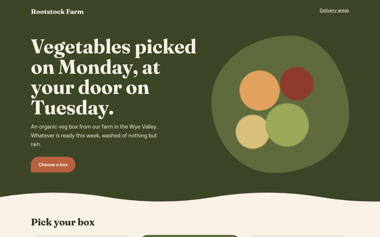
046. Earthy Natural
Rootstock Farm, an organic veg box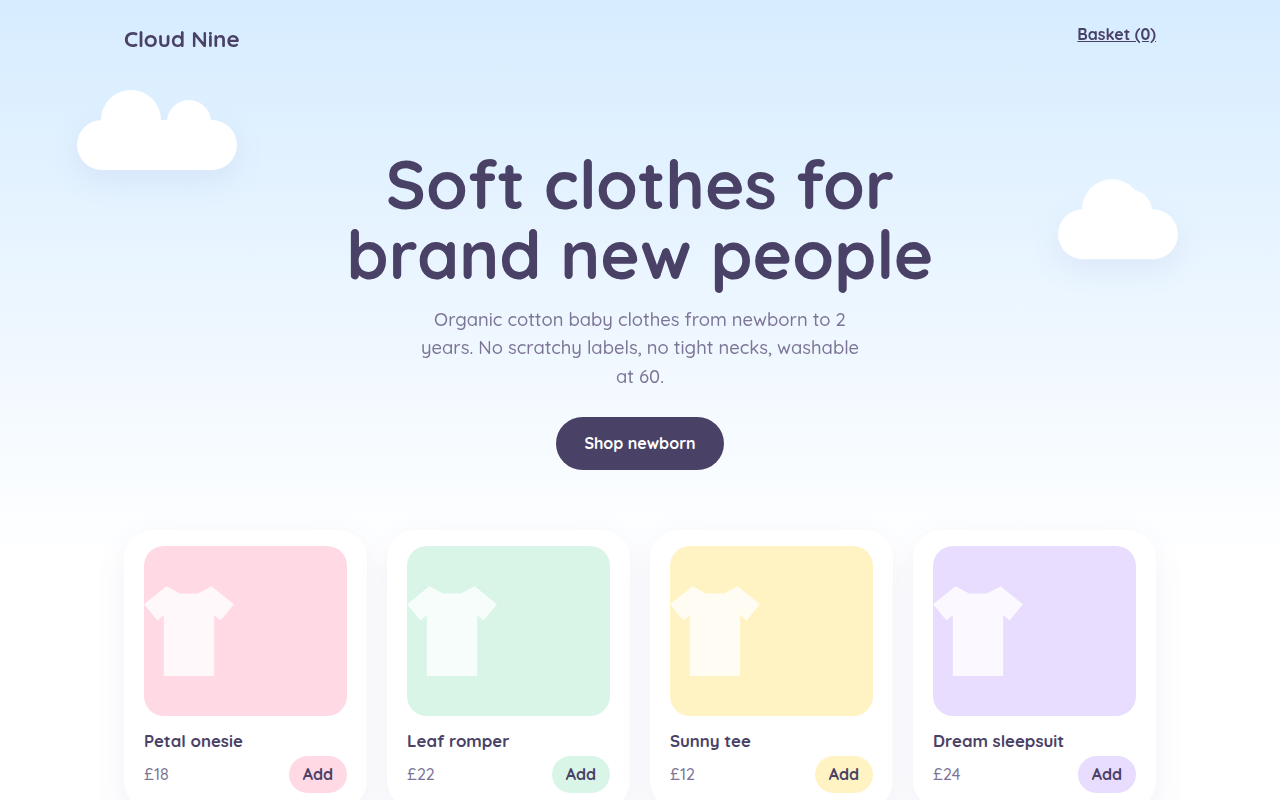
047. Pastel Dream
Cloud Nine, a baby clothing shop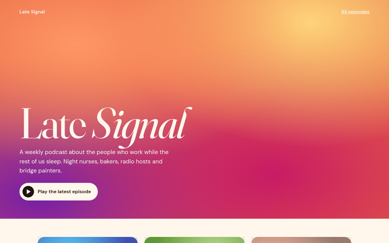
049. Grainy Gradient
Late Signal, a podcast