Home / Trends Over Time
Trends Over Time in HTML and JavaScript
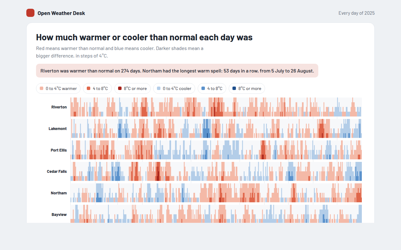
These charts show how numbers change over days, months and years. Start with a simple line chart, add more lines to compare, fill the area to show volume, or use a candlestick chart for prices. Every chart has a crosshair you can move with your mouse or the arrow keys, and every one is a single HTML file with no library.
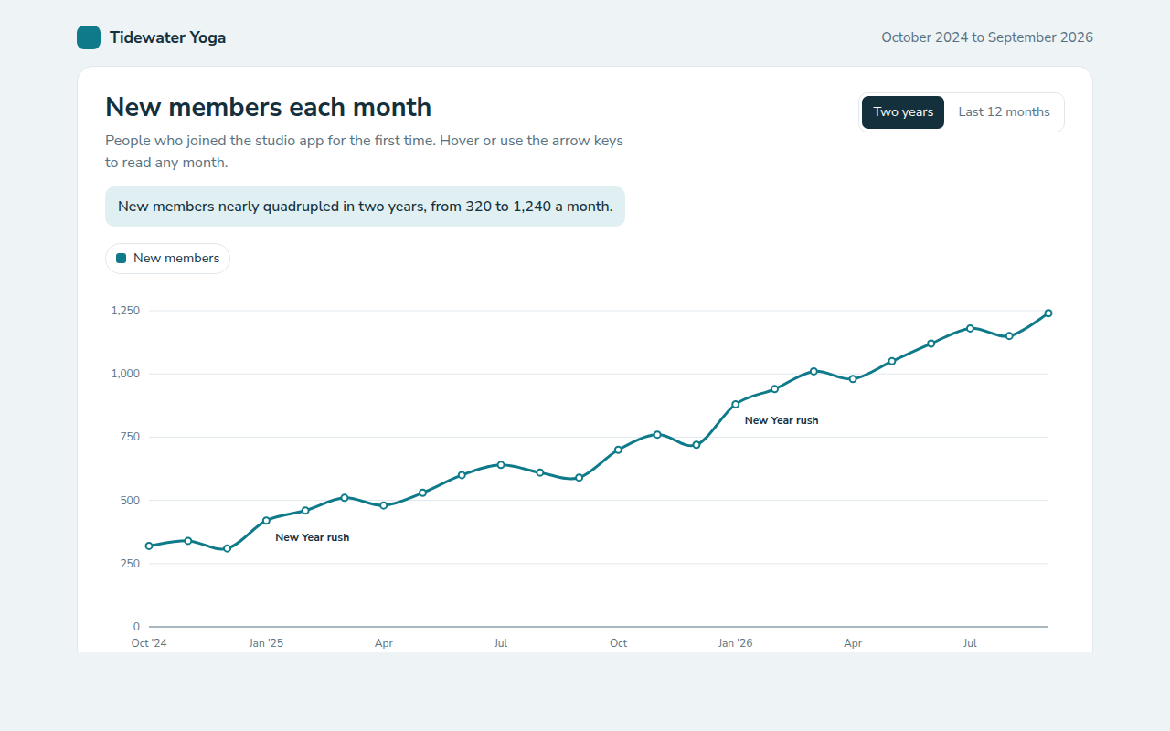
011. Line Chart
Example: new members each month for a yoga studio app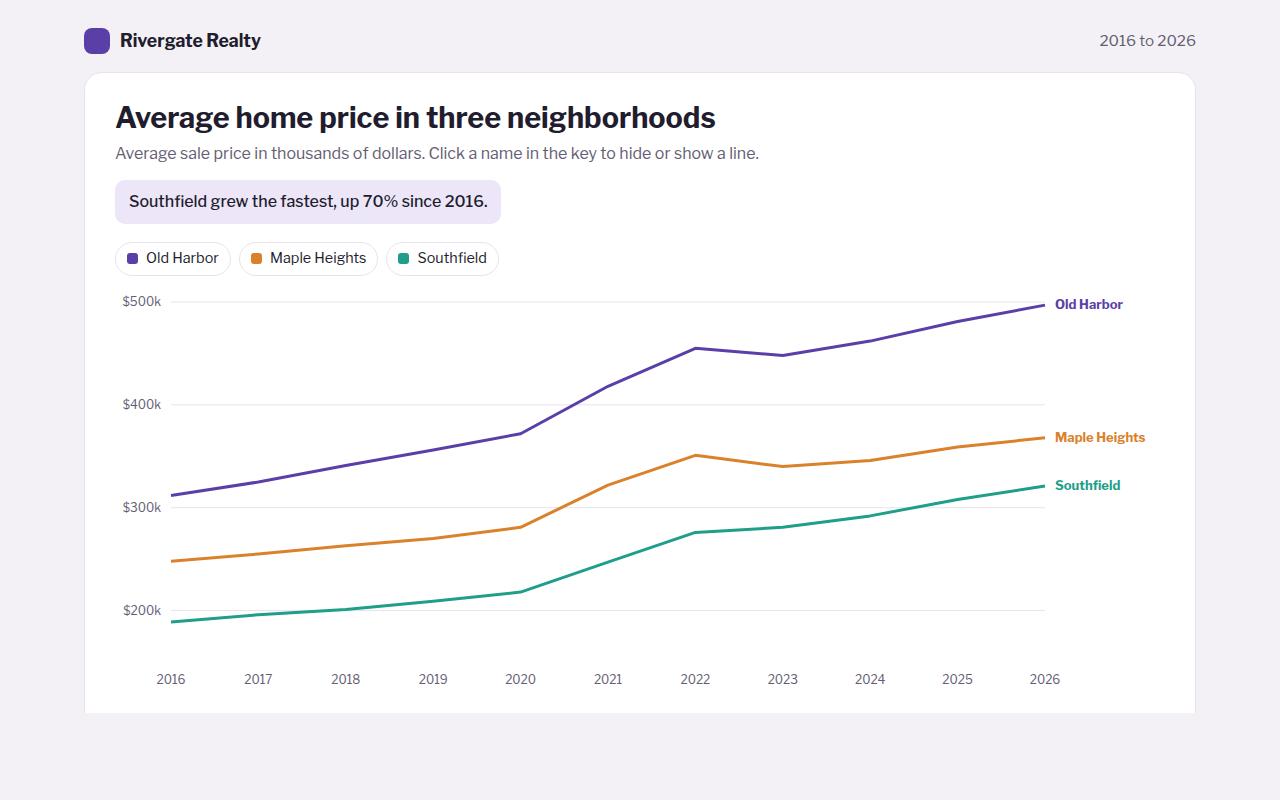
012. Multi Line Chart
Example: average home prices in three neighborhoods over ten years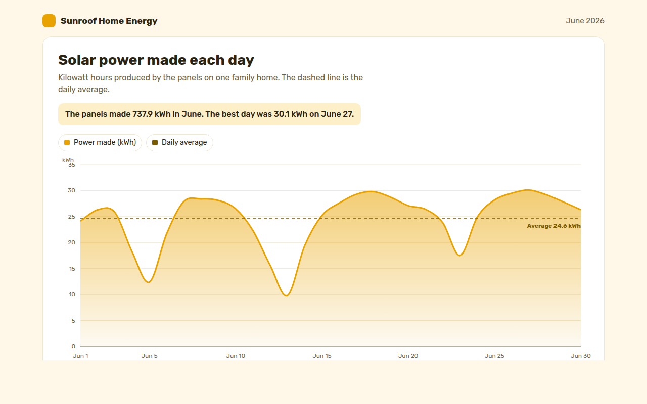
013. Area Chart
Example: solar power made each day by a family home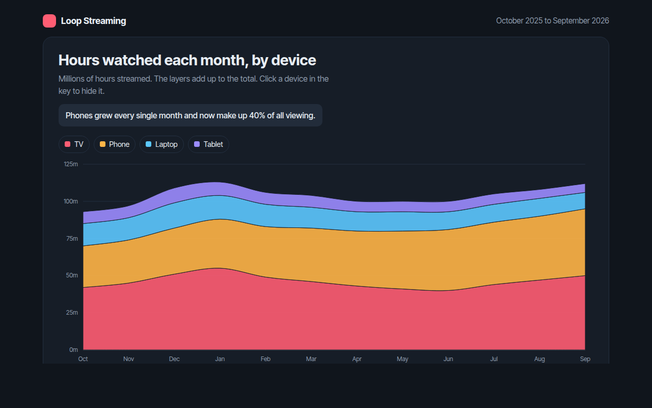
014. Stacked Area Chart
Example: hours watched each month on a streaming app, by device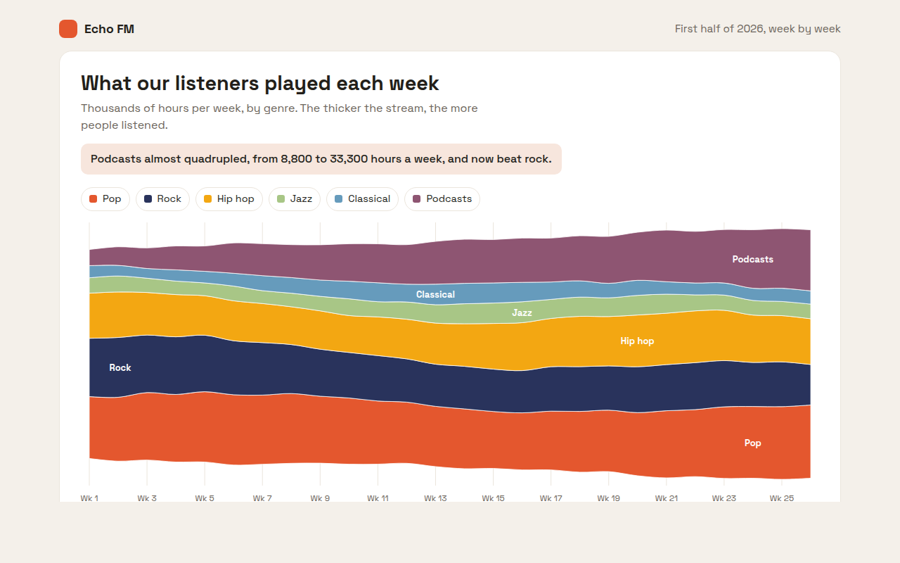
015. Streamgraph
Example: weekly listening hours by genre on a radio app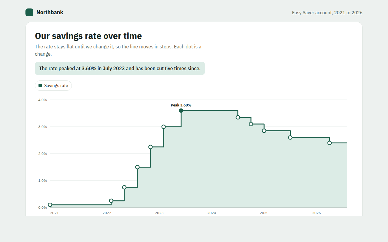
016. Step Line Chart
Example: the interest rate on a savings account from 2021 to 2026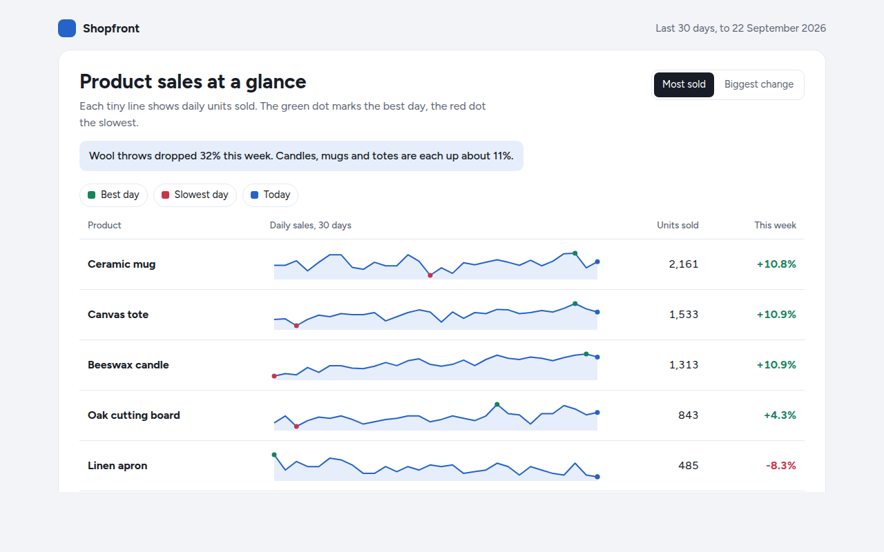
017. Sparkline
Example: daily sales for six products in a shop dashboard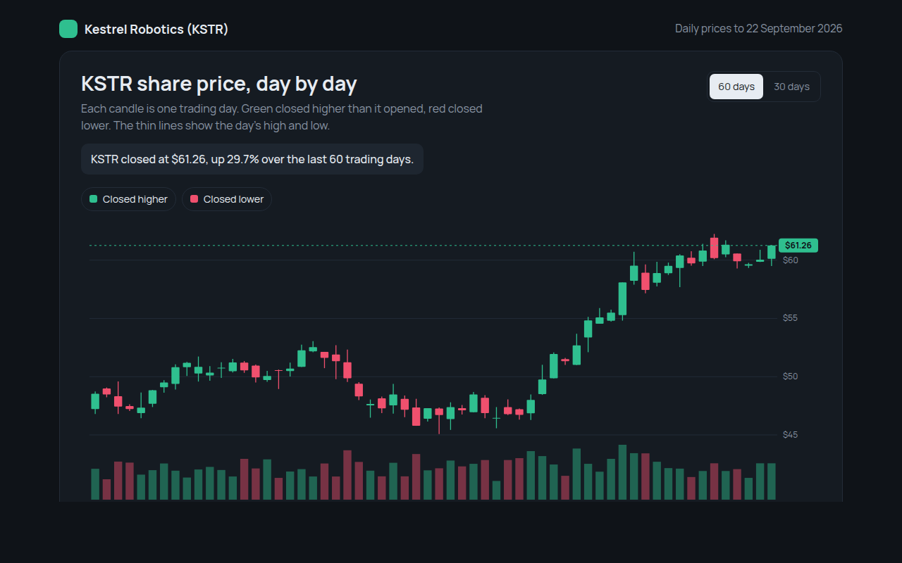
018. Candlestick Chart
Example: daily share prices and volume for a made up robotics company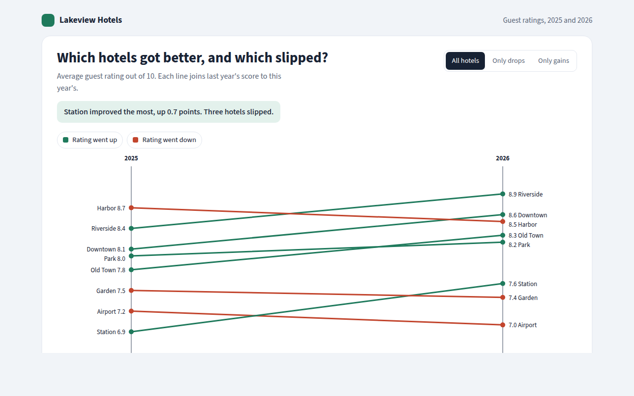
019. Slope Chart
Example: guest ratings for eight hotels in 2025 and 2026