Home / Trends Over Time / Multi Line Chart
Multi Line Chart in HTML, CSS and JavaScript
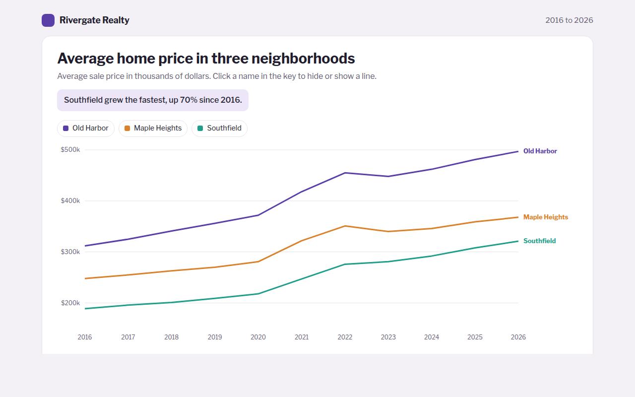
A multi line chart shows two or more lines on the same axes so you can compare how several things changed over the same time. This free template draws one with plain SVG and vanilla JavaScript, no chart library. The example shows average home prices in three neighborhoods over ten years.
What is a multi line chart?
A multi line chart shows two or more lines on the same axes so you can compare how several things changed over the same time. Each line has its own color.
It answers questions like: which neighborhood grew faster, and did they all dip in the same year? Putting the name at the end of each line saves the reader from looking back and forth at a key.
At a glance
- Best for
- Comparing 2 to 5 trends over the same time
- Data you need
- A date and one number per series for each point
- Skip it when
- More than 5 lines. It turns into spaghetti.
- Made with
- HTML, CSS and vanilla JavaScript. No library.
When to use a multi line chart
- Prices in several areas or stores
- Your product against competitors
- This year, last year and the year before by month
- Traffic from several channels over time
When to pick another chart
- Line Chart: you only track one thing
- Stacked Area Chart: the lines add up to a total you care about
- Slope Chart: you only have a start and an end value
What you get in this template
- Three lines with names written right at the end of each line
- A crosshair that lists every value for the chosen year, biggest first
- Click a name in the key to hide or show a line
- The axis zooms to fit only the lines that are showing
- On phones the end labels move into the key
- Arrow key support and a full data table
How the code works
Here is a short version of the idea behind this multi line chart. The full file adds the axis, labels, tooltips, sorting and resizing on top of it.
const years = [2016, 2018, 2020, 2022, 2024, 2026];
const series = [
  { name: 'Old Harbor', color: '#5b3fa8', values: [312, 341, 372, 455, 462, 497] },
  { name: 'Southfield', color: '#1f9e89', values: [189, 201, 218, 276, 292, 321] }
];
const x = i => 50 + i * 90, y = v => 280 - (v - 150) / 350 * 260;

series.forEach(s => {
  const d = s.values.map((v, i) => (i ? 'L' : 'M') + x(i) + ',' + y(v)).join('');
  make('path', { d, fill: 'none', stroke: s.color, 'stroke-width': 3 });
  const last = s.values.length - 1;
  drawText(x(last) + 10, y(s.values[last]) + 4, s.name);
});
The example uses four tiny helpers that create SVG shapes. Put them above the code and it runs as is.
const svg = document.querySelector('svg');
function make(tag, attrs) {
  const n = document.createElementNS('http://www.w3.org/2000/svg', tag);
  for (const k in attrs) n.setAttribute(k, attrs[k]);
  svg.appendChild(n);
  return n;
}
function drawRect(x, y, width, height, fill) { return make('rect', { x, y, width, height, fill }); }
function drawCircle(cx, cy, r, fill) { return make('circle', { cx, cy, r, fill }); }
function drawLine(x1, y1, x2, y2, stroke, width, dash) {
  return make('line', { x1, y1, x2, y2, stroke, 'stroke-width': width || 1, 'stroke-dasharray': dash || 'none' });
}
function drawText(x, y, str, anchor) {
  const t = make('text', { x, y, 'text-anchor': anchor || 'start' });
  t.textContent = str;
  return t;
}
How to add it to your website
- Download the file. Click Download HTML file above. You get one file called multi-line-chart.html with everything inside.
- Change the data. Open the file in any code editor and find the DATA list near the bottom. Replace the names and numbers with your own.
- Change the colors and text. Colors are at the top of the style tag. The title, subtitle and main point are plain HTML near the top of the body.
- Put it online. Upload the file to any host, such as GitHub Pages, Netlify or your own server, or paste it into your site. There is no build step.
Questions people ask
How many lines can a line chart have?
Up to about five. With more, the lines cross so often that nobody can follow them. Highlight one line and gray out the rest, or make small separate charts.
Should I use a legend or label the lines directly?
Label them directly when you can, by writing the name at the end of each line. It is faster to read. Keep a legend as well for hiding lines and for small screens.
Can a multi line chart start above zero?
Yes. Line charts show change, so it is fine to zoom in on the range where the data lives, as long as the axis labels make the start value clear.
What is the difference between a multi line chart and a stacked area chart?
A multi line chart shows each series on its own. A stacked area chart piles them up so you also see the total. Use lines when the series do not add up to anything.
More trends over time
011. Line Chart
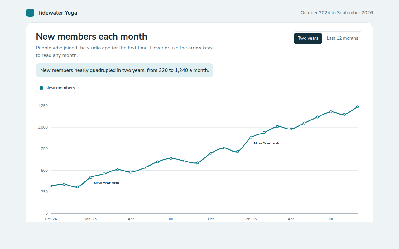
Example: new members each month for a yoga studio app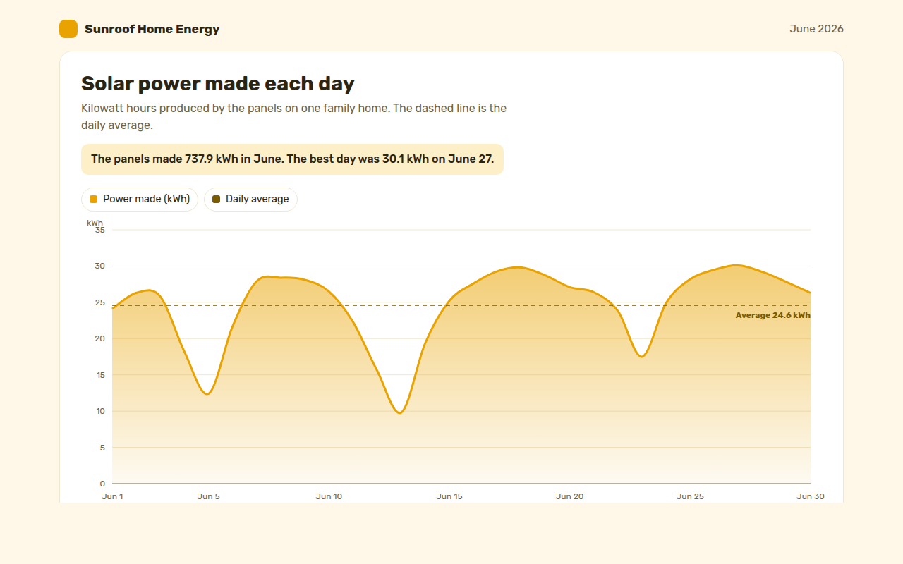
013. Area Chart
Example: solar power made each day by a family home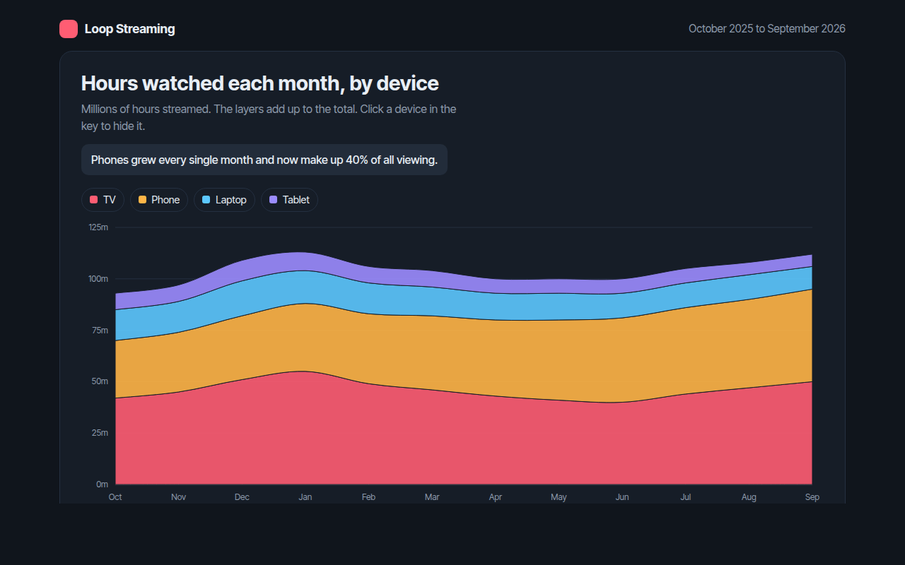
014. Stacked Area Chart
Example: hours watched each month on a streaming app, by device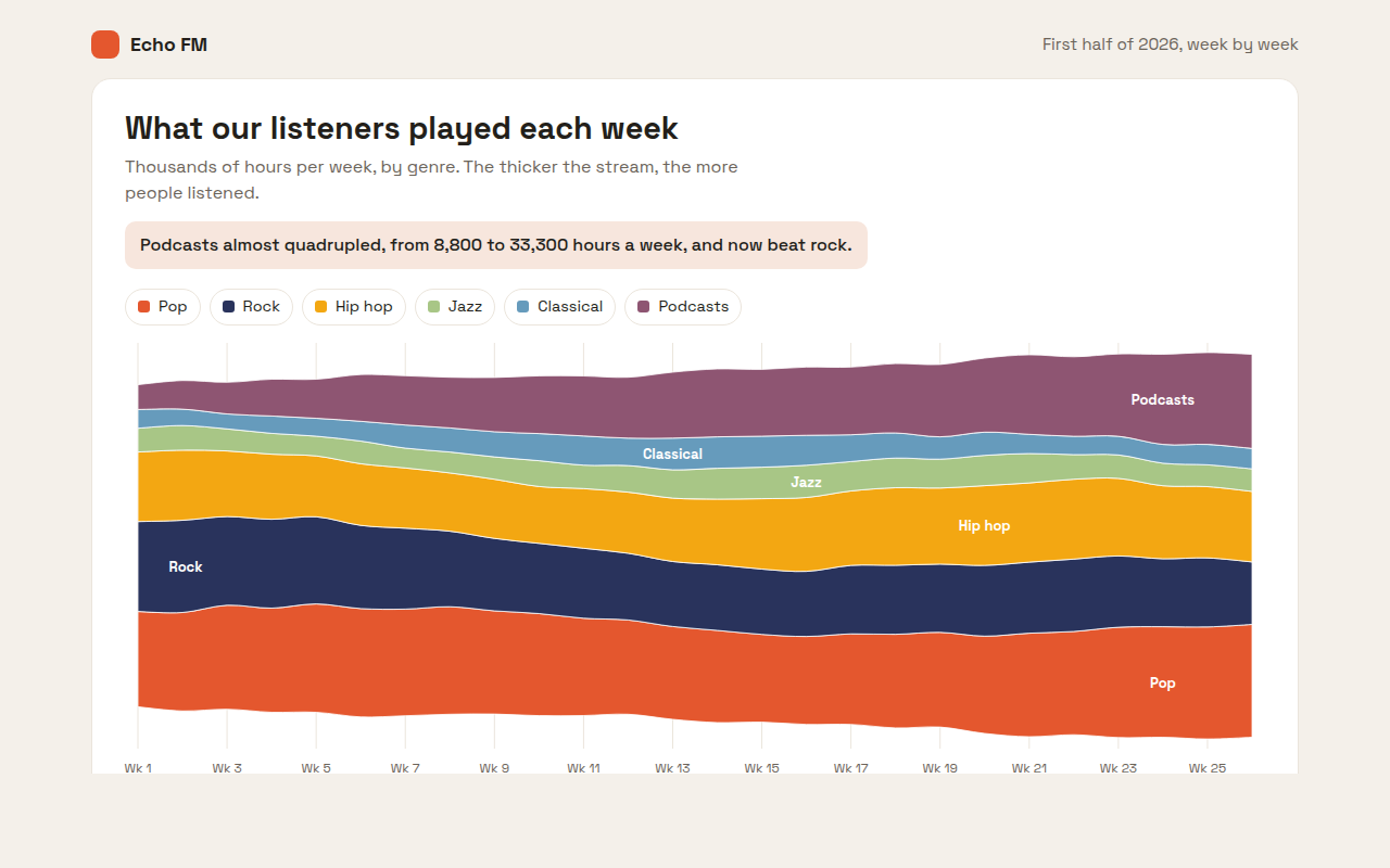
015. Streamgraph
Example: weekly listening hours by genre on a radio app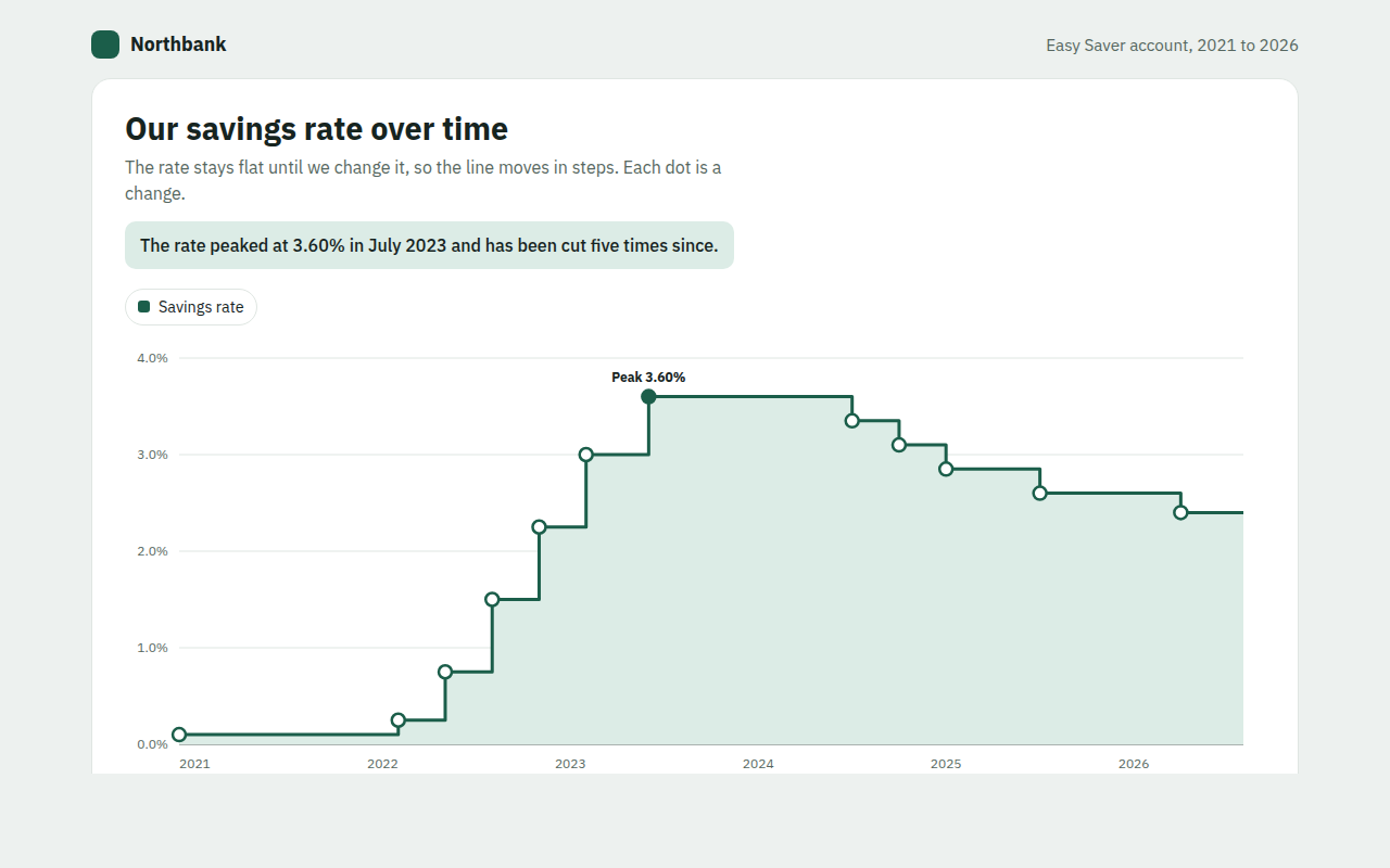
016. Step Line Chart
Example: the interest rate on a savings account from 2021 to 2026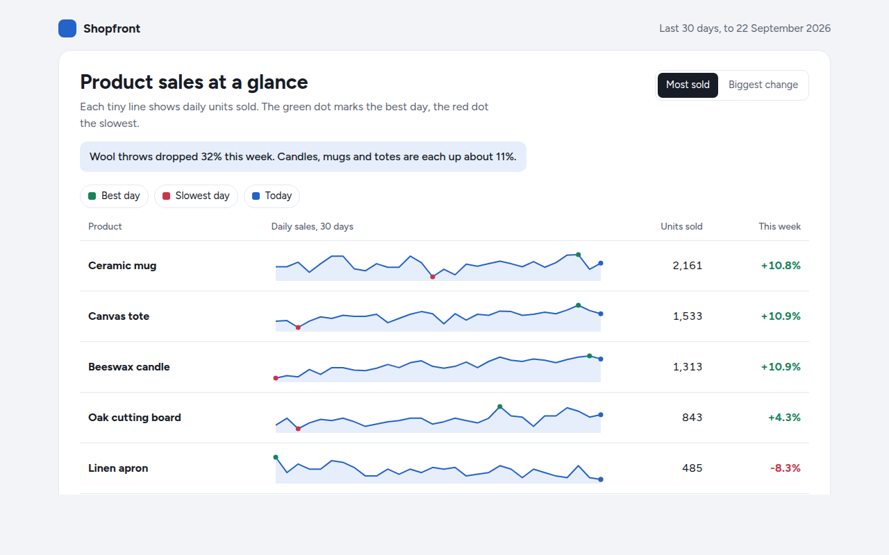
017. Sparkline
Example: daily sales for six products in a shop dashboard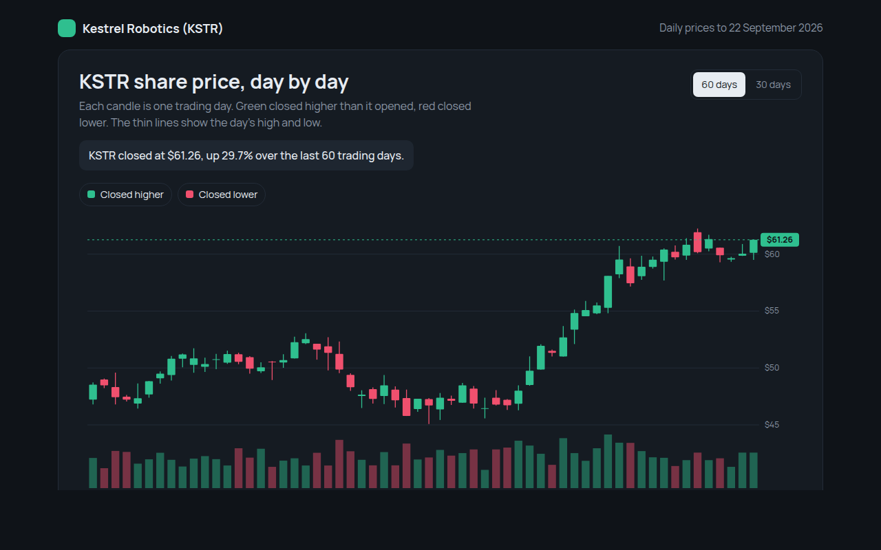
018. Candlestick Chart
Example: daily share prices and volume for a made up robotics company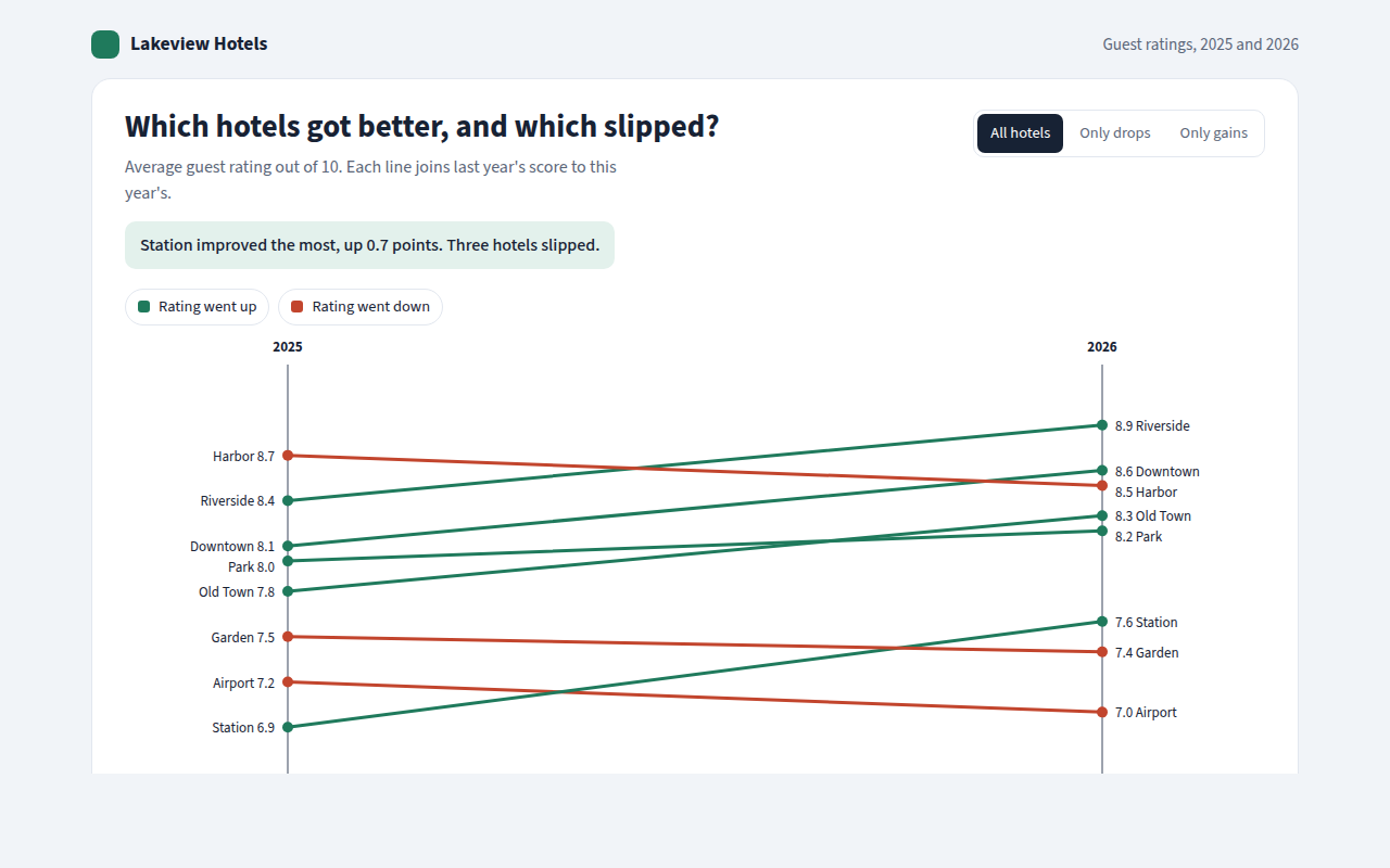
019. Slope Chart
Example: guest ratings for eight hotels in 2025 and 2026