Home / Trends Over Time / Sparkline
Sparkline in HTML, CSS and JavaScript
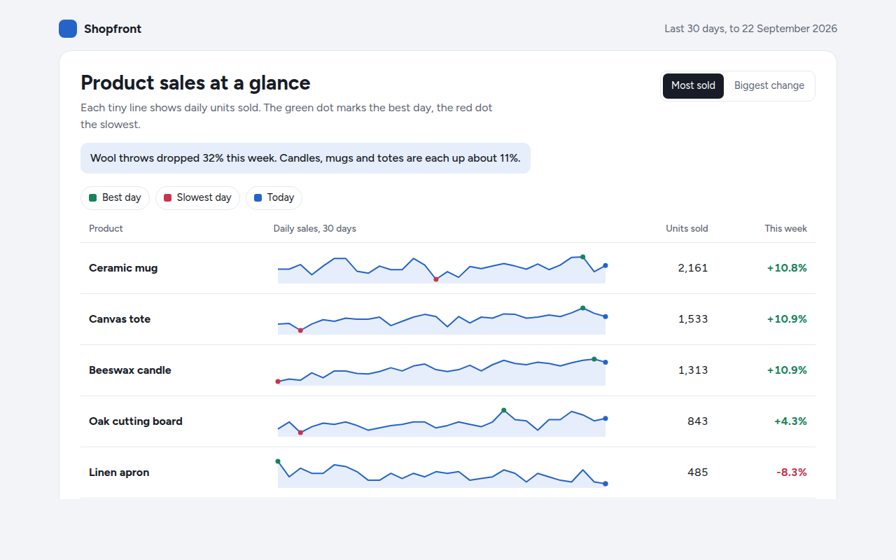
A sparkline is a tiny line chart without axes, small enough to sit inside a table row or next to a number. This free template draws one with plain SVG and vanilla JavaScript, no chart library. The example shows daily sales for six products in a shop dashboard.
What is a sparkline?
A sparkline is a tiny line chart without axes, small enough to sit inside a table row or next to a number. It shows the shape of a trend in a word sized space.
Sparklines were named by Edward Tufte, who called them data words. They are perfect for dashboards, where you want to see at a glance which products are rising and which are falling without opening a full chart.
At a glance
- Best for
- Many small trends side by side in a table
- Data you need
- A short list of numbers for each row
- Skip it when
- When people need exact values from the chart itself.
- Made with
- HTML, CSS and vanilla JavaScript. No library.
When to use a sparkline
- Product or page lists in dashboards
- Stock or crypto watch lists
- KPI cards showing the last 30 days
- Email reports where space is tight
When to pick another chart
- Line Chart: one trend deserves a full size chart
- Horizon Chart: you have many long series and need to compare them closely
What you get in this template
- Six sparklines inside a normal HTML table
- A green dot for the best day, red for the slowest and blue for today
- Hover any sparkline to read the value for that day
- This week against last week, in green or red
- Sort by most sold or by biggest change
- Every sparkline redraws to fit its cell on any screen
How the code works
Here is a short version of the idea behind this sparkline. The full file adds the axis, labels, tooltips, sorting and resizing on top of it.
const sales = [42, 45, 39, 51, 48, 55, 60, 52, 58, 63];
const w = 160, h = 40;
const lo = Math.min(...sales), hi = Math.max(...sales);
const x = i => 4 + i * (w - 8) / (sales.length - 1);
const y = v => h - 4 - (v - lo) / (hi - lo) * (h - 8);

make('path', { d: sales.map((v, i) => (i ? 'L' : 'M') + x(i) + ',' + y(v)).join(''), fill: 'none', stroke: '#2563c9', 'stroke-width': 2 });
drawCircle(x(sales.indexOf(hi)), y(hi), 3, '#16835a');
drawCircle(x(sales.indexOf(lo)), y(lo), 3, '#c8354b');
The example uses four tiny helpers that create SVG shapes. Put them above the code and it runs as is.
const svg = document.querySelector('svg');
function make(tag, attrs) {
  const n = document.createElementNS('http://www.w3.org/2000/svg', tag);
  for (const k in attrs) n.setAttribute(k, attrs[k]);
  svg.appendChild(n);
  return n;
}
function drawRect(x, y, width, height, fill) { return make('rect', { x, y, width, height, fill }); }
function drawCircle(cx, cy, r, fill) { return make('circle', { cx, cy, r, fill }); }
function drawLine(x1, y1, x2, y2, stroke, width, dash) {
  return make('line', { x1, y1, x2, y2, stroke, 'stroke-width': width || 1, 'stroke-dasharray': dash || 'none' });
}
function drawText(x, y, str, anchor) {
  const t = make('text', { x, y, 'text-anchor': anchor || 'start' });
  t.textContent = str;
  return t;
}
How to add it to your website
- Download the file. Click Download HTML file above. You get one file called sparkline.html with everything inside.
- Change the data. Open the file in any code editor and find the DATA list near the bottom. Replace the names and numbers with your own.
- Change the colors and text. Colors are at the top of the style tag. The title, subtitle and main point are plain HTML near the top of the body.
- Put it online. Upload the file to any host, such as GitHub Pages, Netlify or your own server, or paste it into your site. There is no build step.
Questions people ask
What is a sparkline?
A sparkline is a very small line chart with no axes or labels, usually placed in a table or next to a number, that shows the shape of a recent trend.
Who invented sparklines?
Edward Tufte, a well known writer on data design, named them and made them popular in his 2006 book Beautiful Evidence.
Should a sparkline start at zero?
Usually not. A sparkline is about the shape of the trend, so it stretches to fill its space from the lowest to the highest value. Show the actual numbers next to it.
How do I add sparklines to an HTML table?
Put an empty SVG in each table cell, then draw a short path in each one with JavaScript, sized to the width of the cell. This template does exactly that and redraws when the screen size changes.
More trends over time
011. Line Chart
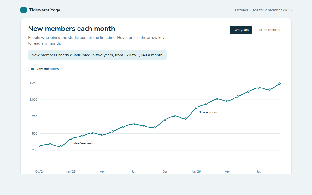
Example: new members each month for a yoga studio app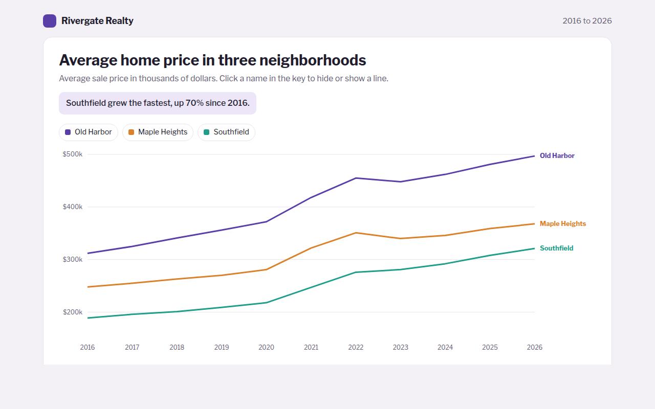
012. Multi Line Chart
Example: average home prices in three neighborhoods over ten years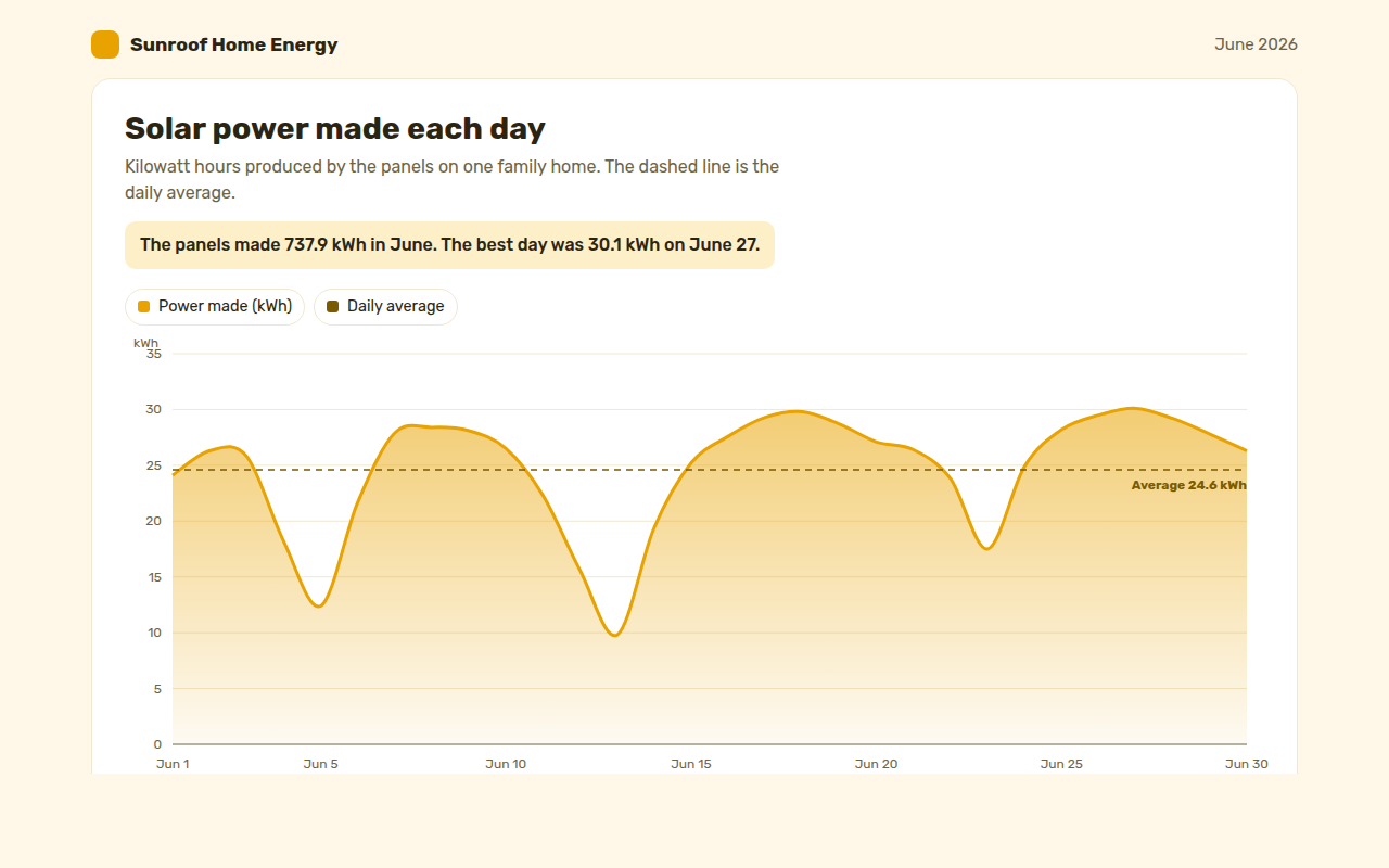
013. Area Chart
Example: solar power made each day by a family home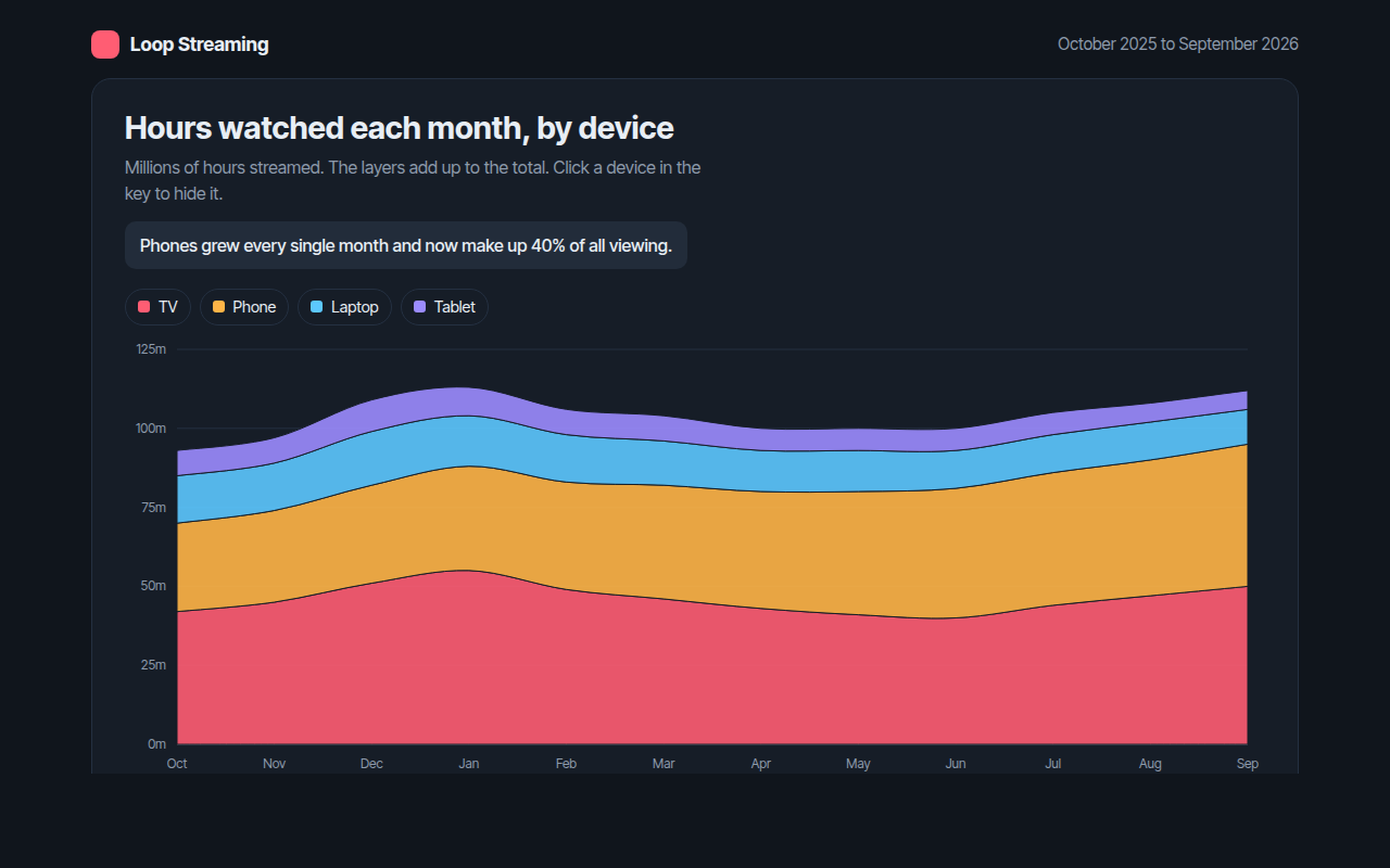
014. Stacked Area Chart
Example: hours watched each month on a streaming app, by device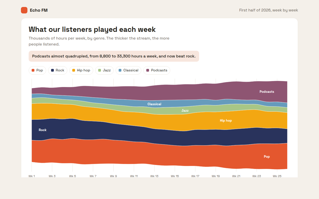
015. Streamgraph
Example: weekly listening hours by genre on a radio app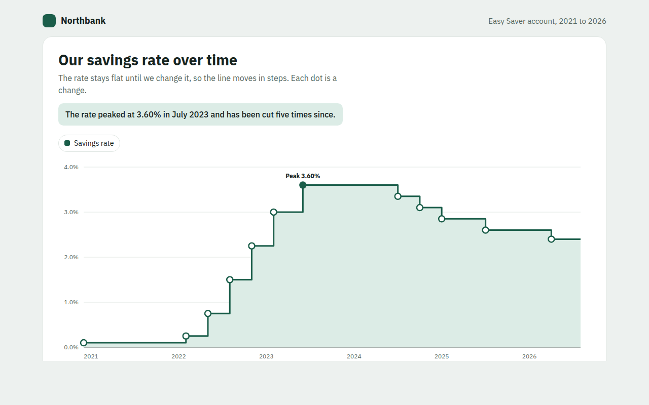
016. Step Line Chart
Example: the interest rate on a savings account from 2021 to 2026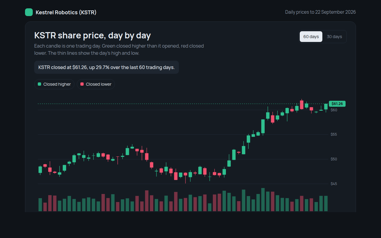
018. Candlestick Chart
Example: daily share prices and volume for a made up robotics company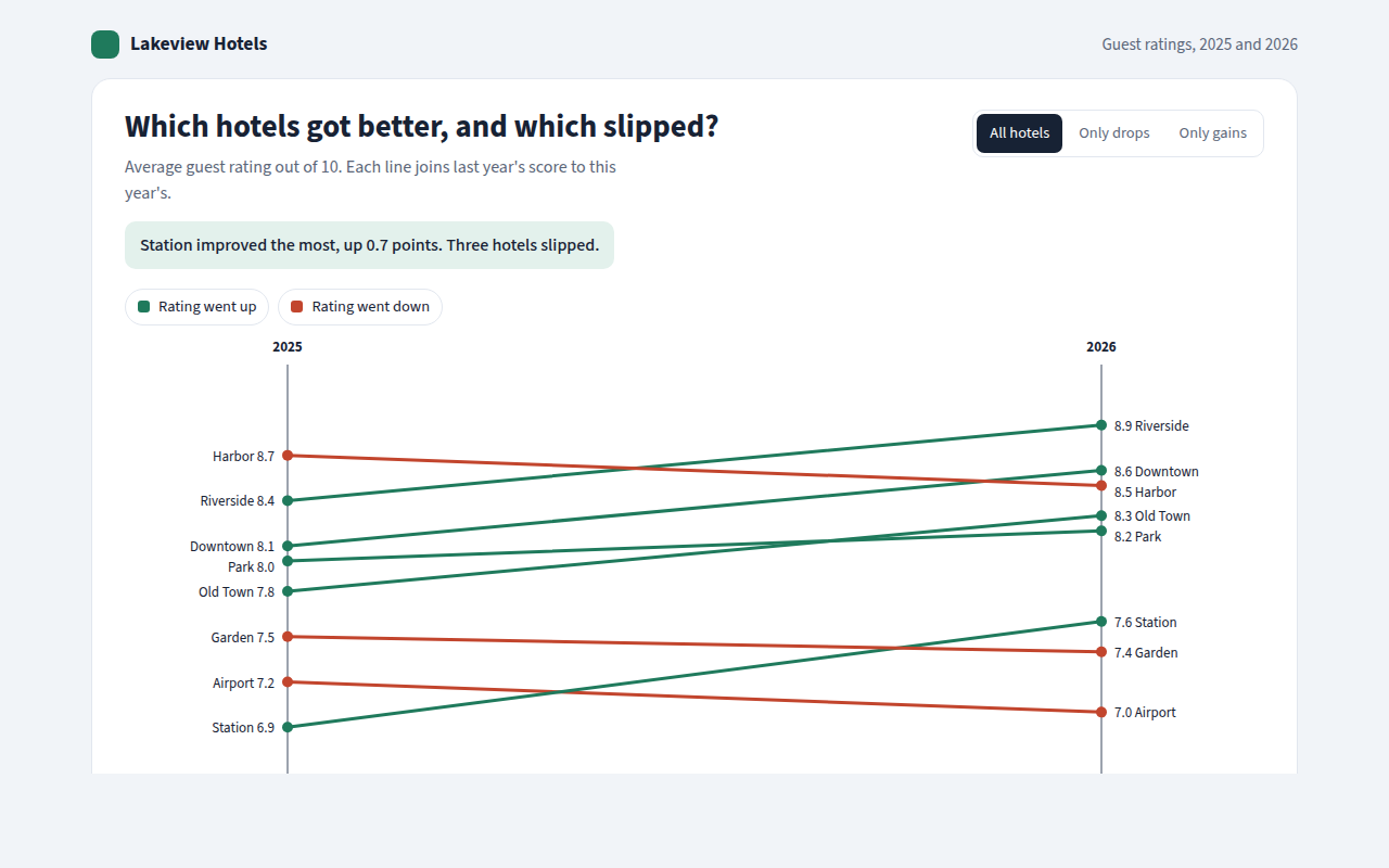
019. Slope Chart
Example: guest ratings for eight hotels in 2025 and 2026