Home / Trends Over Time / Step Line Chart
Step Line Chart in HTML, CSS and JavaScript
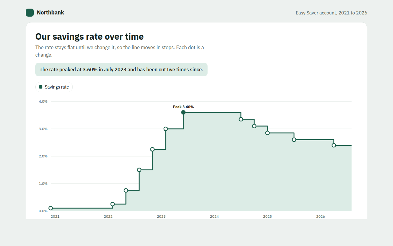
A step line chart shows a value that stays flat and then jumps to a new level, like a price, a rate or a plan limit. This free template draws one with plain SVG and vanilla JavaScript, no chart library. The example shows the interest rate on a savings account from 2021 to 2026.
What is a step line chart?
A step line chart shows a value that stays flat and then jumps to a new level, like a price, a rate or a plan limit. Instead of a sloped line between points, it draws a flat line and then a straight jump.
A normal line chart would suggest the rate slowly slid from one level to the next, which never happened. The steps show the truth: the rate stayed the same until the day it changed.
At a glance
- Best for
- Values that change in jumps and hold between them
- Data you need
- The date of each change and the new value
- Skip it when
- Values measured all the time, like temperature.
- Made with
- HTML, CSS and vanilla JavaScript. No library.
When to use a step line chart
- Interest rates and savings rates
- Prices and subscription fees
- Stock levels and plan limits
- Tax bands and minimum wage history
When to pick another chart
- Line Chart: the value really changes smoothly between points
- Candlestick Chart: you track a price that moves all day
What you get in this template
- Flat lines and clean jumps drawn with SVG H and V commands
- A dot at every change you can hover or reach with Tab
- Tooltips that say raised or cut, from what to what
- The peak is marked on the chart
- A soft fill under the line to show the level
- Keyboard support and a table of every change
How the code works
Here is a short version of the idea behind this step line chart. The full file adds the axis, labels, tooltips, sorting and resizing on top of it.
const changes = [[2021, 0.10], [2022.2, 0.75], [2023, 3.00], [2023.5, 3.60], [2025, 2.85]];
const end = 2026.7;
const x = t => 40 + (t - 2021) / (end - 2021) * 540, y = r => 280 - r / 4 * 260;

let d = 'M' + x(changes[0][0]) + ',' + y(changes[0][1]);
changes.slice(1).forEach(([t, rate]) => { d += 'H' + x(t) + 'V' + y(rate); });
d += 'H' + x(end);
make('path', { d, fill: 'none', stroke: '#1b5e4a', 'stroke-width': 3 });
changes.forEach(([t, rate]) => drawCircle(x(t), y(rate), 5, '#1b5e4a'));
The example uses four tiny helpers that create SVG shapes. Put them above the code and it runs as is.
const svg = document.querySelector('svg');
function make(tag, attrs) {
  const n = document.createElementNS('http://www.w3.org/2000/svg', tag);
  for (const k in attrs) n.setAttribute(k, attrs[k]);
  svg.appendChild(n);
  return n;
}
function drawRect(x, y, width, height, fill) { return make('rect', { x, y, width, height, fill }); }
function drawCircle(cx, cy, r, fill) { return make('circle', { cx, cy, r, fill }); }
function drawLine(x1, y1, x2, y2, stroke, width, dash) {
  return make('line', { x1, y1, x2, y2, stroke, 'stroke-width': width || 1, 'stroke-dasharray': dash || 'none' });
}
function drawText(x, y, str, anchor) {
  const t = make('text', { x, y, 'text-anchor': anchor || 'start' });
  t.textContent = str;
  return t;
}
How to add it to your website
- Download the file. Click Download HTML file above. You get one file called step-line-chart.html with everything inside.
- Change the data. Open the file in any code editor and find the DATA list near the bottom. Replace the names and numbers with your own.
- Change the colors and text. Colors are at the top of the style tag. The title, subtitle and main point are plain HTML near the top of the body.
- Put it online. Upload the file to any host, such as GitHub Pages, Netlify or your own server, or paste it into your site. There is no build step.
Questions people ask
What is a step line chart?
It is a line chart that moves in flat steps and sudden jumps, instead of slopes. It is used for values that stay the same until they change, like rates and prices.
When should I use a step chart instead of a line chart?
Use a step chart when the value holds steady between changes. A normal line would draw a slope that suggests gradual change, which is misleading for rates, prices or limits.
How do I draw steps in SVG?
Use the H command to draw flat to the next change date, then V to jump up or down to the new value. Repeat for each change and finish with H to the end date.
Should the step happen before or after the date?
In most cases the new value starts on the change date, so draw flat until that date and then jump. This template works that way.
More trends over time
011. Line Chart
Example: new members each month for a yoga studio app
012. Multi Line Chart
Example: average home prices in three neighborhoods over ten years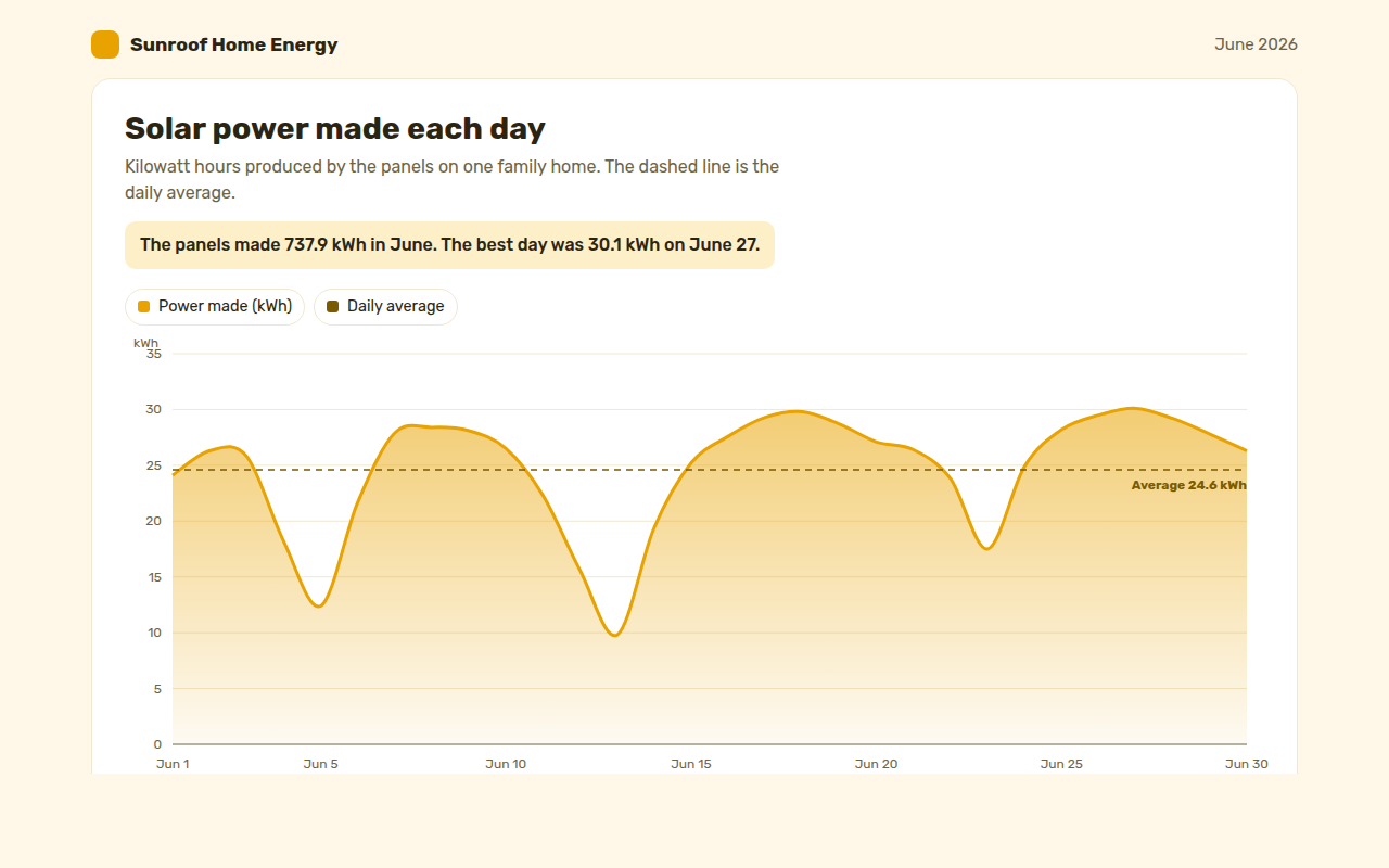
013. Area Chart
Example: solar power made each day by a family home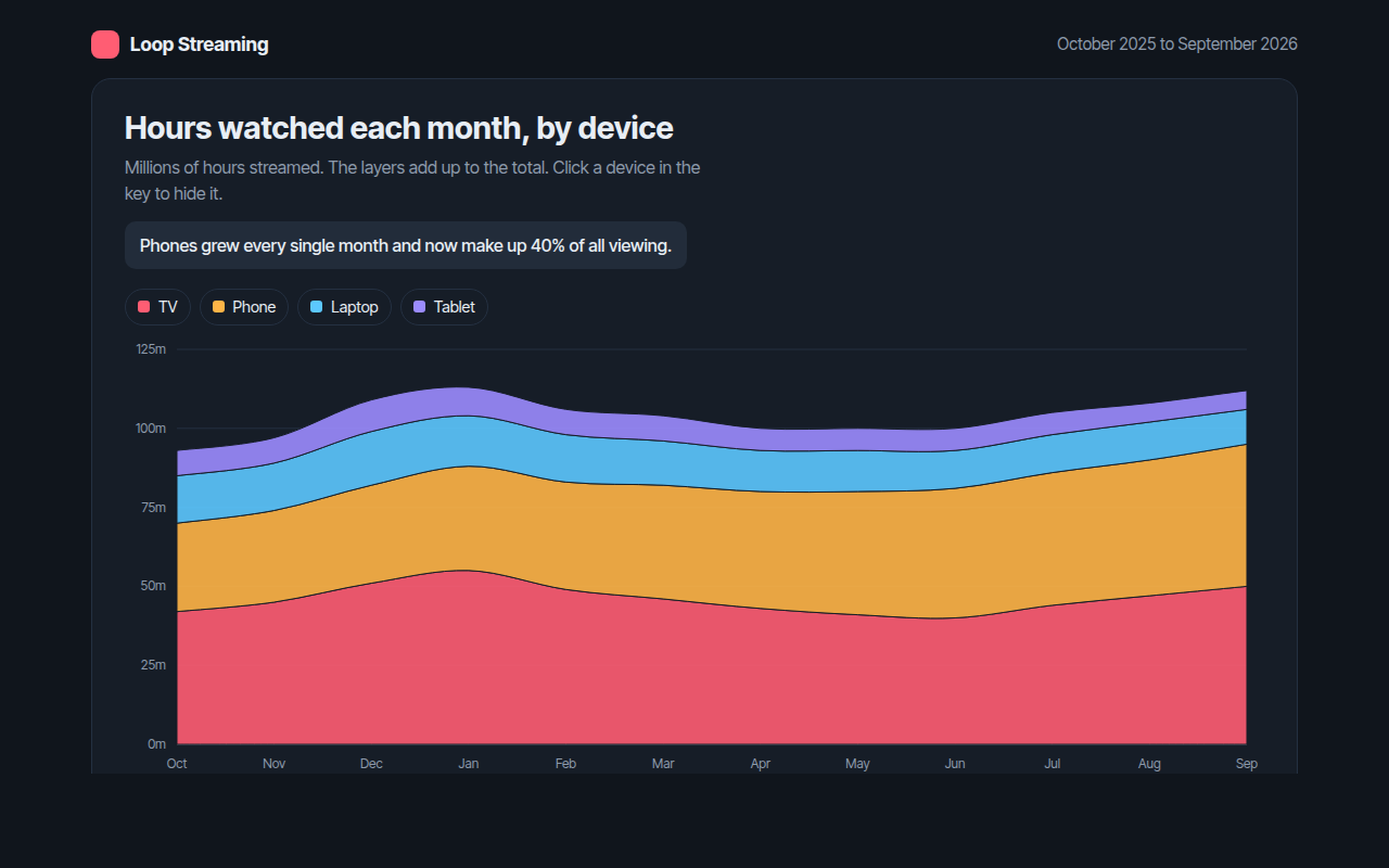
014. Stacked Area Chart
Example: hours watched each month on a streaming app, by device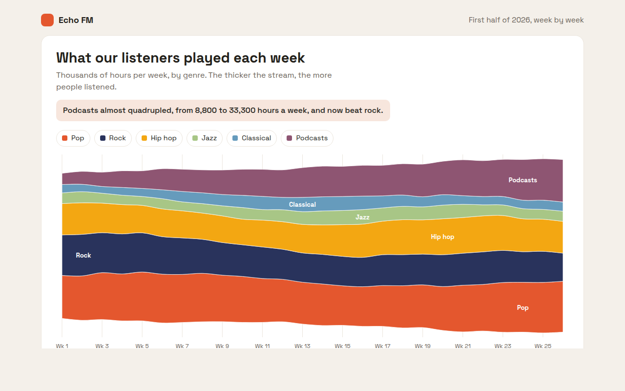
015. Streamgraph
Example: weekly listening hours by genre on a radio app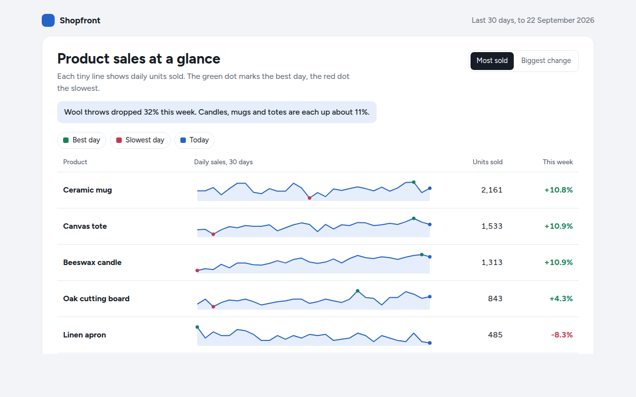
017. Sparkline
Example: daily sales for six products in a shop dashboard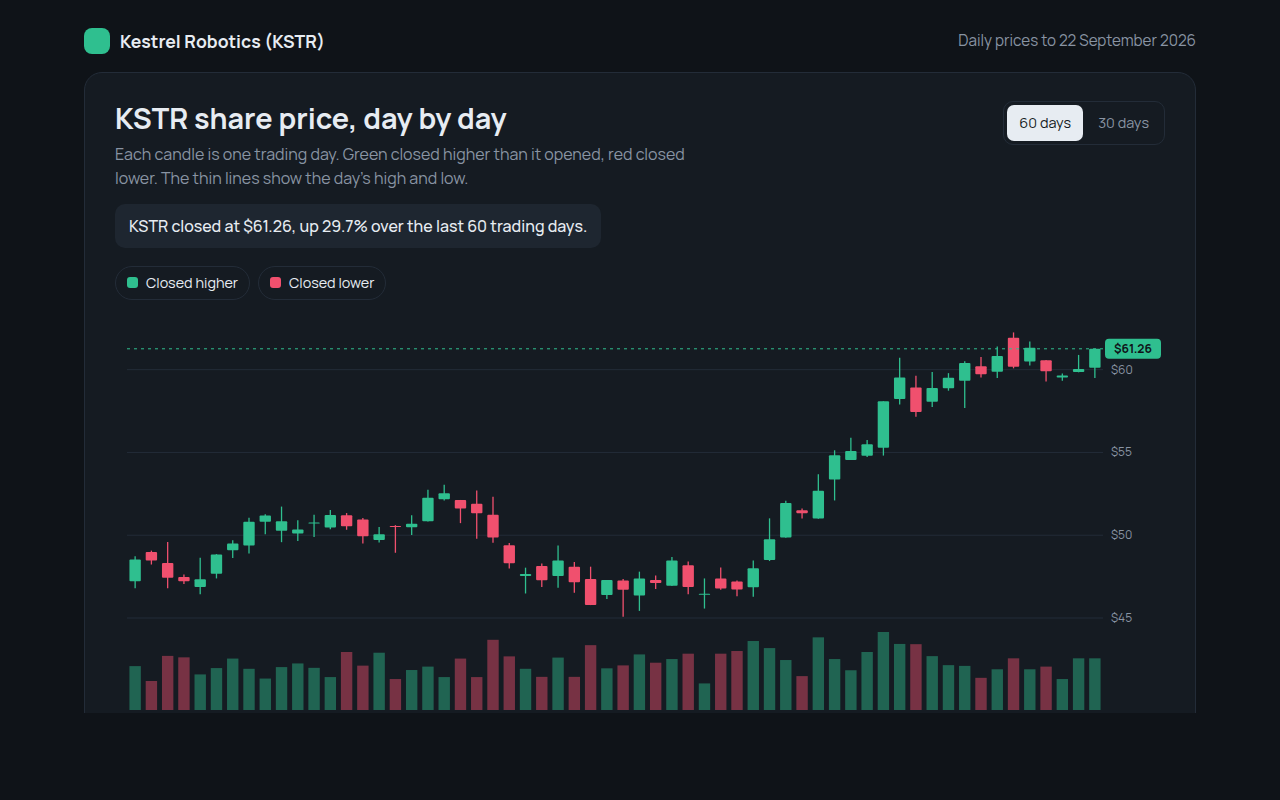
018. Candlestick Chart
Example: daily share prices and volume for a made up robotics company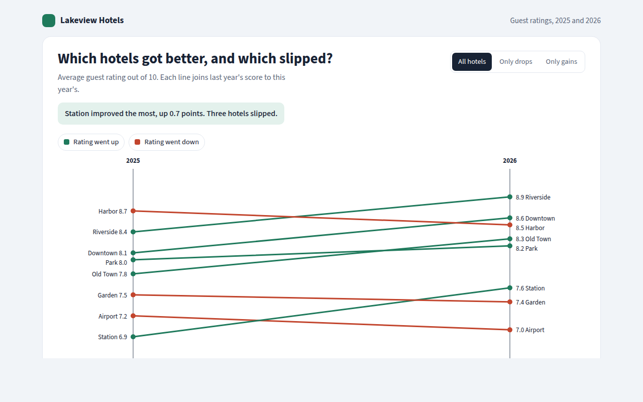
019. Slope Chart
Example: guest ratings for eight hotels in 2025 and 2026