Home / Relationships
Relationships in HTML and JavaScript
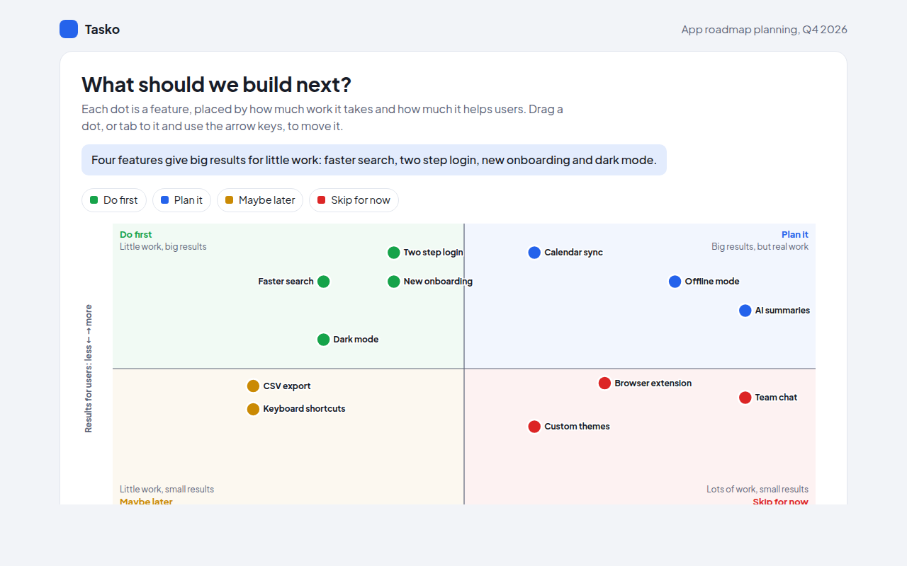
These charts show how two or more measures relate to each other. Does price drop as miles go up? Which hours are busiest? Which campaign gave the best value? Start with a scatter plot, add size with a bubble chart, or use a heatmap when both measures are categories. Every chart here is one HTML file with no library.
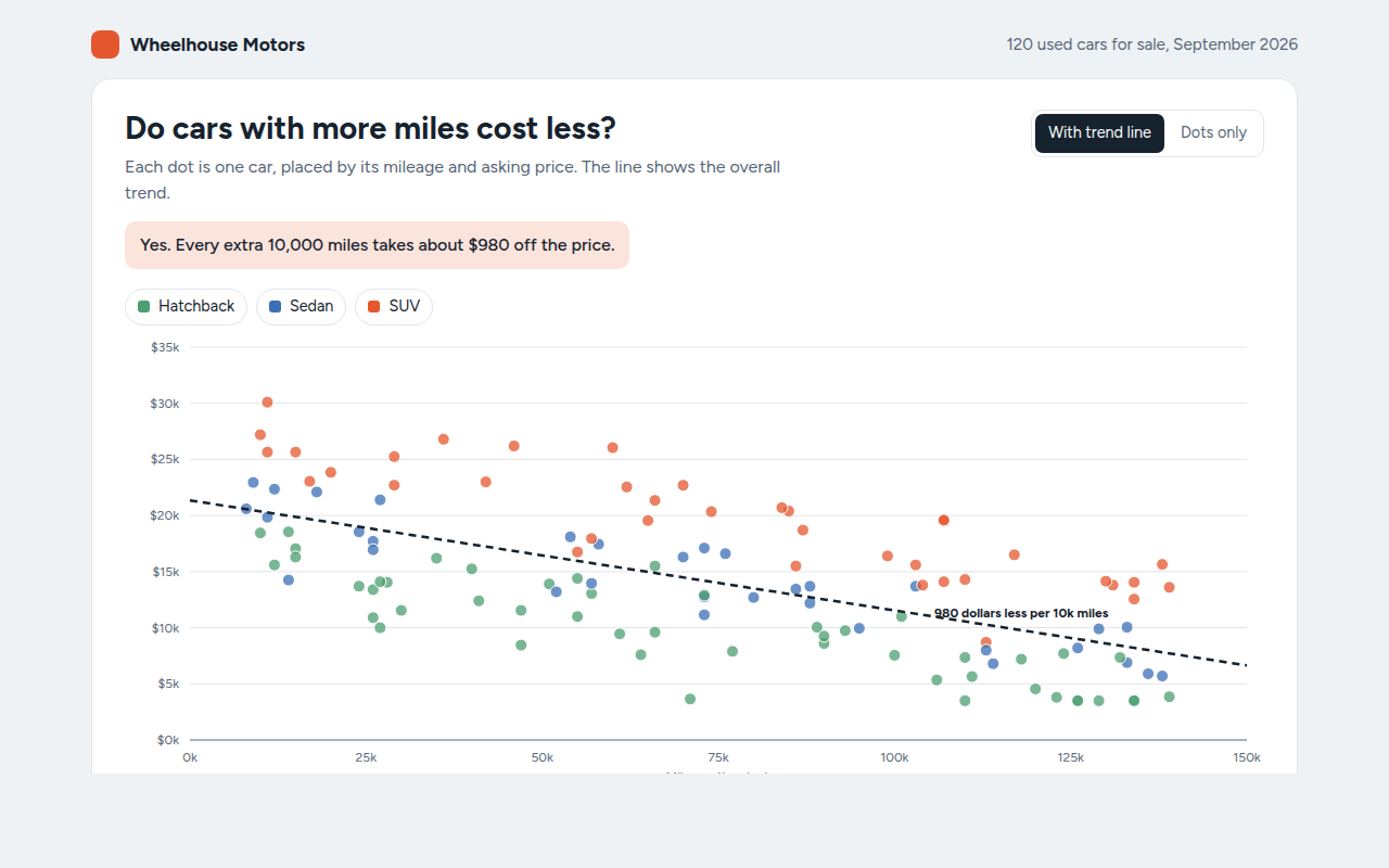
041. Scatter Plot
Example: used car prices against mileage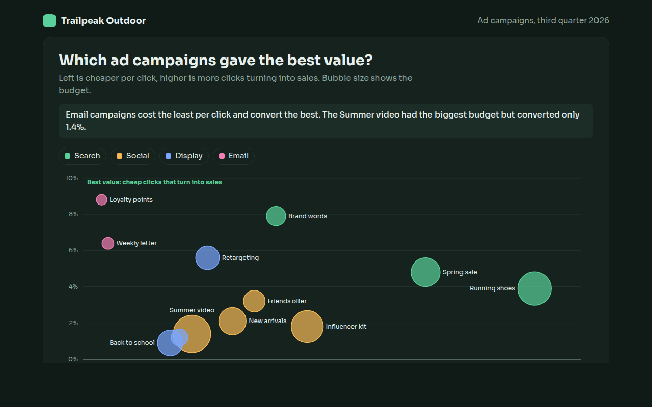
042. Bubble Chart
Example: ad campaigns compared on cost, conversion and budget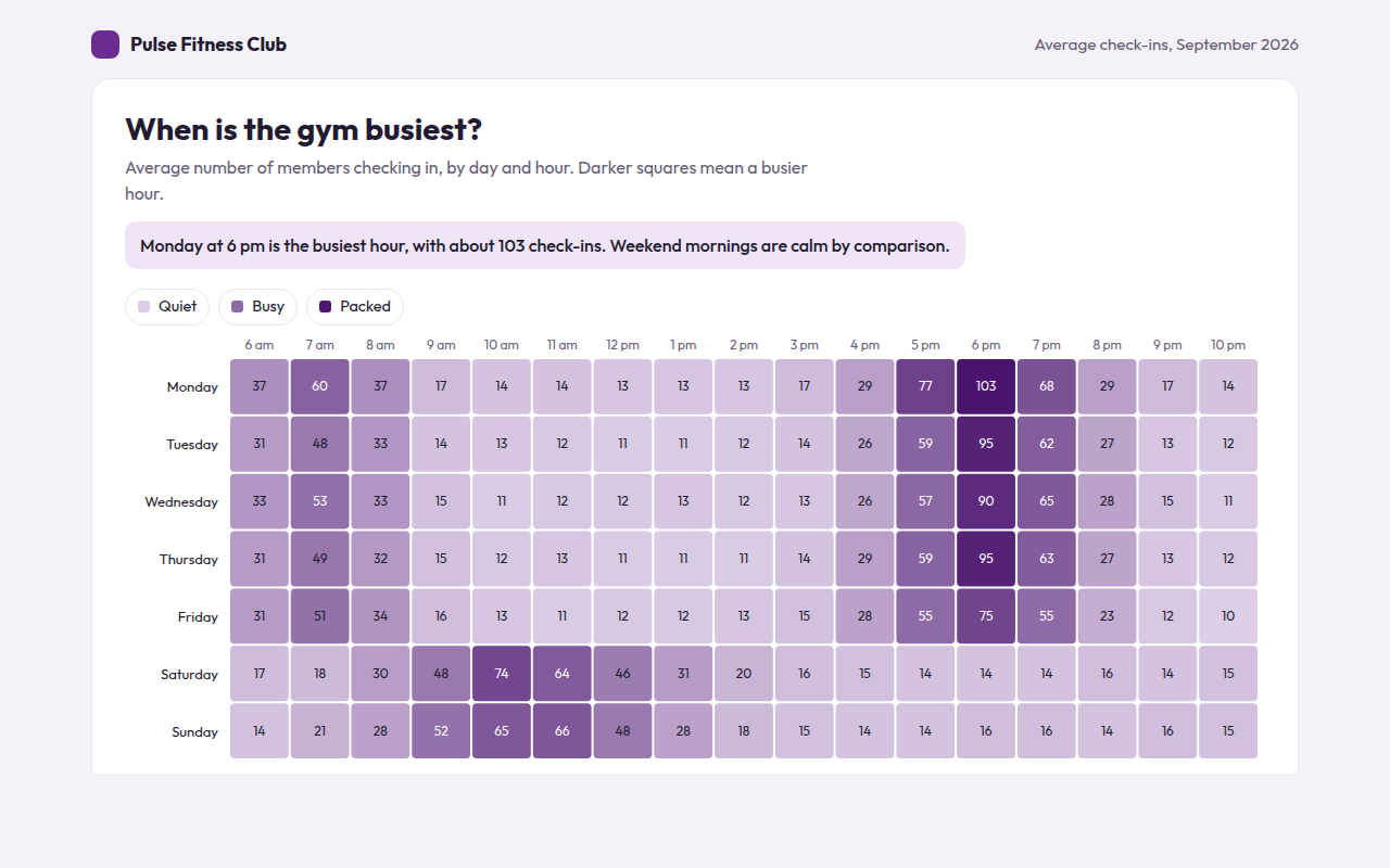
043. Heatmap
Example: gym check-ins by day and hour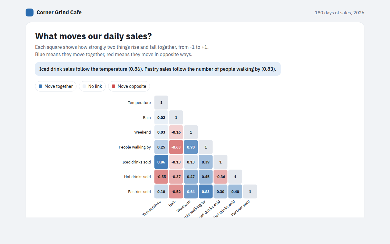
044. Correlation Matrix
Example: what drives daily sales at a cafe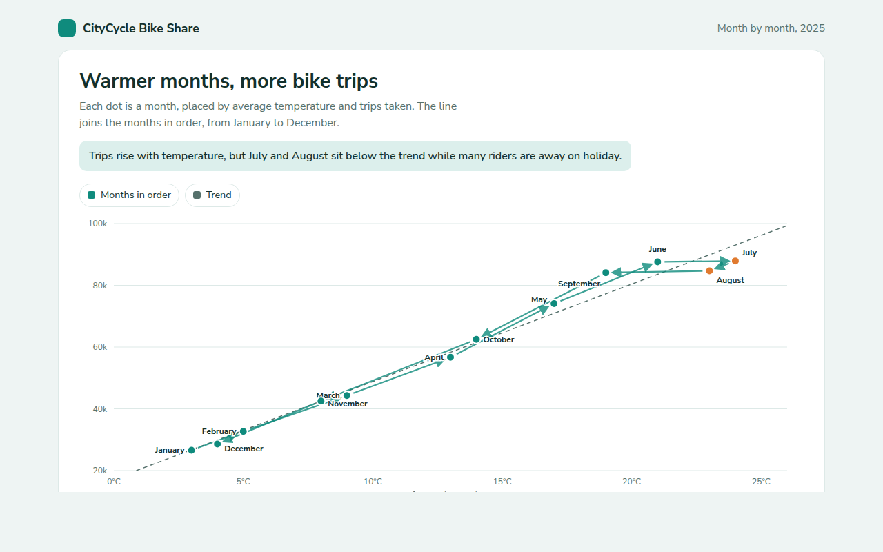
045. Connected Scatter Plot
Example: monthly bike share trips against average temperature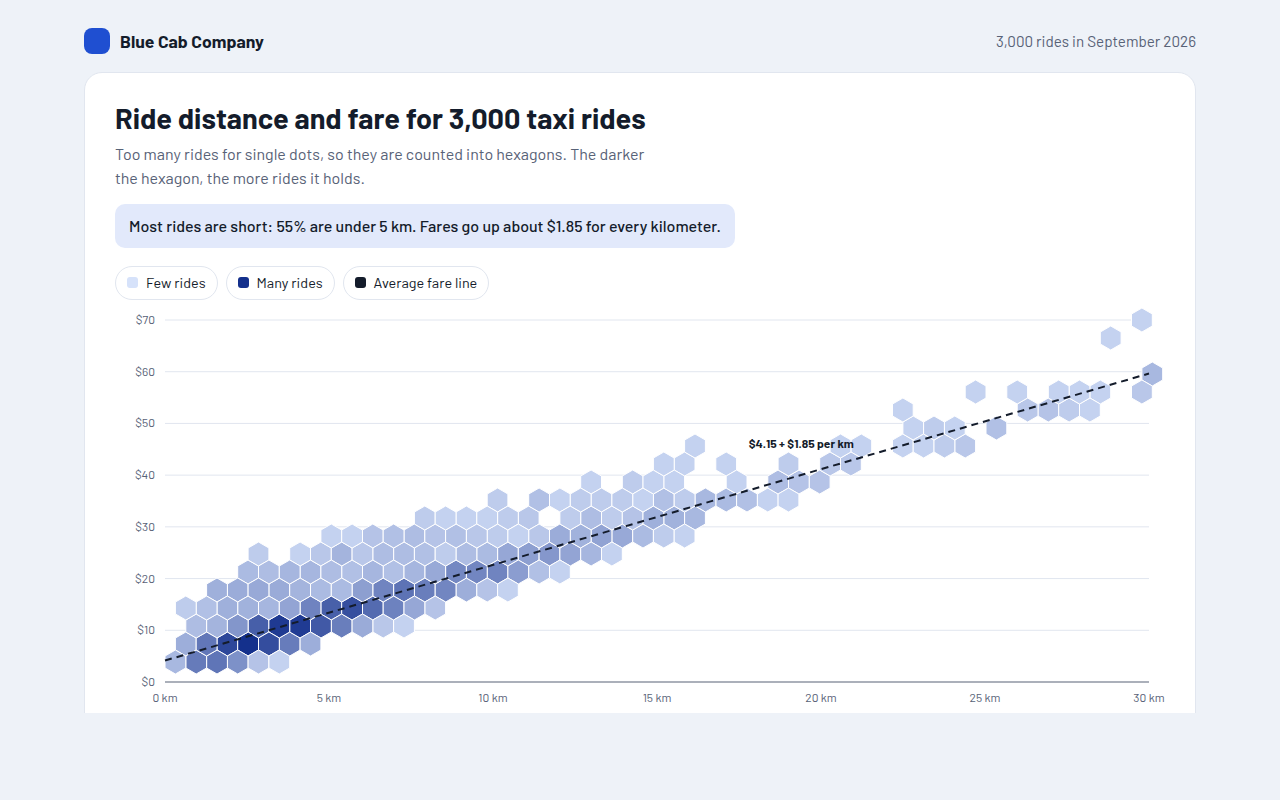
046. Hexbin Plot
Example: distance and fare for 3,000 taxi rides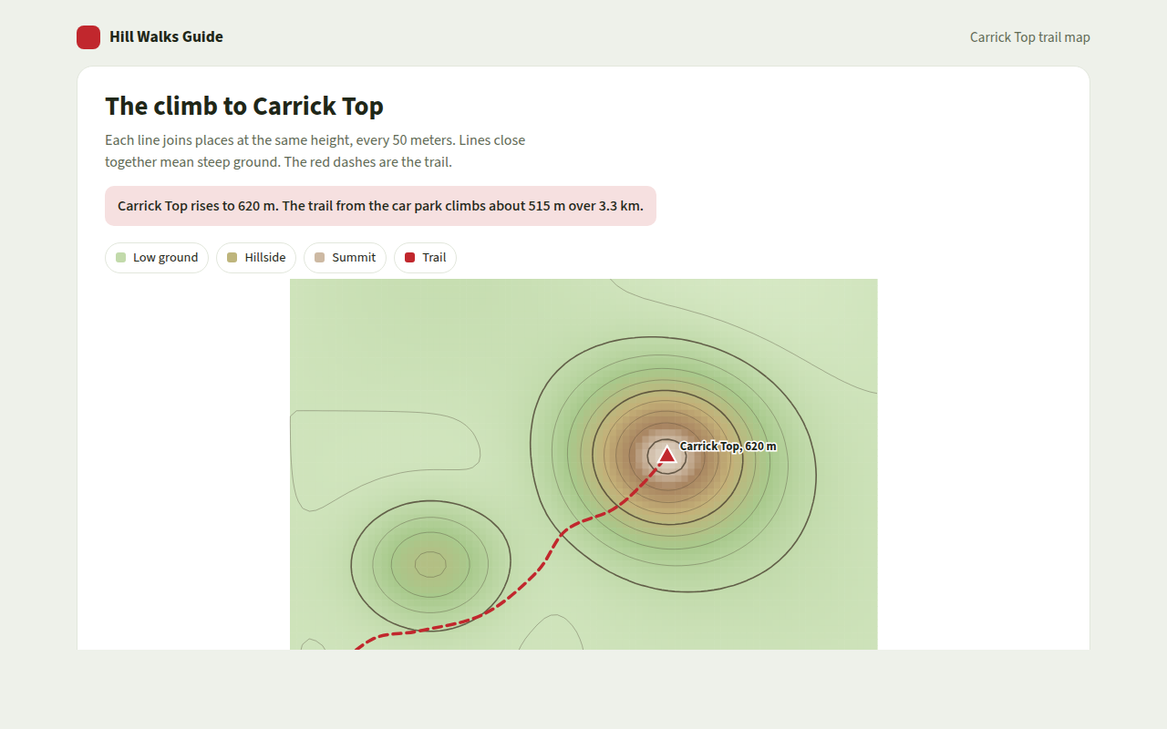
047. Contour Plot
Example: a hill walk with height lines and a trail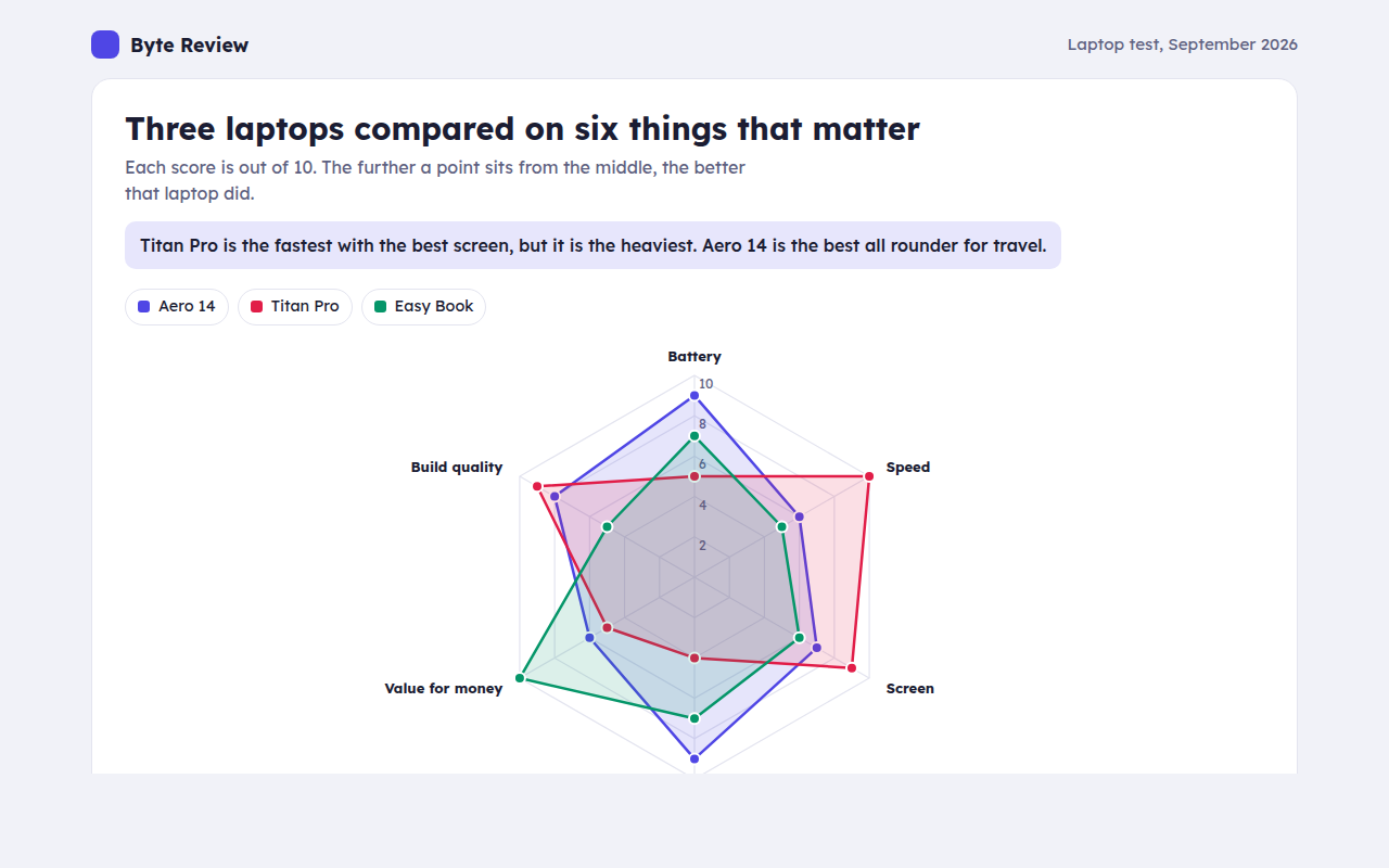
048. Radar Chart
Example: three laptops scored on six features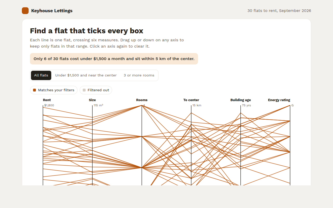
049. Parallel Coordinates Chart
Example: rental flats compared on six measures