Home / Relationships / Contour Plot
Contour Plot in HTML, CSS and JavaScript
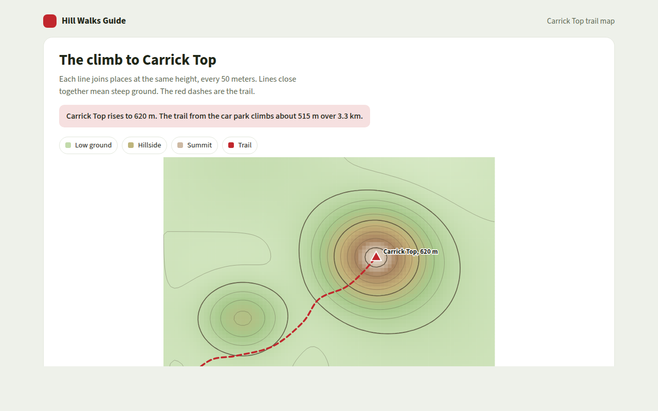
A contour plot shows a surface on a flat map using lines. This free template draws one with plain SVG and vanilla JavaScript, no chart library. The example shows a hill walk with height lines and a trail.
What is a contour plot?
A contour plot shows a surface on a flat map using lines. Each line joins points that share the same value, like the same height on a hill. Close lines mean a steep slope, far apart lines mean gentle ground.
Hikers know these lines from maps, but the same chart works for any value that changes across two measures, like temperature across a region or profit across different prices and ad budgets.
At a glance
- Best for
- A value that changes smoothly across two measures
- Data you need
- A value for every point on a grid
- Skip it when
- Scattered data without a smooth surface.
- Made with
- HTML, CSS and vanilla JavaScript. No library.
When to use a contour plot
- Hills and trail maps
- Temperature or rainfall across an area
- Results across two settings, like price and budget
- Signal strength or noise across a room
When to pick another chart
- Heatmap: your grid has only a few rows and columns
- Hexbin Plot: you have raw points, not a surface
What you get in this template
- Height lines every 50 meters drawn with marching squares in plain JavaScript
- A soft color fill from green lowland to pale summit
- Thicker lines every 200 meters
- A trail that draws itself from the car park to the top
- Hover anywhere, or move a marker with the arrow keys, to read the height
- A table of heights along the trail
How the code works
Here is a short version of the idea behind this contour plot. The full file adds the axis, labels, tooltips, sorting and resizing on top of it.
// Color a grid of cells by height (the base of a contour map)
const height = (x, y) => 150 + 460 * Math.exp(-(((x - 0.6) / 0.18) ** 2 + ((y - 0.45) / 0.2) ** 2));
const cols = 40, rows = 25, cell = 14;

for (let j = 0; j < rows; j++) {
  for (let i = 0; i < cols; i++) {
    const z = height(i / cols, j / rows), t = (z - 150) / 460;
    drawRect(i * cell, j * cell, cell, cell, 'rgb(' + Math.round(200 - 40 * t) + ',' + Math.round(225 - 90 * t) + ',' + Math.round(180 - 80 * t) + ')');
  }
}
The example uses four tiny helpers that create SVG shapes. Put them above the code and it runs as is.
const svg = document.querySelector('svg');
function make(tag, attrs) {
  const n = document.createElementNS('http://www.w3.org/2000/svg', tag);
  for (const k in attrs) n.setAttribute(k, attrs[k]);
  svg.appendChild(n);
  return n;
}
function drawRect(x, y, width, height, fill) { return make('rect', { x, y, width, height, fill }); }
function drawCircle(cx, cy, r, fill) { return make('circle', { cx, cy, r, fill }); }
function drawLine(x1, y1, x2, y2, stroke, width, dash) {
  return make('line', { x1, y1, x2, y2, stroke, 'stroke-width': width || 1, 'stroke-dasharray': dash || 'none' });
}
function drawText(x, y, str, anchor) {
  const t = make('text', { x, y, 'text-anchor': anchor || 'start' });
  t.textContent = str;
  return t;
}
How to add it to your website
- Download the file. Click Download HTML file above. You get one file called contour-plot.html with everything inside.
- Change the data. Open the file in any code editor and find the DATA list near the bottom. Replace the names and numbers with your own.
- Change the colors and text. Colors are at the top of the style tag. The title, subtitle and main point are plain HTML near the top of the body.
- Put it online. Upload the file to any host, such as GitHub Pages, Netlify or your own server, or paste it into your site. There is no build step.
Questions people ask
What is a contour plot?
A contour plot draws lines that join points with the same value on a flat map. It is the same idea as the height lines on a hiking map.
How are contour lines drawn?
With an algorithm called marching squares. It looks at each small square of a grid, checks which corners are above the chosen height, and draws a short line through the square where the height is crossed.
What do lines close together mean?
They mean the value changes quickly over a short distance. On a hill map, that is a steep slope.
Can I use contour plots for business data?
Yes. Any result that depends on two settings, like profit across price and ad spend, can be shown as a contour plot to find the best area.
More relationships
041. Scatter Plot
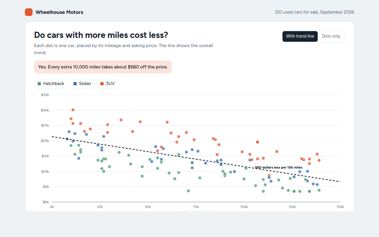
Example: used car prices against mileage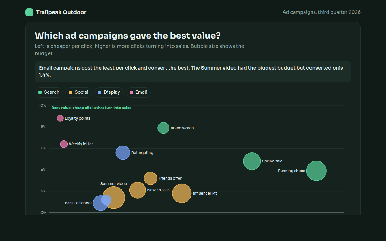
042. Bubble Chart
Example: ad campaigns compared on cost, conversion and budget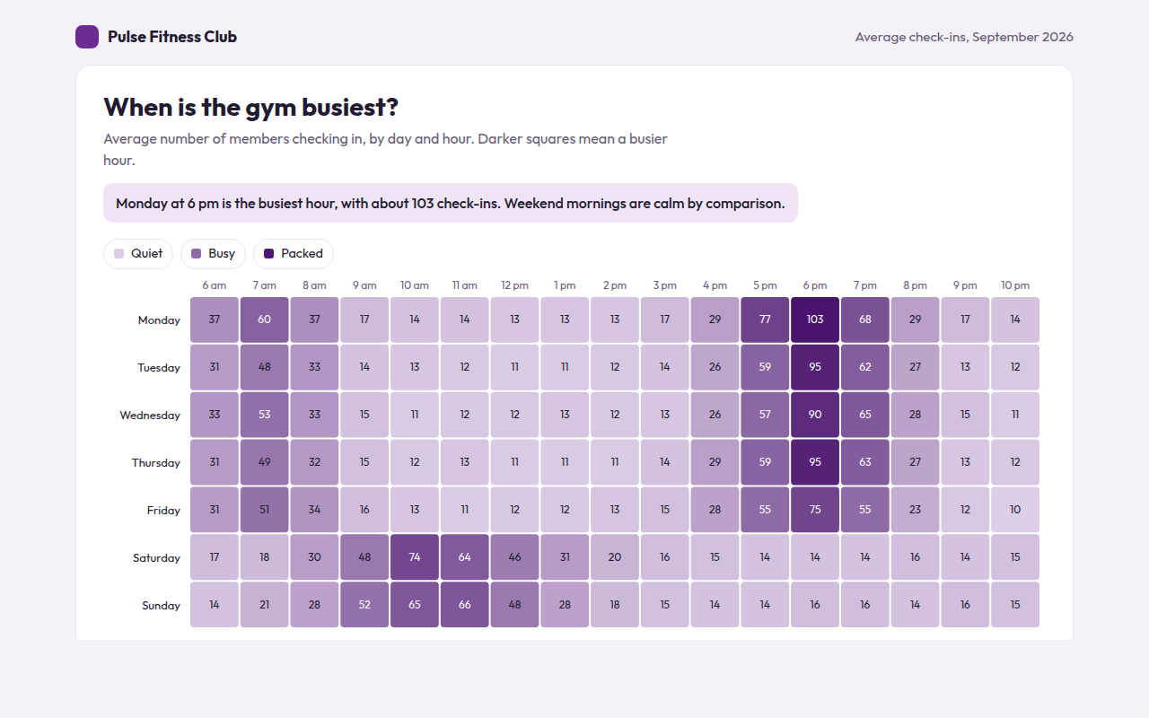
043. Heatmap
Example: gym check-ins by day and hour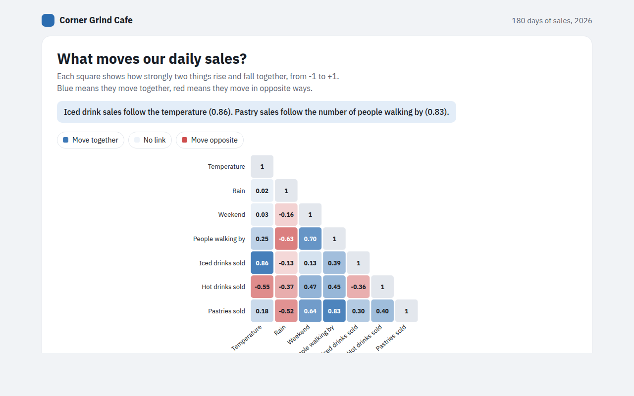
044. Correlation Matrix
Example: what drives daily sales at a cafe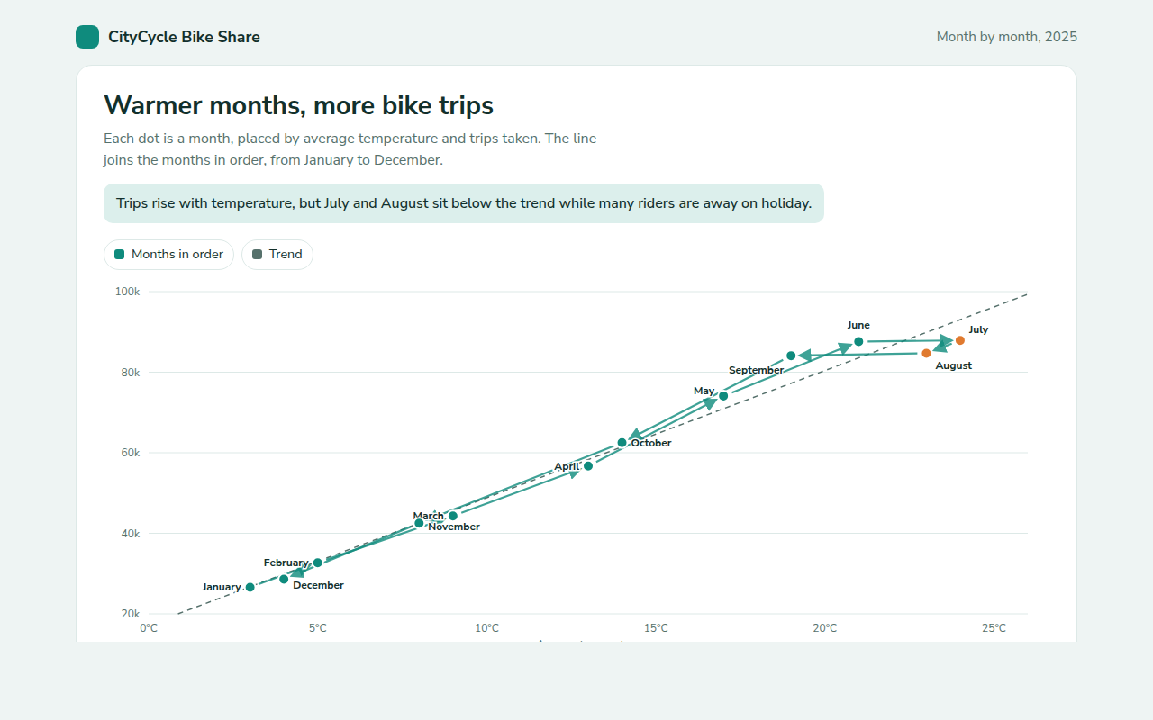
045. Connected Scatter Plot
Example: monthly bike share trips against average temperature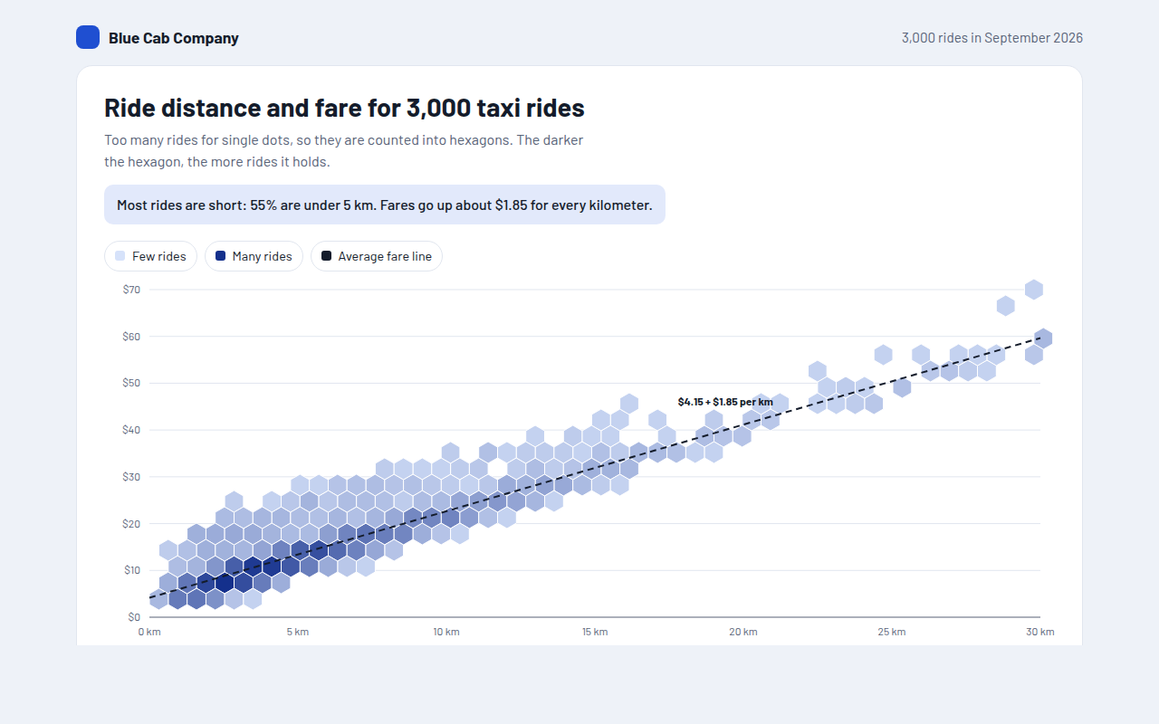
046. Hexbin Plot
Example: distance and fare for 3,000 taxi rides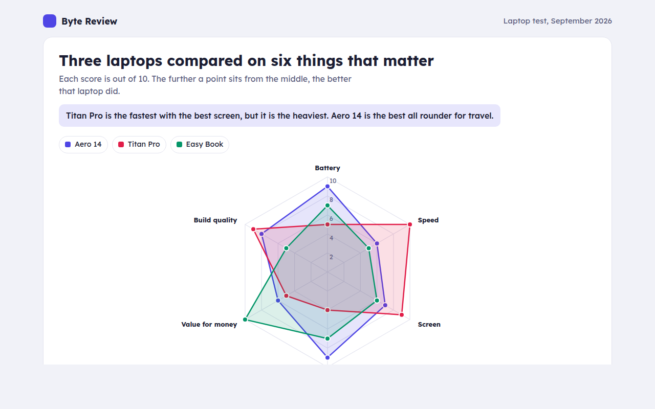
048. Radar Chart
Example: three laptops scored on six features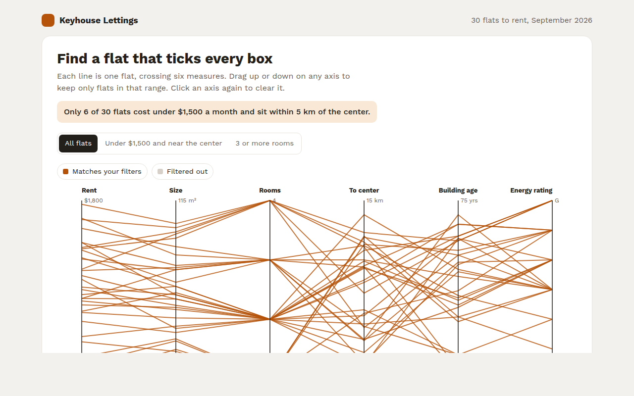
049. Parallel Coordinates Chart
Example: rental flats compared on six measures