Home / Relationships / Hexbin Plot
Hexbin Plot in HTML, CSS and JavaScript
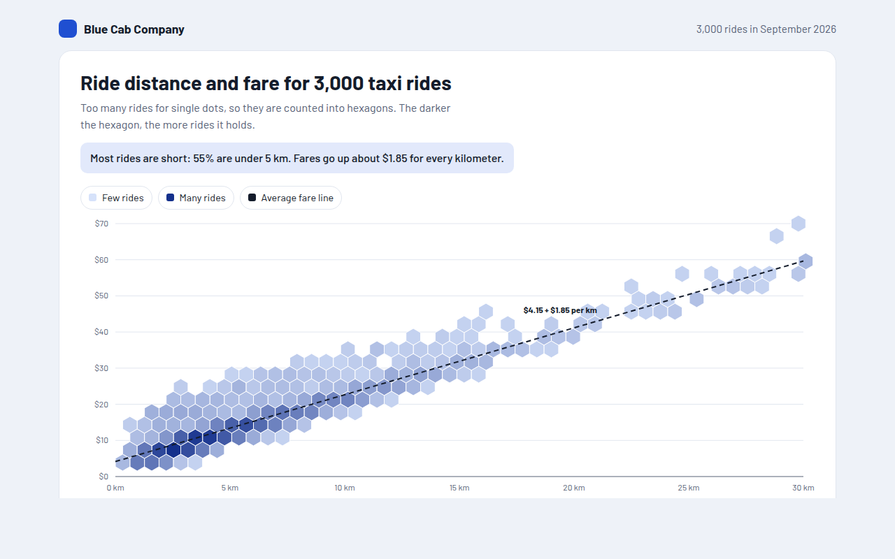
A hexbin plot is a scatter plot for large data. This free template draws one with plain SVG and vanilla JavaScript, no chart library. The example shows distance and fare for 3,000 taxi rides.
What is a hexbin plot?
A hexbin plot is a scatter plot for large data. Instead of drawing thousands of dots that pile on top of each other, it counts the points that fall in each hexagon and colors the hexagon by that count.
You can see where most of the data sits, which a crowded scatter plot hides. Hexagons are used instead of squares because they fit together neatly and their centers are all the same distance apart.
At a glance
- Best for
- Thousands of points on two measures
- Data you need
- Two numbers for each item, ideally 1,000 or more
- Skip it when
- Small data sets. A scatter plot shows each point.
- Made with
- HTML, CSS and vanilla JavaScript. No library.
When to use a hexbin plot
- Taxi or delivery rides by distance and price
- Website visits by time on page and pages seen
- Sensor readings with many samples
- Property sales by size and price
When to pick another chart
- Scatter Plot: you have fewer than about 500 points
- Heatmap: both of your measures are categories
What you get in this template
- 3,000 rides counted into hexagons in plain JavaScript
- A color scale from pale to deep blue by number of rides
- A dashed line for the average fare formula
- Hover or use the arrow keys to read each hexagon
- Smaller hexagons on phones
- A summary table by distance band
How the code works
Here is a short version of the idea behind this hexbin plot. The full file adds the axis, labels, tooltips, sorting and resizing on top of it.
const rides = [[2.1, 7.9], [4.5, 12.1], [4.8, 12.6], [5.1, 13.0], [12.4, 27.5], [4.6, 12.2]];
const R = 14, dx = R * Math.sqrt(3), dy = R * 1.5;
const x = km => 40 + km / 30 * 540, y = f => 280 - f / 70 * 260;
const bins = {};

rides.forEach(([km, fare]) => {
  const row = Math.round(y(fare) / dy), col = Math.round((x(km) - (row % 2 ? dx / 2 : 0)) / dx);
  const key = row + ',' + col;
  bins[key] = (bins[key] || 0) + 1;
});
Object.entries(bins).forEach(([key, n]) => {
  const [row, col] = key.split(',').map(Number), cx = col * dx + (row % 2 ? dx / 2 : 0), cy = row * dy;
  const pts = [0, 1, 2, 3, 4, 5].map(k => (cx + R * Math.cos(Math.PI / 3 * k + Math.PI / 6)) + ',' + (cy + R * Math.sin(Math.PI / 3 * k + Math.PI / 6)));
  make('polygon', { points: pts.join(' '), fill: n > 1 ? '#1f4fd1' : '#a9bff5' });
});
The example uses four tiny helpers that create SVG shapes. Put them above the code and it runs as is.
const svg = document.querySelector('svg');
function make(tag, attrs) {
  const n = document.createElementNS('http://www.w3.org/2000/svg', tag);
  for (const k in attrs) n.setAttribute(k, attrs[k]);
  svg.appendChild(n);
  return n;
}
function drawRect(x, y, width, height, fill) { return make('rect', { x, y, width, height, fill }); }
function drawCircle(cx, cy, r, fill) { return make('circle', { cx, cy, r, fill }); }
function drawLine(x1, y1, x2, y2, stroke, width, dash) {
  return make('line', { x1, y1, x2, y2, stroke, 'stroke-width': width || 1, 'stroke-dasharray': dash || 'none' });
}
function drawText(x, y, str, anchor) {
  const t = make('text', { x, y, 'text-anchor': anchor || 'start' });
  t.textContent = str;
  return t;
}
How to add it to your website
- Download the file. Click Download HTML file above. You get one file called hexbin-plot.html with everything inside.
- Change the data. Open the file in any code editor and find the DATA list near the bottom. Replace the names and numbers with your own.
- Change the colors and text. Colors are at the top of the style tag. The title, subtitle and main point are plain HTML near the top of the body.
- Put it online. Upload the file to any host, such as GitHub Pages, Netlify or your own server, or paste it into your site. There is no build step.
Questions people ask
What is a hexbin plot?
It is a chart that groups many points into hexagon shaped bins and colors each hexagon by how many points it holds. It is used when a scatter plot has too many dots to read.
Why use hexagons instead of squares?
Hexagons fit together with no gaps and are closer to circles, so each bin covers a more even area. This makes patterns look smoother and fairer than with squares.
How big should the hexagons be?
Big enough that most hexagons hold several points, small enough to keep the shape. Try a few sizes. This template uses smaller hexagons on phones.
Is a hexbin plot the same as a 2D histogram?
It is one kind of 2D histogram. A 2D histogram can use squares or hexagons. Hexbin simply means it uses hexagons.
More relationships
041. Scatter Plot
Example: used car prices against mileage
042. Bubble Chart
Example: ad campaigns compared on cost, conversion and budget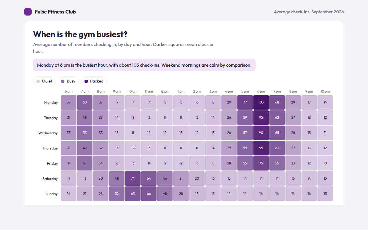
043. Heatmap
Example: gym check-ins by day and hour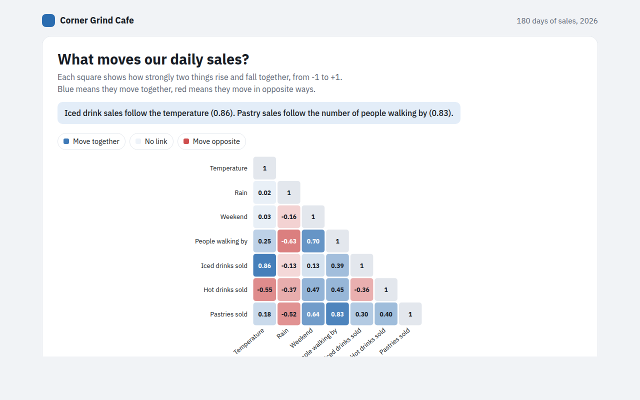
044. Correlation Matrix
Example: what drives daily sales at a cafe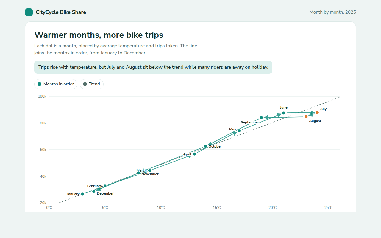
045. Connected Scatter Plot
Example: monthly bike share trips against average temperature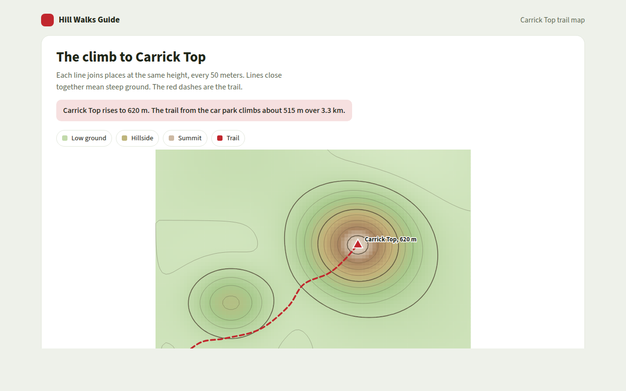
047. Contour Plot
Example: a hill walk with height lines and a trail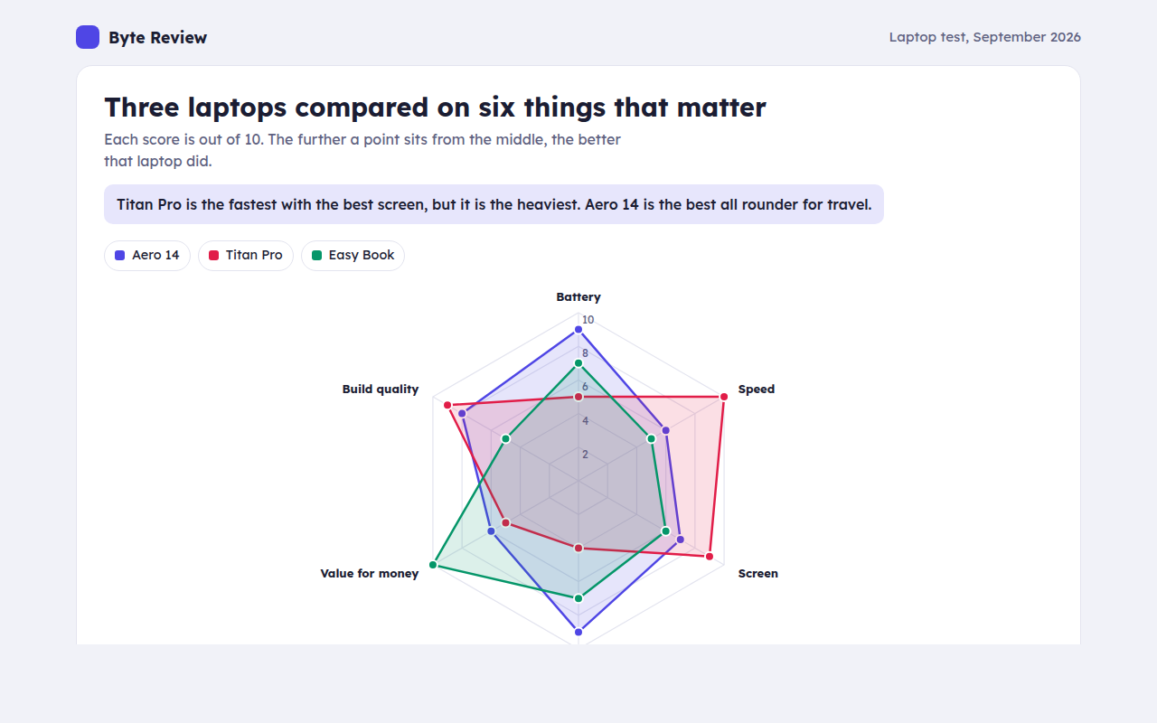
048. Radar Chart
Example: three laptops scored on six features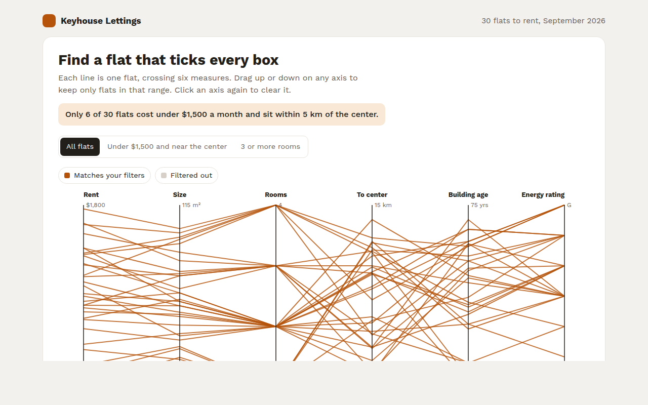
049. Parallel Coordinates Chart
Example: rental flats compared on six measures