Home / Flow and Network / Alluvial Diagram
Alluvial Diagram in HTML, CSS and JavaScript
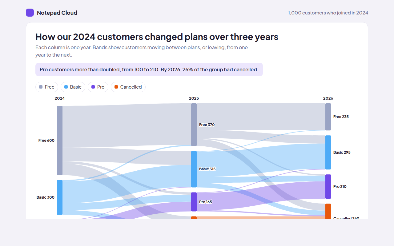
An alluvial diagram shows how items move between groups over time. This free template draws one with plain SVG and vanilla JavaScript, no chart library. The example shows customers changing plans over three years.
What is a alluvial diagram?
An alluvial diagram shows how items move between groups over time. Each column is a point in time, blocks show the groups, and bands show items moving from one group to another between columns.
It is like a Sankey diagram where the stages are dates. It answers questions like: how many free users became paying customers, and how many of them later cancelled?
At a glance
- Best for
- The same items changing groups over time
- Data you need
- Counts of items moving between groups for each step in time
- Skip it when
- Many groups per column. Bands get too thin.
- Made with
- HTML, CSS and vanilla JavaScript. No library.
When to use a alluvial diagram
- Customers moving between plans
- Students changing subjects year to year
- Voters or members changing groups
- Staff moving between teams
When to pick another chart
- Sankey Diagram: your stages are steps in a process, not dates
- Stacked Area Chart: you only care about the size of each group over time
What you get in this template
- Three columns for 2024, 2025 and 2026
- Bands colored by the plan customers came from
- Hover a block to see every band that passes through it
- Hover a band to see how many stayed or moved
- Bands reveal from left to right on load
- A table of plan sizes each year
How the code works
Here is a short version of the idea behind this alluvial diagram. The full file adds the axis, labels, tooltips, sorting and resizing on top of it.
const years = [[600, 300, 100], [370, 315, 165]];   // Free, Basic, Pro
const moves = [[0, 0, 360], [0, 1, 120], [1, 1, 190], [1, 2, 60], [2, 2, 85]];
const colors = ['#9aa4c4', '#4dabf7', '#7048e8'], k = 0.28, gap = 14;
const tops = years.map(col => { let y = 20; return col.map(v => { const t = y; y += v * k + gap; return t; }); });
const outUsed = [0, 0, 0], inUsed = [0, 0, 0];

moves.forEach(([a, b, n]) => {
  const w = n * k, y1 = tops[0][a] + outUsed[a], y2 = tops[1][b] + inUsed[b];
  outUsed[a] += w; inUsed[b] += w;
  make('path', { d: 'M80,' + y1 + 'C300,' + y1 + ' 300,' + y2 + ' 520,' + y2 + 'V' + (y2 + w) + 'C300,' + (y2 + w) + ' 300,' + (y1 + w) + ' 80,' + (y1 + w) + 'Z', fill: colors[a], 'fill-opacity': 0.45 });
});
The example uses four tiny helpers that create SVG shapes. Put them above the code and it runs as is.
const svg = document.querySelector('svg');
function make(tag, attrs) {
  const n = document.createElementNS('http://www.w3.org/2000/svg', tag);
  for (const k in attrs) n.setAttribute(k, attrs[k]);
  svg.appendChild(n);
  return n;
}
function drawRect(x, y, width, height, fill) { return make('rect', { x, y, width, height, fill }); }
function drawCircle(cx, cy, r, fill) { return make('circle', { cx, cy, r, fill }); }
function drawLine(x1, y1, x2, y2, stroke, width, dash) {
  return make('line', { x1, y1, x2, y2, stroke, 'stroke-width': width || 1, 'stroke-dasharray': dash || 'none' });
}
function drawText(x, y, str, anchor) {
  const t = make('text', { x, y, 'text-anchor': anchor || 'start' });
  t.textContent = str;
  return t;
}
How to add it to your website
- Download the file. Click Download HTML file above. You get one file called alluvial-diagram.html with everything inside.
- Change the data. Open the file in any code editor and find the DATA list near the bottom. Replace the names and numbers with your own.
- Change the colors and text. Colors are at the top of the style tag. The title, subtitle and main point are plain HTML near the top of the body.
- Put it online. Upload the file to any host, such as GitHub Pages, Netlify or your own server, or paste it into your site. There is no build step.
Questions people ask
What is an alluvial diagram?
It is a chart that shows how items move between groups across several points in time, using blocks for groups and bands for the moves.
What is the difference between an alluvial diagram and a Sankey diagram?
They look alike. A Sankey usually shows flow through steps of a process. An alluvial diagram shows the same items being grouped differently over time.
Why is it called alluvial?
The bands look like rivers splitting and joining, and alluvial means made by flowing water, like soil left by a river.
How many time points can an alluvial diagram show?
Three to five columns work well. With more, the chart gets wide and the bands hard to follow.
More flow and network
051. Sankey Diagram
Example: website visitors from source to landing page to outcome
052. Chord Diagram
Example: customers switching between five phone networks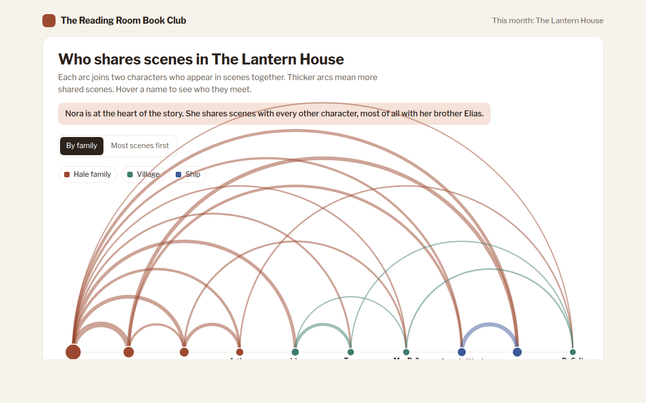
053. Arc Diagram
Example: characters who share scenes in a novel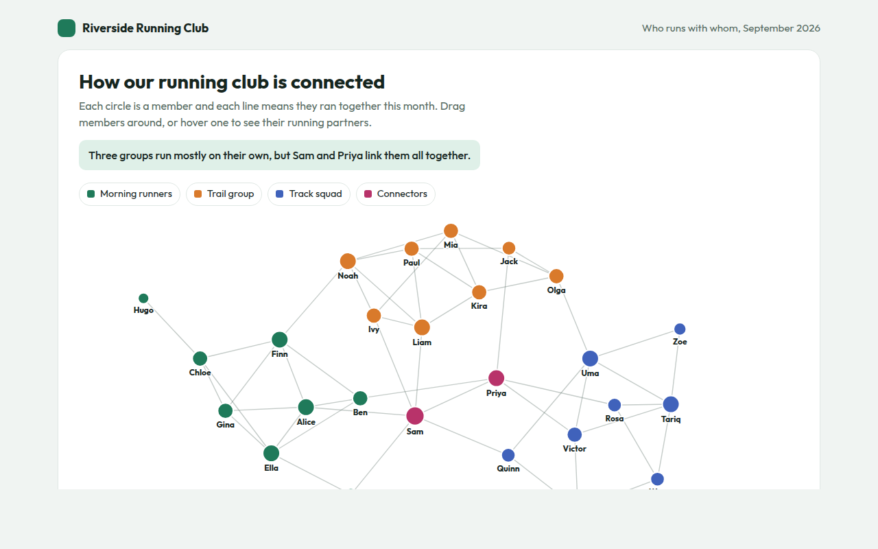
054. Network Graph
Example: who runs with whom in a running club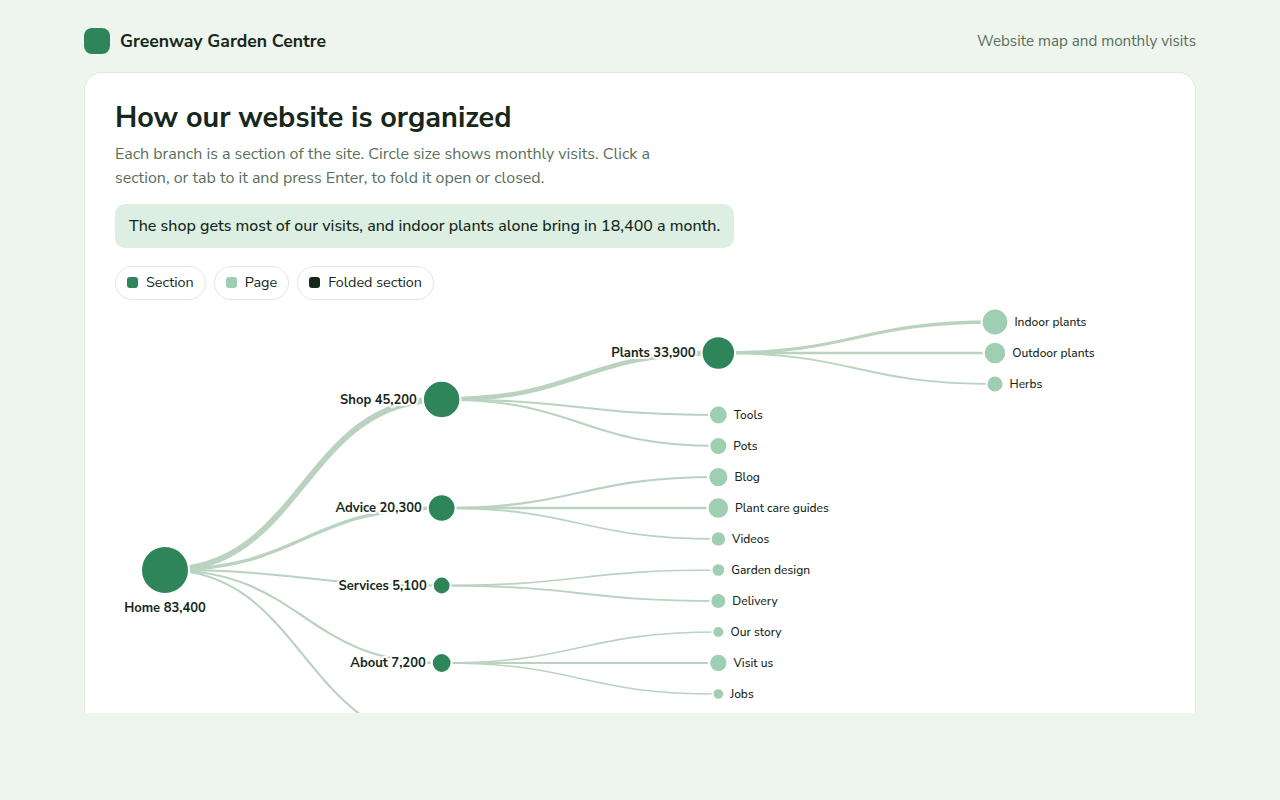
056. Tree Diagram
Example: a garden centre website map with monthly visits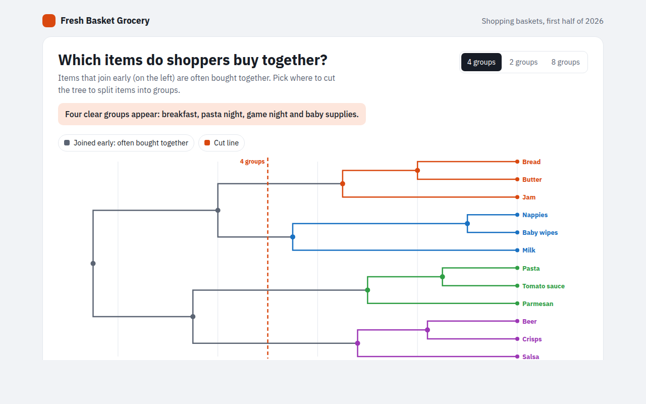
057. Dendrogram
Example: grocery items that shoppers buy together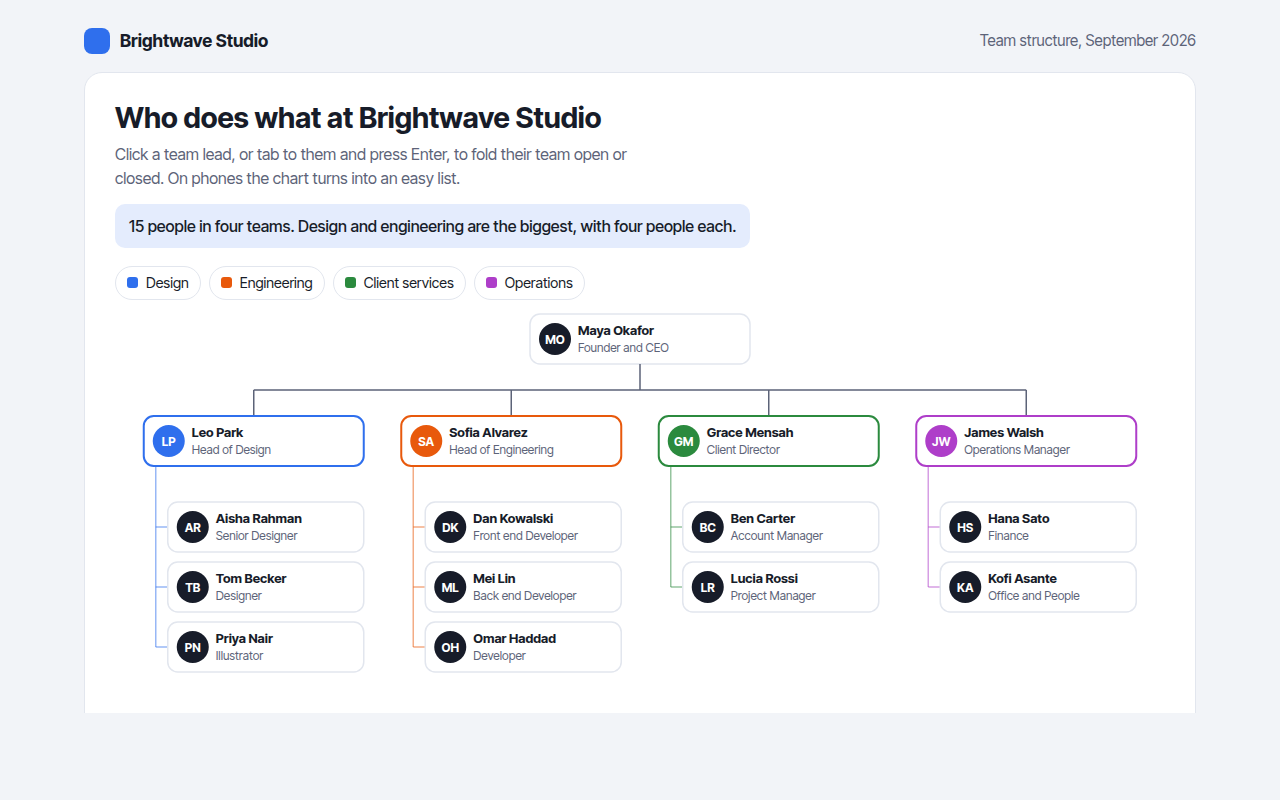
058. Org Chart
Example: the team structure of a design studio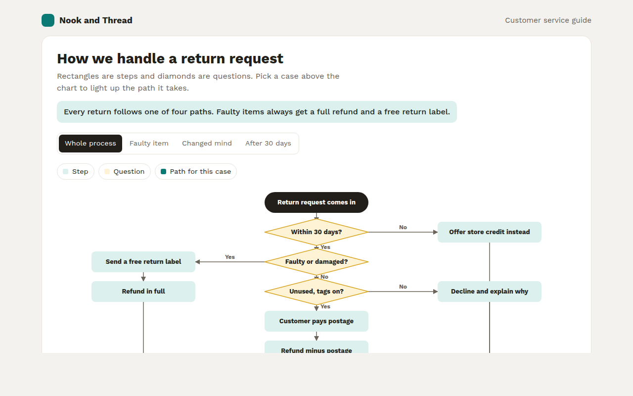
059. Flowchart
Example: how an online shop handles a return request