Home / 3D and Depth / Isometric
Isometric CSS Template, Free with Live Demo
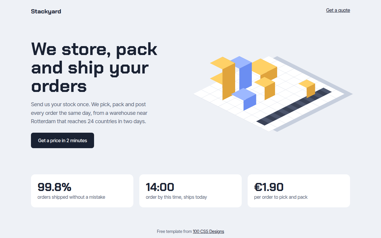
Free isometric website template for a fulfillment warehouse. 3D boxes, a grid floor and a moving conveyor, all built with CSS transforms. Live demo. The example is Stackyard, a fulfillment warehouse.
What is isometric?
Isometric design shows objects at an angle from above, with no vanishing point, so everything looks tidy and technical. It is popular for logistics, SaaS and illustration heavy sites.
The floor is a flat grid rotated with rotateX(60deg) and rotateZ(-45deg). Each box is three faces, top, left and right, built with CSS transforms, and the size and height are set with custom properties.
Good for
- Logistics and warehouse companies
- SaaS and infrastructure products
- Games and city builders
- Process and how it works sections
What you get in this template
- Isometric grid floor made with gradients
- Stackable 3D boxes built from three faces
- Box size and height set per box with variables
- Two box colors for variety
- Moving conveyor belt that stops for reduced motion
The key CSS
This is the part that makes the isometric look work. Copy it into your own project.
.floor { transform: rotateX(60deg) rotateZ(-45deg); transform-style: preserve-3d; }
.box { position: absolute; width: var(--s, 60px); height: var(--s, 60px); transform-style: preserve-3d; }
.box .t { inset: 0; transform: translateZ(var(--h, 60px)); }
.box .l { bottom: 0; width: 100%; height: var(--h, 60px); transform-origin: bottom; transform: rotateX(-90deg); }
.box .r { right: 0; width: var(--h, 60px); height: 100%; transform-origin: right; transform: rotateY(90deg); }
How to use it
- Click Download HTML file above.
- Open the file in any code editor, like VS Code.
- Change the text, colors and links to match your project. Colors are at the top of the style tag.
- Upload it to any host, such as GitHub Pages, Netlify or your own server. It is one file with no build step.
Questions people ask
How do you make an isometric view in CSS?
Rotate a flat element with transform: rotateX(60deg) rotateZ(-45deg). Anything inside it with preserve-3d then sits on an isometric plane.
How do I build a 3D box with CSS?
Use three faces: a top moved up with translateZ, and two sides folded down with rotateX(-90deg) and rotateY(90deg) from their edges.
Should I use SVG for isometric art instead?
For detailed illustrations, SVG is easier. CSS boxes are great when you want parts you can change with code, like stock levels.
More 3D and Depth designs
071. 3D Tilt Cards
Postcard Club, a postcard subscription
073. Layered Shadows
Forma, a furniture maker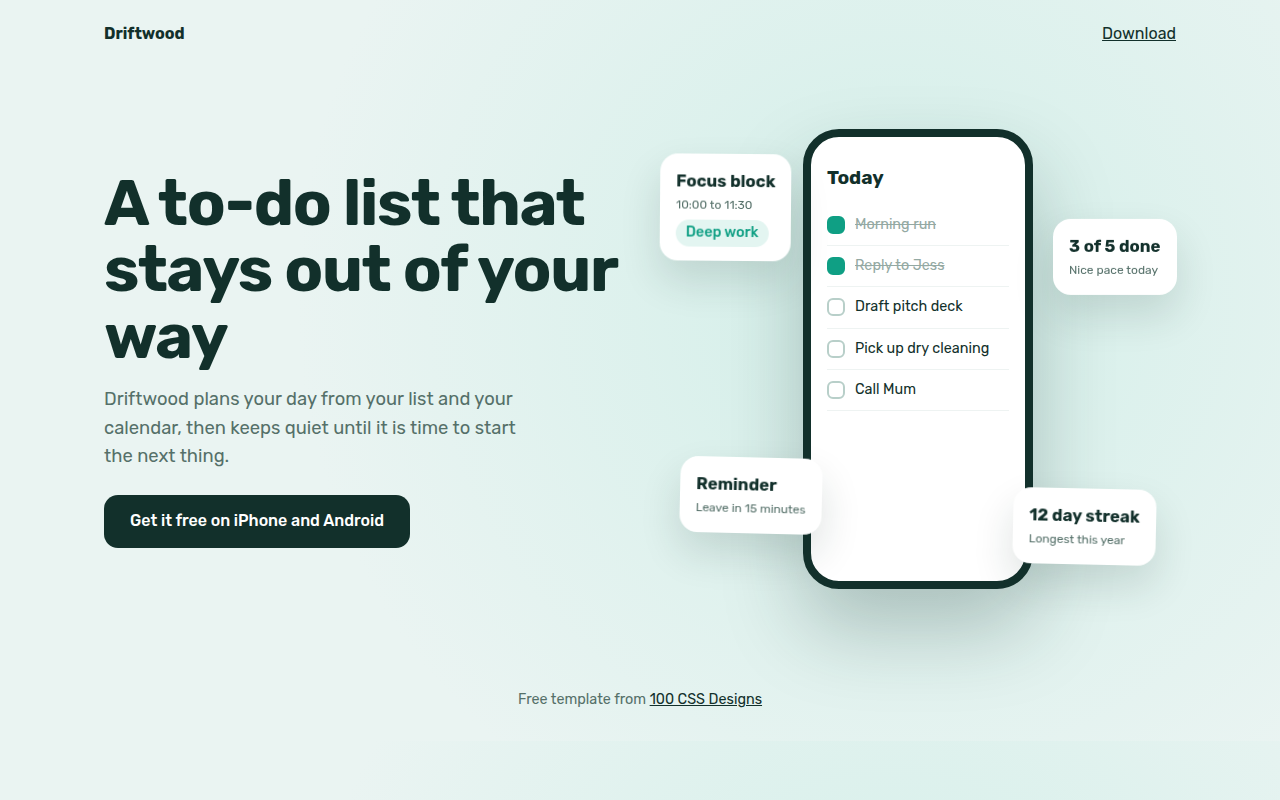
074. Floating Elements
Driftwood, a to-do app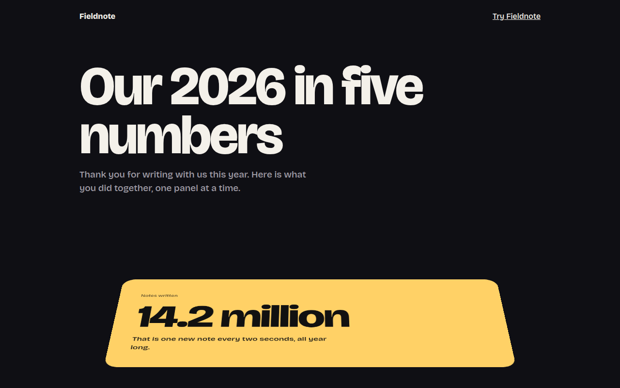
075. Perspective Scroll
Fieldnote, a year in review page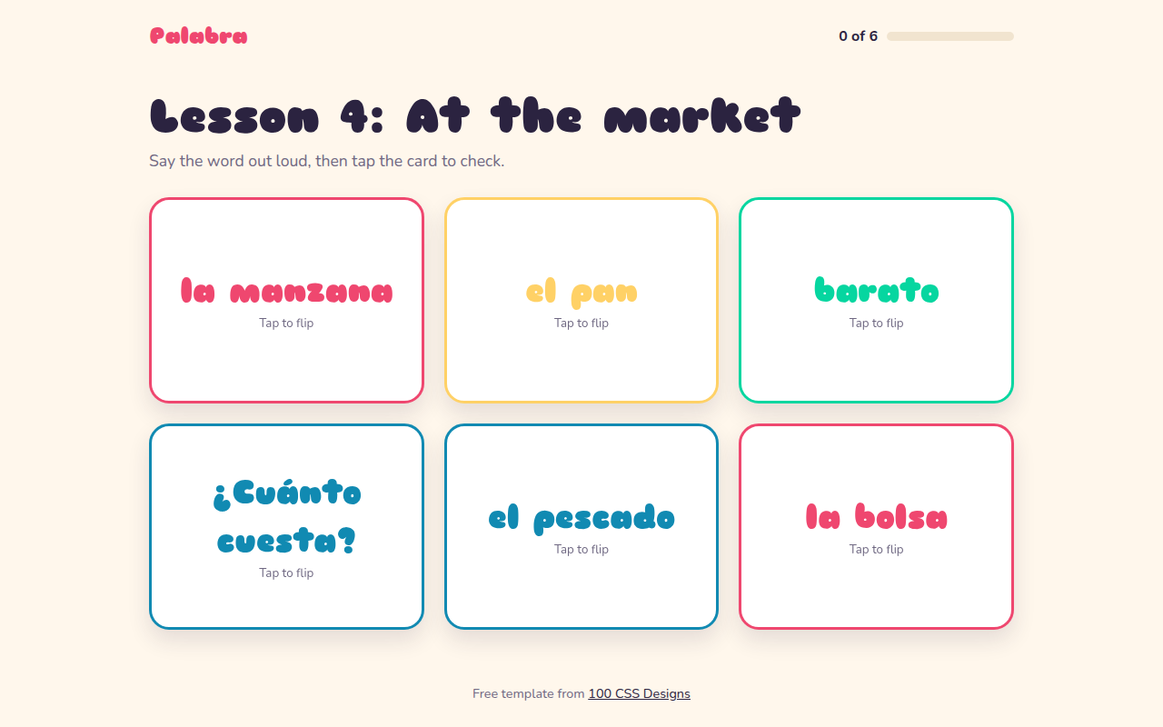
076. Flip Cards
Palabra, a Spanish flashcard app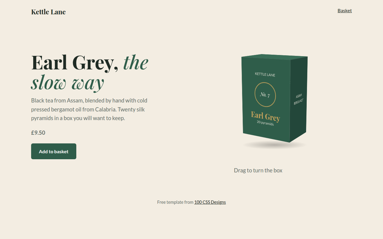
077. 3D Product Box
Kettle Lane, a tea brand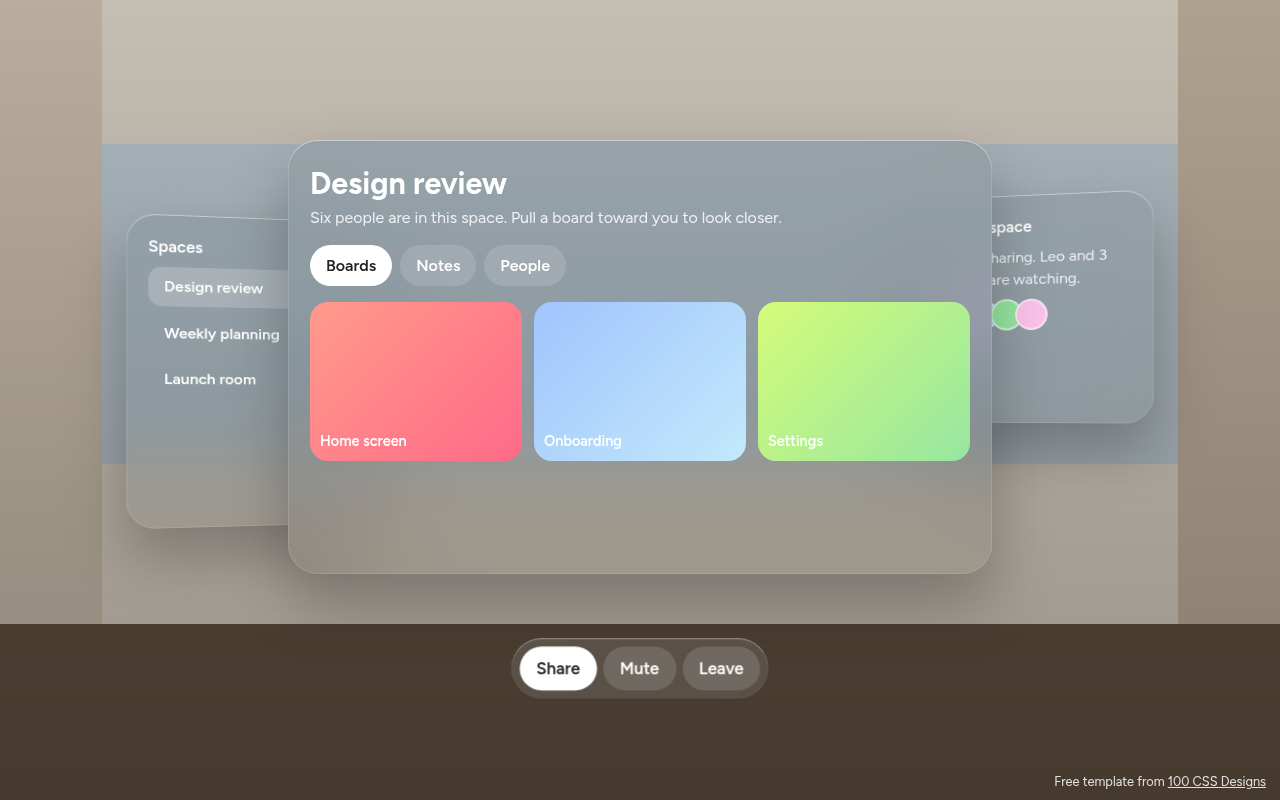
078. Spatial UI
Habitat, a spatial meeting workspace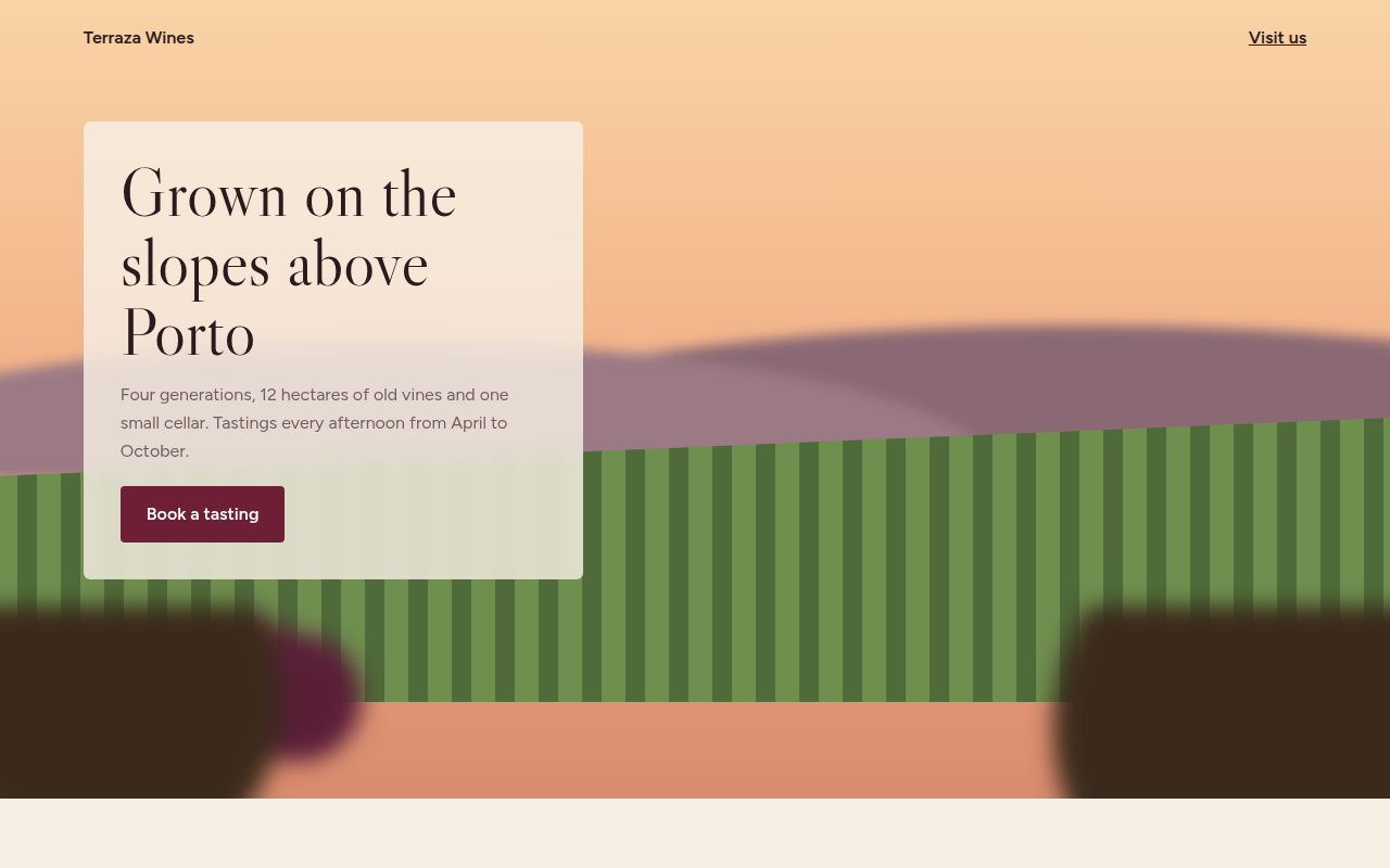
079. Depth Blur
Terraza, a family winery