Home / SEO and Site Tools / Responsive Image Maker
Responsive Image Maker in JavaScript, Free with Live Demo
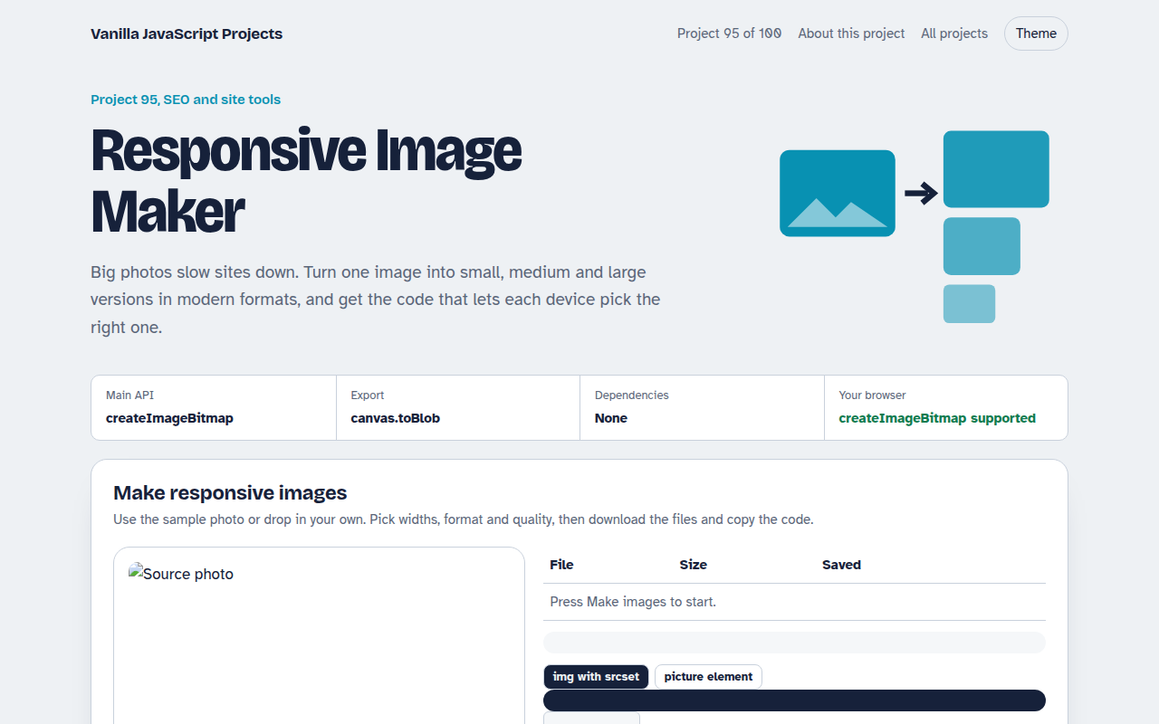
Free responsive image maker in plain JavaScript. Drop in one photo, get it resized to several widths as WebP or JPEG, compare file sizes and copy ready srcset and picture code.
Runs on: Canvas toBlob and createImageBitmap. Works in all modern browsers. AVIF export depends on the browser; the tool falls back to WebP.
What is the Responsive Image Maker?
An image resizer for the web. Start with the sample photo or drop in your own, choose widths, a format and quality, and get resized files in a few seconds.
A table shows each file size and how much smaller it is than the original. The tool also writes the srcset or picture code so each device loads the right size.
Good for
- Preparing photos for a website
- Shops with product images
- Blogs and portfolios
- Speeding up slow pages
What this project does
- Four widths from 400 to 1600 pixels
- WebP, JPEG or AVIF output
- Quality slider with size comparison
- Individual downloads
- Ready srcset and picture code
How it works
- Decode oncecreateImageBitmap decodes the photo a single time. Every size is then drawn from that bitmap onto a canvas of the right width.
- Encode to modern formatscanvas.toBlob saves each size as WebP, JPEG or AVIF at the quality you choose, and the file sizes are shown so you can compare.
- Let the browser chooseThe srcset and sizes code lists every file with its width. Each device then downloads only the size it needs.
The key JavaScript
This is the heart of the project. The full file has the rest, including the screen layout and error handling.
const bitmap = await createImageBitmap(file);
for (const w of [400, 800, 1200]) {
  const c = document.createElement("canvas");
  c.width = w; c.height = Math.round(bitmap.height * w / bitmap.width);
  c.getContext("2d").drawImage(bitmap, 0, 0, c.width, c.height);
  const blob = await new Promise((r) => c.toBlob(r, "image/webp", 0.75));
}
// <img srcset="photo-400.webp 400w, photo-800.webp 800w, photo-1200.webp 1200w"
//      sizes="(max-width: 700px) 100vw, 700px">
How to use it
- Click Download HTML file above.
- Open the file in a code editor, like VS Code.
- Run it from a local server with
npx serve .so the camera, microphone and AI features are allowed. - Change the text and colors, then upload it to GitHub Pages, Netlify or your own site. It is one file with no build step.
Questions people ask
Are my photos uploaded?
No. Everything happens in your browser. The photo never leaves your device.
Which format should I use?
WebP works everywhere today and is usually 25 to 35 percent smaller than JPEG. AVIF is smaller still where supported.
What does the sizes attribute do?
It tells the browser how wide the image will be shown, so it can pick the best file before the page layout is ready.
More SEO and Site Tools projects
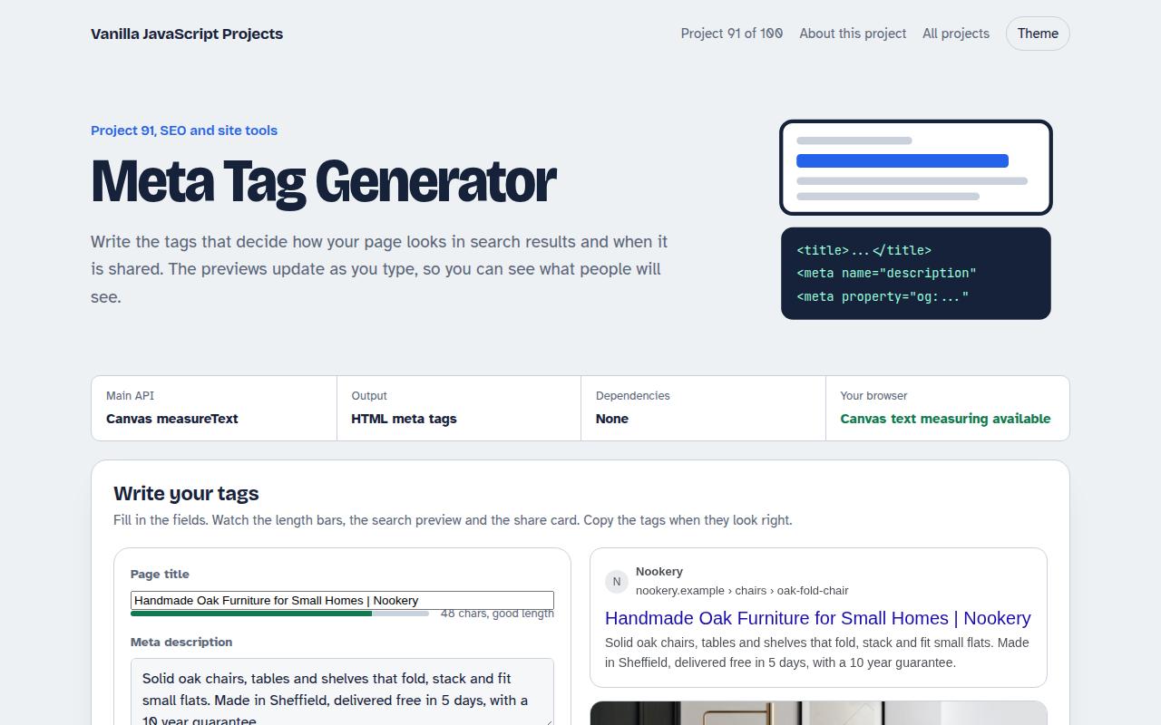
091. Meta Tag Generator
A form that writes your title, description and social tags with live search and share previews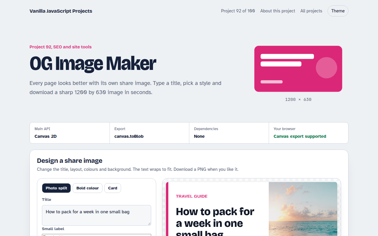
092. OG Image Maker
A canvas tool that makes 1200 by 630 share images with your title and brand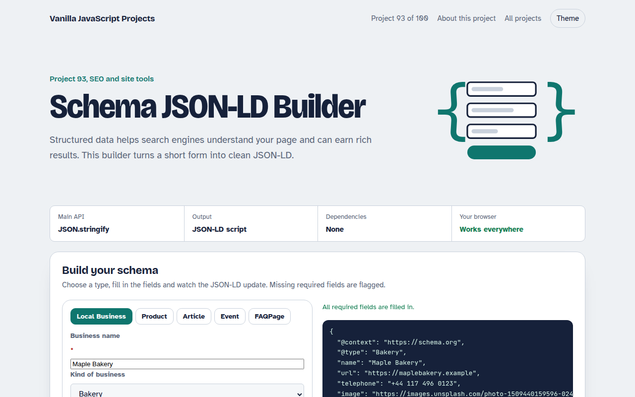
093. Schema JSON-LD Builder
A form that writes structured data for businesses, products, articles, events and FAQs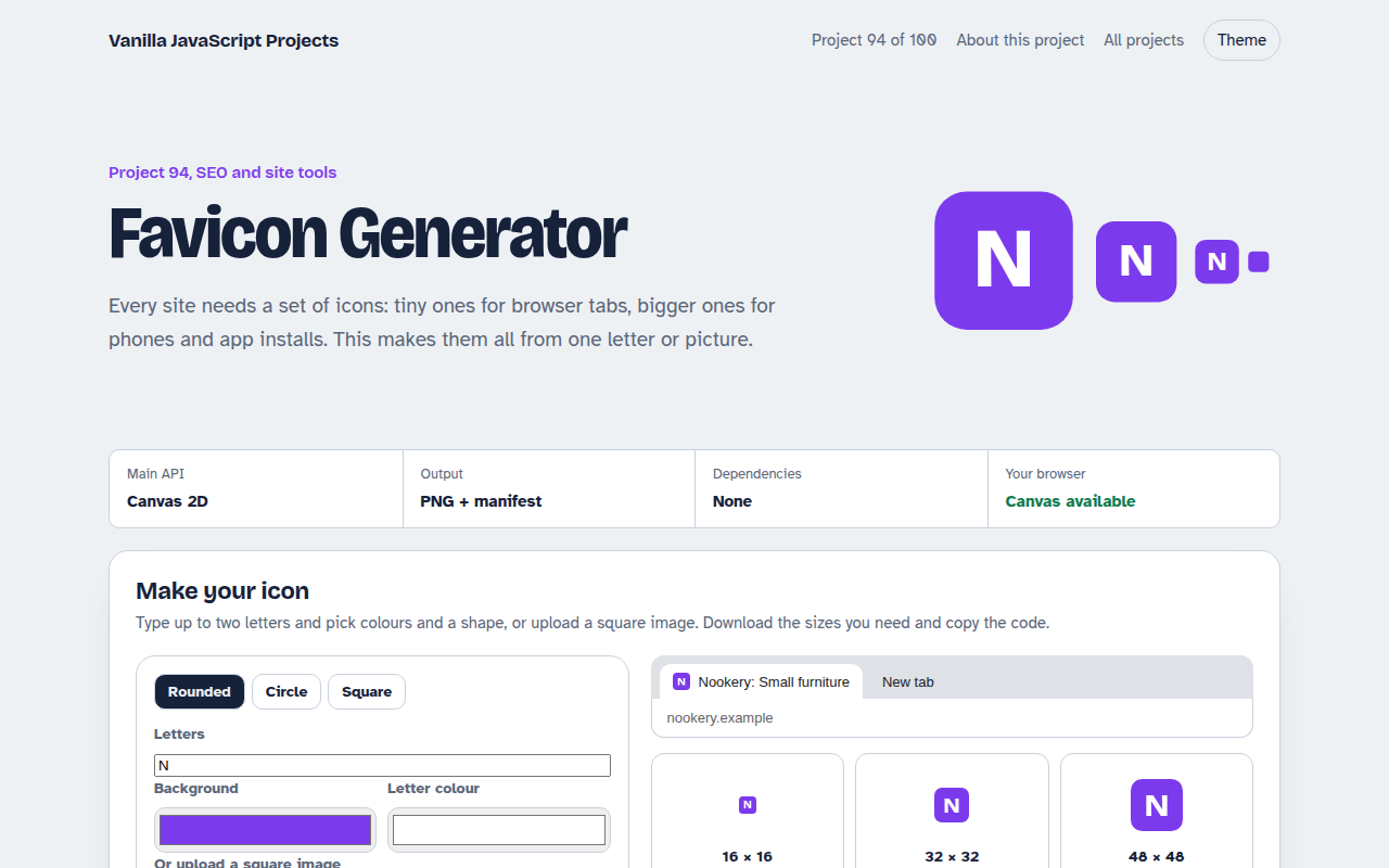
094. Favicon Generator
A tool that makes every favicon size and a web manifest from a letter or an image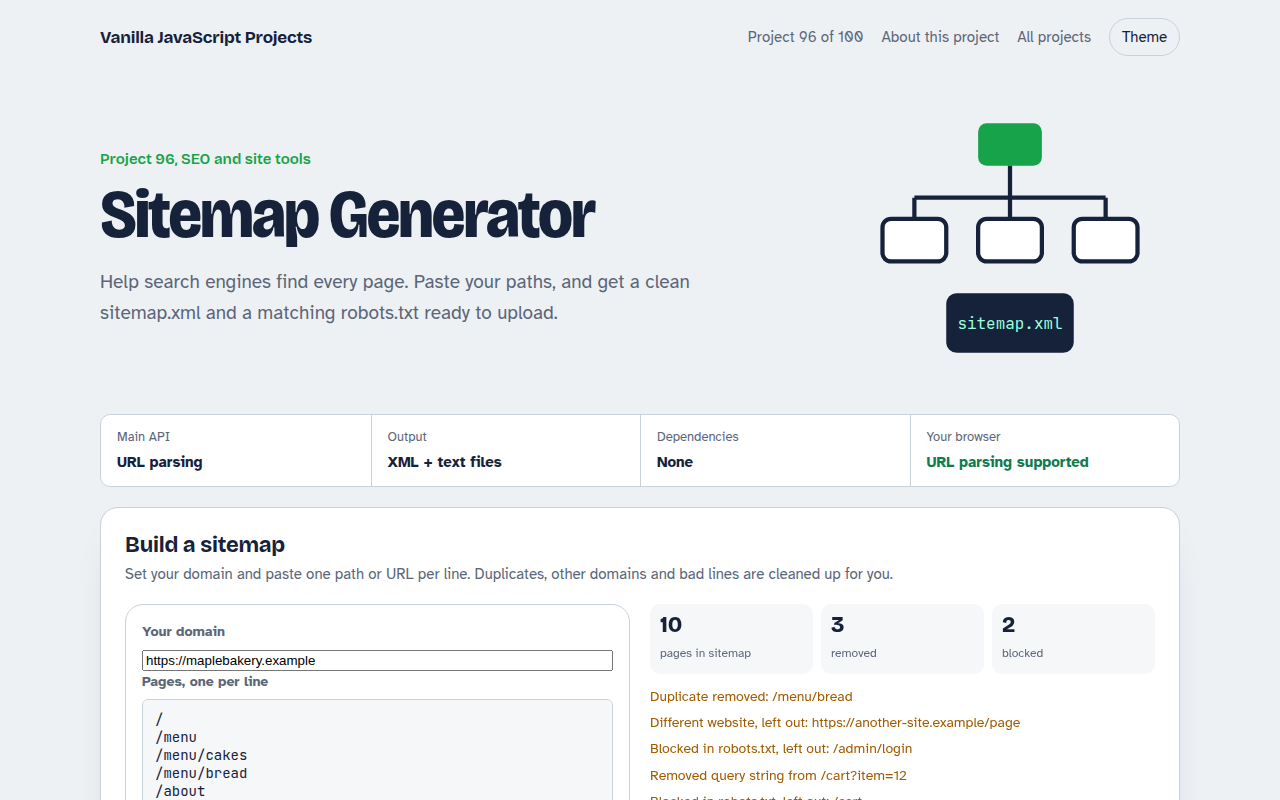
096. Sitemap Generator
A tool that turns a list of pages into sitemap.xml and robots.txt