Home / AI Era Interfaces / Spotlight Cards
Spotlight Cards CSS Template, Free with Live Demo
Free spotlight card template where cards and their borders glow wherever your cursor is. Dark feature grid made with CSS radial gradients. Live demo. The example is Lumen, an API platform.

What is spotlight cards?
Spotlight cards light up where your cursor is, like shining a torch over a dark surface. The glow spreads across the card and along its border, and moves with the mouse.
A tiny script sends the cursor position to each card as two CSS variables. CSS does the rest with radial gradients, and a mask trick turns one of them into a glowing border.
Good for
- Feature grids on dark SaaS sites
- Pricing sections
- Developer and API platforms
- Portfolio project grids
What you get in this template
- Soft glow that follows the cursor
- Glowing border using mask composite
- All cards react together as one surface
- Bento style grid with one wide card
- Glow always on for touch screens
The key CSS
This is the part that makes the spotlight cards look work. Copy it into your own project.
.sp::before {
  content: ""; position: absolute; inset: 0; border-radius: inherit;
  background: radial-gradient(400px circle at var(--x) var(--y), rgba(94,234,212,.12), transparent 40%);
}
.sp::after {
  content: ""; position: absolute; inset: 0; border-radius: inherit; padding: 1px;
  background: radial-gradient(300px circle at var(--x) var(--y), rgba(94,234,212,.7), transparent 40%);
  -webkit-mask: linear-gradient(#000 0 0) content-box, linear-gradient(#000 0 0);
  -webkit-mask-composite: xor; mask-composite: exclude;
}
How to use it
- Click Download HTML file above.
- Open the file in any code editor, like VS Code.
- Change the text, colors and links to match your project. Colors are at the top of the style tag.
- Upload it to any host, such as GitHub Pages, Netlify or your own server. It is one file with no build step.
Questions people ask
How do you make a glow follow the mouse in CSS?
Set two CSS variables, like --x and --y, on pointermove with a line of JavaScript, then use them as the center of a radial gradient: radial-gradient(400px circle at var(--x) var(--y), color, transparent).
How does the glowing border work?
A second gradient layer has 1px padding and a mask that removes everything except that padding, so only the edge shows.
What happens on phones with no cursor?
The template shows the glow all the time on touch devices, using the hover: none media query.
More AI Era Interfaces designs
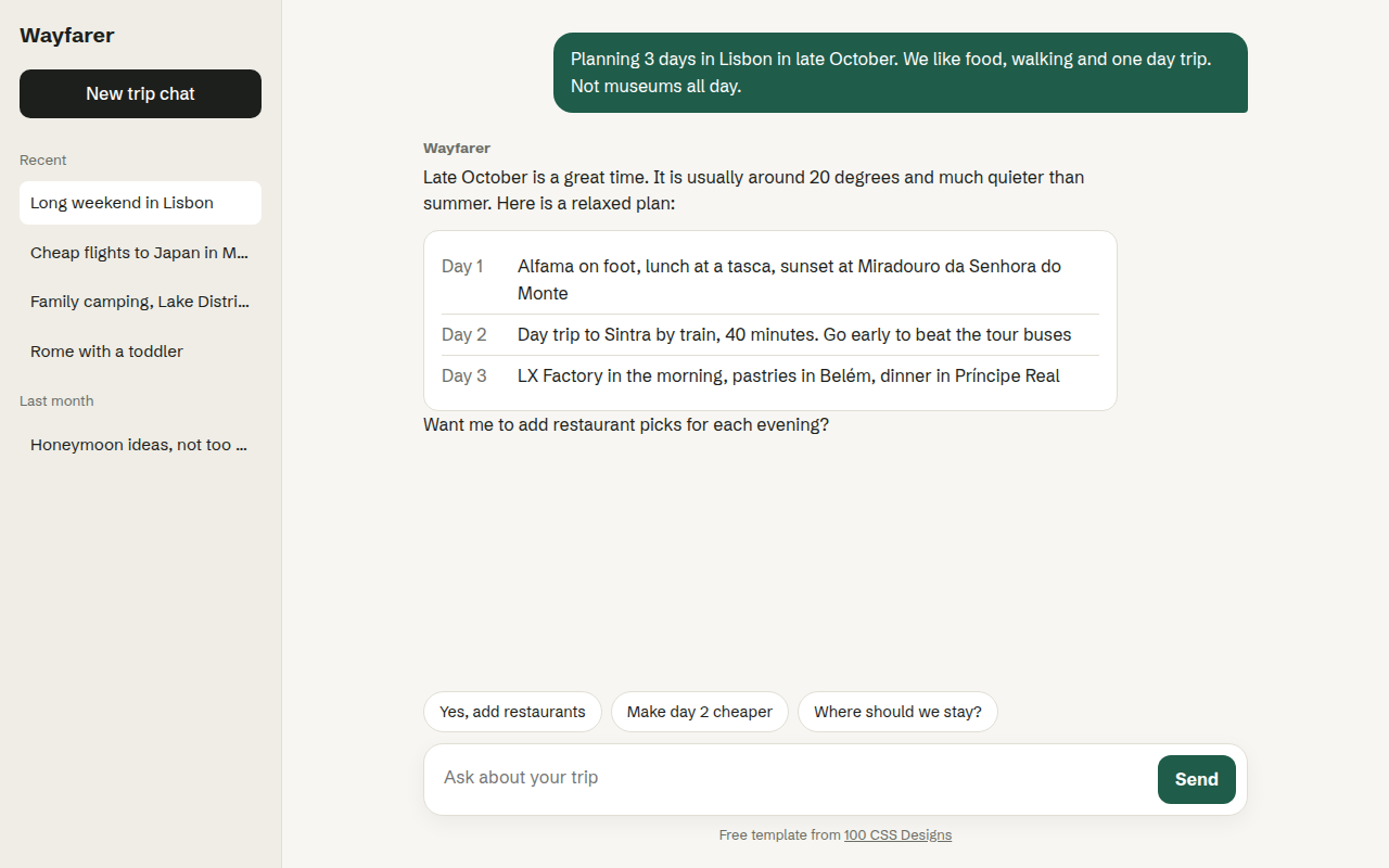
031. Chat UI
Wayfarer, an AI travel assistant
032. AI Dashboard
Signalboard, an AI customer support dashboard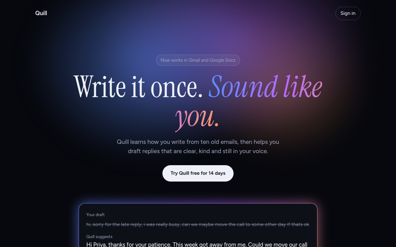
033. AI Glow Gradient
Quill, an AI writing assistant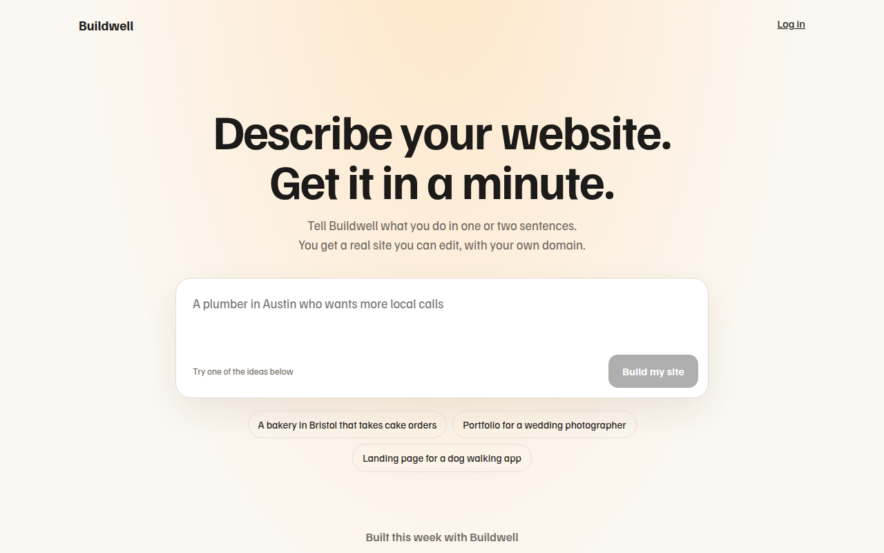
034. Prompt Box Hero
Buildwell, an AI website builder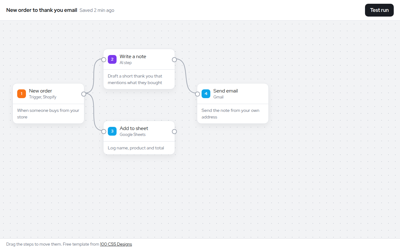
035. Node Workflow Canvas
Relay, an automation builder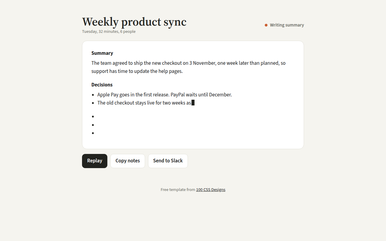
036. Streaming Text
Recap, an AI meeting notes tool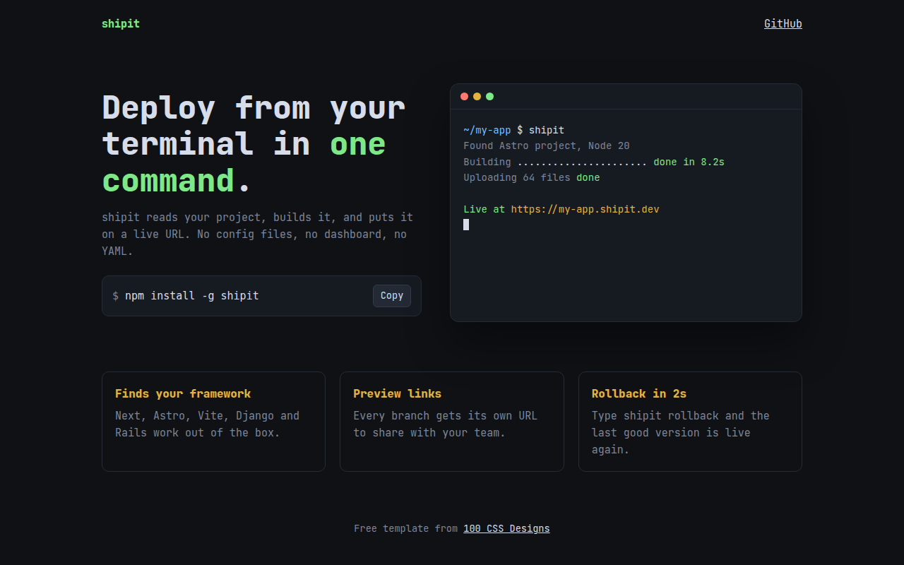
037. Terminal Developer
shipit, a command line deploy tool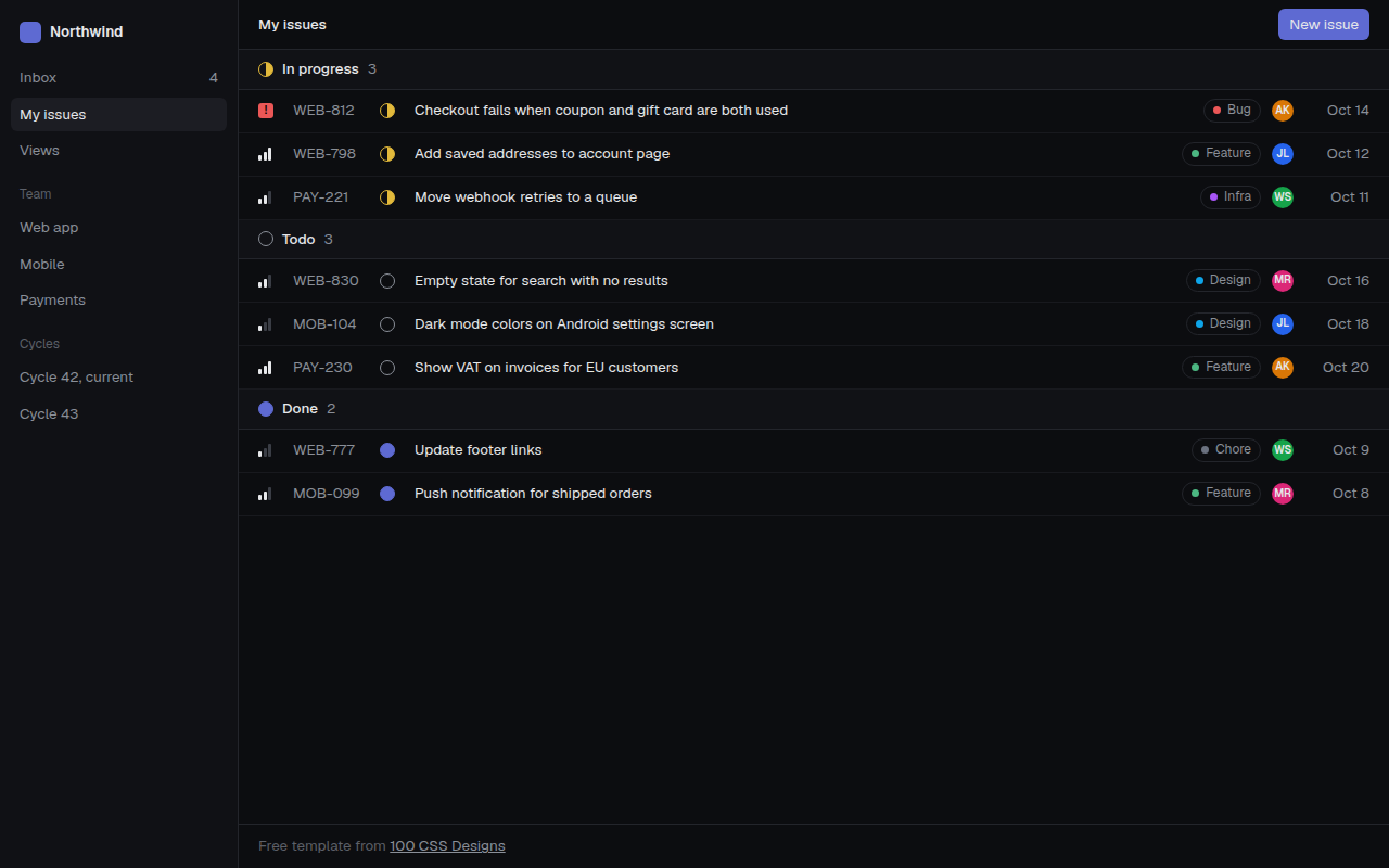
038. Linear Style Minimal
Tracklet, an issue tracker