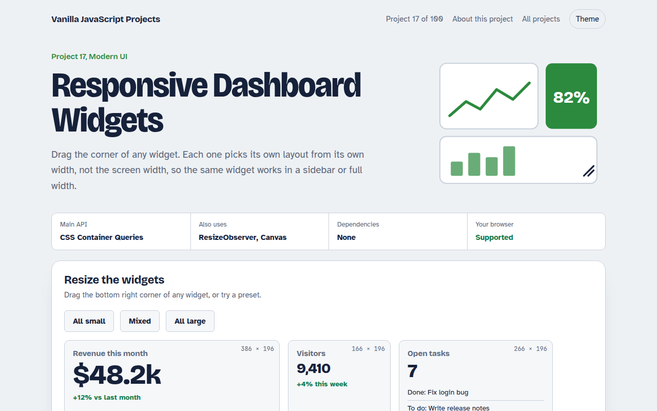
Home / Modern UI / UI Component Library
UI Component Library in JavaScript, Free with Live Demo
Free UI component library in plain JavaScript. Six Web Components with Shadow DOM: button, toggle, tabs, rating, progress ring and accordion. Works with any framework.
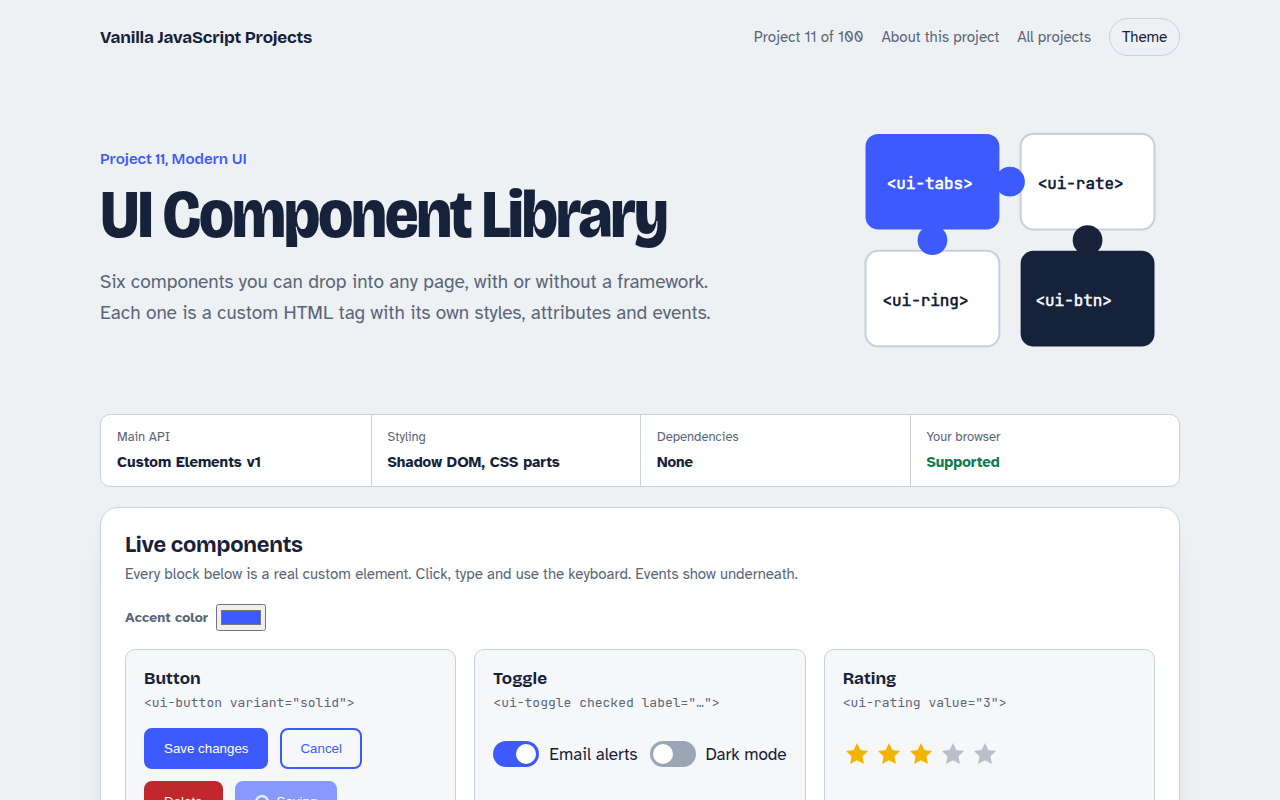
Runs on: Custom Elements v1. Every modern browser. Custom Elements and Shadow DOM have been supported everywhere since 2020.
What is the UI Component Library?
Web Components let you make your own HTML tags, like <ui-toggle> or <ui-rating>, that work in any page and any framework. This project builds six of them: a button, a toggle switch, tabs, a star rating, a progress ring and an accordion.
Each component is a JavaScript class that keeps its markup and styles inside a Shadow DOM, so nothing leaks in or out. They react when you change an attribute and fire normal events, which is why the same tag works in React, Vue or plain HTML.
Good for
- Design systems shared across several apps
- Widgets you embed on other people's sites
- Teams that use more than one framework
- Learning how browsers build components
What this project does
- ui-button, ui-toggle, ui-tabs, ui-rating, ui-progress and ui-accordion
- Every component reacts to attribute changes
- Custom events you can listen to from any framework
- Theme with CSS custom properties that pierce the shadow root
- Keyboard and screen reader friendly
How it works
- Define a classEach component extends HTMLElement and builds its markup inside an open shadow root.
- Watch attributesobservedAttributes lists what to watch, and attributeChangedCallback re-renders when one changes.
- Talk to the pageComponents fire CustomEvents such as change, so any framework can listen with a normal event listener.
The key JavaScript
This is the heart of the project. The full file has the rest, including the screen layout and error handling.
class UiToggle extends HTMLElement {
  static observedAttributes = ["checked", "label"];
  constructor() {
    super();
    this.attachShadow({ mode: "open" });
  }
  attributeChangedCallback() { this.render(); }
  toggle() {
    this.toggleAttribute("checked");
    this.dispatchEvent(new CustomEvent("change", { detail: this.hasAttribute("checked") }));
  }
  render() { /* build markup inside this.shadowRoot */ }
}
customElements.define("ui-toggle", UiToggle);
How to use it
- Click Download HTML file above.
- Open the file in a code editor, like VS Code.
- Run it from a local server with
npx serve .so the camera, microphone and AI features are allowed. - Change the text and colors, then upload it to GitHub Pages, Netlify or your own site. It is one file with no build step.
Questions people ask
Can I use Web Components in React?
Yes. They are real HTML elements, so React can render them. Pass values as attributes and listen to their events with a ref or the onChange style props in React 19.
Do Web Components work in all browsers?
Yes. Custom Elements and Shadow DOM have worked in Chrome, Edge, Firefox and Safari since 2020. No polyfill is needed.
How do I style a component from outside?
Use CSS custom properties, like --ui-accent in this project. They pass through the Shadow DOM, so you can theme every component from one place.
More Modern UI projects
012. View Transitions Gallery
A photo gallery where images grow smoothly into the detail page
013. Client-side Router
A tiny single page app router with real URLs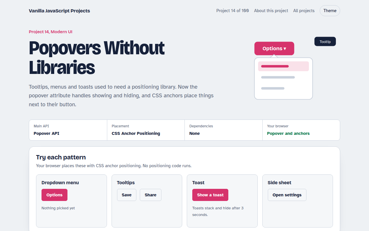
014. Popovers Without Libraries
Tooltips, menus, toasts and a side sheet with no library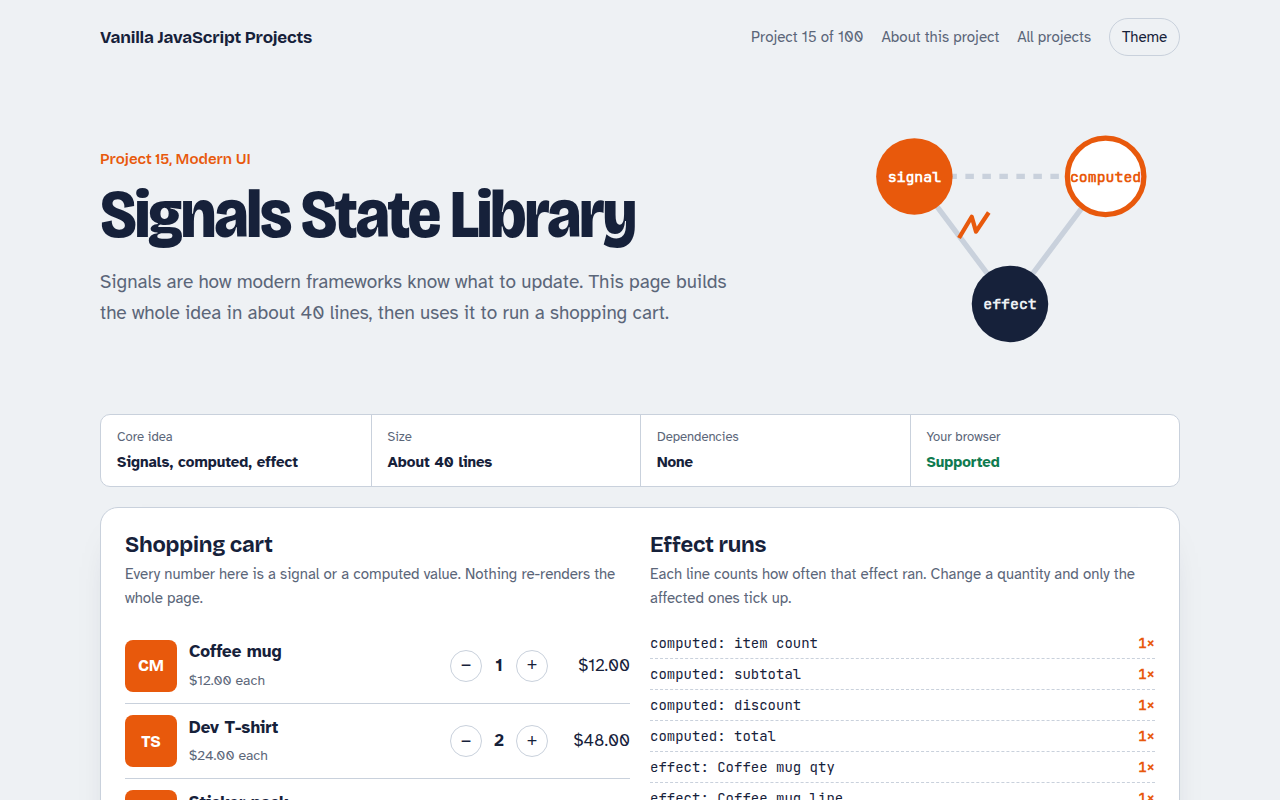
015. Signals State Library
A 40 line reactive state library running a shopping cart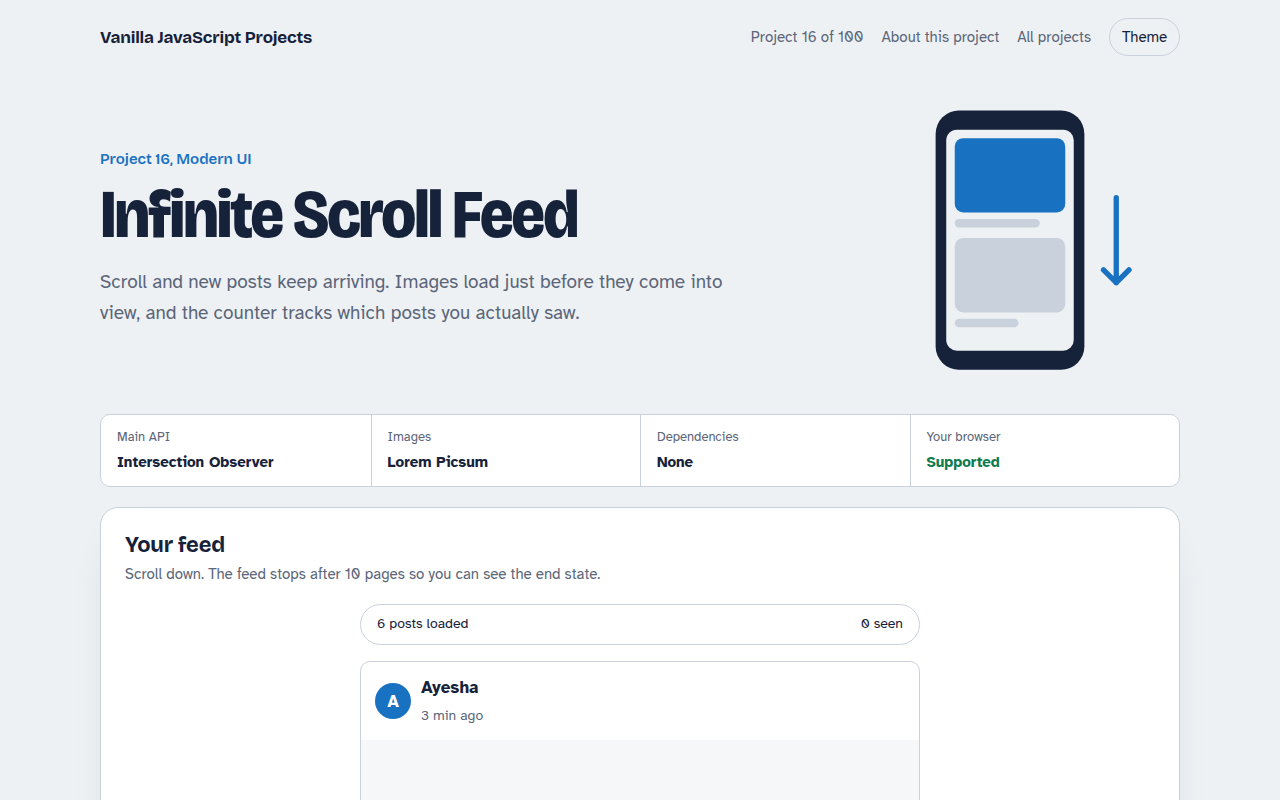
016. Infinite Scroll Feed
A photo feed that loads more posts as you scroll