Home / Modern UI / Responsive Dashboard Widgets
Responsive Dashboard Widgets in JavaScript, Free with Live Demo
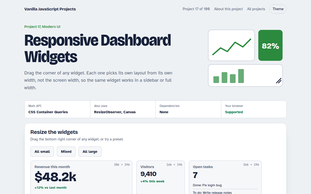
Free responsive dashboard in HTML, CSS and JavaScript. Resize any widget and it switches layout with container queries, while ResizeObserver redraws the charts.
Runs on: CSS Container Queries. Every modern browser (container queries since 2023).
What is the Responsive Dashboard Widgets?
Drag the corner of any widget on this dashboard and watch it change: a small widget shows just the number, a wider one adds a chart, and a big one adds details. Each widget decides its layout from its own width, not the screen width.
That is what CSS container queries do. The same widget works in a narrow sidebar or a wide main area without extra code. ResizeObserver tells JavaScript the new size so the canvas charts stay sharp.
Good for
- Admin and analytics dashboards
- Reusable cards in design systems
- Sidebars and layouts users can resize
- Learning container queries
What this project does
- Four widgets: revenue, visitors, tasks and weather
- Three layouts per widget: small, medium and large
- Drag handles to resize, plus preset layouts
- Charts redraw crisply at any size and pixel density
- Live size readout on each widget
How it works
- Make it a containerEach widget has container-type: inline-size, so its children can ask how wide the widget is.
- Style by size@container rules switch the layout at 260 px and 440 px of widget width, whatever the page width.
- Redraw on resizeResizeObserver reports the new size and the canvas chart is redrawn to fit, sharp on high density screens.
The key JavaScript
This is the heart of the project. The full file has the rest, including the screen layout and error handling.
.widget { container-type: inline-size; resize: both; overflow: hidden; }

/* The widget, not the screen, decides the layout */
@container (min-width: 260px) { .widget canvas { display: block; } }
@container (min-width: 440px) { .widget .body { display: grid; grid-template-columns: auto 1fr; } }

// Keep the canvas sharp at every size
new ResizeObserver(([entry]) => {
  const { width, height } = entry.contentRect;
  canvas.width = width * devicePixelRatio;
  canvas.height = height * devicePixelRatio;
  draw();
}).observe(canvas);
How to use it
- Click Download HTML file above.
- Open the file in a code editor, like VS Code.
- Run it from a local server with
npx serve .so the camera, microphone and AI features are allowed. - Change the text and colors, then upload it to GitHub Pages, Netlify or your own site. It is one file with no build step.
Questions people ask
What is the difference between media queries and container queries?
Media queries look at the screen size. Container queries look at the size of a parent element, so a component adapts to wherever you place it.
Do container queries work everywhere?
Yes. All major browsers have supported them since 2023.
Why do the charts need JavaScript?
Canvas has a fixed pixel size. ResizeObserver reports the new size, and the chart is redrawn at the right resolution for sharp lines.
More Modern UI projects
011. UI Component Library
Six reusable Web Components you can drop into any page
012. View Transitions Gallery
A photo gallery where images grow smoothly into the detail page
013. Client-side Router
A tiny single page app router with real URLs
014. Popovers Without Libraries
Tooltips, menus, toasts and a side sheet with no library
015. Signals State Library
A 40 line reactive state library running a shopping cart