Home / Dashboard Widgets / Gauge Chart
Gauge Chart in HTML, CSS and JavaScript
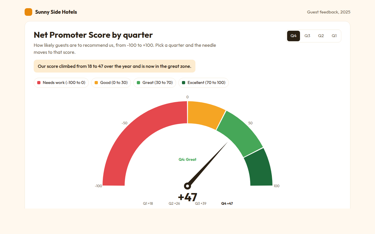
A gauge chart shows one number on a dial, like the speedometer in a car. This free template draws one with plain SVG and vanilla JavaScript, no chart library. The example shows a hotel Net Promoter Score by quarter.
What is a gauge chart?
A gauge chart shows one number on a dial, like the speedometer in a car. A needle points to the value, and colored zones show at a glance whether it is poor, good or great.
Gauges work well for a single score that people check often, like a Net Promoter Score or server load. The zones give the number meaning without anyone needing to know what a good score is.
At a glance
- Best for
- One score against clear zones
- Data you need
- One number and the limits of each zone
- Skip it when
- Comparing many scores. Use a bullet chart.
- Made with
- HTML, CSS and vanilla JavaScript. No library.
When to use a gauge chart
- Customer satisfaction and NPS scores
- Server, battery or storage levels
- Sales against a monthly target
- Health or quality scores on a dashboard
When to pick another chart
- Bullet Chart: you need to compare several scores in little space
- Progress Ring Chart: you are tracking progress toward goals
- Semi Donut Chart: the total is made of several parts
What you get in this template
- A half circle dial with four colored zones
- A needle that swings from the last value to the new one
- The score counts up in the middle as the needle moves
- A quarter switch to compare the year
- The zone name appears in its own color
- Tooltips on each zone and a data table
How the code works
Here is a short version of the idea behind this gauge chart. The full file adds the axis, labels, tooltips, sorting and resizing on top of it.
const score = 47, cx = 220, cy = 220, r = 160;
const angle = v => (-90 + (v + 100) / 200 * 180) * Math.PI / 180;   // -100 to +100 across the top
const zones = [[-100, 0, '#e5484d'], [0, 30, '#f5a524'], [30, 70, '#46a758'], [70, 100, '#1d6b3a']];
const pt = (rad, v) => (cx + rad * Math.sin(angle(v))) + ',' + (cy - rad * Math.cos(angle(v)));

zones.forEach(([a, b, color]) => make('path', { fill: color,
  d: 'M' + pt(r, a) + 'A' + r + ',' + r + ' 0 0 1 ' + pt(r, b) + 'L' + pt(r * 0.74, b) + 'A' + r * 0.74 + ',' + r * 0.74 + ' 0 0 0 ' + pt(r * 0.74, a) + 'Z' }));
make('line', { x1: cx, y1: cy, x2: pt(r * 0.7, score).split(',')[0], y2: pt(r * 0.7, score).split(',')[1], stroke: '#2a2014', 'stroke-width': 5 });
drawCircle(cx, cy, 10, '#2a2014');
The example uses four tiny helpers that create SVG shapes. Put them above the code and it runs as is.
const svg = document.querySelector('svg');
function make(tag, attrs) {
  const n = document.createElementNS('http://www.w3.org/2000/svg', tag);
  for (const k in attrs) n.setAttribute(k, attrs[k]);
  svg.appendChild(n);
  return n;
}
function drawRect(x, y, width, height, fill) { return make('rect', { x, y, width, height, fill }); }
function drawCircle(cx, cy, r, fill) { return make('circle', { cx, cy, r, fill }); }
function drawLine(x1, y1, x2, y2, stroke, width, dash) {
  return make('line', { x1, y1, x2, y2, stroke, 'stroke-width': width || 1, 'stroke-dasharray': dash || 'none' });
}
function drawText(x, y, str, anchor) {
  const t = make('text', { x, y, 'text-anchor': anchor || 'start' });
  t.textContent = str;
  return t;
}
How to add it to your website
- Download the file. Click Download HTML file above. You get one file called gauge-chart.html with everything inside.
- Change the data. Open the file in any code editor and find the DATA list near the bottom. Replace the names and numbers with your own.
- Change the colors and text. Colors are at the top of the style tag. The title, subtitle and main point are plain HTML near the top of the body.
- Put it online. Upload the file to any host, such as GitHub Pages, Netlify or your own server, or paste it into your site. There is no build step.
Questions people ask
What is a gauge chart used for?
A gauge shows a single value against a scale with colored zones, like a speedometer. It is used for scores and levels that people check often.
How do I make a gauge chart without a library?
Draw the zones as SVG arc paths across a half circle, then draw a needle rotated to the angle of your value. This template does it in plain JavaScript.
What is a Net Promoter Score?
It asks customers how likely they are to recommend you from 0 to 10. The share of 9s and 10s minus the share of 0 to 6 gives a score from -100 to +100.
Are gauge charts a good idea?
For one key number with clear zones, yes. For several numbers they take a lot of space, and a bullet chart shows the same thing more compactly.
More dashboard widgets
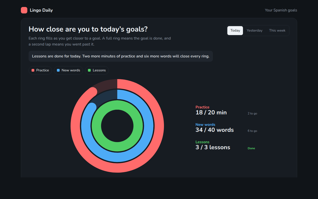
062. Progress Ring Chart
Example: daily goals in a language learning app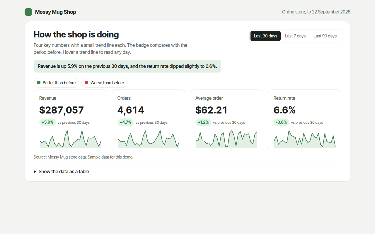
063. KPI Cards with Sparklines
Example: revenue, orders, average order and returns for an online shop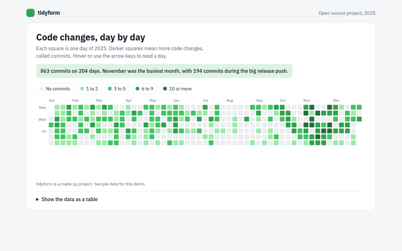
064. Calendar Heatmap
Example: a year of code changes on an open source project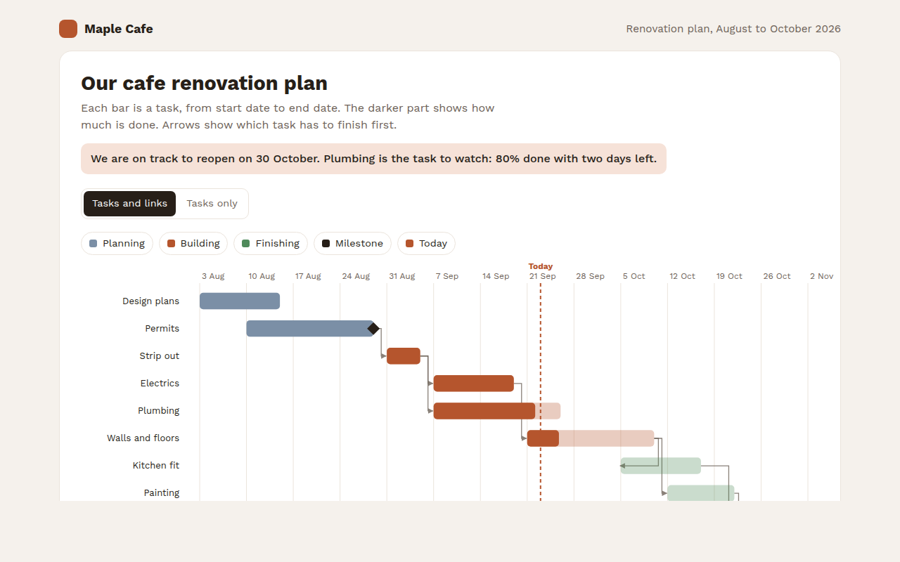
065. Gantt Chart
Example: a cafe renovation plan with tasks and milestones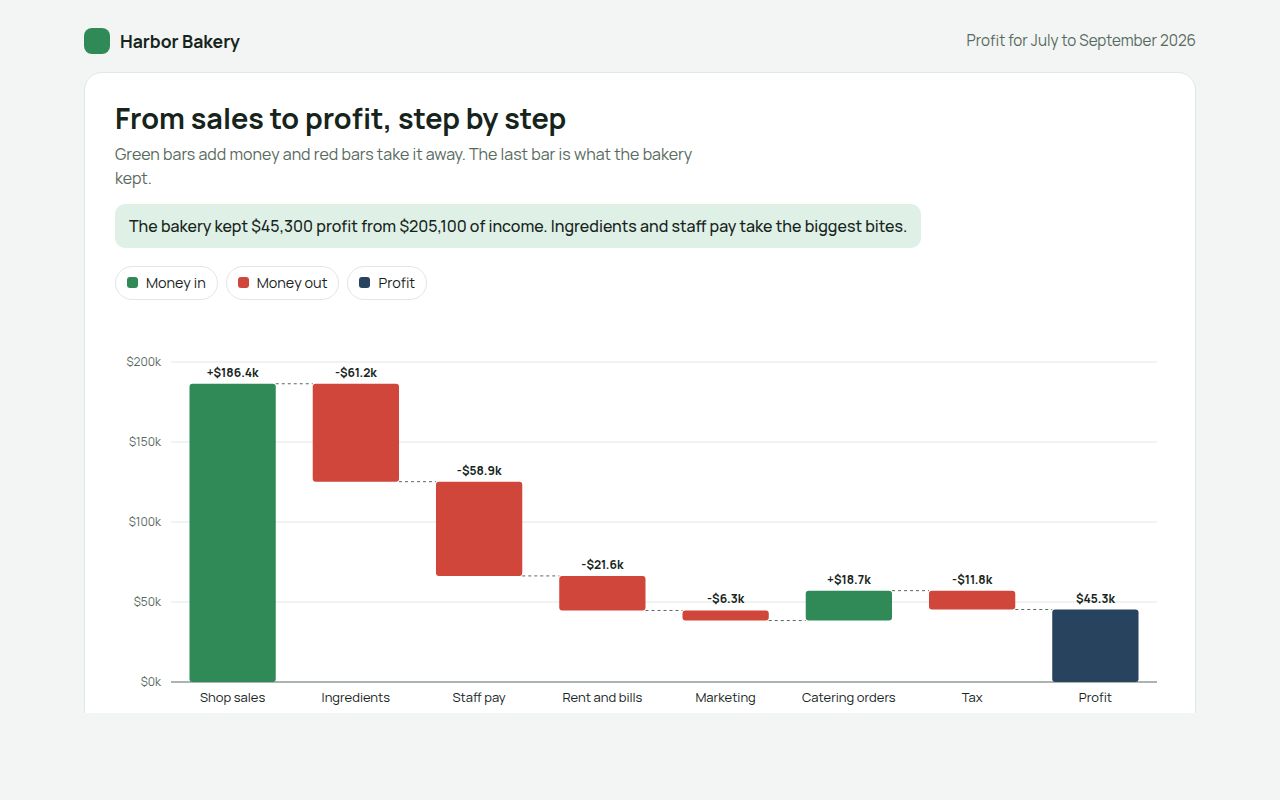
066. Waterfall Chart
Example: how a bakery turns sales into profit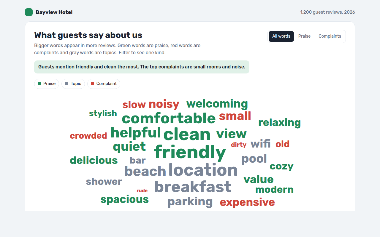
067. Word Cloud
Example: words guests use in hotel reviews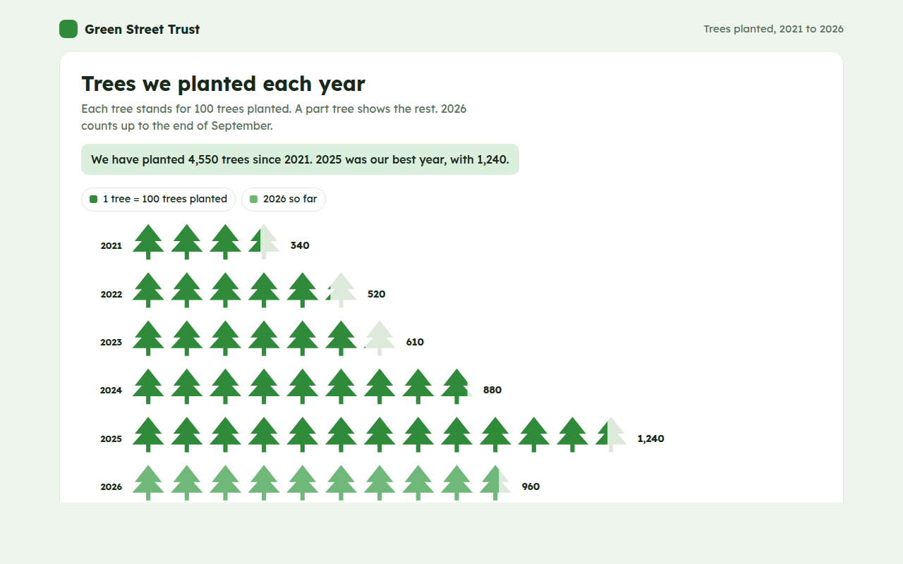
068. Pictogram Chart
Example: trees planted by a charity each year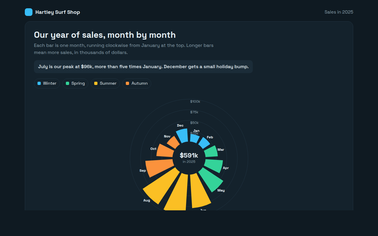
069. Radial Bar Chart
Example: monthly sales for a surf shop