Home / Dashboard Widgets / Waterfall Chart
Waterfall Chart in HTML, CSS and JavaScript
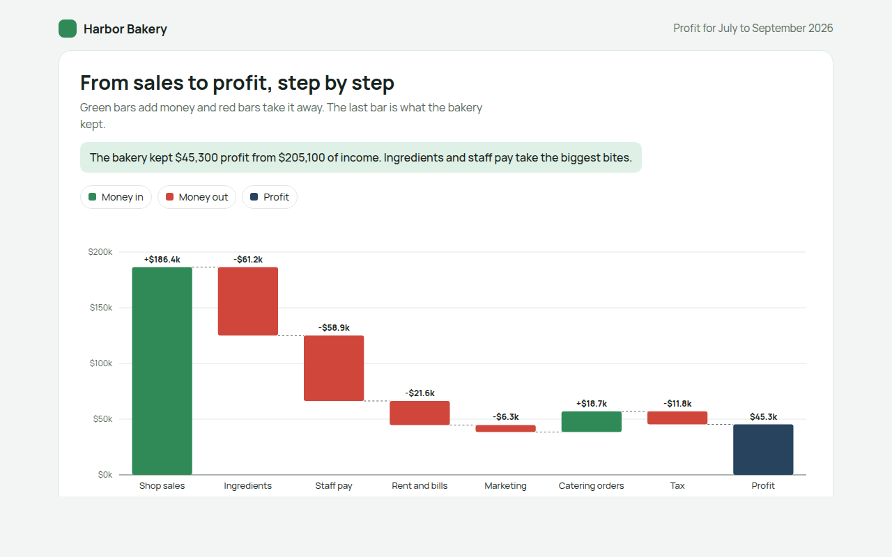
A waterfall chart shows how you get from one number to another, step by step. This free template draws one with plain SVG and vanilla JavaScript, no chart library. The example shows how a bakery turns sales into profit.
What is a waterfall chart?
A waterfall chart shows how you get from one number to another, step by step. Each bar starts where the last one ended, going up for money in and down for money out, and the final bar shows the result.
It is the clearest way to explain a profit and loss statement to people who do not read accounts. You can see at once which costs take the biggest bites out of sales.
At a glance
- Best for
- Explaining how a total was built up
- Data you need
- A list of positive and negative amounts in order
- Skip it when
- Data over time. Use a line or bar chart.
- Made with
- HTML, CSS and vanilla JavaScript. No library.
When to use a waterfall chart
- Profit and loss for a business
- Cash flow over a month or year
- Budget changes from last year to this year
- Explaining changes in headcount or stock
When to pick another chart
- Diverging Bar Chart: each item stands on its own and does not add up
- Stacked Bar Chart: you want to show parts of a total at several points in time
What you get in this template
- Floating bars that start where the last one ended
- Green for money in, red for money out, dark blue for the result
- Dashed lines joining each step
- Values in thousands above every bar
- Tooltips with the running total
- Tilted labels on phones and a full data table
How the code works
Here is a short version of the idea behind this waterfall chart. The full file adds the axis, labels, tooltips, sorting and resizing on top of it.
const steps = [['Sales', 186400], ['Ingredients', -61200], ['Staff', -58900], ['Rent', -21600]];
const y = v => 280 - v / 200000 * 260;
let total = 0;

steps.forEach(([name, v], i) => {
  const from = total, to = total + v;
  drawRect(40 + i * 110, y(Math.max(from, to)), 80, Math.abs(y(from) - y(to)), v >= 0 ? '#2f8a57' : '#d0463b');
  drawText(80 + i * 110, 298, name, 'middle');
  total = to;
});
drawRect(40 + steps.length * 110, y(total), 80, y(0) - y(total), '#28435e');
The example uses four tiny helpers that create SVG shapes. Put them above the code and it runs as is.
const svg = document.querySelector('svg');
function make(tag, attrs) {
  const n = document.createElementNS('http://www.w3.org/2000/svg', tag);
  for (const k in attrs) n.setAttribute(k, attrs[k]);
  svg.appendChild(n);
  return n;
}
function drawRect(x, y, width, height, fill) { return make('rect', { x, y, width, height, fill }); }
function drawCircle(cx, cy, r, fill) { return make('circle', { cx, cy, r, fill }); }
function drawLine(x1, y1, x2, y2, stroke, width, dash) {
  return make('line', { x1, y1, x2, y2, stroke, 'stroke-width': width || 1, 'stroke-dasharray': dash || 'none' });
}
function drawText(x, y, str, anchor) {
  const t = make('text', { x, y, 'text-anchor': anchor || 'start' });
  t.textContent = str;
  return t;
}
How to add it to your website
- Download the file. Click Download HTML file above. You get one file called waterfall-chart.html with everything inside.
- Change the data. Open the file in any code editor and find the DATA list near the bottom. Replace the names and numbers with your own.
- Change the colors and text. Colors are at the top of the style tag. The title, subtitle and main point are plain HTML near the top of the body.
- Put it online. Upload the file to any host, such as GitHub Pages, Netlify or your own server, or paste it into your site. There is no build step.
Questions people ask
What is a waterfall chart?
A waterfall chart shows how a starting value is changed by a series of increases and decreases to reach a final value. Each bar floats where the previous one ended.
What is a waterfall chart used for?
Mostly for finance: profit and loss, cash flow and budget changes. It is also handy for explaining any change made of several parts.
Is a waterfall chart the same as a bridge chart?
Yes. It is also called a bridge chart, a cascade chart or a flying bricks chart.
Should the axis start at zero?
Yes. The bars show amounts, so starting at zero keeps their sizes honest.
More dashboard widgets
061. Gauge Chart
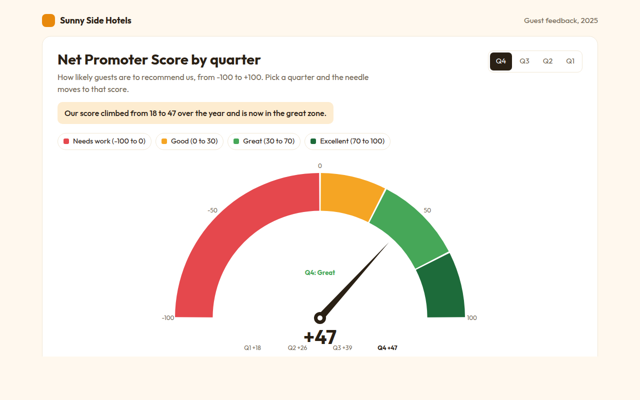
Example: a hotel Net Promoter Score by quarter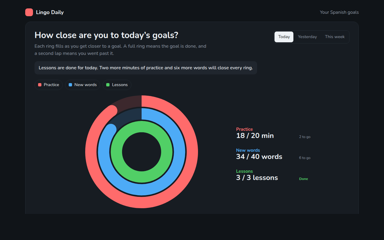
062. Progress Ring Chart
Example: daily goals in a language learning app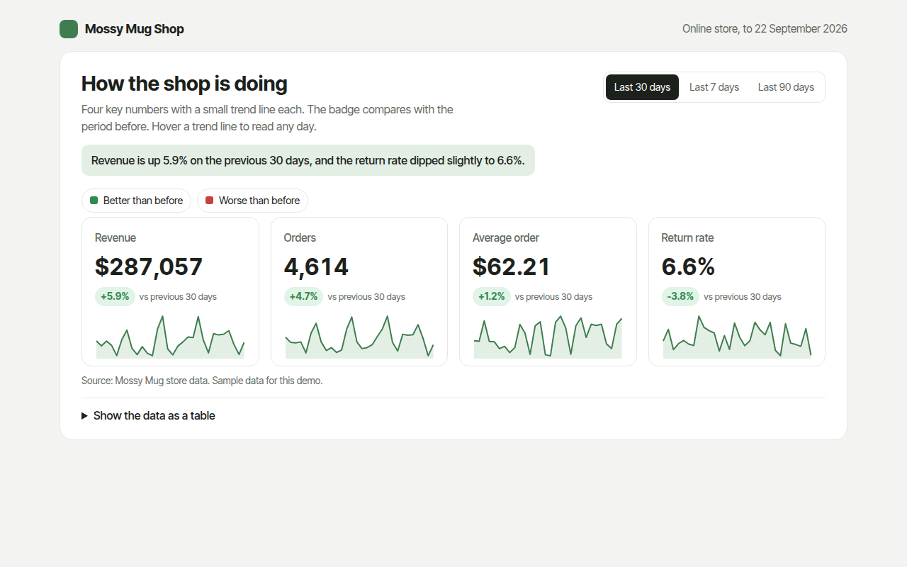
063. KPI Cards with Sparklines
Example: revenue, orders, average order and returns for an online shop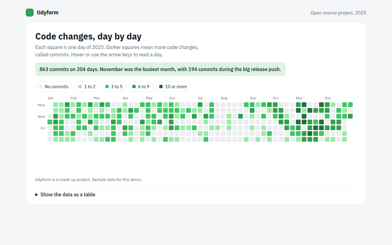
064. Calendar Heatmap
Example: a year of code changes on an open source project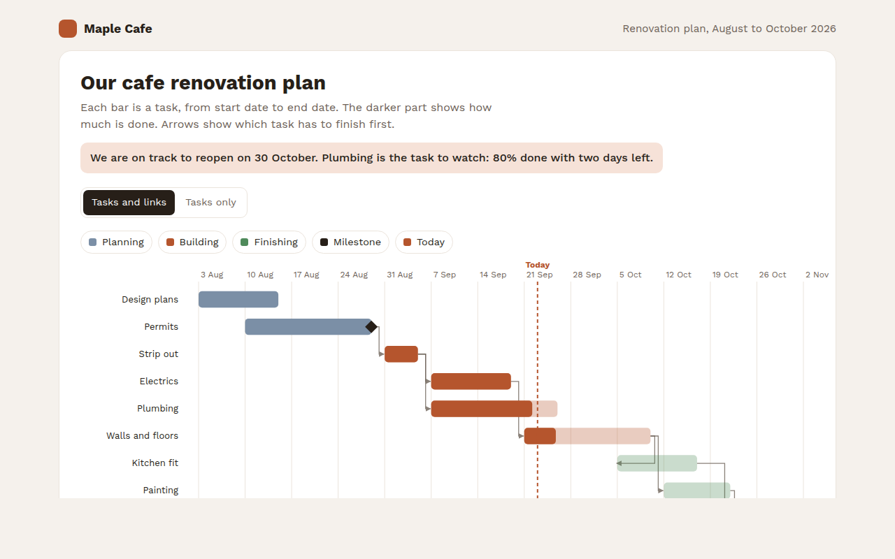
065. Gantt Chart
Example: a cafe renovation plan with tasks and milestones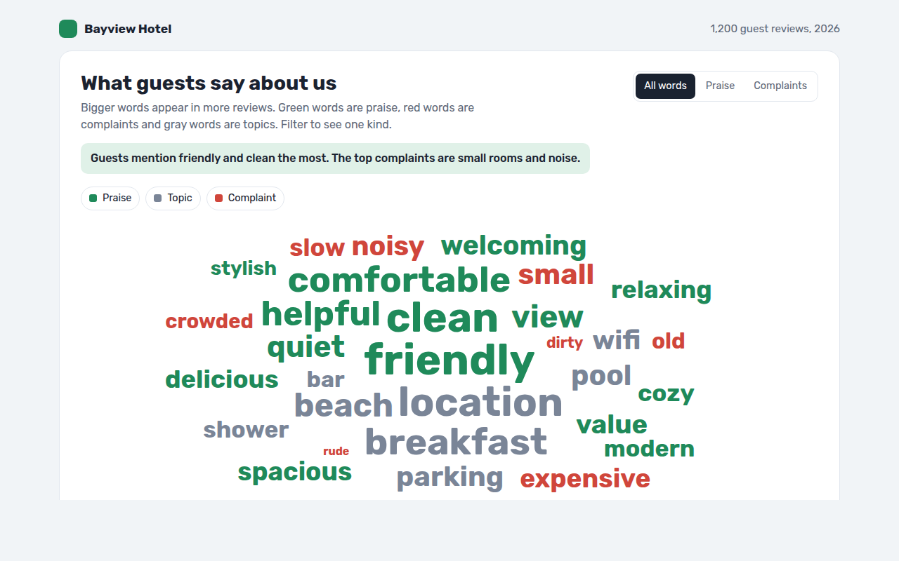
067. Word Cloud
Example: words guests use in hotel reviews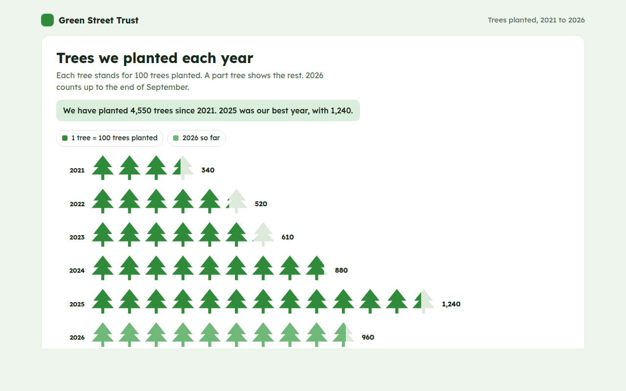
068. Pictogram Chart
Example: trees planted by a charity each year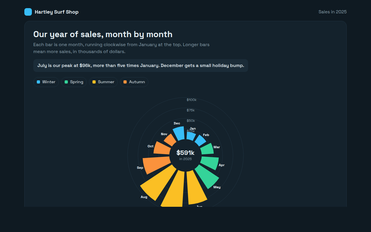
069. Radial Bar Chart
Example: monthly sales for a surf shop