Home / Dashboard Widgets / KPI Cards with Sparklines
KPI Cards with Sparklines in HTML, CSS and JavaScript
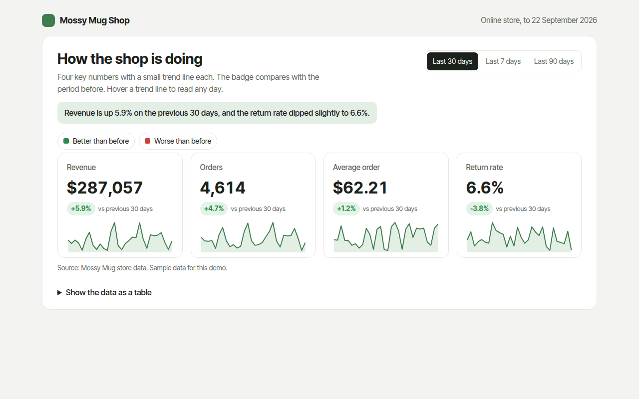
KPI cards show the few numbers that matter most, each on its own card with a big value, a badge for the change since last period and a tiny trend line. This free template draws one with plain SVG and vanilla JavaScript, no chart library. The example shows revenue, orders, average order and returns for an online shop.
What is a kpi cards with sparklines?
KPI cards show the few numbers that matter most, each on its own card with a big value, a badge for the change since last period and a tiny trend line. KPI stands for key performance indicator.
They sit at the top of most dashboards because they answer the first question anyone asks: how are we doing right now? The badge color tells you if the change is good or bad, which is not always the same as up or down.
At a glance
- Best for
- The top numbers at the head of a dashboard
- Data you need
- A daily value for each measure over two periods
- Skip it when
- Showing more than about six cards. Pick what matters.
- Made with
- HTML, CSS and vanilla JavaScript. No library.
When to use a kpi cards with sparklines
- Online shop and app dashboards
- Weekly or monthly reports
- Team and project dashboards
- Finance and sales summaries
When to pick another chart
- Sparkline: you want many small trends in a table
- Line Chart: one measure needs a full size chart
What you get in this template
- Four cards in a grid that stacks on phones
- Change badges in green or red, with return rate treated as better when it falls
- A sparkline in every card with hover values for each day
- A switch between 7, 30 and 90 days
- Every number is worked out from the daily data
- A data table with this period and the one before
How the code works
Here is a short version of the idea behind this kpi cards with sparklines. The full file adds the axis, labels, tooltips, sorting and resizing on top of it.
const days = [8620, 9140, 8890, 9760, 10210, 9980, 10640];
const total = days.reduce((a, b) => a + b, 0), before = 61200;
const change = (total - before) / before * 100;
const x = i => 20 + i * 36, lo = Math.min(...days), hi = Math.max(...days), y = v => 150 - (v - lo) / (hi - lo) * 40;

drawRect(10, 10, 240, 160, '#ffffff');
drawText(24, 40, 'Revenue');
drawText(24, 80, '$' + total.toLocaleString('en-US'));
drawText(24, 105, (change >= 0 ? '+' : '') + change.toFixed(1) + '% vs last week');
make('path', { d: 'M' + days.map((v, i) => x(i) + ',' + y(v)).join('L'), fill: 'none', stroke: '#3f7d4e', 'stroke-width': 2 });
The example uses four tiny helpers that create SVG shapes. Put them above the code and it runs as is.
const svg = document.querySelector('svg');
function make(tag, attrs) {
  const n = document.createElementNS('http://www.w3.org/2000/svg', tag);
  for (const k in attrs) n.setAttribute(k, attrs[k]);
  svg.appendChild(n);
  return n;
}
function drawRect(x, y, width, height, fill) { return make('rect', { x, y, width, height, fill }); }
function drawCircle(cx, cy, r, fill) { return make('circle', { cx, cy, r, fill }); }
function drawLine(x1, y1, x2, y2, stroke, width, dash) {
  return make('line', { x1, y1, x2, y2, stroke, 'stroke-width': width || 1, 'stroke-dasharray': dash || 'none' });
}
function drawText(x, y, str, anchor) {
  const t = make('text', { x, y, 'text-anchor': anchor || 'start' });
  t.textContent = str;
  return t;
}
How to add it to your website
- Download the file. Click Download HTML file above. You get one file called kpi-cards.html with everything inside.
- Change the data. Open the file in any code editor and find the DATA list near the bottom. Replace the names and numbers with your own.
- Change the colors and text. Colors are at the top of the style tag. The title, subtitle and main point are plain HTML near the top of the body.
- Put it online. Upload the file to any host, such as GitHub Pages, Netlify or your own server, or paste it into your site. There is no build step.
Questions people ask
What is a KPI card?
A KPI card is a small box on a dashboard showing one key number, how it changed since the last period, and often a tiny trend line.
How many KPI cards should a dashboard have?
Three to six. Choose the numbers people act on. Too many cards and none of them stand out.
Should the change badge be green when the number goes up?
Only if up is good. For costs, return rates or complaints, a drop is good news, so the badge should be green when they fall. This template handles that.
What should I compare against?
The period just before is the most common choice, as used here. The same period last year works better for seasonal businesses.
More dashboard widgets
061. Gauge Chart
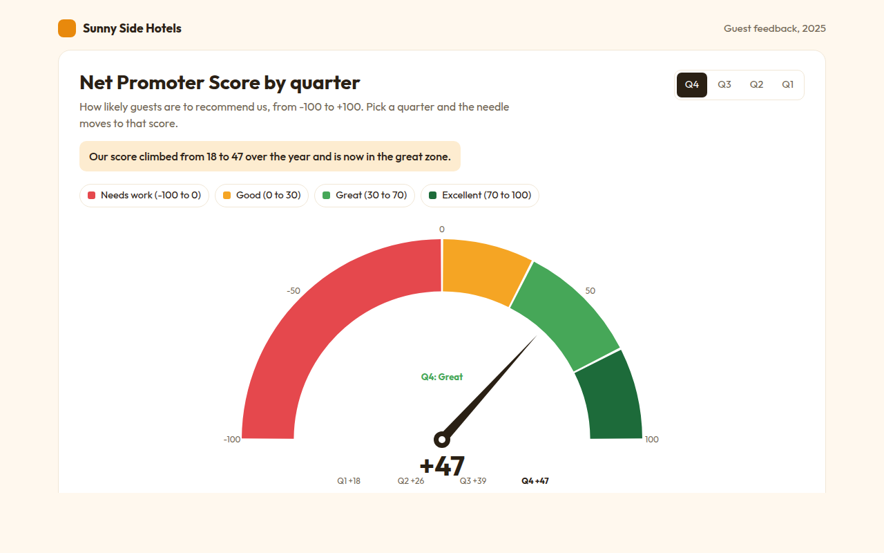
Example: a hotel Net Promoter Score by quarter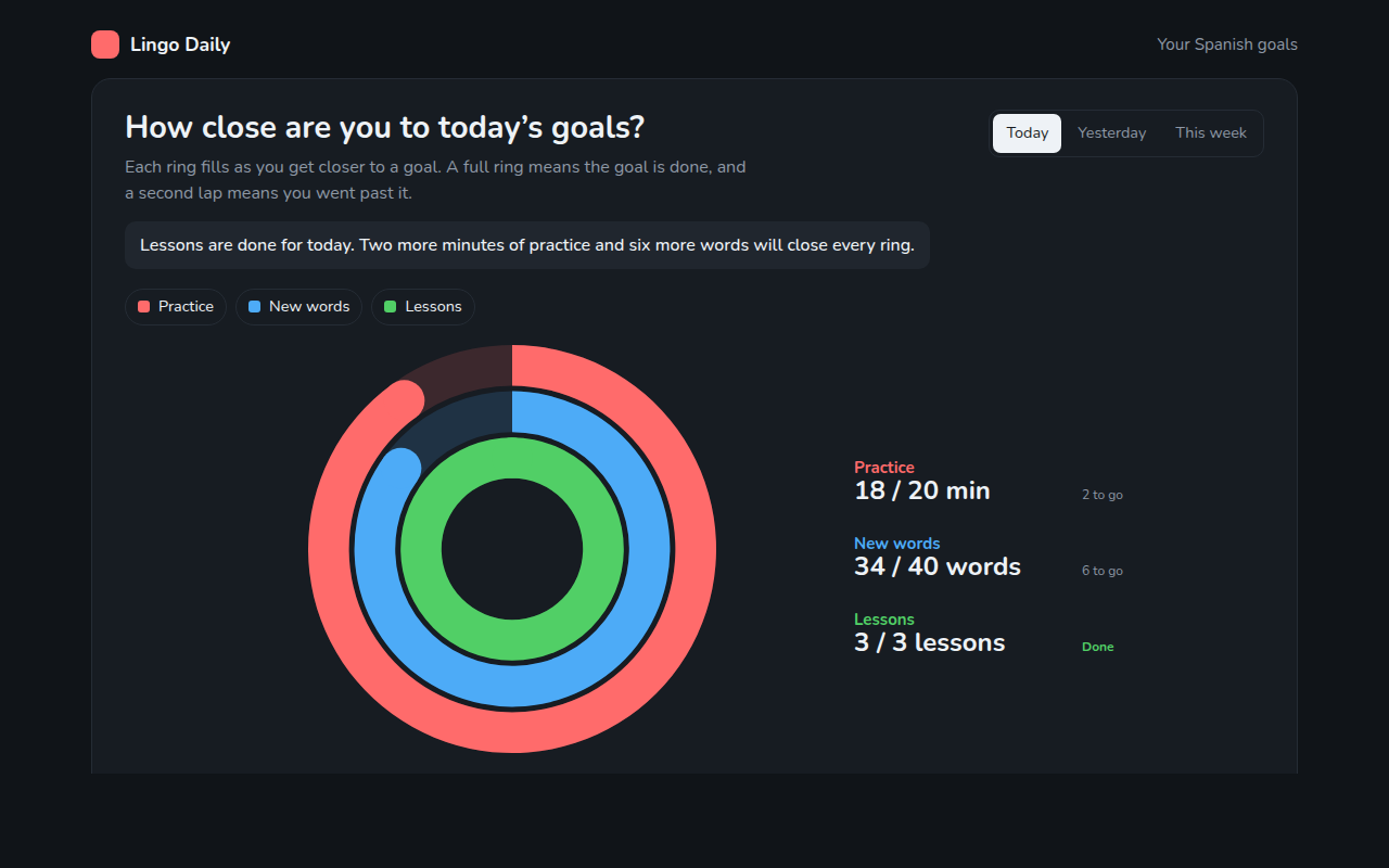
062. Progress Ring Chart
Example: daily goals in a language learning app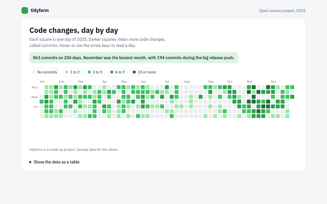
064. Calendar Heatmap
Example: a year of code changes on an open source project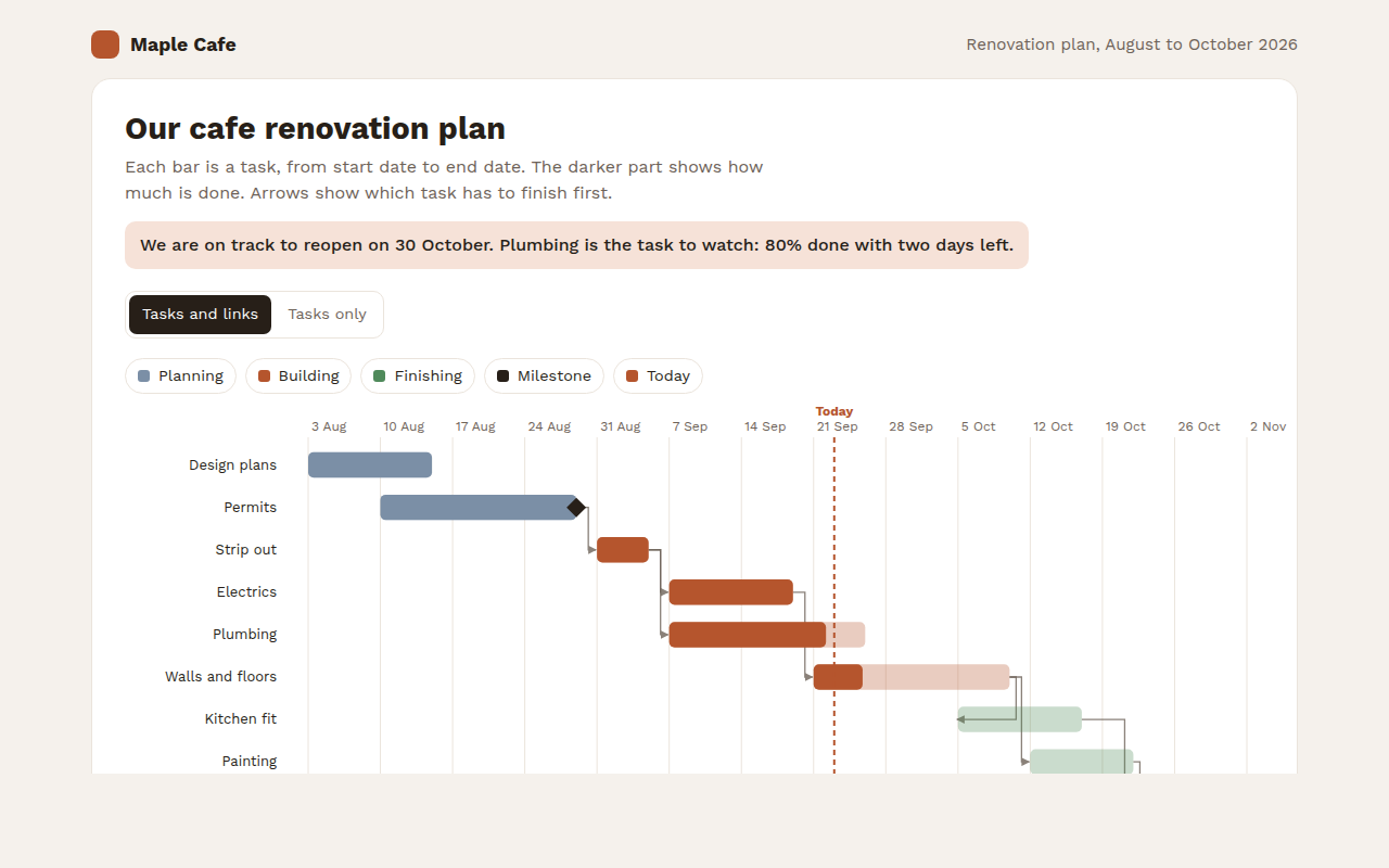
065. Gantt Chart
Example: a cafe renovation plan with tasks and milestones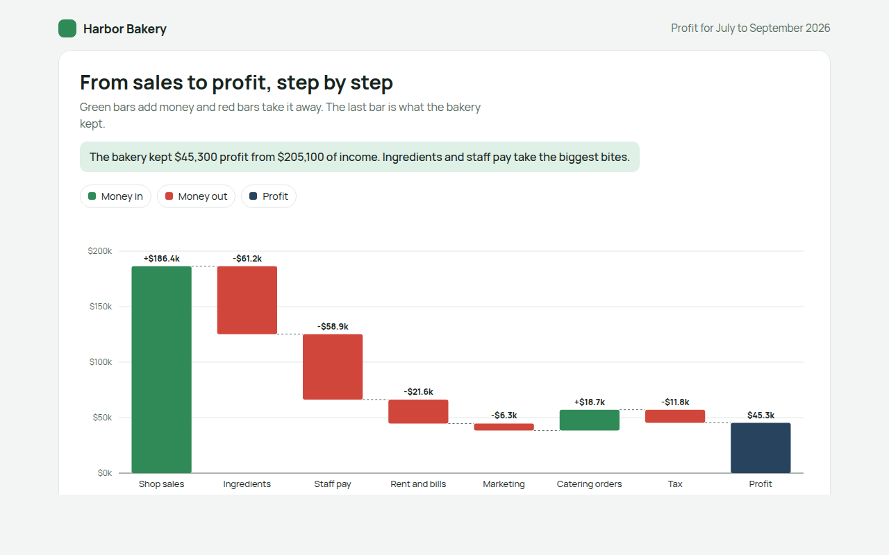
066. Waterfall Chart
Example: how a bakery turns sales into profit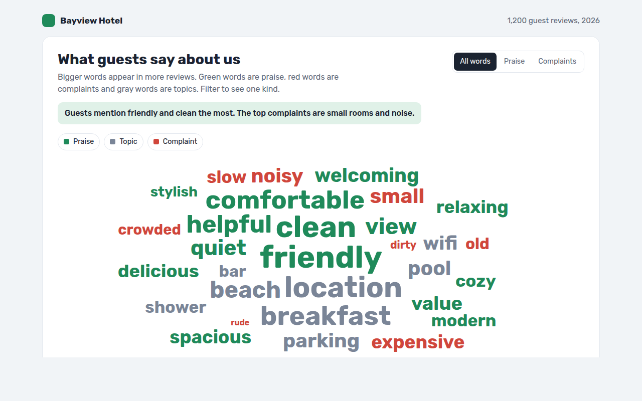
067. Word Cloud
Example: words guests use in hotel reviews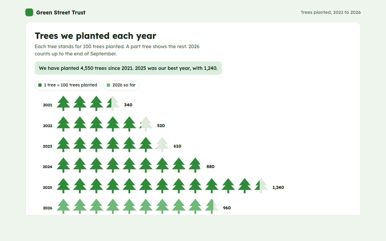
068. Pictogram Chart
Example: trees planted by a charity each year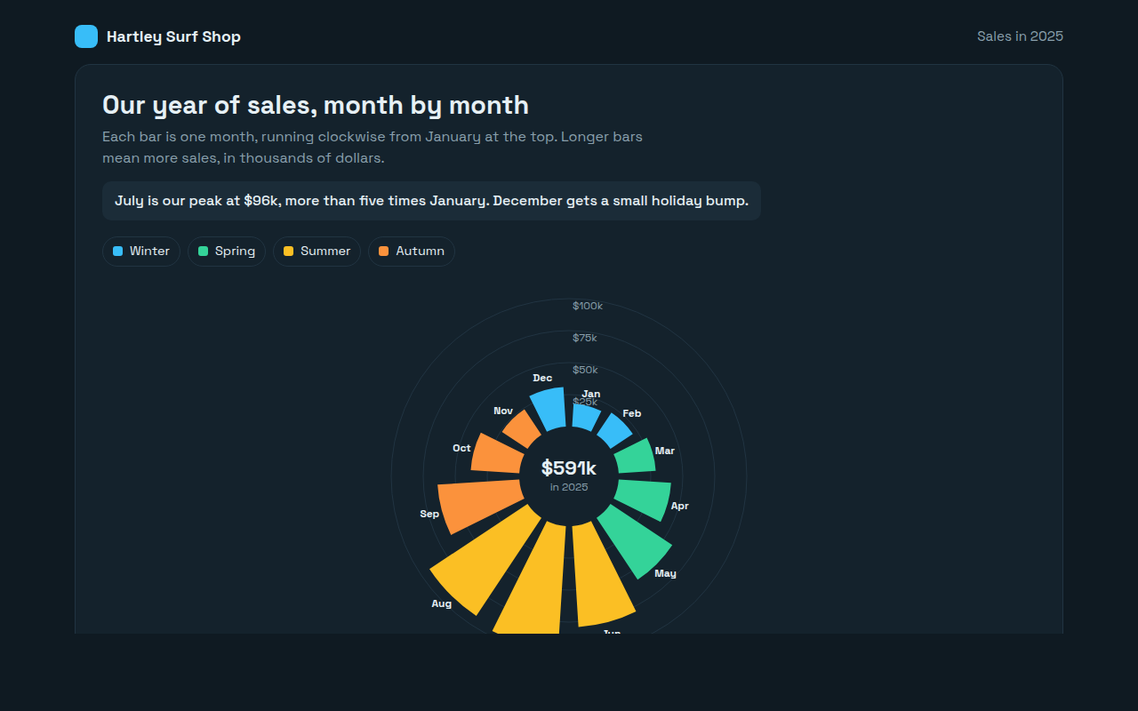
069. Radial Bar Chart
Example: monthly sales for a surf shop