Home / Dashboard Widgets / Calendar Heatmap
Calendar Heatmap in HTML, CSS and JavaScript
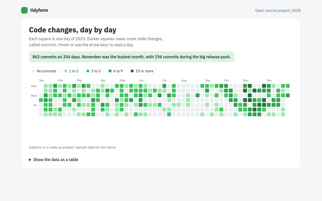
A calendar heatmap shows a year as a grid of small squares, one per day, arranged in weeks. This free template draws one with plain SVG and vanilla JavaScript, no chart library. The example shows a year of code changes on an open source project.
What is a calendar heatmap?
A calendar heatmap shows a year as a grid of small squares, one per day, arranged in weeks. The darker the square, the more activity on that day.
Most people know it from GitHub profiles. It makes habits and patterns visible: busy weeks, quiet holidays, weekends off and streaks of daily work.
At a glance
- Best for
- Daily activity over a whole year
- Data you need
- A number for every day
- Skip it when
- Data that is not daily. Use a bar or line chart.
- Made with
- HTML, CSS and vanilla JavaScript. No library.
When to use a calendar heatmap
- Code commits or writing streaks
- Workouts, study or habit tracking
- Daily sales or bookings
- Support tickets or website visits by day
When to pick another chart
- Heatmap: you compare hours against days of the week
- Line Chart: you care about the trend more than single days
What you get in this template
- 365 squares laid out in weeks, Monday to Sunday
- Five shades from no activity to 10 or more
- Month labels across the top
- Arrow keys move day by day and week by week
- Scrolls sideways on phones so squares stay readable
- A monthly summary table
How the code works
Here is a short version of the idea behind this calendar heatmap. The full file adds the axis, labels, tooltips, sorting and resizing on top of it.
const counts = Array.from({ length: 365 }, (v, i) => (i * 7919) % 11 > 6 ? (i * 31) % 12 : 0);
const shades = ['#ebedf0', '#9be9a8', '#40c463', '#30a14e', '#216e39'];
const level = v => v === 0 ? 0 : v <= 2 ? 1 : v <= 5 ? 2 : v <= 9 ? 3 : 4;
const firstDay = 2, size = 10; // 1 January 2025 was a Wednesday

counts.forEach((v, i) => {
  const k = i + firstDay;
  drawRect(20 + Math.floor(k / 7) * size, 20 + (k % 7) * size, size - 2, size - 2, shades[level(v)]);
});
The example uses four tiny helpers that create SVG shapes. Put them above the code and it runs as is.
const svg = document.querySelector('svg');
function make(tag, attrs) {
  const n = document.createElementNS('http://www.w3.org/2000/svg', tag);
  for (const k in attrs) n.setAttribute(k, attrs[k]);
  svg.appendChild(n);
  return n;
}
function drawRect(x, y, width, height, fill) { return make('rect', { x, y, width, height, fill }); }
function drawCircle(cx, cy, r, fill) { return make('circle', { cx, cy, r, fill }); }
function drawLine(x1, y1, x2, y2, stroke, width, dash) {
  return make('line', { x1, y1, x2, y2, stroke, 'stroke-width': width || 1, 'stroke-dasharray': dash || 'none' });
}
function drawText(x, y, str, anchor) {
  const t = make('text', { x, y, 'text-anchor': anchor || 'start' });
  t.textContent = str;
  return t;
}
How to add it to your website
- Download the file. Click Download HTML file above. You get one file called calendar-heatmap.html with everything inside.
- Change the data. Open the file in any code editor and find the DATA list near the bottom. Replace the names and numbers with your own.
- Change the colors and text. Colors are at the top of the style tag. The title, subtitle and main point are plain HTML near the top of the body.
- Put it online. Upload the file to any host, such as GitHub Pages, Netlify or your own server, or paste it into your site. There is no build step.
Questions people ask
What is a calendar heatmap?
A calendar heatmap is a grid of days, usually a year, where the color of each square shows how much happened on that day.
How do I make a GitHub style contribution graph?
Put each day in a column for its week and a row for its weekday, then color it by its count in four or five steps. This template shows the full code.
How many color steps should I use?
Four or five, plus one for zero. More steps are hard to tell apart.
How do I make it work on a phone?
A full year needs about 53 columns, which is too many for a phone. Let the calendar scroll sideways, as this template does, so the squares stay big enough to tap.
More dashboard widgets
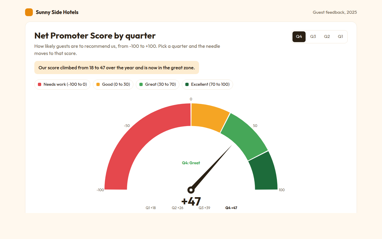
061. Gauge Chart
Example: a hotel Net Promoter Score by quarter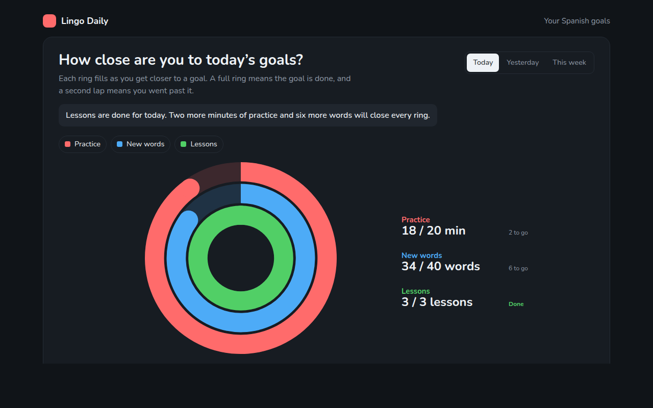
062. Progress Ring Chart
Example: daily goals in a language learning app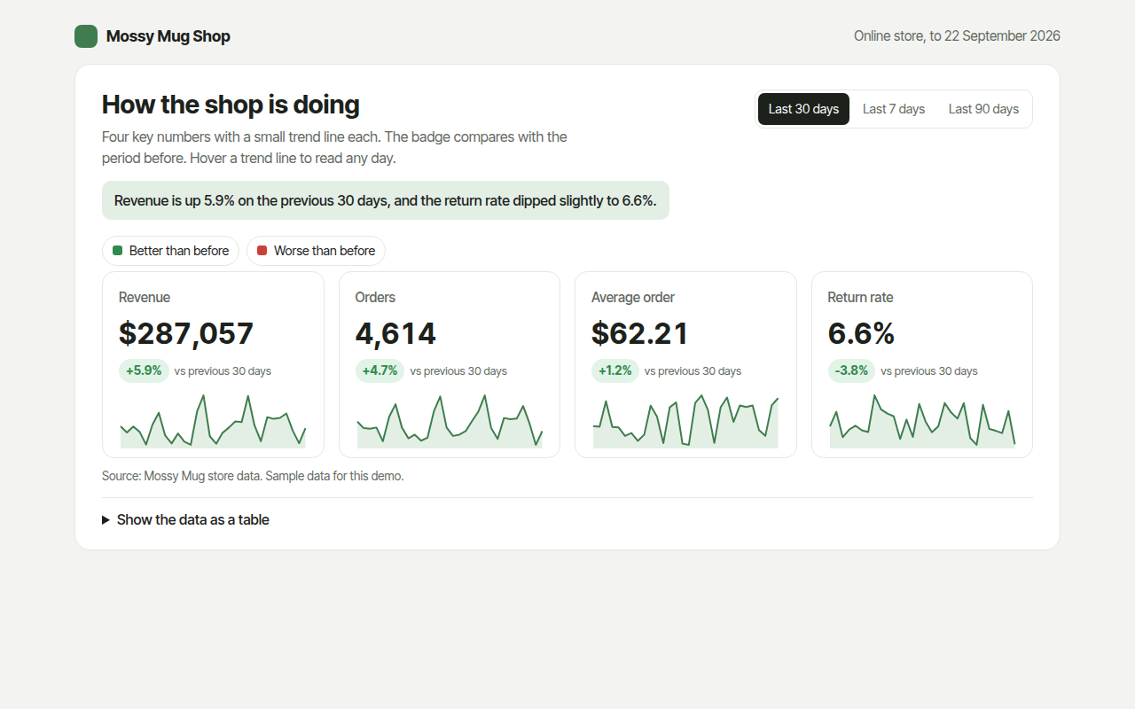
063. KPI Cards with Sparklines
Example: revenue, orders, average order and returns for an online shop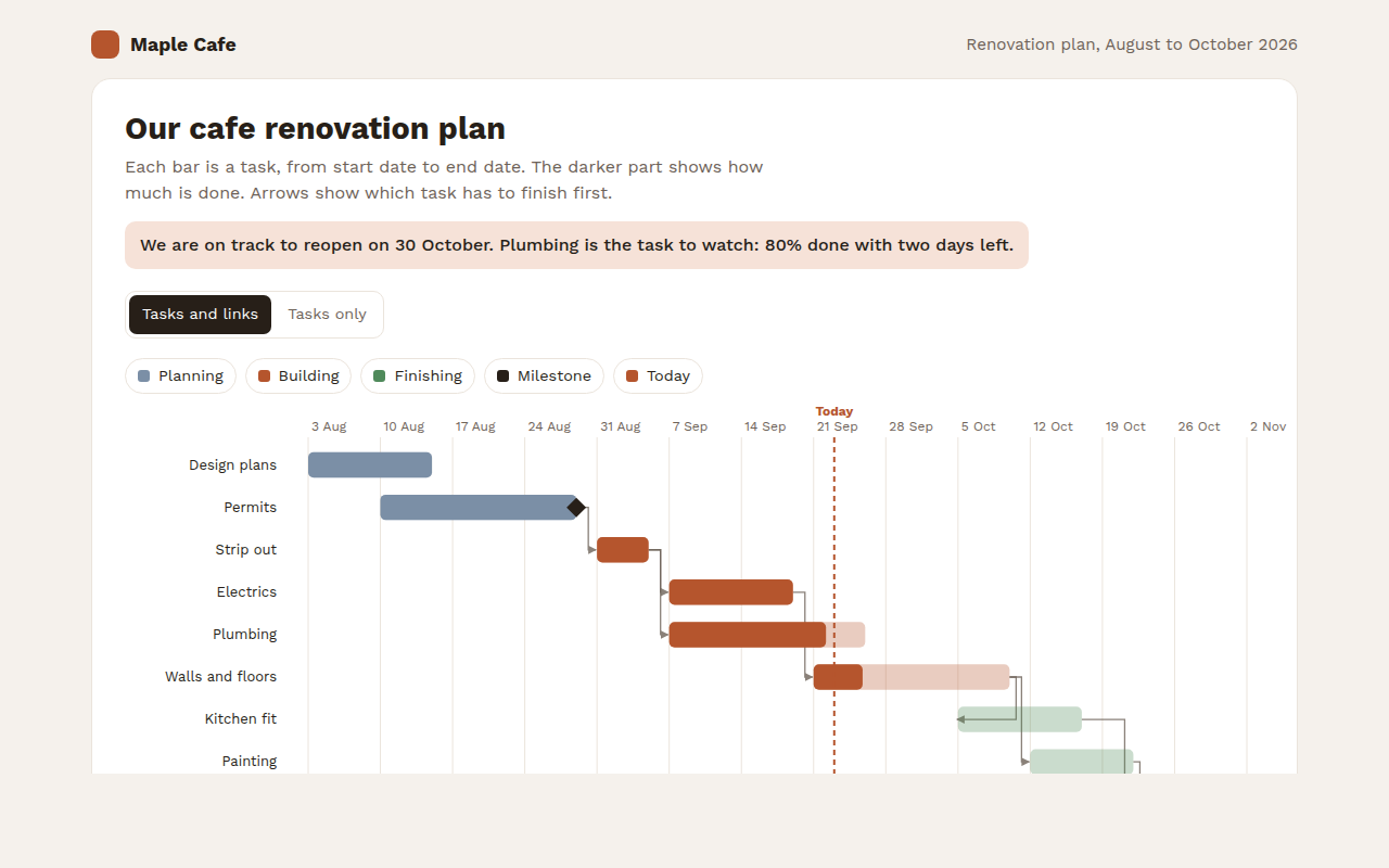
065. Gantt Chart
Example: a cafe renovation plan with tasks and milestones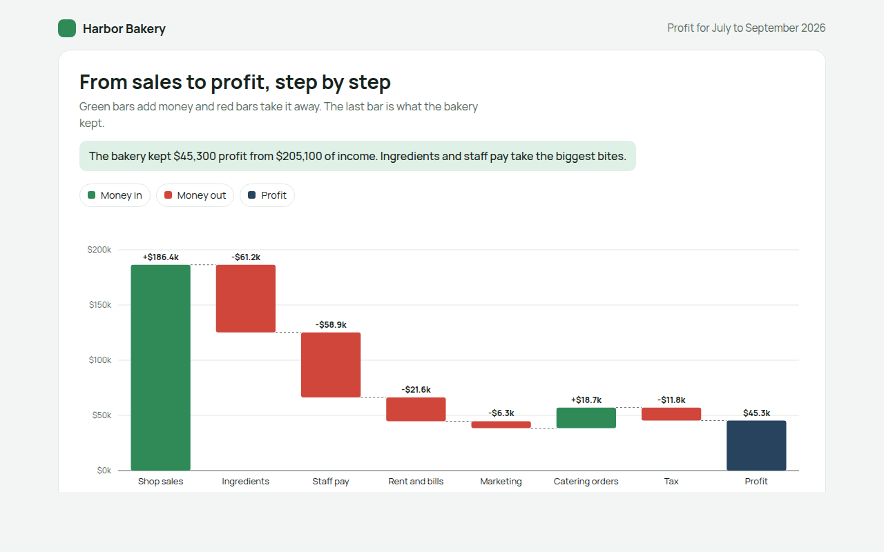
066. Waterfall Chart
Example: how a bakery turns sales into profit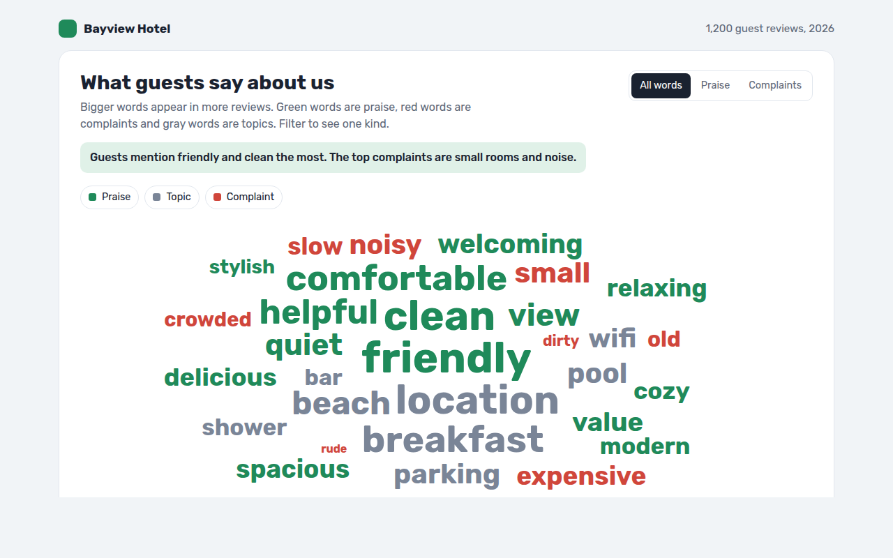
067. Word Cloud
Example: words guests use in hotel reviews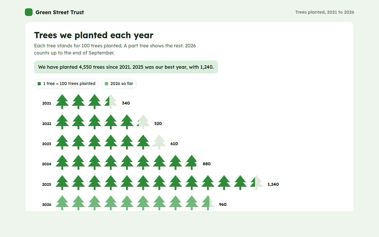
068. Pictogram Chart
Example: trees planted by a charity each year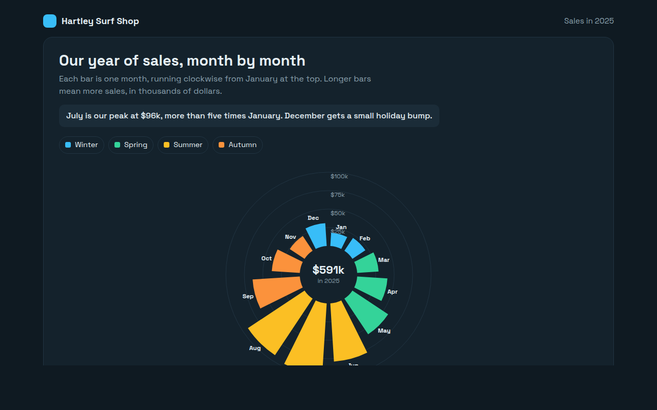
069. Radial Bar Chart
Example: monthly sales for a surf shop