Home / Layout Patterns / Bento Grid
Bento Grid CSS Template, Free with Live Demo
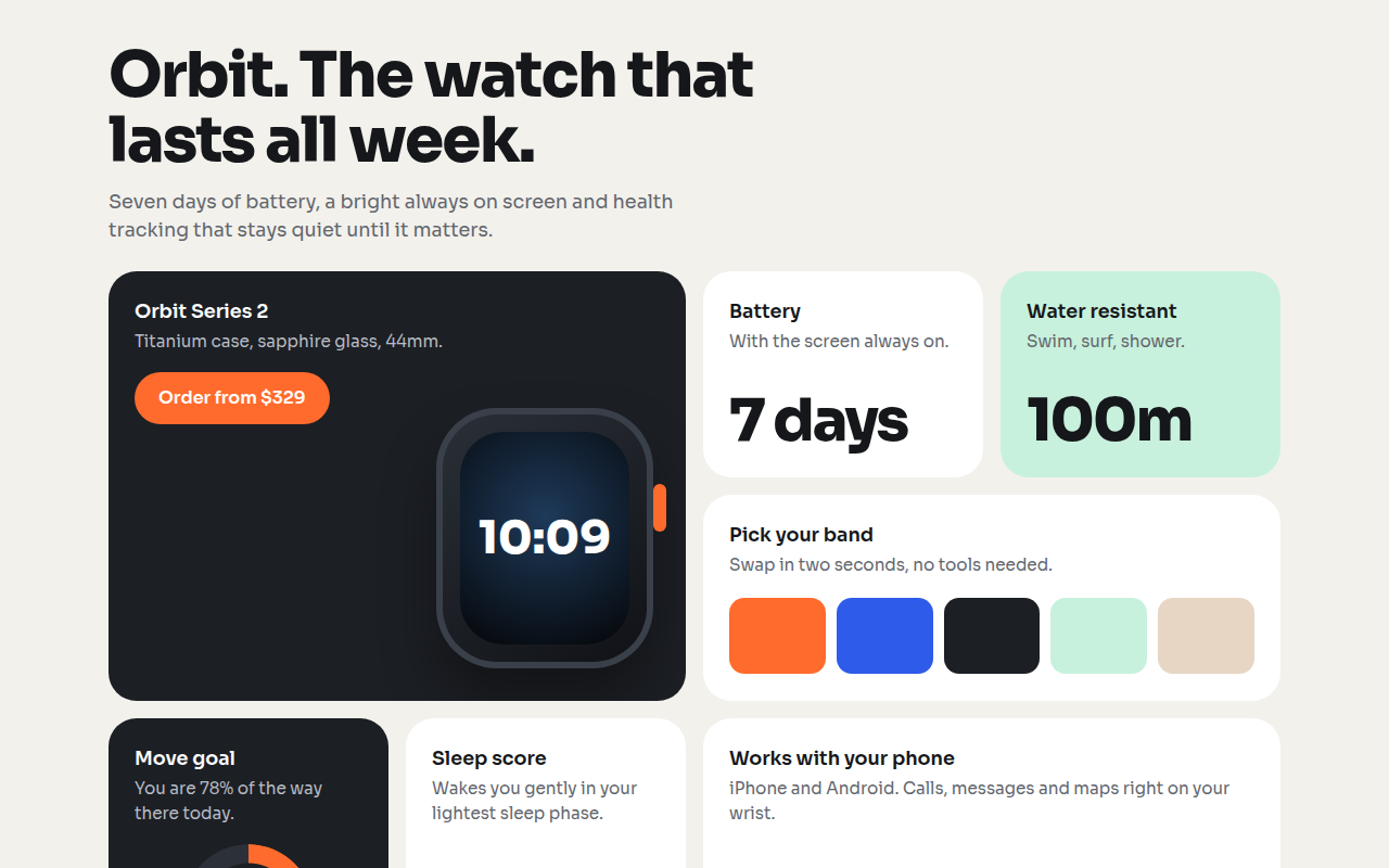
Free bento grid website template in pure CSS Grid. Apple style boxes of different sizes for a product page. Live demo, key CSS and single HTML download. The example is Orbit, a smartwatch product page.
What is bento grid?
A bento grid splits a page into boxes of different sizes, like a Japanese lunch box. Apple made it famous on its product pages, and now almost every tech launch uses it.
Each box holds one idea: a big number, a picture, a short line of text. Because the sizes vary, the eye moves around the page naturally and people take in many features in a few seconds.
Good for
- Product and feature pages
- SaaS homepages
- Personal portfolios and link pages
- Dashboards with a few key numbers
What you get in this template
- 4 column CSS grid with fixed row height
- Big, wide and tall tiles using span
- CSS drawn watch with a live style screen
- Progress ring made with conic-gradient
- Falls back to 2 columns, then 1, on smaller screens
The key CSS
This is the part that makes the bento grid look work. Copy it into your own project.
.bento {
  display: grid;
  grid-template-columns: repeat(4, 1fr);
  grid-auto-rows: 190px;
  gap: 16px;
}
.big  { grid-column: span 2; grid-row: span 2; }
.wide { grid-column: span 2; }
.tall { grid-row: span 2; }
How to use it
- Click Download HTML file above.
- Open the file in any code editor, like VS Code.
- Change the text, colors and links to match your project. Colors are at the top of the style tag.
- Upload it to any host, such as GitHub Pages, Netlify or your own server. It is one file with no build step.
Questions people ask
How do you make a bento grid in CSS?
Use display: grid with a set number of columns and grid-auto-rows for the row height. Then make some tiles bigger with grid-column: span 2 or grid-row: span 2.
Why is the bento grid so popular?
It shows many features at once without a long scroll, and the mix of sizes makes the page easy to scan. Apple, Linear and many startups use it.
Does a bento grid work on phones?
Yes. This template switches to two columns on tablets and one column on phones, so every tile stays readable.
More Layout Patterns designs
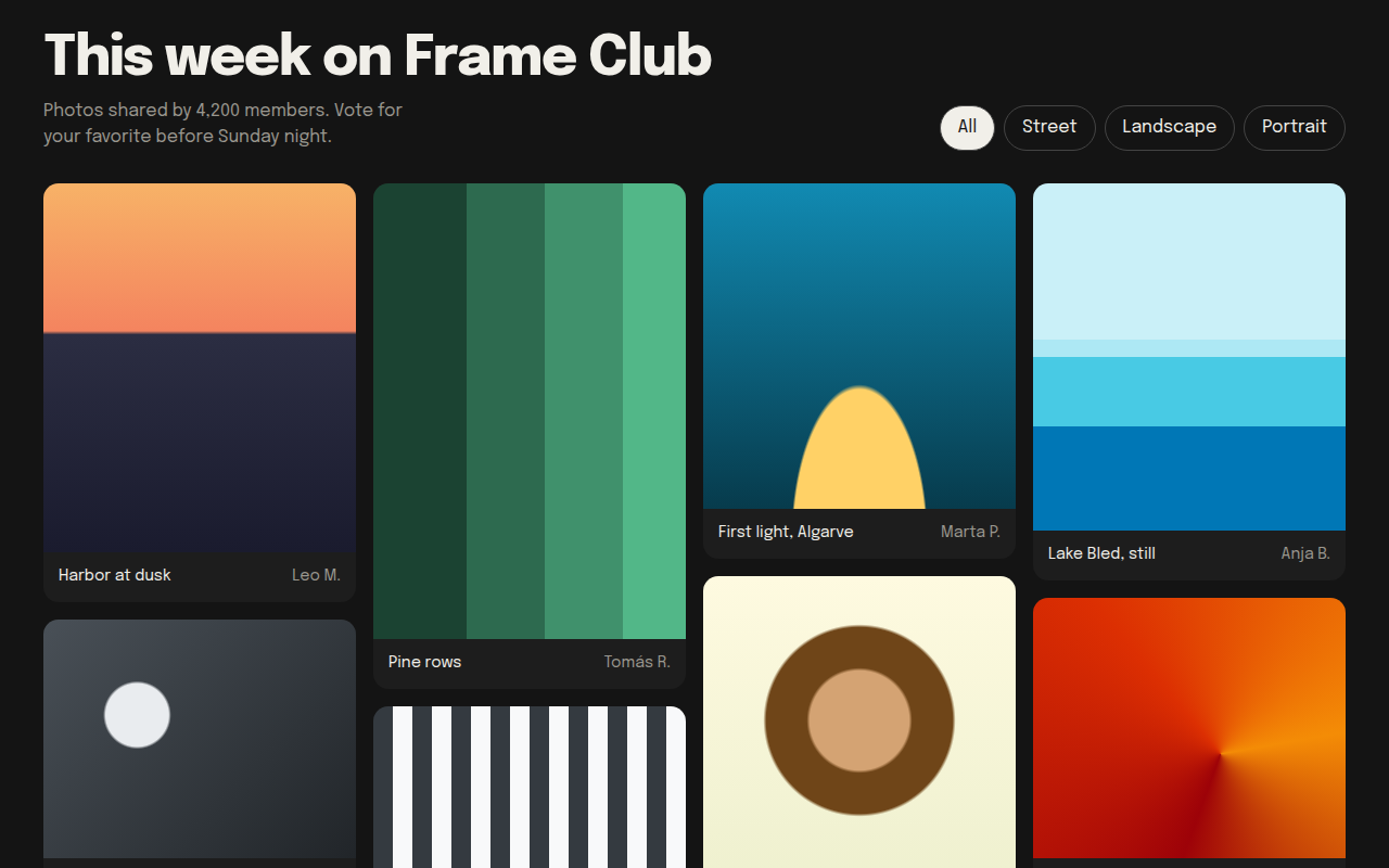
022. Masonry
Frame Club, a photo community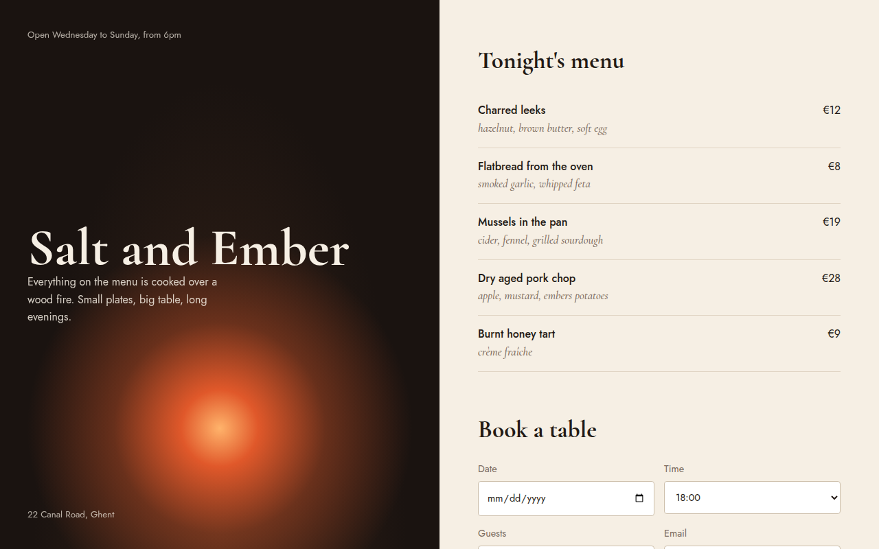
023. Split Screen
Salt and Ember, a wood fire restaurant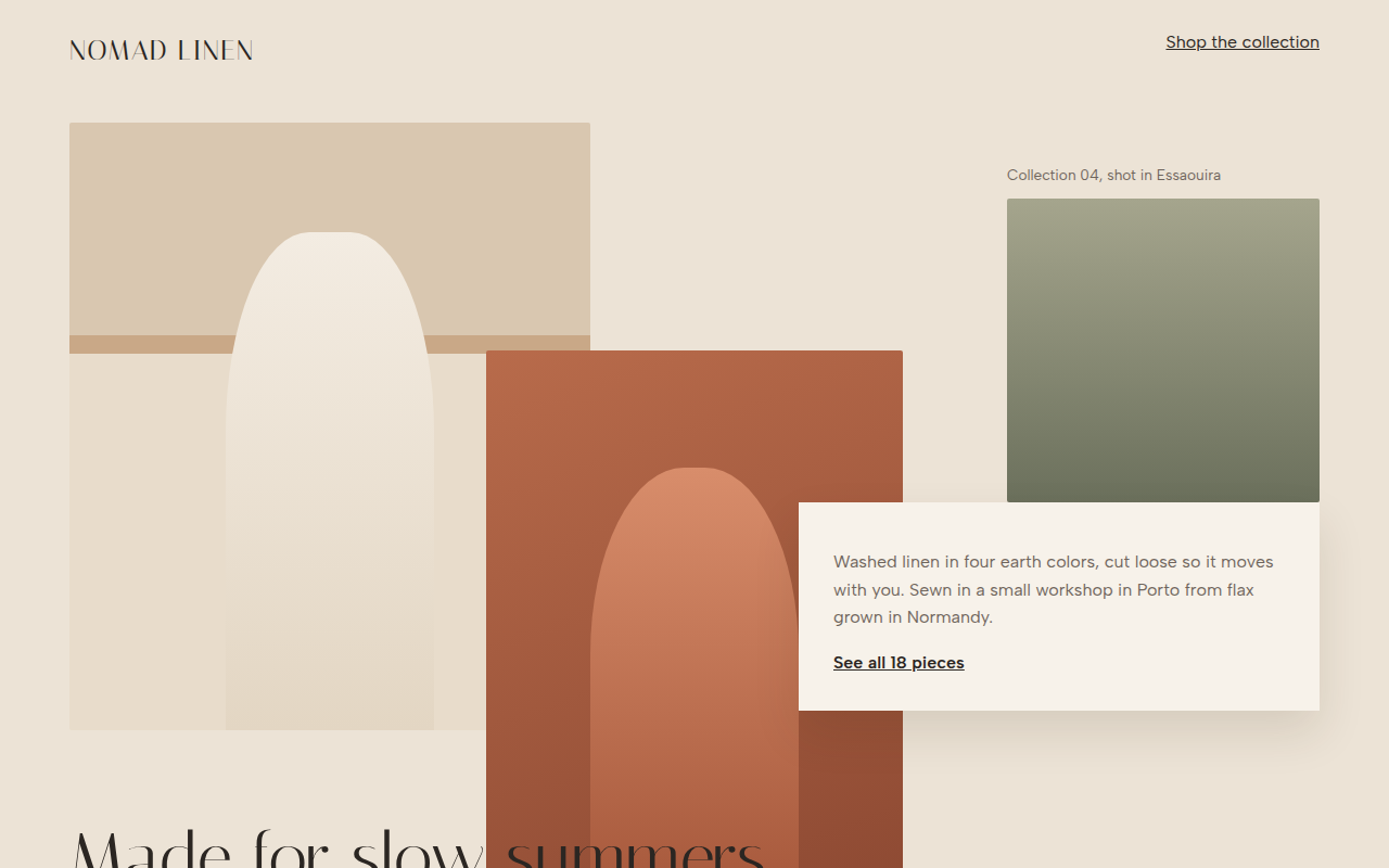
024. Broken Grid
Nomad Linen, a fashion lookbook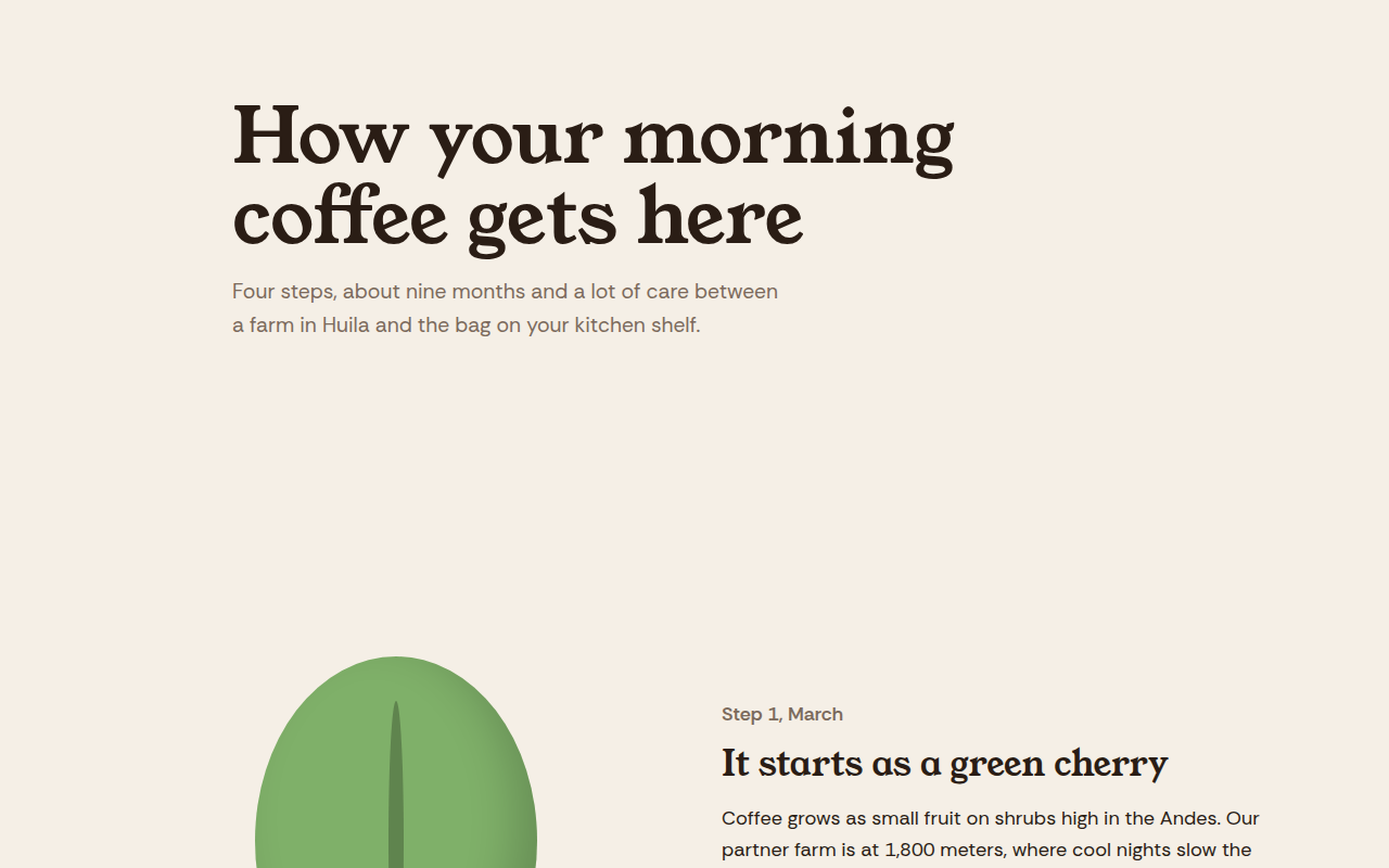
025. Scrollytelling
Hilltop Roasters, a bean to cup story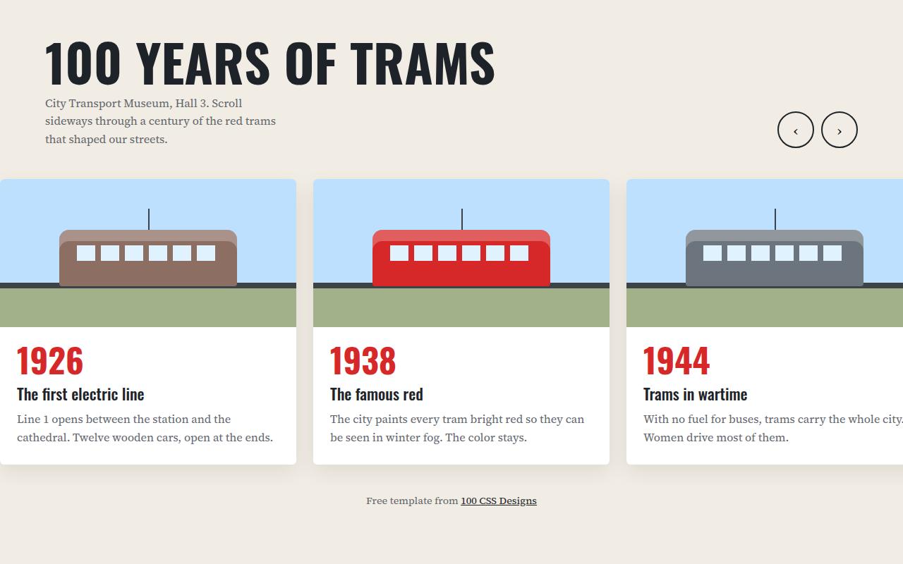
026. Horizontal Scroll
A museum timeline of 100 years of trams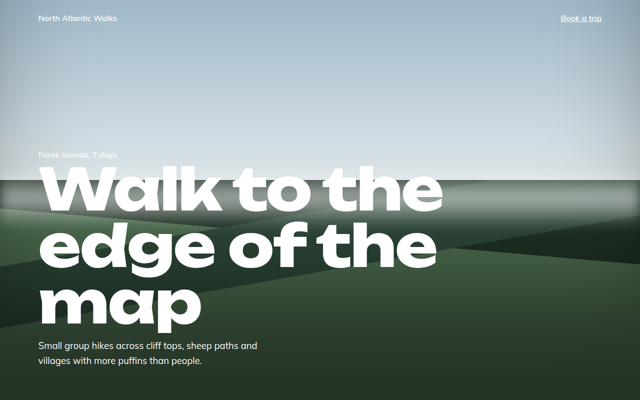
027. Full Bleed
North Atlantic Walks, a hiking tour company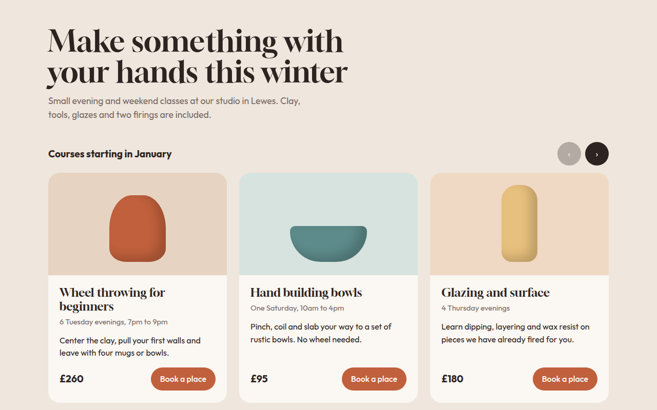
028. Card Carousel
Kiln, a pottery class studio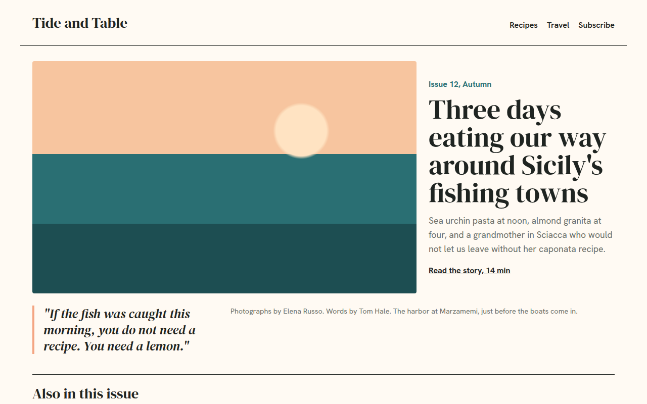
029. Magazine Layout
Tide and Table, a food and travel magazine