Home / Layout Patterns / Long Form Page
Long Form Page CSS Template, Free with Live Demo
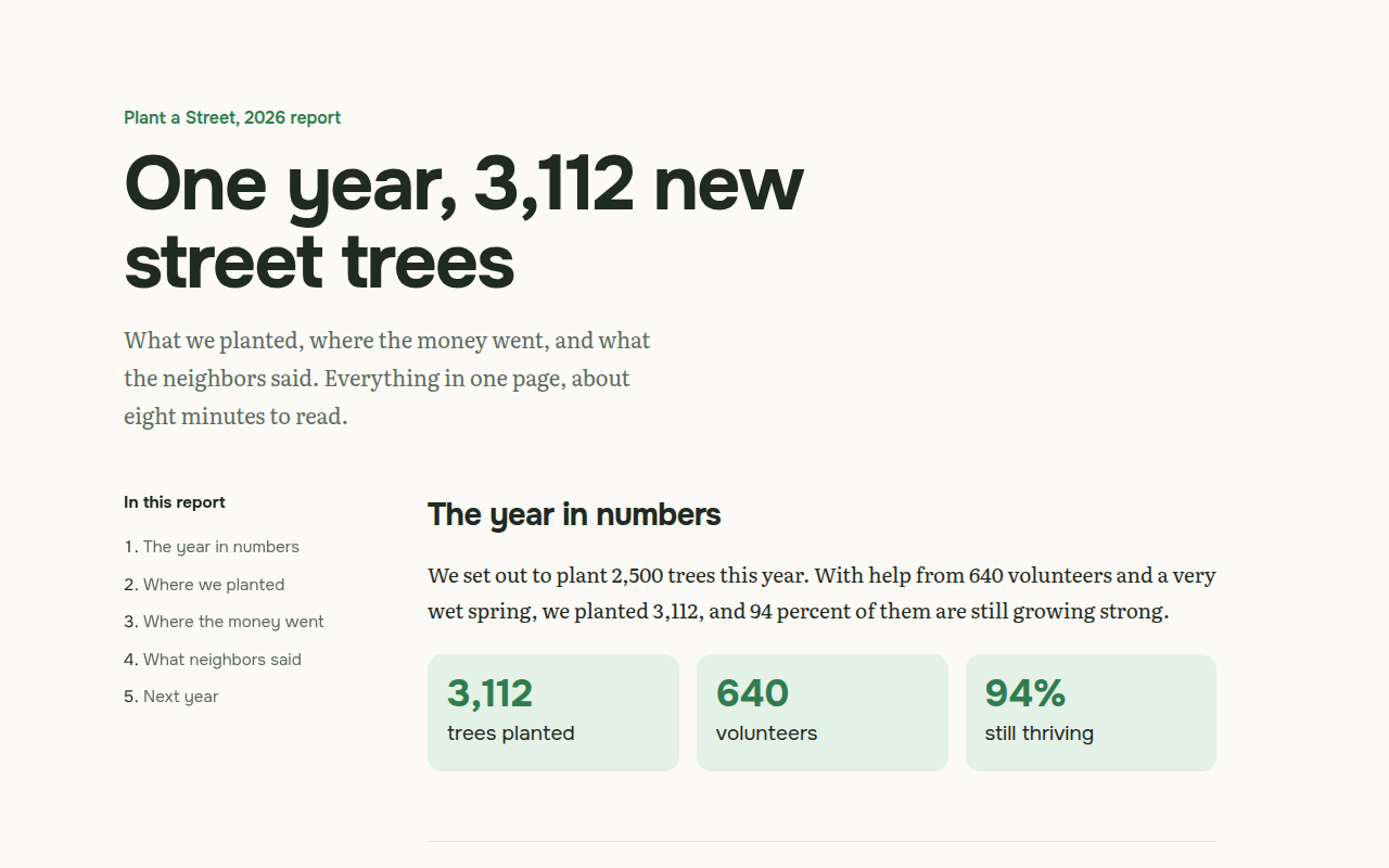
Free long form single page template with a sticky table of contents, reading progress bar and big number blocks. Built for a charity report. Live demo. The example is Plant a Street, a charity annual report.
What is long form page?
A long form page puts a whole story on one page instead of many. Readers scroll from start to end, with a table of contents on the side so they always know where they are.
It is great for reports, guides and case studies, and it is good for SEO too, because one strong page with all the detail often ranks better than five thin ones.
Good for
- Annual and impact reports
- Guides and how to articles
- Case studies
- Personal essays and long reads
What you get in this template
- Sticky table of contents that highlights the current section
- Reading progress bar across the top
- Big number cards for key facts
- Comfortable serif body text at 19px
- Anchor links with smooth scroll
The key CSS
This is the part that makes the long form page look work. Copy it into your own project.
.layout { display: grid; grid-template-columns: 220px 1fr; gap: 60px; }
.toc { position: sticky; top: 30px; align-self: start; }
article section { max-width: 66ch; scroll-margin-top: 30px; }
.progress { position: fixed; top: 0; left: 0; height: 4px; background: #2f7d4f; }
How to use it
- Click Download HTML file above.
- Open the file in any code editor, like VS Code.
- Change the text, colors and links to match your project. Colors are at the top of the style tag.
- Upload it to any host, such as GitHub Pages, Netlify or your own server. It is one file with no build step.
Questions people ask
How do I make a sticky table of contents?
Put the contents in a grid column next to the article and give it position: sticky, top: 30px and align-self: start.
How does the reading progress bar work?
A few lines of JavaScript read how far down the page you are and set the width of a fixed bar at the top.
Are long pages good for SEO?
Yes, when the content is useful and well structured. Clear headings and a table of contents also help Google show links to sections in the results.
More Layout Patterns designs
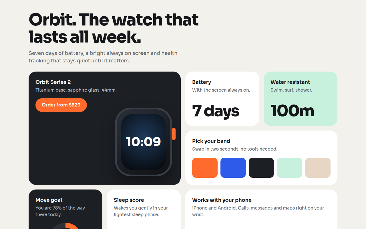
021. Bento Grid
Orbit, a smartwatch product page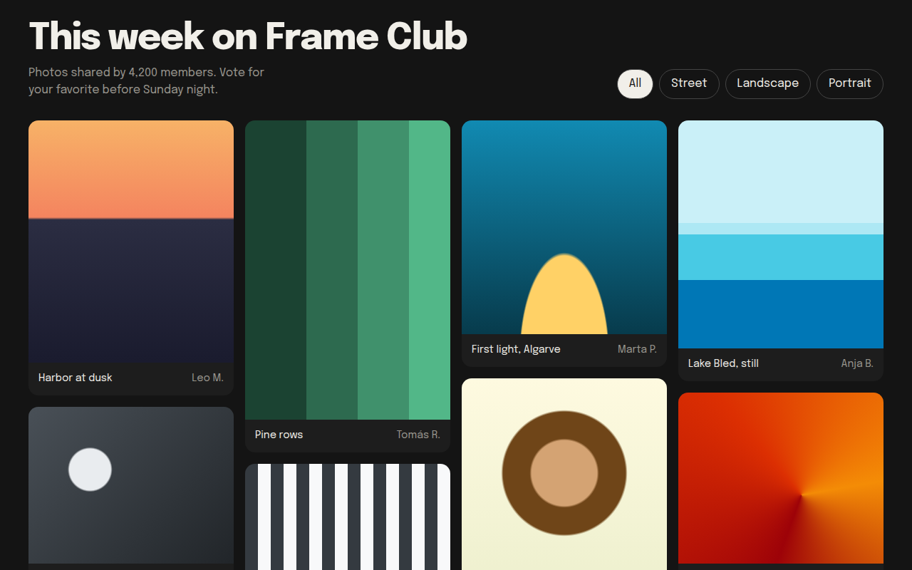
022. Masonry
Frame Club, a photo community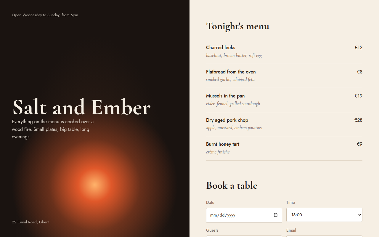
023. Split Screen
Salt and Ember, a wood fire restaurant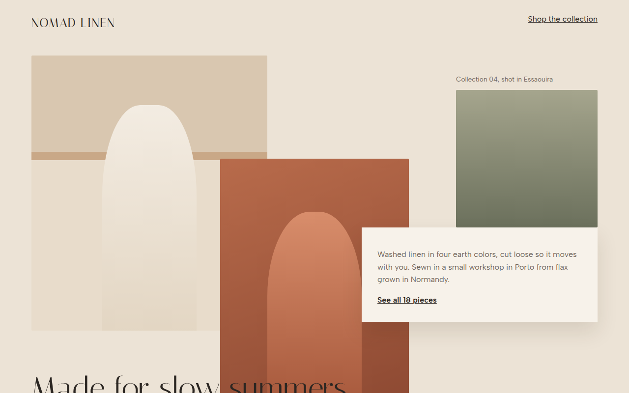
024. Broken Grid
Nomad Linen, a fashion lookbook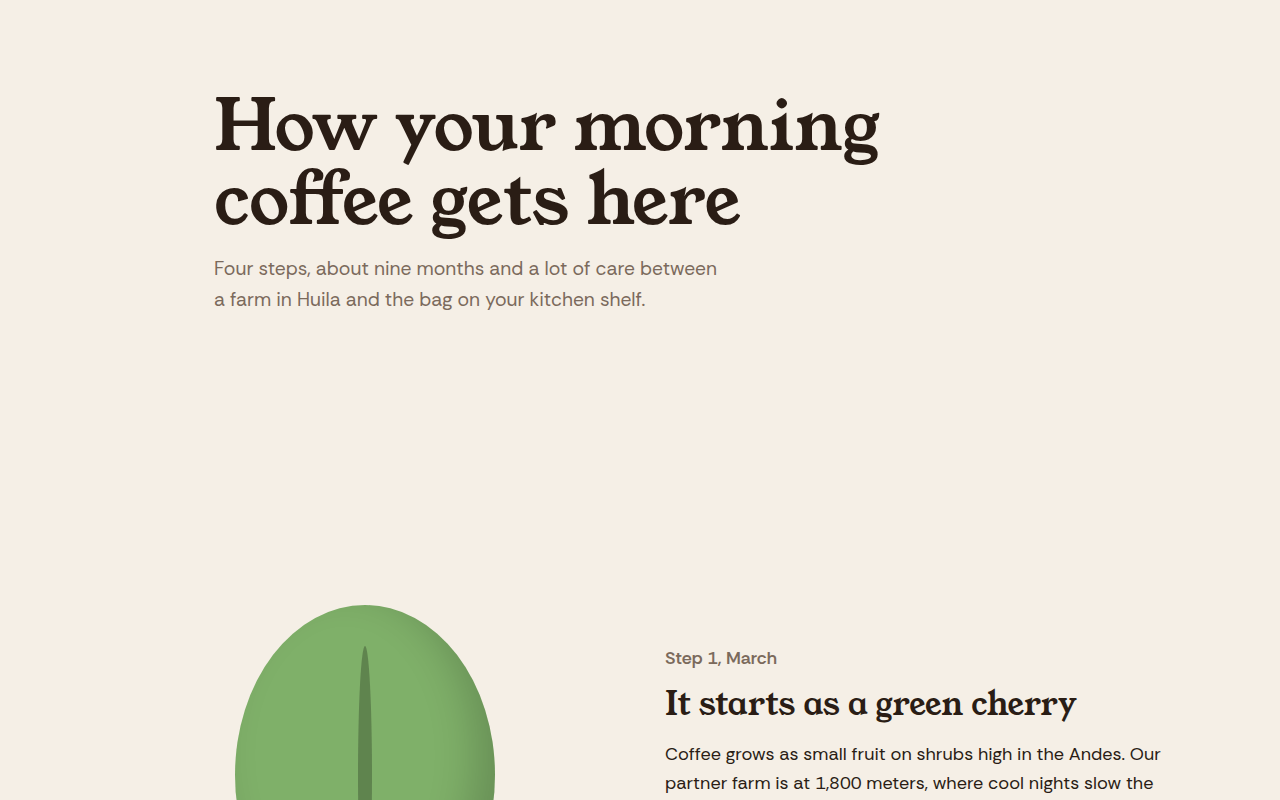
025. Scrollytelling
Hilltop Roasters, a bean to cup story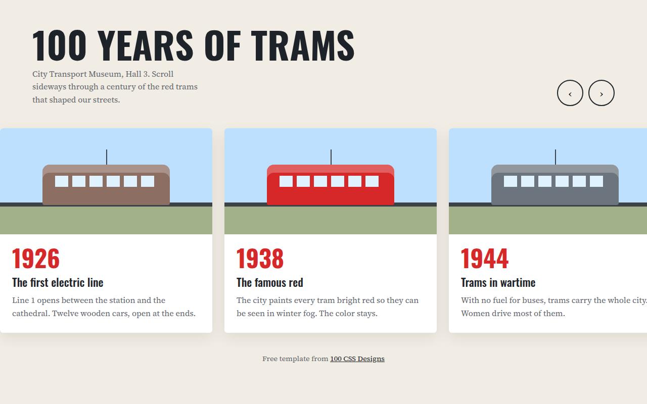
026. Horizontal Scroll
A museum timeline of 100 years of trams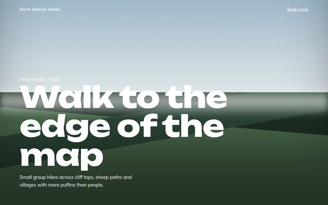
027. Full Bleed
North Atlantic Walks, a hiking tour company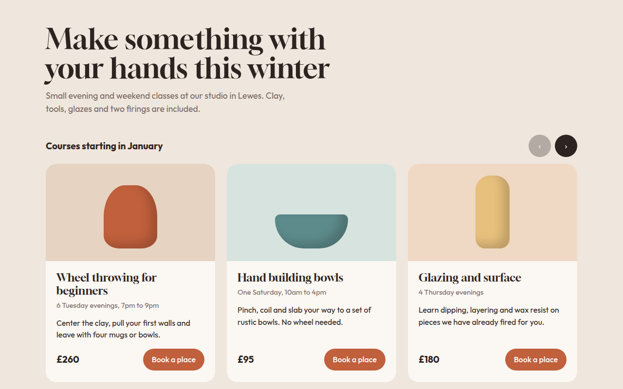
028. Card Carousel
Kiln, a pottery class studio