Home / Layout Patterns / Broken Grid
Broken Grid CSS Template, Free with Live Demo
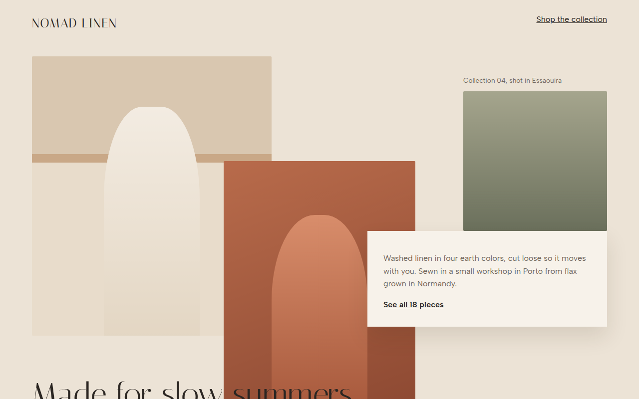
Free broken grid website template for a fashion lookbook. Overlapping images and text placed on an asymmetric 12 column CSS Grid. Live demo and download. The example is Nomad Linen, a fashion lookbook.
What is broken grid?
A broken grid still uses a grid, but lets things overlap and cross the lines. Images sit on top of each other, text boxes cut into photos, and the headline breaks out of its column.
It looks like an editorial fashion spread. CSS Grid makes it easy because items can share the same rows and columns, and z-index decides which one sits on top.
Good for
- Fashion and lifestyle brands
- Photography portfolios
- Architecture and interior studios
- Editorial features and campaigns
What you get in this template
- 12 column grid with overlapping items
- Layered image blocks with z-index
- Headline that crosses into the photos
- Floating text card with shadow
- Turns into a clean vertical list on phones
The key CSS
This is the part that makes the broken grid look work. Copy it into your own project.
.look {
  display: grid;
  grid-template-columns: repeat(12, 1fr);
  grid-template-rows: repeat(10, 70px);
}
.i1  { grid-column: 1 / 6;  grid-row: 1 / 9; }
.i2  { grid-column: 5 / 9;  grid-row: 4 / 11; z-index: 1; }
.txt { grid-column: 8 / 13; grid-row: 6 / 10; z-index: 2; }
How to use it
- Click Download HTML file above.
- Open the file in any code editor, like VS Code.
- Change the text, colors and links to match your project. Colors are at the top of the style tag.
- Upload it to any host, such as GitHub Pages, Netlify or your own server. It is one file with no build step.
Questions people ask
What is a broken grid layout?
It is a layout where elements overlap or break out of the usual grid columns on purpose, creating depth and an editorial feel.
How do you overlap elements with CSS Grid?
Give two items grid-column and grid-row values that share some of the same cells. Use z-index to choose which one appears on top.
Is a broken grid accessible?
Yes, as long as the reading order in the HTML makes sense. Screen readers follow the HTML, not the visual overlap.
More Layout Patterns designs
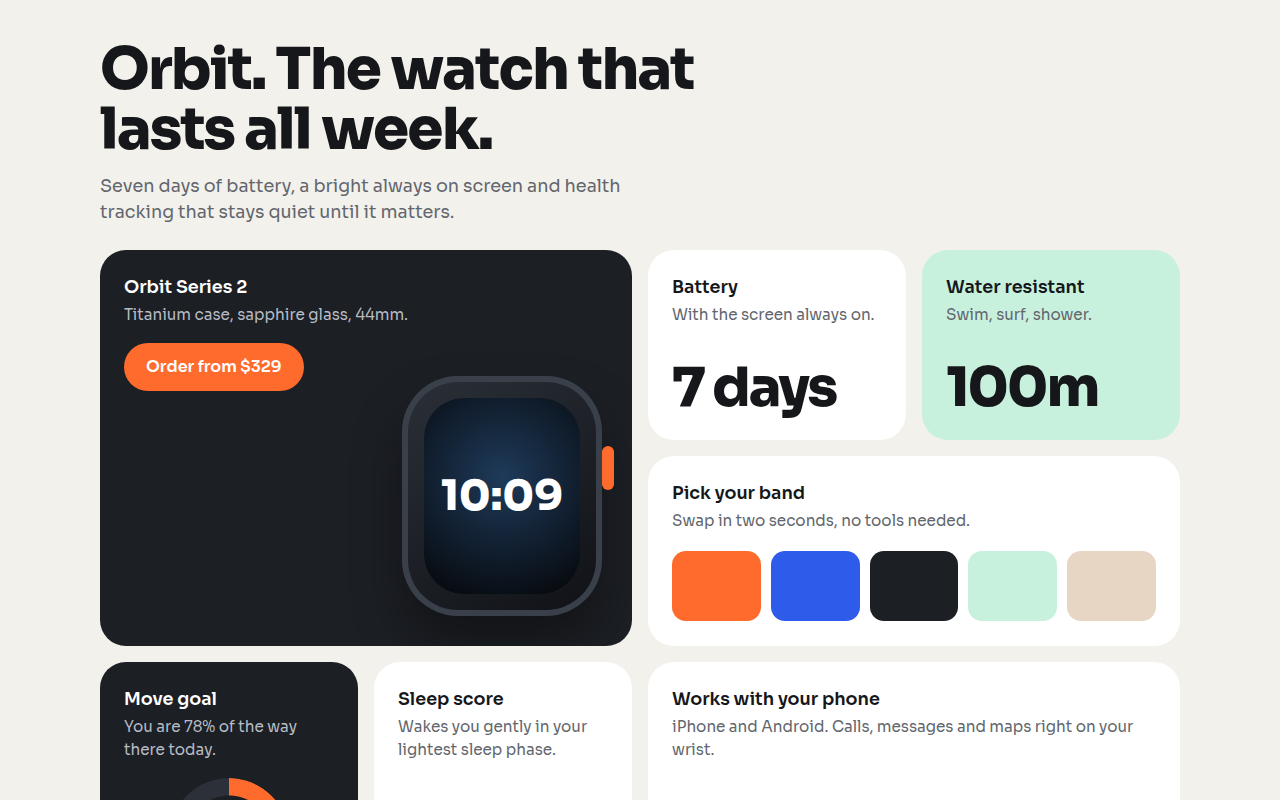
021. Bento Grid
Orbit, a smartwatch product page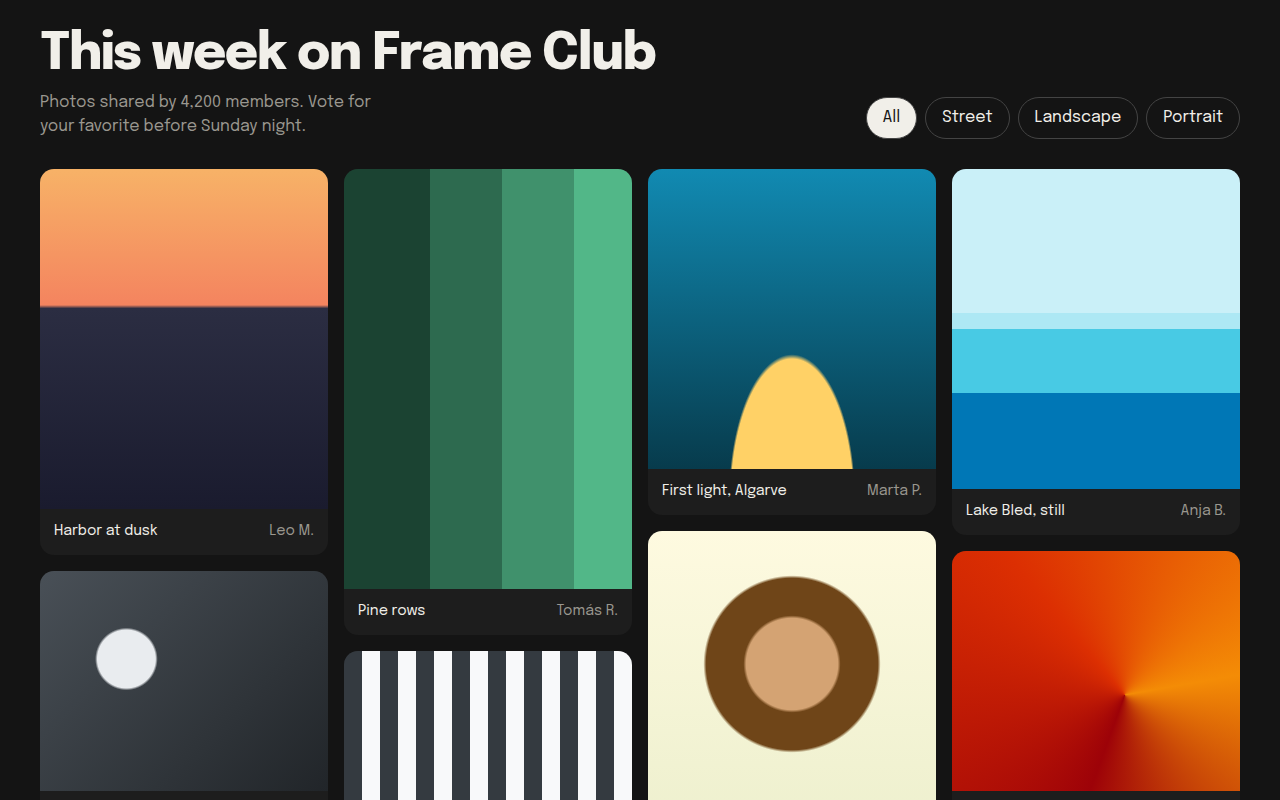
022. Masonry
Frame Club, a photo community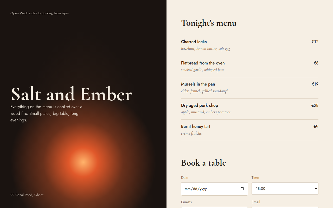
023. Split Screen
Salt and Ember, a wood fire restaurant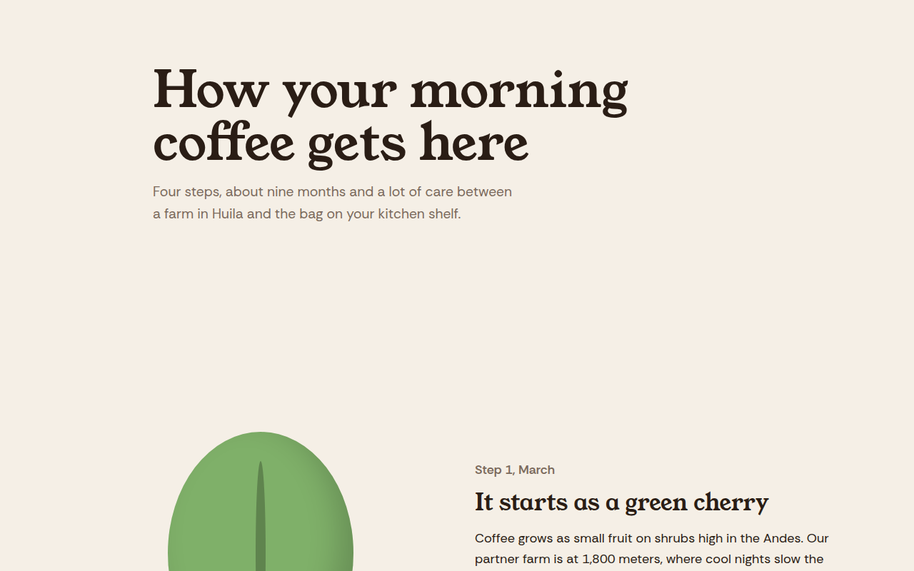
025. Scrollytelling
Hilltop Roasters, a bean to cup story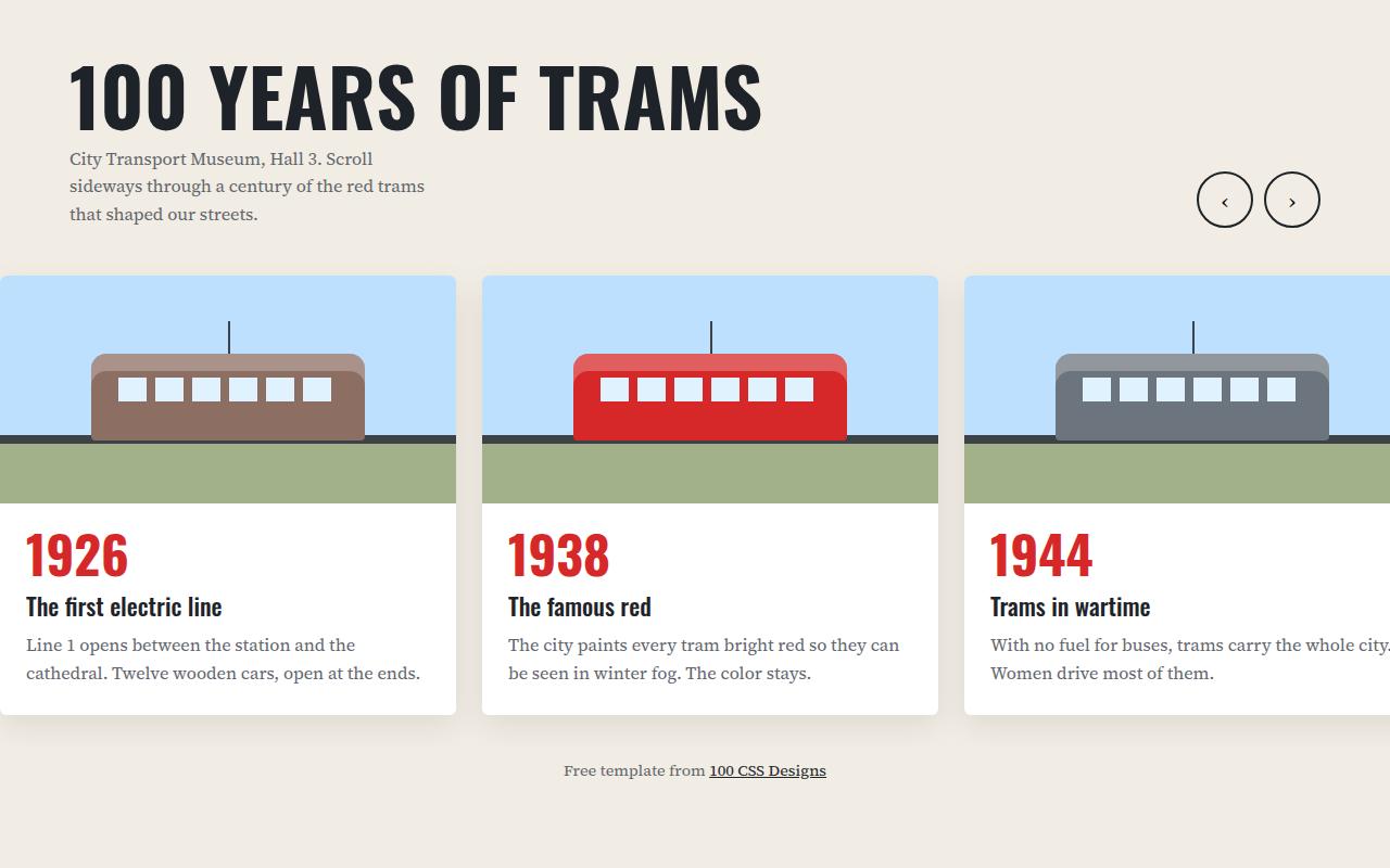
026. Horizontal Scroll
A museum timeline of 100 years of trams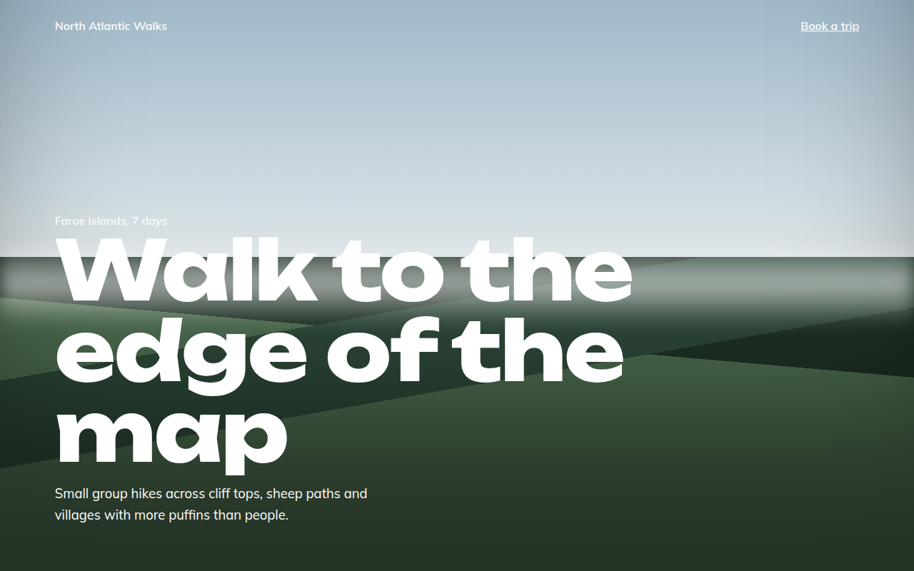
027. Full Bleed
North Atlantic Walks, a hiking tour company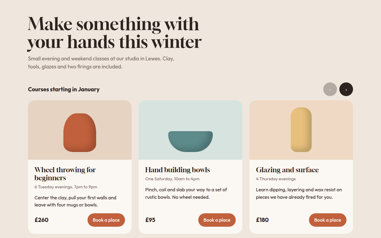
028. Card Carousel
Kiln, a pottery class studio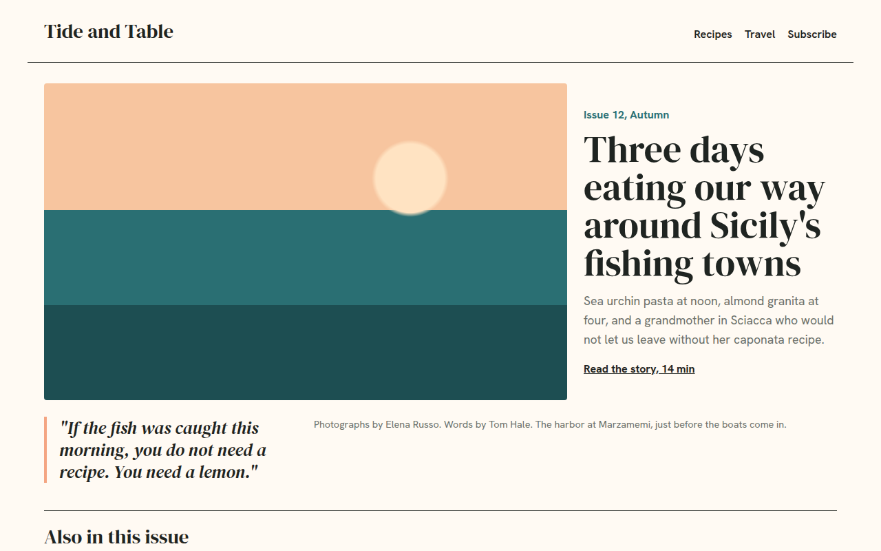
029. Magazine Layout
Tide and Table, a food and travel magazine