Home / Layout Patterns / Card Carousel
Card Carousel CSS Template, Free with Live Demo
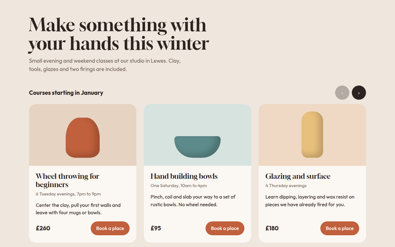
Free card carousel template with CSS scroll snap, arrow buttons and dots. Swipeable course cards for a pottery studio. Live demo and HTML download. The example is Kiln, a pottery class studio.
What is card carousel?
A card carousel shows a row of cards that people swipe or click through. It saves space when you have more items than fit on one screen, like classes, products or reviews.
This one is built on native scrolling with scroll snap, so swiping feels natural on phones. A small script adds the arrow buttons and the dots that show where you are.
Good for
- Courses and event listings
- Product rows in online shops
- Testimonials and reviews
- Related articles
What you get in this template
- Three cards on desktop, two on tablet, one and a bit on phone
- Native swipe with scroll snap
- Arrow buttons that disable at each end
- Dots that follow the scroll position
- Pots drawn in CSS with one custom property set
The key CSS
This is the part that makes the card carousel look work. Copy it into your own project.
.rail {
  display: grid;
  grid-auto-flow: column;
  grid-auto-columns: calc((100% - 48px) / 3);
  gap: 24px;
  overflow-x: auto;
  scroll-snap-type: x mandatory;
}
.c { scroll-snap-align: start; }
@media (max-width: 560px) { .rail { grid-auto-columns: 85%; } }
How to use it
- Click Download HTML file above.
- Open the file in any code editor, like VS Code.
- Change the text, colors and links to match your project. Colors are at the top of the style tag.
- Upload it to any host, such as GitHub Pages, Netlify or your own server. It is one file with no build step.
Questions people ask
How do you make a carousel without a JavaScript library?
Use a scrolling container with scroll snap for the movement, then add a few lines of JavaScript for arrow buttons that call scrollBy().
Why show part of the next card on phones?
A partly visible card tells people there is more to swipe. That is why the phone layout uses 85 percent width.
Are carousels bad for conversions?
Auto playing sliders often are. A carousel people control themselves, with clear cards and prices, works well.
More Layout Patterns designs
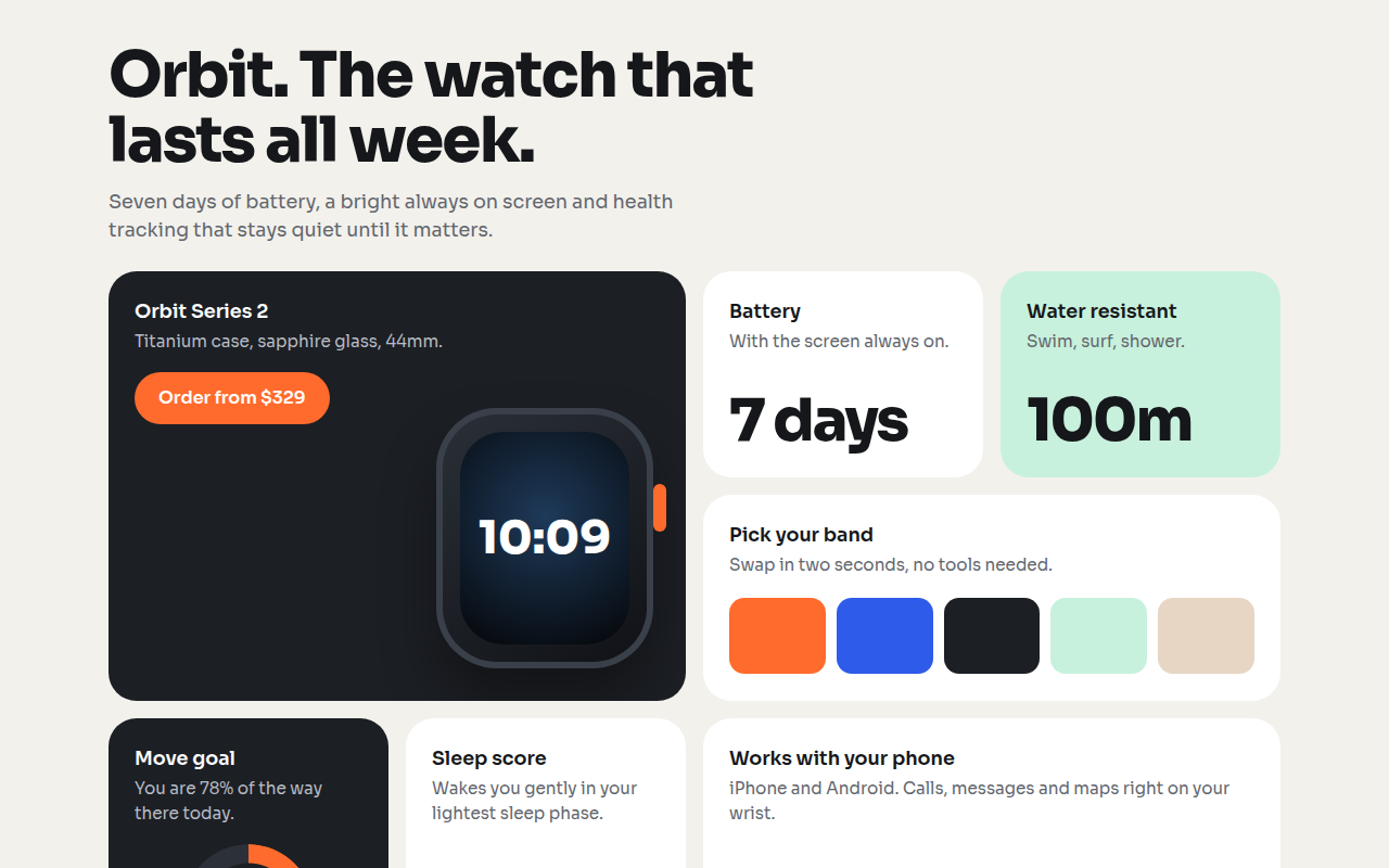
021. Bento Grid
Orbit, a smartwatch product page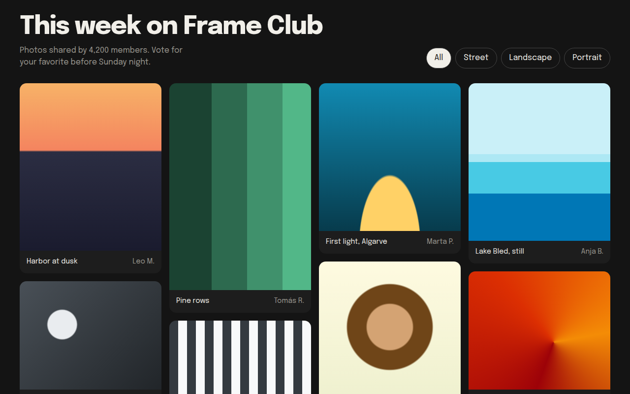
022. Masonry
Frame Club, a photo community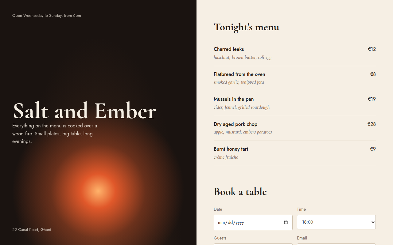
023. Split Screen
Salt and Ember, a wood fire restaurant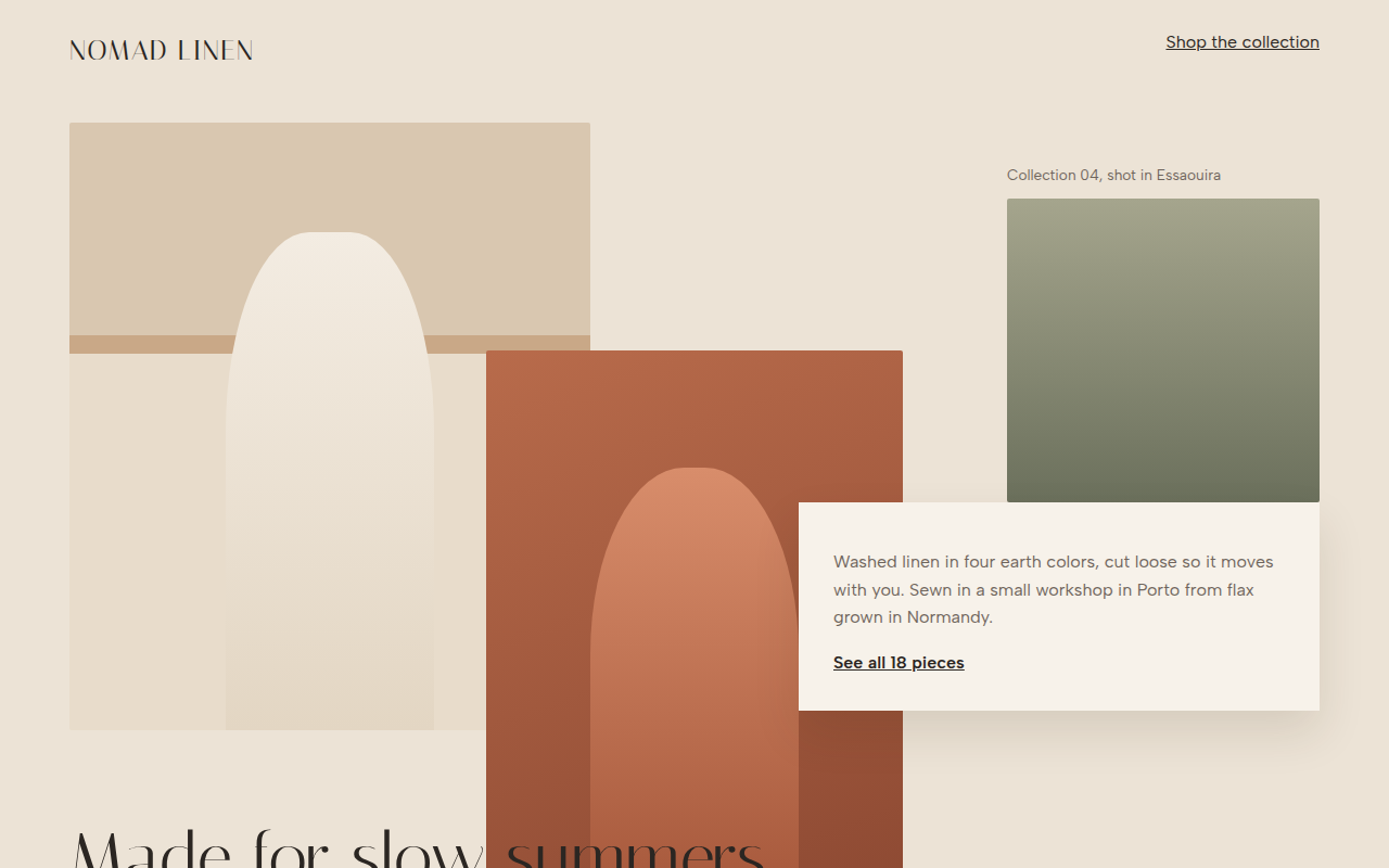
024. Broken Grid
Nomad Linen, a fashion lookbook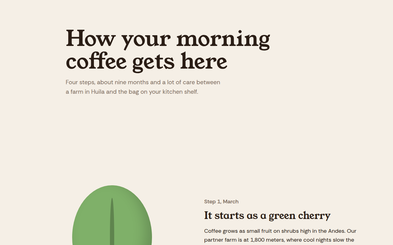
025. Scrollytelling
Hilltop Roasters, a bean to cup story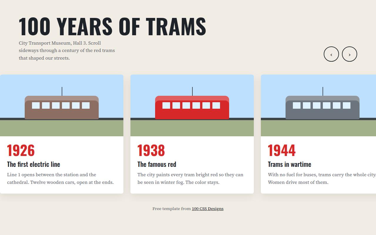
026. Horizontal Scroll
A museum timeline of 100 years of trams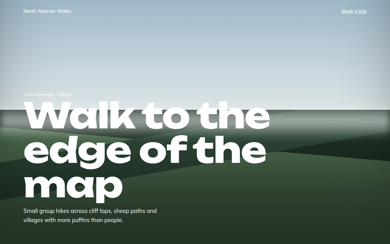
027. Full Bleed
North Atlantic Walks, a hiking tour company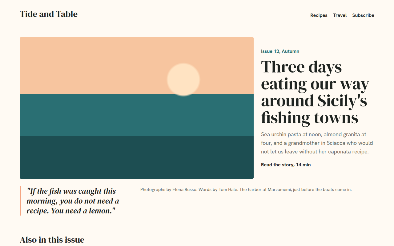
029. Magazine Layout
Tide and Table, a food and travel magazine