Home / Layout Patterns / Masonry
Masonry CSS Template, Free with Live Demo
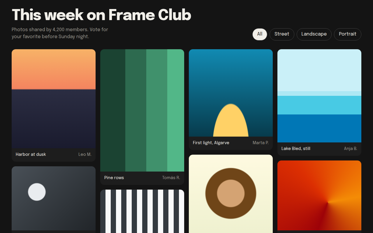
Free masonry grid template in pure CSS for a photo gallery. Pinterest style staggered columns with no JavaScript library. Live demo and HTML download. The example is Frame Club, a photo community.
What is masonry?
A masonry layout stacks items of different heights in columns, so there are no big gaps. It is the layout Pinterest made famous, and it suits photos better than a strict grid.
You do not need a JavaScript library. CSS columns do it: set a column width, and add break-inside: avoid so no card gets split between two columns.
Good for
- Photo galleries and portfolios
- Mood boards and inspiration sites
- Recipe and product collections
- User generated content feeds
What you get in this template
- Pure CSS masonry with the columns property
- Cards never split across columns
- Photo placeholders drawn with gradients
- Filter buttons with pressed state
- Dark gallery background that makes images pop
The key CSS
This is the part that makes the masonry look work. Copy it into your own project.
.wall {
  columns: 4 260px;
  column-gap: 16px;
}
figure {
  break-inside: avoid;
  margin: 0 0 16px;
  border-radius: 14px;
  overflow: hidden;
}
How to use it
- Click Download HTML file above.
- Open the file in any code editor, like VS Code.
- Change the text, colors and links to match your project. Colors are at the top of the style tag.
- Upload it to any host, such as GitHub Pages, Netlify or your own server. It is one file with no build step.
Questions people ask
How do you make a masonry layout without JavaScript?
Use CSS columns, for example columns: 4 260px, and add break-inside: avoid to each item. The browser fills each column top to bottom.
What is the downside of CSS columns masonry?
Items are ordered down each column, not across rows. For a gallery that rarely matters. If order is important, you can use a small script instead.
Is there a native CSS masonry?
A grid masonry feature is being built into browsers, but support is not complete yet. CSS columns work everywhere today.
More Layout Patterns designs
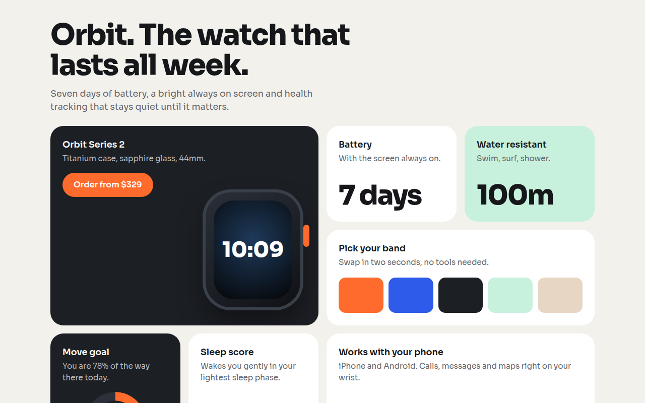
021. Bento Grid
Orbit, a smartwatch product page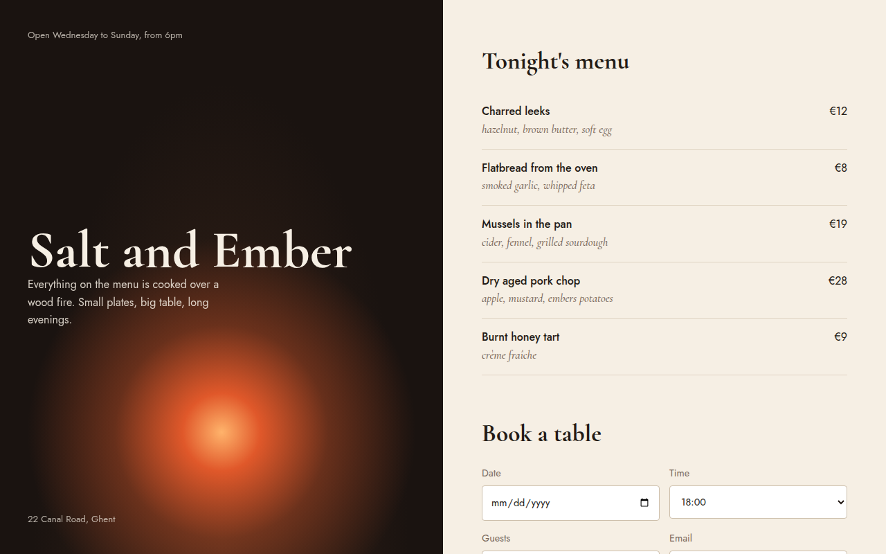
023. Split Screen
Salt and Ember, a wood fire restaurant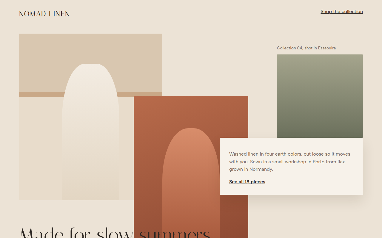
024. Broken Grid
Nomad Linen, a fashion lookbook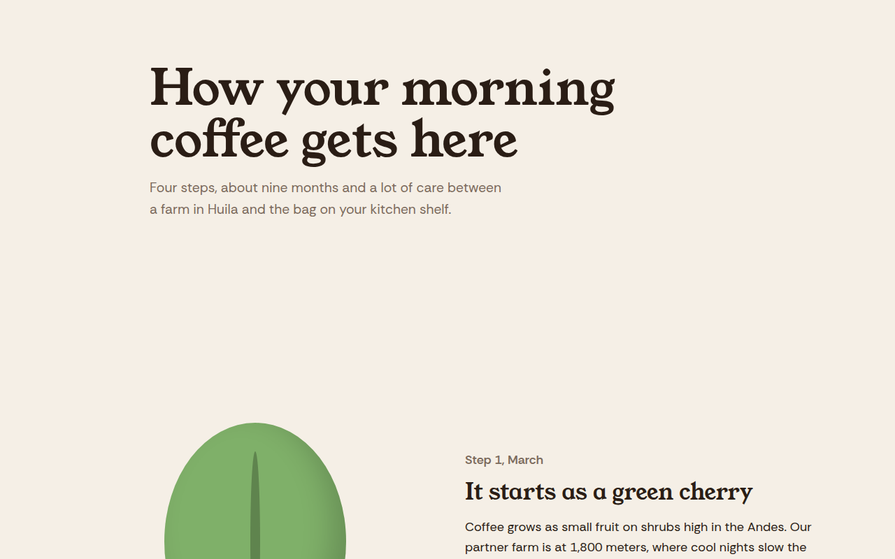
025. Scrollytelling
Hilltop Roasters, a bean to cup story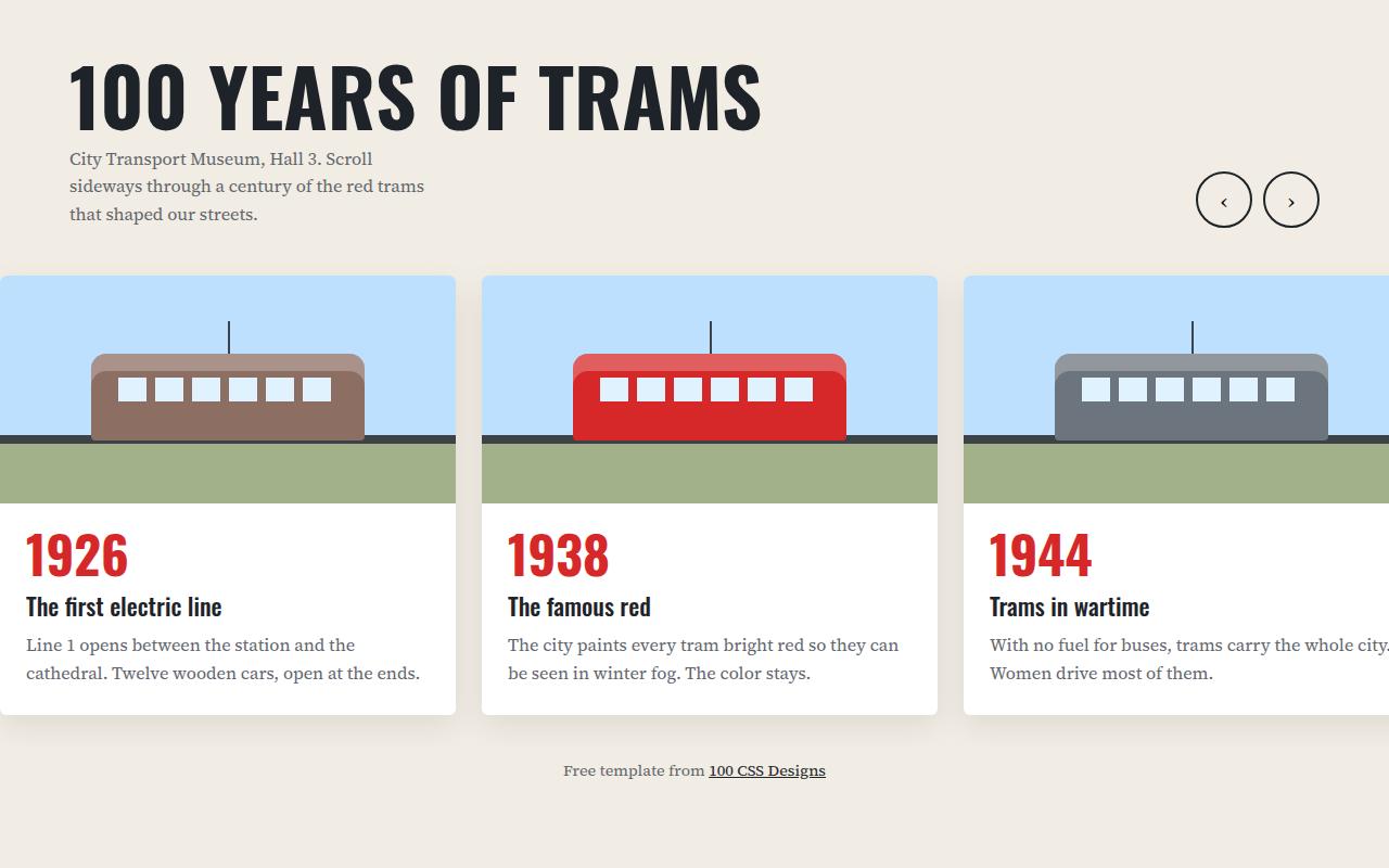
026. Horizontal Scroll
A museum timeline of 100 years of trams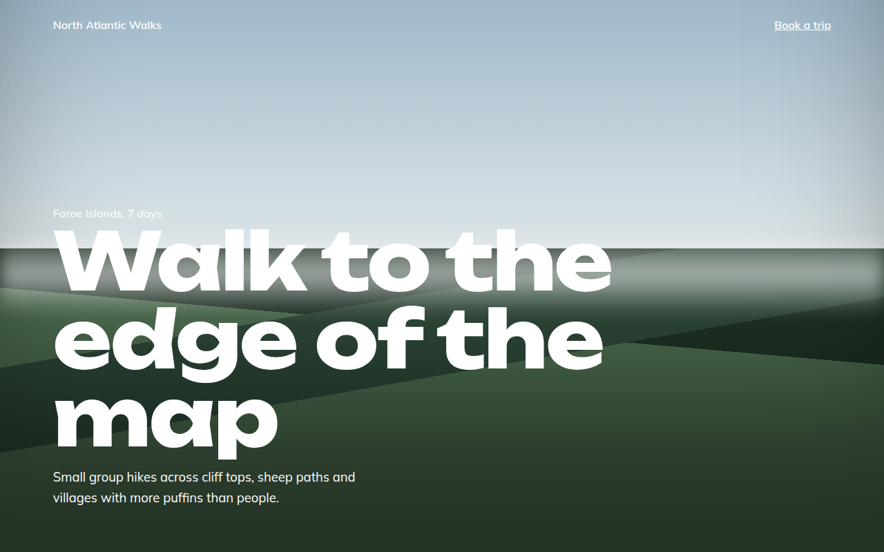
027. Full Bleed
North Atlantic Walks, a hiking tour company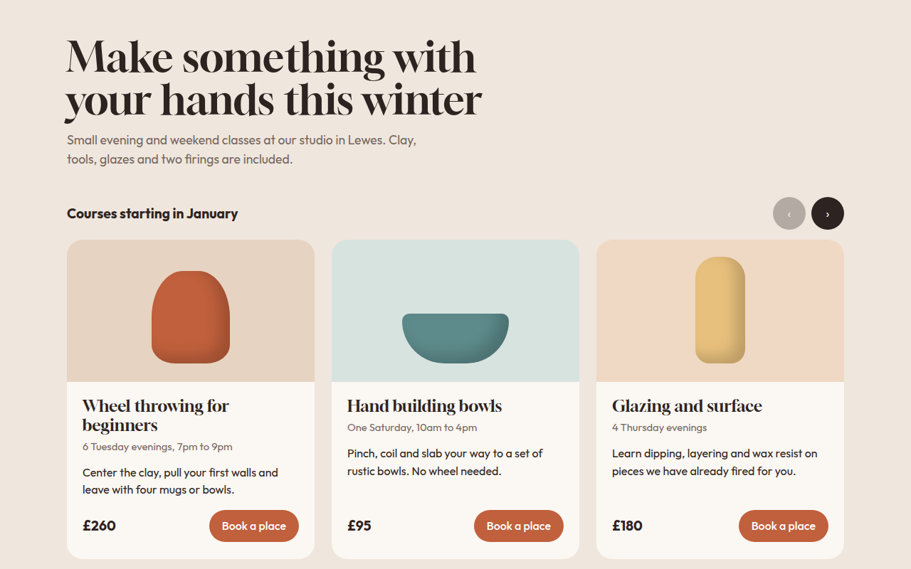
028. Card Carousel
Kiln, a pottery class studio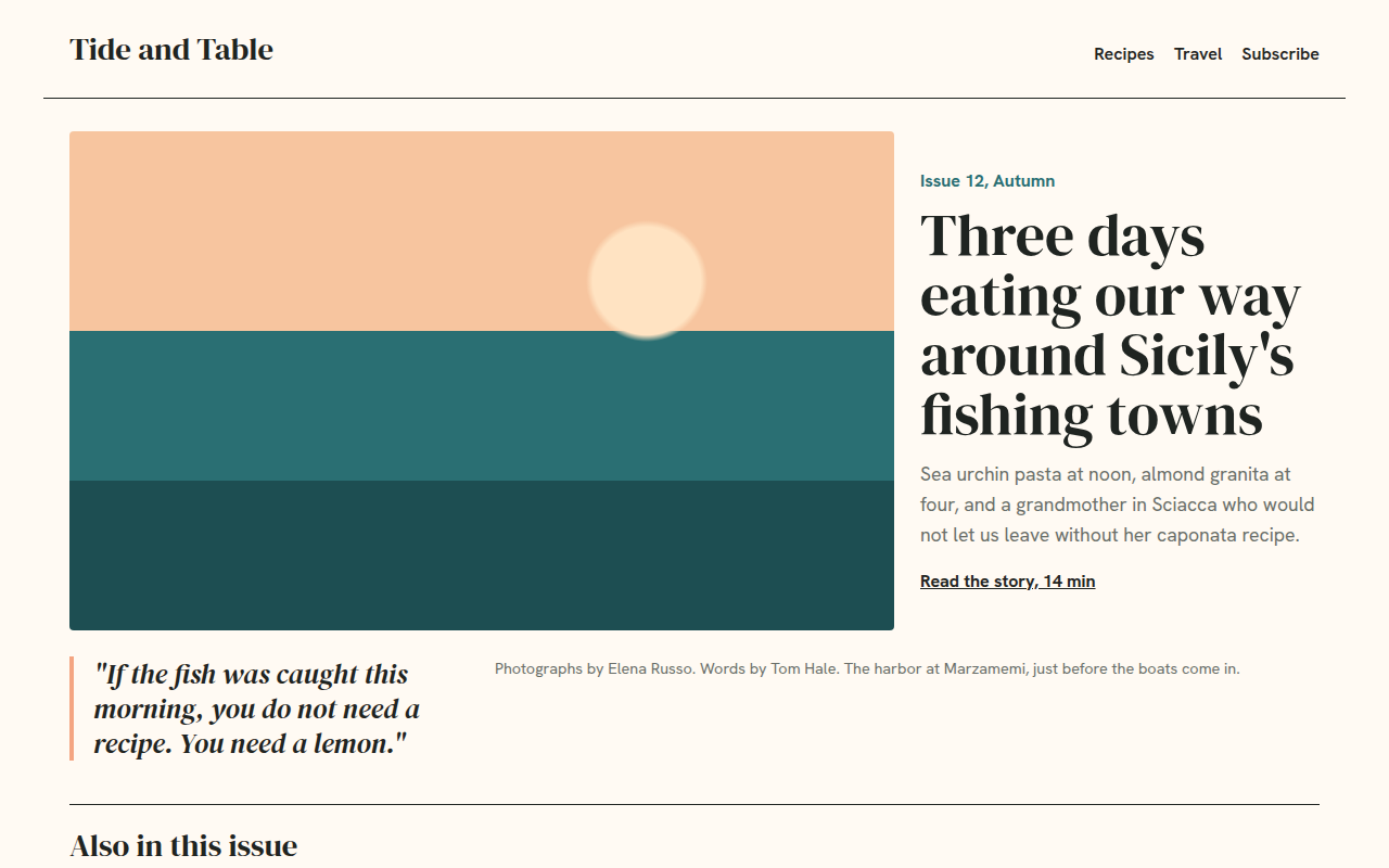
029. Magazine Layout
Tide and Table, a food and travel magazine