Home / Layout Patterns / Magazine Layout
Magazine Layout CSS Template, Free with Live Demo
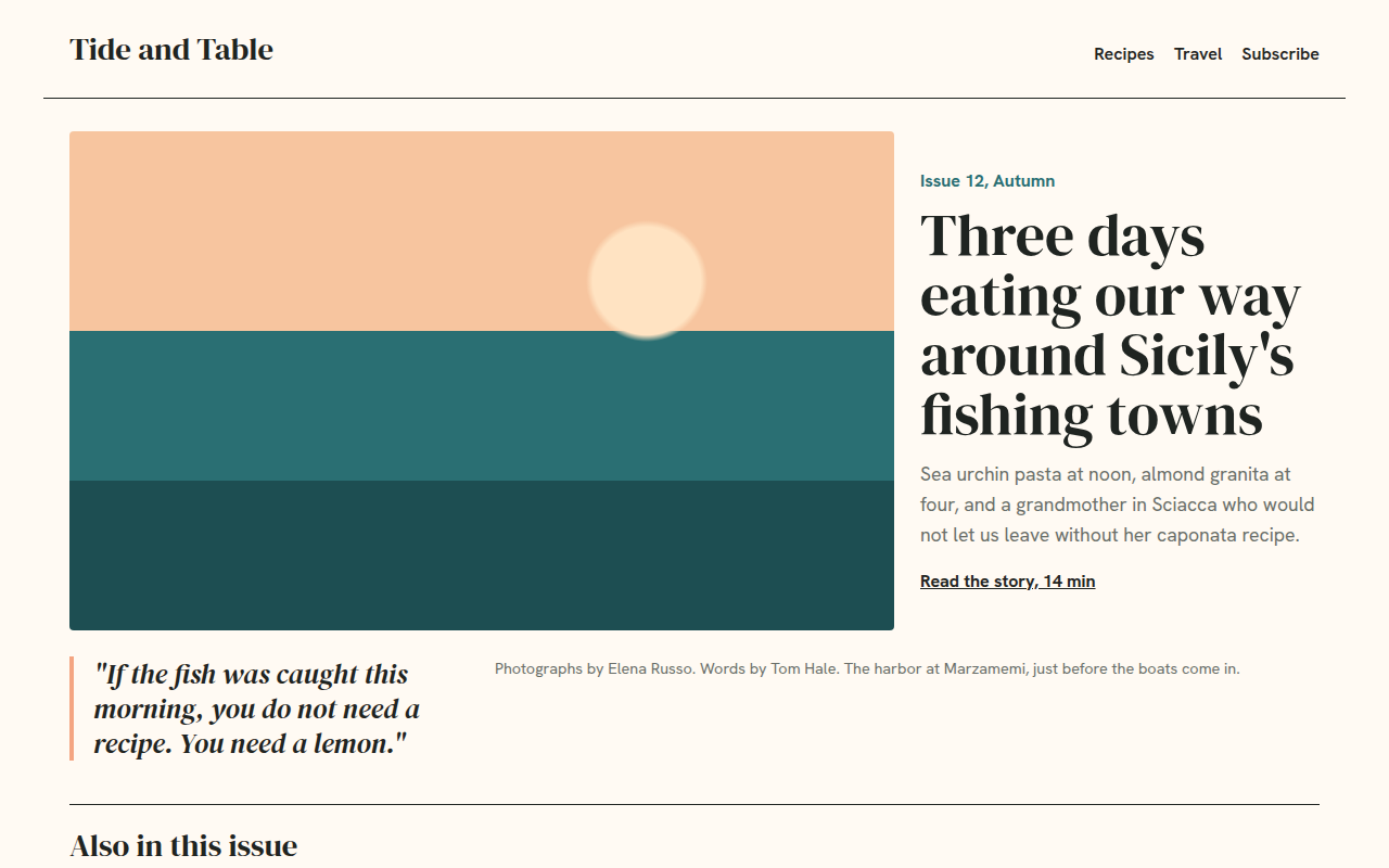
Free magazine website template with a cover story, CSS grid template areas, pull quote and article grid. Built for a food and travel magazine. Live demo. The example is Tide and Table, a food and travel magazine.
What is magazine layout?
A magazine layout looks like the opening spread of a printed magazine. A big cover photo, a headline beside it, a pull quote and a caption, then a row of smaller stories.
CSS grid-template-areas makes it easy to read and change. You name each area, draw the layout in the CSS like a small map, and redraw it for phones.
Good for
- Online magazines and blogs
- Food and travel publications
- Newsletters with a web archive
- Brand content hubs
What you get in this template
- Cover story built with grid-template-areas
- Italic pull quote with accent bar
- Photo caption and credit line
- Also in this issue grid with one wide story
- Simple one column layout on phones
The key CSS
This is the part that makes the magazine layout look work. Copy it into your own project.
.cover {
  display: grid;
  grid-template-columns: repeat(6, 1fr);
  grid-template-areas:
    "img img img img txt txt"
    "img img img img txt txt"
    "q   q   cap cap cap cap";
  gap: 24px;
}
.img { grid-area: img; }  .txt { grid-area: txt; }
.q   { grid-area: q; }    .cap { grid-area: cap; }
How to use it
- Click Download HTML file above.
- Open the file in any code editor, like VS Code.
- Change the text, colors and links to match your project. Colors are at the top of the style tag.
- Upload it to any host, such as GitHub Pages, Netlify or your own server. It is one file with no build step.
Questions people ask
What is grid-template-areas?
It is a CSS Grid property that lets you name areas of your layout and place them with a text map. It makes complex layouts easy to read and change.
How is this different from the newspaper template?
The newspaper template flows text in columns like a daily paper. This one is image led, with a big cover story like a glossy magazine.
Can I use this as a blog theme?
Yes. Use the cover section for your latest post and the grid for recent posts.
More Layout Patterns designs
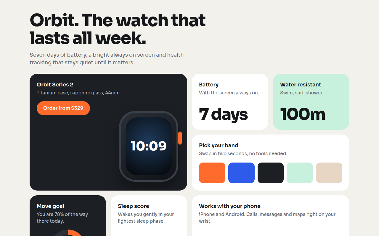
021. Bento Grid
Orbit, a smartwatch product page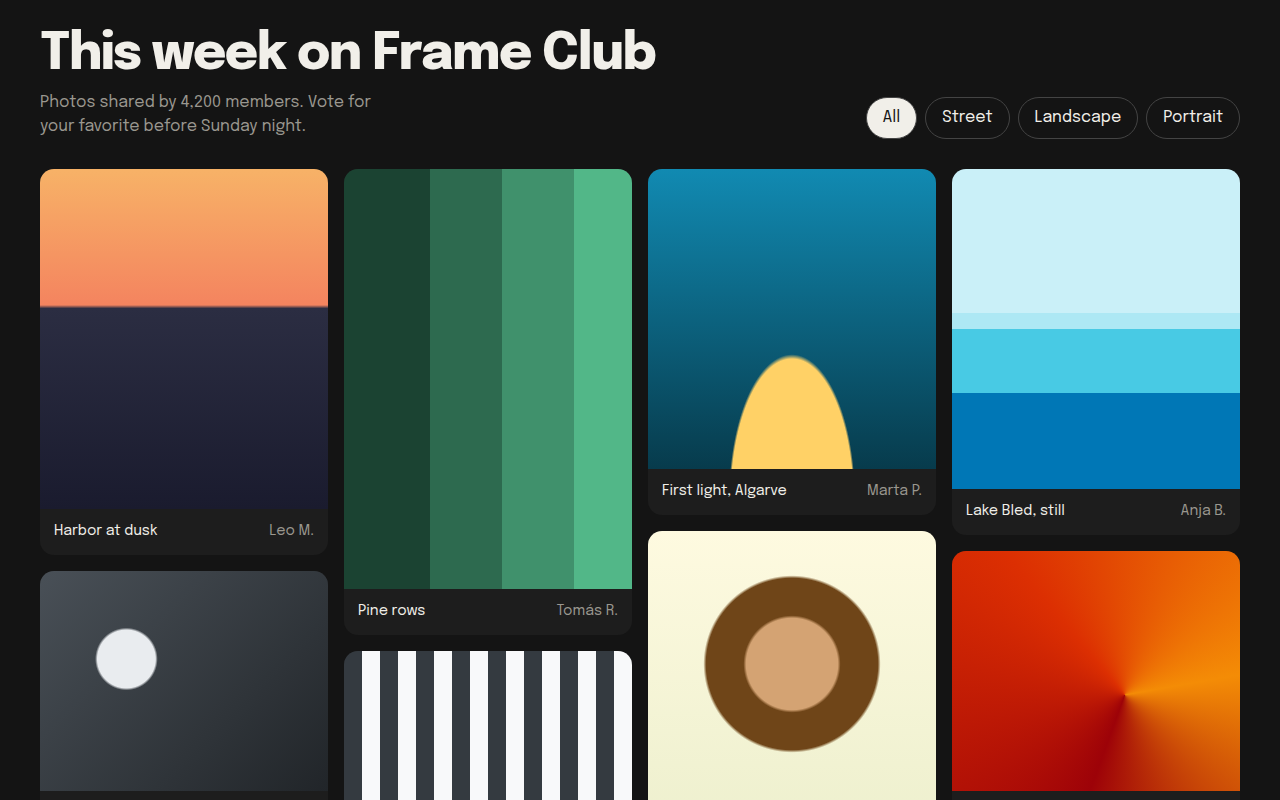
022. Masonry
Frame Club, a photo community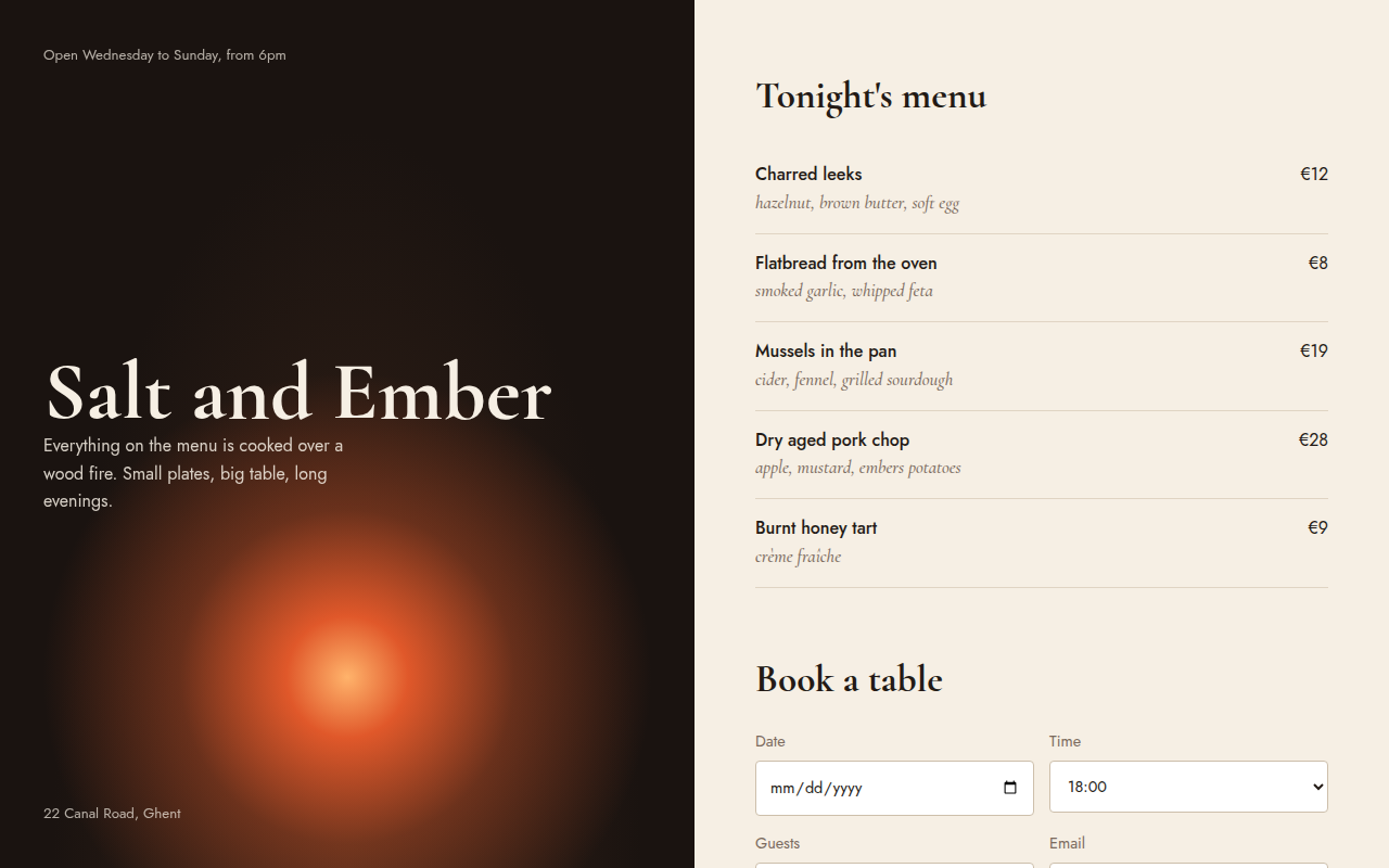
023. Split Screen
Salt and Ember, a wood fire restaurant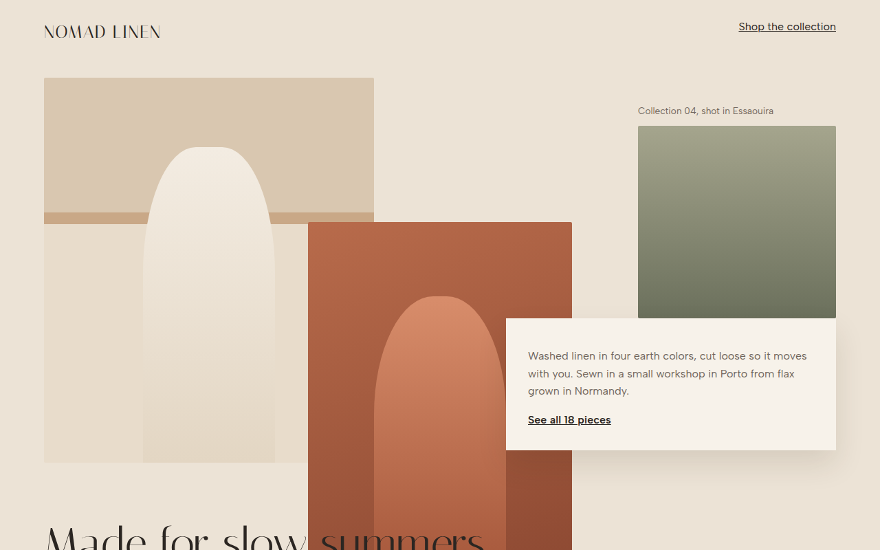
024. Broken Grid
Nomad Linen, a fashion lookbook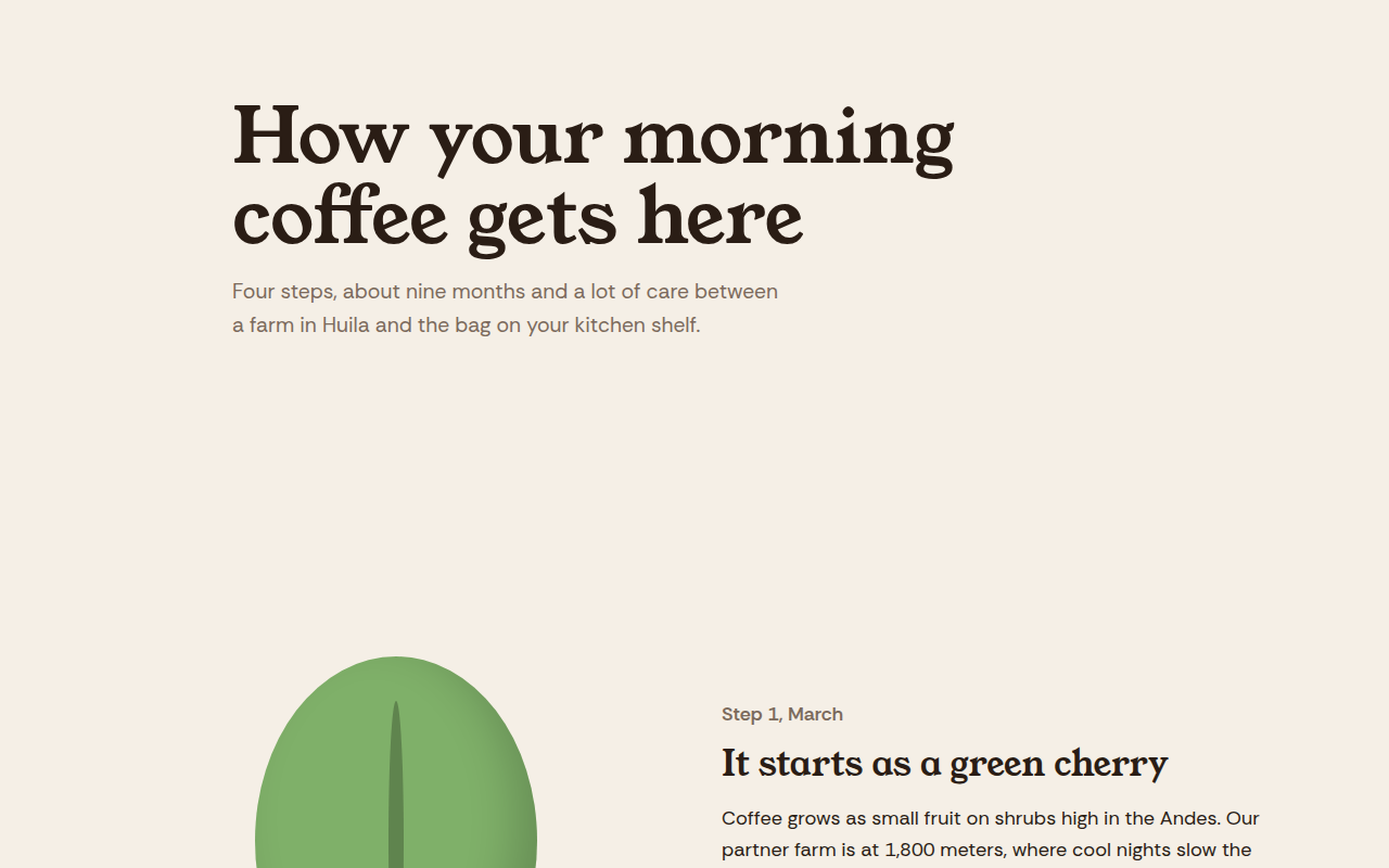
025. Scrollytelling
Hilltop Roasters, a bean to cup story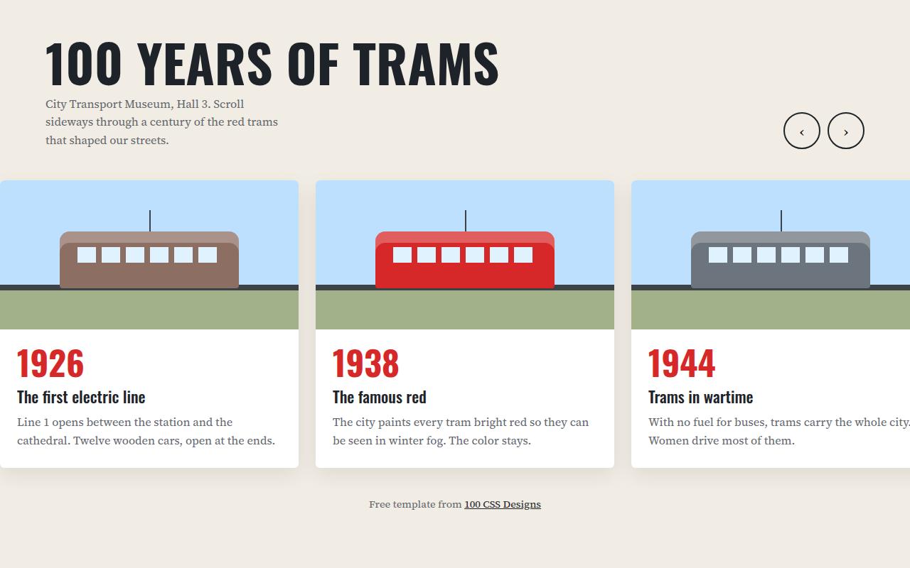
026. Horizontal Scroll
A museum timeline of 100 years of trams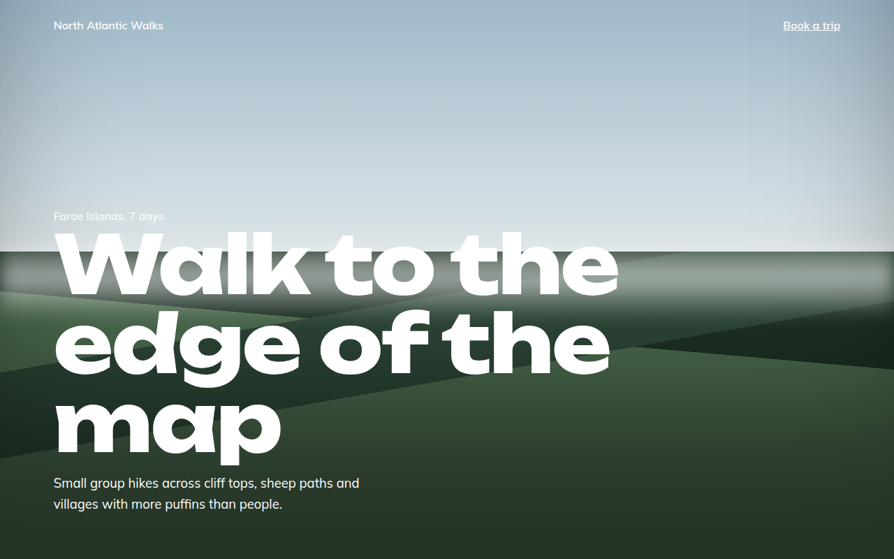
027. Full Bleed
North Atlantic Walks, a hiking tour company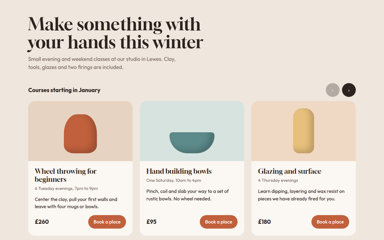
028. Card Carousel
Kiln, a pottery class studio