Home / Modern UI / Accessible Modal and Form Kit
Accessible Modal and Form Kit in JavaScript, Free with Live Demo
Free accessible modal and form kit in plain JavaScript. Native dialog with focus handling, live error messages and custom validation with the Constraint Validation API.
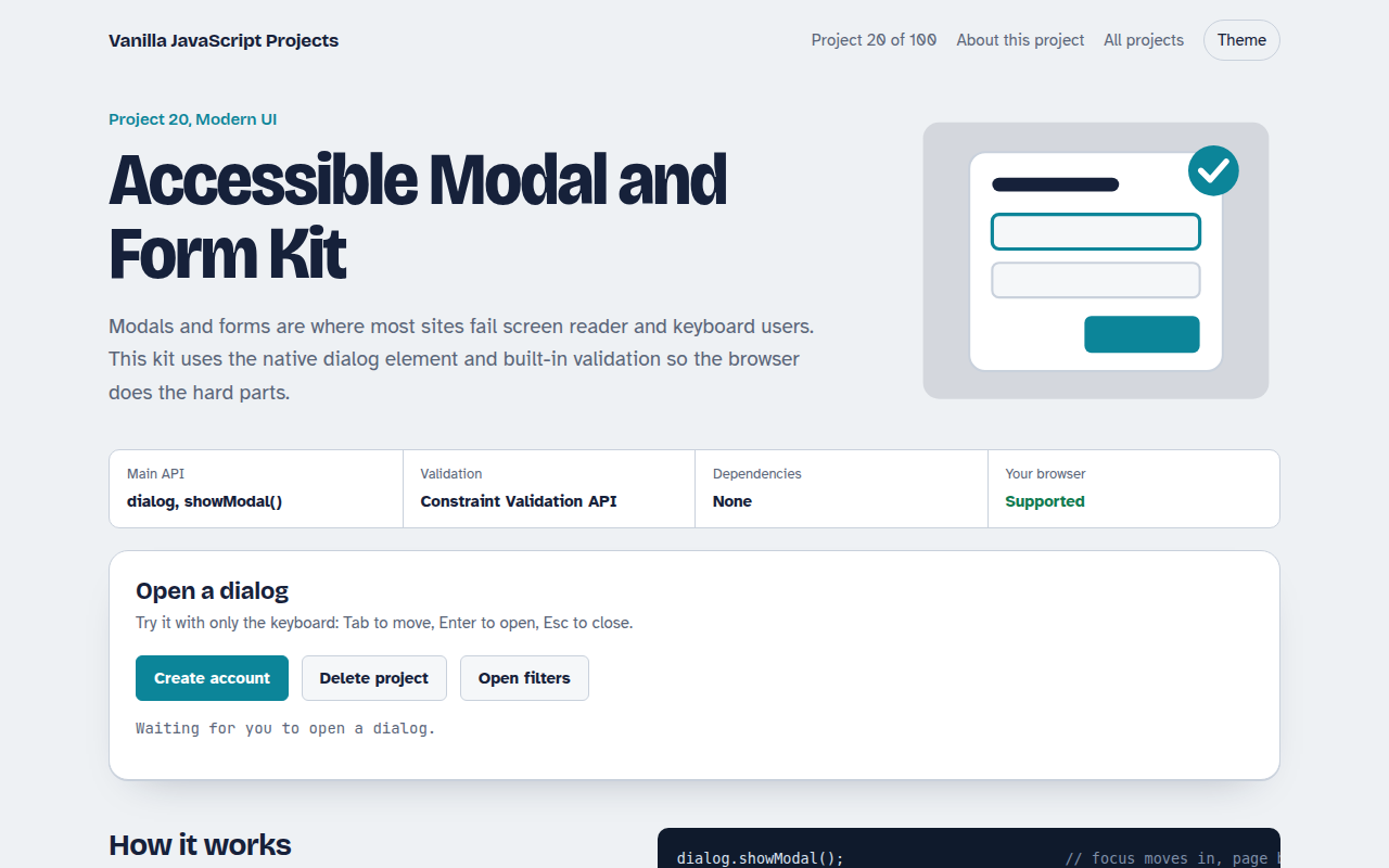
Runs on: dialog, showModal(). Every modern browser.
What is the Accessible Modal and Form Kit?
Pop up forms are where many sites fail keyboard and screen reader users. This kit shows a sign up form in a modal, a confirm dialog and a slide in drawer, all built on the native dialog element so the browser handles focus and the Esc key.
The form uses the built in Constraint Validation API with friendly messages under each field. Errors are announced by screen readers, the first bad field gets focus, and focus returns to the button that opened the dialog.
Good for
- Sign up and login forms
- Delete and confirm prompts
- Filter drawers in shops
- Meeting accessibility rules
What this project does
- Sign-up form in a modal with focus trap and Esc to close
- Errors appear under each field and are read out by screen readers
- Custom rules: password strength and matching passwords
- Confirm dialog that returns the user's choice
- Slide-in drawer built on the same dialog element
How it works
- Open as modalshowModal() puts the dialog in the top layer, makes the page behind inert and moves focus inside.
- Validate on the flyEach field is checked on blur and on submit using the browser's own ValidityState, with friendly messages.
- Close and return focusWhen the dialog closes, focus goes back to the button that opened it, and returnValue says which button was used.
The key JavaScript
This is the heart of the project. The full file has the rest, including the screen layout and error handling.
dialog.showModal();                         // focus moves in, page behind is inert

input.addEventListener("blur", () => {
  const v = input.validity;                 // built-in ValidityState
  const msg = v.valueMissing ? "Enter your email"
            : v.typeMismatch ? "That does not look like an email" : "";
  input.setAttribute("aria-invalid", !!msg);
  errorEl.textContent = msg;                // aria-live reads it out
});

dialog.addEventListener("close", () => {
  console.log(dialog.returnValue);          // "create" or "cancel"
  openButton.focus();                       // give focus back
});
How to use it
- Click Download HTML file above.
- Open the file in a code editor, like VS Code.
- Run it from a local server with
npx serve .so the camera, microphone and AI features are allowed. - Change the text and colors, then upload it to GitHub Pages, Netlify or your own site. It is one file with no build step.
Questions people ask
Why use the dialog element instead of a div?
showModal() makes the rest of the page inert, puts the dialog on top and moves focus into it. With a div you have to build all of that yourself.
How do I show custom error messages?
Check the field's validity object, like validity.valueMissing, and write your own message into an element linked with aria-describedby.
Is the form accessible for screen readers?
Yes. Errors are in aria-live regions, invalid fields get aria-invalid, and every input has a real label.
More Modern UI projects
011. UI Component Library
Six reusable Web Components you can drop into any page
012. View Transitions Gallery
A photo gallery where images grow smoothly into the detail page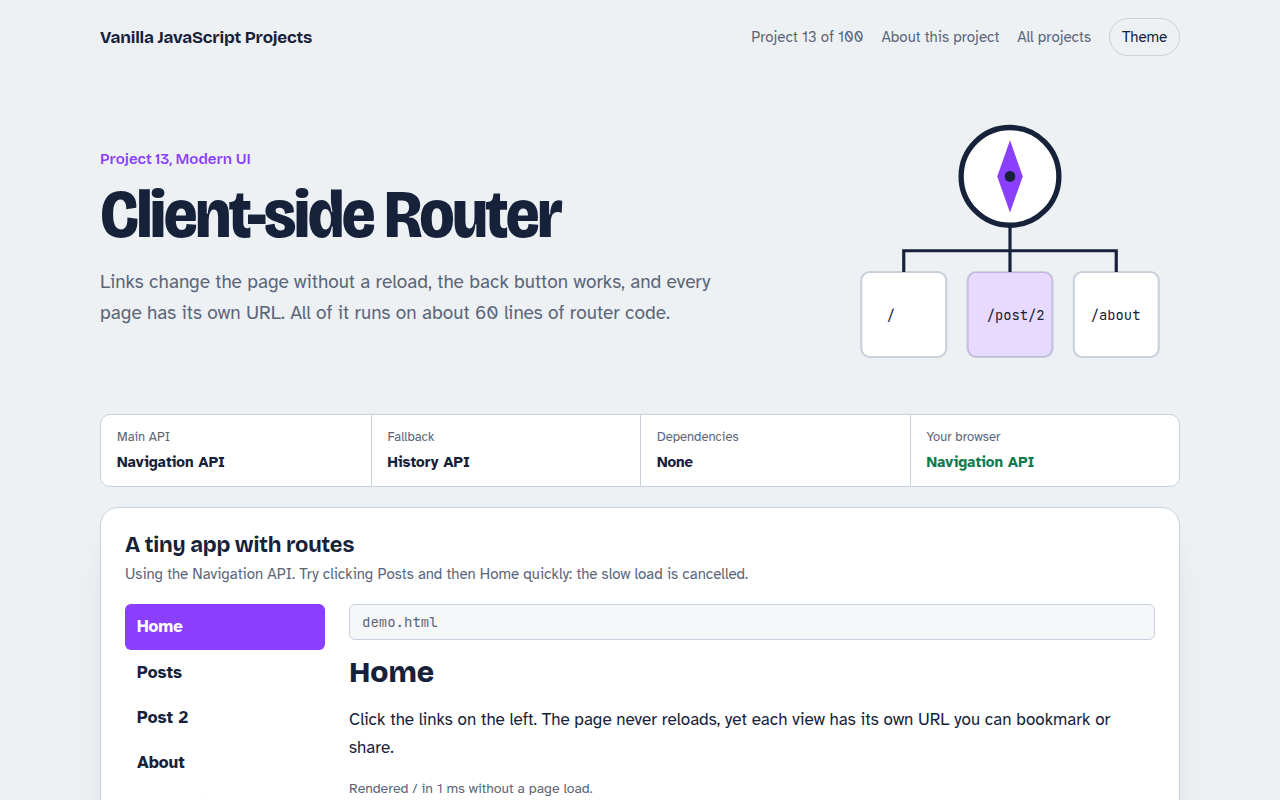
013. Client-side Router
A tiny single page app router with real URLs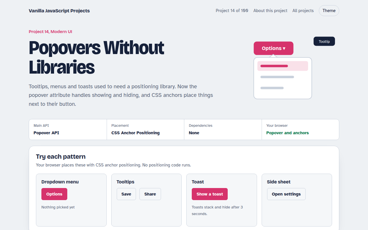
014. Popovers Without Libraries
Tooltips, menus, toasts and a side sheet with no library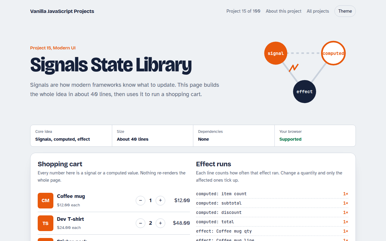
015. Signals State Library
A 40 line reactive state library running a shopping cart